Cannabis AI Pricing Platform Landing Page Template
Yield is a single-page landing page template built for a cannabis artificial intelligence pricing platform. It opens with a live margin calculator, stacks three head-to-head comparison tables, and drives visitors toward a two-step audit form. The Dynamic Motion design runs on a Monochrome Steel palette, making data the visual hero from the first scroll to the final call to action.
by Rocket studio
Quick summary
Yield is a high-intensity, single-page landing page template for a cannabis AI price optimization platform. It leads with an interactive margin calculator, builds conviction through vertically stacked comparison tables, and closes with a persistent bottom-bar call to action. Data moves on screen like a trading ticker. The design is forge black, cool gray, and electric green, nothing decorative, everything functional.
Who this template is for
This template is built for cannabis technology companies and pricing platform founders who sell to operators at scale. The target buyer already knows the problem; this page makes them feel the cost of doing nothing.
- Multi-state operators running thirty or more licenses who need dynamic SKU-level repricing across their entire portfolio
- Single-store dispensary owners losing margin on flower priced by gut instinct rather than real-time market data
- Cultivation finance leads who need wholesale quote tools that respond to spot-market movement
What problem this template solves
Static pricing in cannabis retail is a slow margin bleed. Competitor menus shift overnight, harvest cycles disrupt wholesale costs, and most dispensaries still reprice manually or not at all. A product page that only lists features cannot communicate urgency at that scale.
- Visitors arrive skeptical and leave before understanding their real dollar loss from delayed repricing
- Generic software landing pages lack the data-forward credibility needed to convert finance-minded operators
- A comparison-only pitch fails without showing the visitor their own numbers first
What you get with this template
You get a fully structured, single-page landing page that guides a cannabis pricing platform visitor from personal number-crunching to competitive proof to a gated audit request. Every section is designed to do one thing: make the cost of inaction visible.
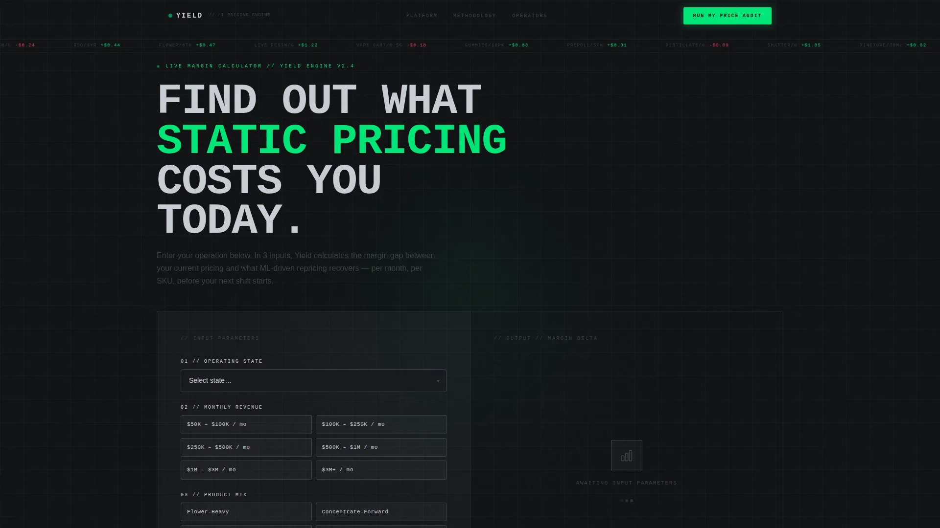
- A live margin calculator section with state selector, monthly revenue input, and product-mix chooser that outputs animated margin delta figures
- Three vertically stacked comparison tables scoring manual pricing, a competitor platform, and spreadsheet models against the AI solution across latency, SKU coverage, compliance integration, and margin lift
- A two-step conversion form that captures store count, point-of-sale system, work email, and optional revenue range
Feature list
This section walks through the core interactive and structural components built into the Yield template.
Live Margin Calculator Header
Visitors select their state, enter approximate monthly revenue, and choose a product mix (flower-heavy, concentrate-forward, or edible-diverse). The moment they submit, animated figures cascade across the screen: current average margin, projected optimized margin, and the dollar delta between them. Numbers snap into place like a split-flap departure board, making data the visual centerpiece instead of any hero image.
Three-Table Comparison Architecture
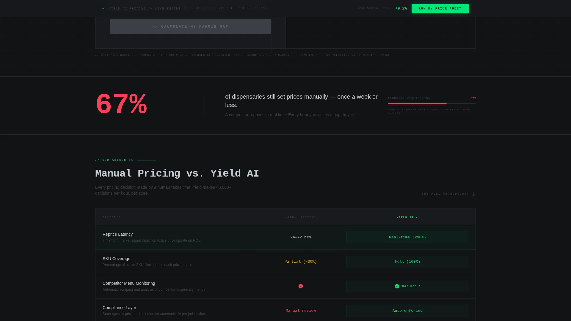
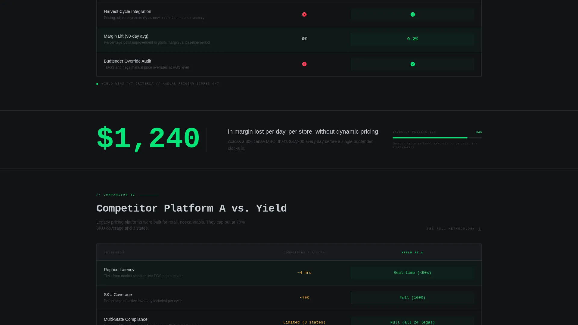
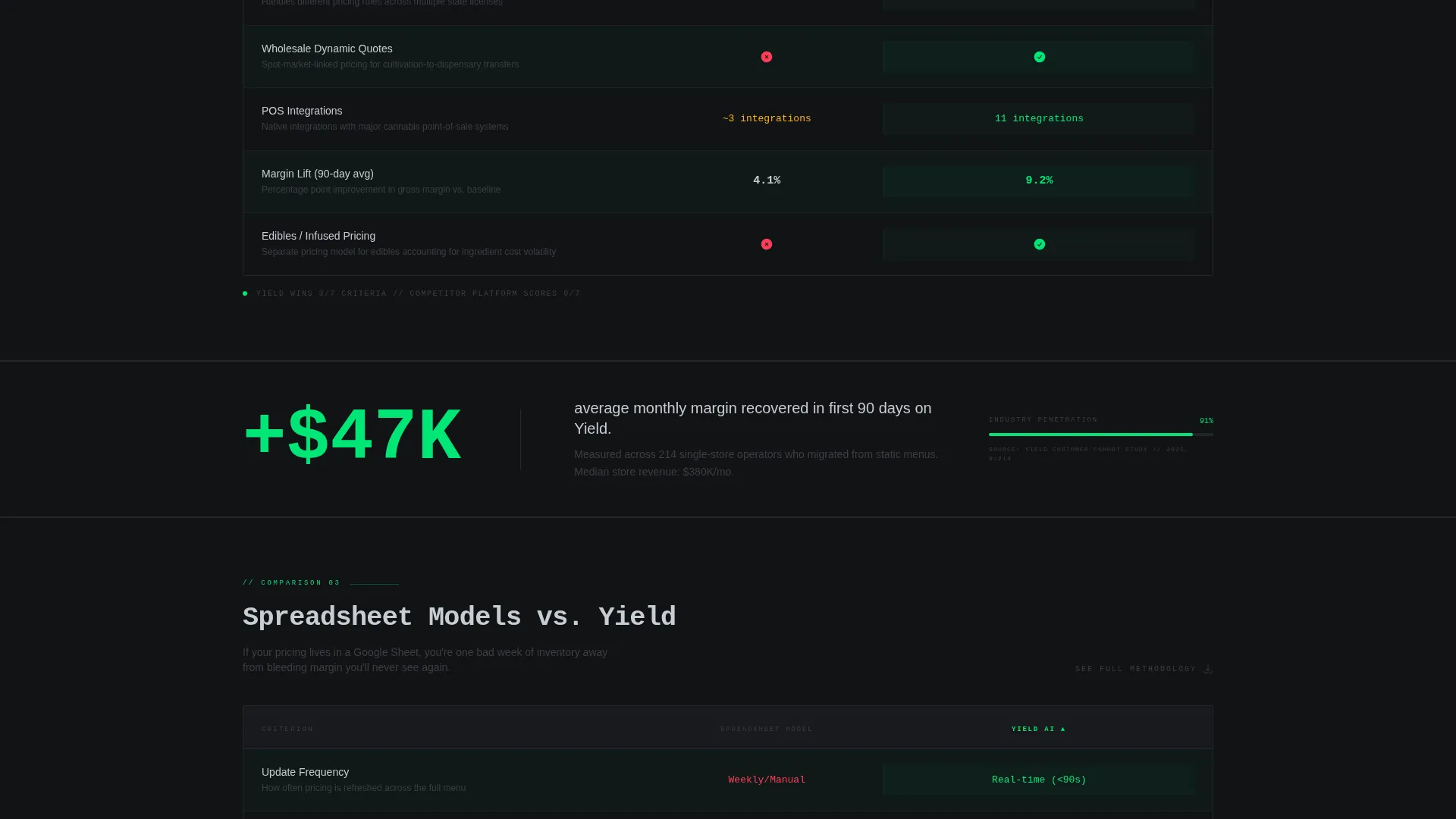
Three comparison tables stack vertically down the page. Each table scores a different opponent: manual pricing practices, a competitor platform, and spreadsheet-based models. Scoring columns cover repricing latency, SKU-level coverage, compliance integration, and margin lift percentage. This format lets visitors self-identify with the method they currently use and immediately see how it ranks.
Scroll-Triggered Stat Callout Bars
Between each comparison table, single-stat callout bars animate into view on scroll. Each bar surfaces a hard figure drawn from a published market study: average daily margin erosion without dynamic pricing, the share of dispensaries still using static menus, and revenue recaptured in the first ninety days. The animation timing makes each number land with the weight of a headline.
Persistent Bottom-Bar Call to Action
After the visitor scrolls past the calculator, a slim chromium bar locks to the bottom of the viewport. It carries the primary call to action: "Run My Price Audit." The bar stays visible through every comparison table and callout section, so the moment conviction tips, the next step is already on screen.
Two-Step Gated Audit Form
Clicking the bottom-bar call to action opens a two-step form. Step one captures store count and the visitor's point-of-sale system. Step two asks for a work email and an optional revenue range. The progressive disclosure keeps the initial ask low and increases completion rates by separating context questions from contact details.
Methodology PDF Gate
A secondary text link beneath each comparison table reads "See Full Methodology." Clicking it gates a downloadable PDF report behind a simple email capture. This creates a second, lower-commitment conversion path for visitors who are not yet ready to request a full audit.
Page sections overview
| Section | Purpose |
|---|---|
| Calculator / Estimator header | Let visitors input their own numbers and see animated margin delta output immediately |
| Manual Pricing comparison table | Score manual dispensary pricing against the AI platform across four criteria |
| Competitor platform comparison table | Show head-to-head feature and performance gaps between platforms |
| Spreadsheet Models comparison table | Illustrate the limits of static spreadsheet workflows versus real-time repricing |
| Scroll stat callout bars | Surface hard market-study figures between tables to sustain urgency on scroll |
| Methodology PDF gate | Offer a secondary conversion path for research-mode visitors via email capture |
| Persistent bottom call to action bar | Keep the "Run My Price Audit" action visible throughout the full page scroll |
| Two-step audit form | Capture store count, POS system, work email, and optional revenue range |
Design & branding system
The visual identity runs on a Monochrome Steel color system with zero decorative elements. Every color choice carries a functional meaning: backgrounds signal depth, text signals clarity, and the accent color signals a positive outcome.
- Forge black (#111215) as the page background, gunmetal mid-tone (#3B3F45) for section depth, and brushed chromium (#C8CDD3) for body text and single-pixel section dividers
- Electric green (#00E676) reserved exclusively for positive-delta numbers in the calculator output and for primary call-to-action elements, so green always means money saved or action taken
- Dynamic Motion theme drives the split-flap number animations, scroll-triggered callout bars, and cascading figure sequences, movement is purposeful, never decorative
Mobile & speed optimization
The template is structured for fast rendering on any screen size. The Dynamic Motion animations are scoped to meaningful interactions rather than continuous background effects, keeping performance lean.
- Calculator inputs and animated outputs reflow cleanly for smaller viewports so the delta figures remain legible on a phone screen
- The persistent call to action bar is sized for thumb reach on mobile, and the two-step form fields are spaced for easy tap input without pinch-zooming
- Comparison tables scroll horizontally on narrow screens rather than collapsing columns, preserving the full scoring data across all four criteria
How this template helps you convert
The page is engineered so visitors earn confidence before they see any ask. By the time the bottom-bar call to action is visible, the visitor has already calculated their own margin loss and read three scored comparisons.
- The calculator personalizes the pitch immediately. Seeing your own projected dollar delta in animated green is more persuasive than any static claim, so visitors arrive at the comparison tables already invested in the outcome.
- The stacked comparison tables replace sales copy with scored evidence. Visitors self-select the row that matches their current workflow and read down to the result, which means the template does the qualifying work before any form appears.
- The two-step form reduces friction at the highest-intent moment. Separating operational questions from contact details makes the first click feel low-stakes, and the methodology PDF gate captures a second audience segment that needs more evidence before committing.
Other information about this template
This template is designed for cannabis technology founders, growth marketers, and platform sales teams who need a credibility-first landing page rather than a feature-list page. A few additional details worth noting before you build.
- The page references point-of-sale system options in the audit form step, including Dutchie, Treez, and Blaze as named dropdown choices alongside a general "other" option
- The comparison table methodology is intended to reference a published market study, so the downloadable PDF gate works best when paired with a real research document or a detailed internal analysis
- The template does not include a navigation bar or multi-page routing; the single-page scroll structure is intentional and keeps visitor attention focused on the conversion flow
- Color customization should preserve the functional meaning of electric green; using it for decorative elements would break the visual grammar that makes positive-delta numbers instantly readable
Theme
Dynamic Motion
Creative direction
Industry Report
Color system
Monochrome Steel
Style
Comparison Table
Direction
Comparison/Versus
Page Sections
Live Margin Calculator with Animated Output
Three Stacked Comparison Tables
Scroll-triggered Stat Callout Bars
Persistent Bottom-bar Call to Action
Two-step Progressive Audit Form
Methodology PDF Email Gate
Related questions
What kind of business is this landing page template built for?
Can I use this template if I only have one comparison table's worth of content?
How does the margin calculator section work?
What happens when someone clicks 'Run My Price Audit'?
Is the 'See Full Methodology' link a built-in PDF?



