Agriculture Volunteer Management Landing Page Template
Yield is an agriculture volunteer management landing page template built for farm cooperatives, gleaner nonprofits, and county extension programs. It opens with a live volunteer capacity planner, then walks visitors through a side-by-side comparison table. The Dashboard Pro design in a Void and Violet palette makes every data point feel urgent, clear, and actionable.
by Rocket studio
Quick summary
Yield is a single-page landing page template for an agriculture volunteer management platform. It leads with an interactive capacity planner, proves its value through a structured comparison table, and drives visitors toward a free app download. The dark Dashboard Pro aesthetic keeps the focus on data while the layout stays clean and easy to scan.
Who this template is for
This template is built for organizations that coordinate farm labor volunteers across multiple sites and seasons. If your work lives between a spreadsheet and a group text thread, this layout was designed with your specific frustrations in mind.
- Farm cooperative managers handling dozens of weekend volunteers across multiple sites
- Nonprofit directors running gleaner programs that recover unharvested produce
- County extension agents coordinating disaster-response labor after storms or flooding
What problem this template solves
Volunteer farm coordination breaks down fast when tools are not built for agricultural rhythms. Generic platforms ignore harvest windows, planting deadlines, and weather-triggered cancellations. This template communicates that Yield solves those exact pain points, right from the first screen.
- No clear way to show shift coverage rates or multi-site visibility at a glance
- Manual coordination with spreadsheets and group texts leads to no-shows and lost produce
- Generic volunteer tools cannot handle season-aware scheduling or skill matching for equipment operation
What you get with this template
The template delivers a focused, single-page layout structured to move a visitor from curious to convinced to converted. Every section earns its position on the page.
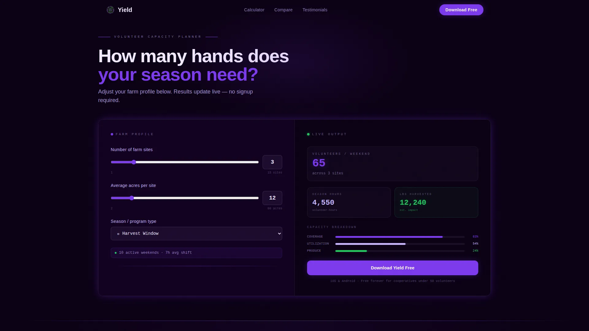
- An interactive volunteer capacity planner with three input fields and a live animated output panel
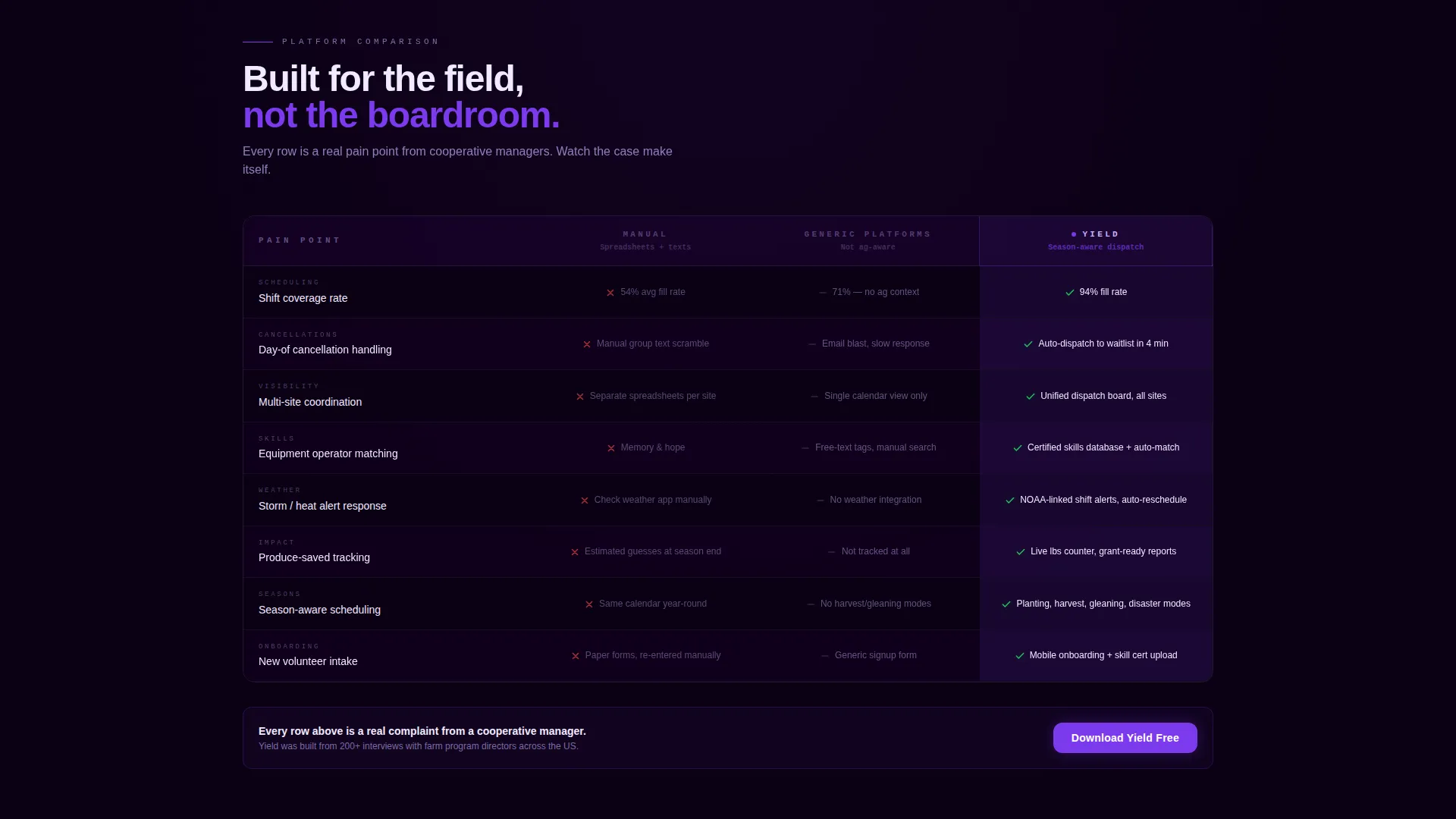
- A three-column comparison table contrasting manual coordination, generic platforms, and Yield
- A closing conversion section that resurfaces the visitor's own calculator results before the final call to action
Feature list
This template is built around a small number of high-impact components. Each one is purposeful and directly tied to the conversion goal.
Live Volunteer Capacity Planner
The calculator sits above the fold with no introductory content before it. Visitors enter the number of farm sites, average acres per site, and select a season from a dropdown. The output panel updates in real time, showing estimated volunteers needed per weekend, total volunteer-hours across the season, and projected pounds of produce saved or planted. Numbers animate in electric violet, and a small bar chart builds itself as values change.
Season-Aware Comparison Table
Three columns compare manual coordination, generic volunteer platforms, and Yield across specific row criteria. Each row targets a distinct pain point: shift coverage rate, day-of cancellation handling, multi-site visibility, and produce-saved tracking. The Yield column uses violet cell backgrounds and green checkmarks, while competitor columns remain in muted void gray, letting the visual argument build row by row.
Personalized Closing call to action Section
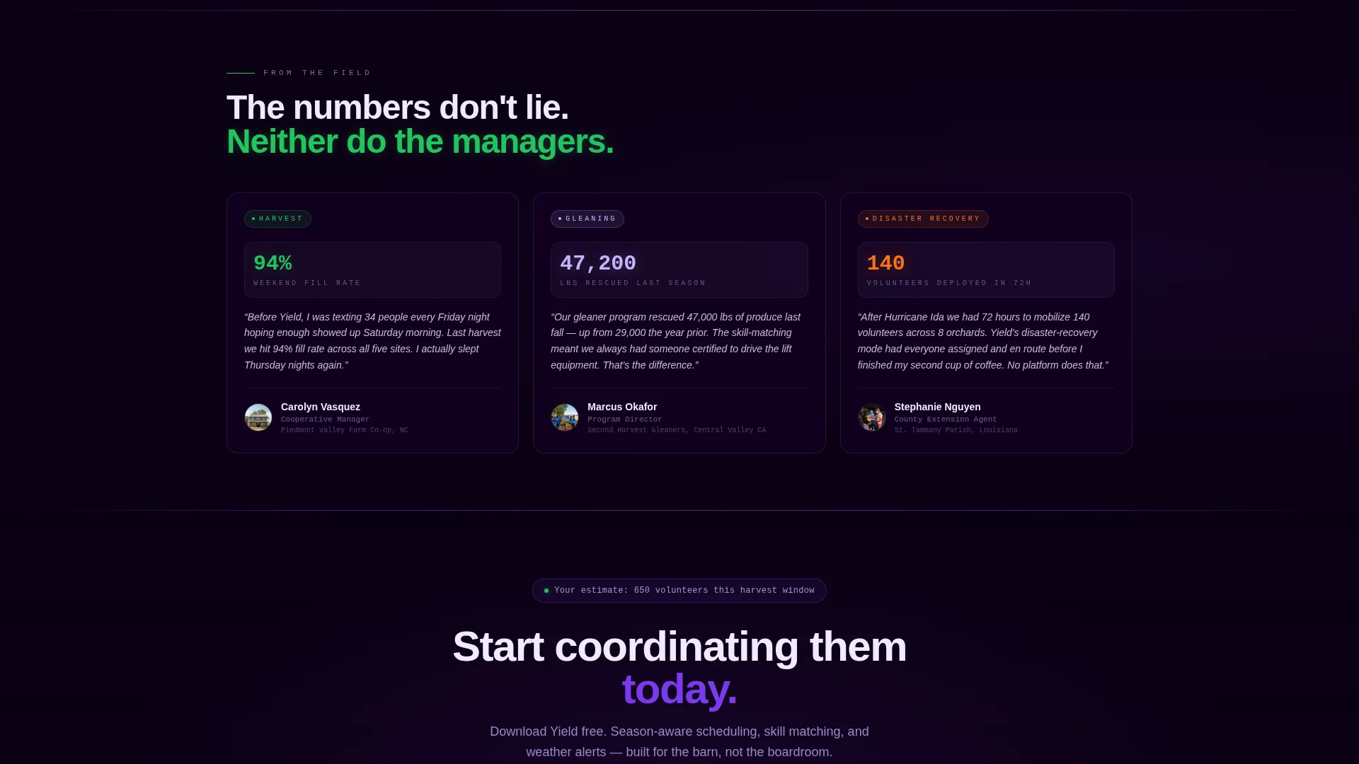
The final conversion block pulls the visitor's calculator output back into the call to action. The copy dynamically references their own estimate, for example noting how many volunteers they said they needed this harvest, then presenting the app download as the immediate next step.
App Download Call to Action
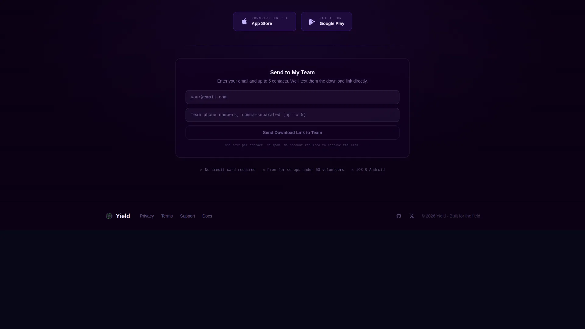
The primary action is a free app download with paired App Store and Google Play badges. The call to action appears three times: pinned below the calculator output, repeated after the comparison table, and again in the closing section.
Team Distribution Path
A secondary conversion path labeled "Send to My Team" captures an email address and sends the download link to up to five contacts. This turns a cooperative manager into a distribution channel without requiring a separate page or flow.
Dashboard Pro Dark Theme
The layout uses a deep void black background that keeps all data elements visually prominent. Electric violet highlights active states and data outputs. Muted lavender handles secondary text and table borders. A cultivar green appears only for positive metrics and confirmation states, keeping its meaning clear every time it shows up.
Page sections overview
| Section | Purpose |
|---|---|
| Capacity Planner Header | Proves value immediately with a live interactive volunteer estimator above the fold |
| Animated Output Panel | Displays real-time volunteer and produce estimates with a building bar chart |
| Comparison Table | Positions Yield against manual tools and generic platforms row by row |
| Primary call to action Block | Presents the free app download with App Store and Google Play badges |
| Closing Personalized Section | Resurfaces the visitor's own calculator result to reinforce the download action |
| Team Share Path | Captures email and distributes the download link to up to five team contacts |
Design & branding system
The visual identity follows a Dashboard Pro theme. The palette is built to feel like mission control glowing in a dark room, where every highlight carries meaning and the background never competes with the data.
- Deep void black (#0B0014) for primary backgrounds, electric violet (#7C3AED) for active states and data highlights, muted lavender (#C4B5FD) for secondary text and table borders
- Cultivar green (#22C55E) appears exclusively for positive metrics and confirmation states, so it always signals something good
- Table rows and calculator outputs are styled to appear to float forward against the dark background, creating a layered holographic readout effect
Mobile & speed optimization
The template is structured for clarity on smaller screens. The calculator layout and comparison table are built to remain readable and functional without horizontal scrolling or layout collapse.
- The three-input calculator layout adapts to a stacked mobile format so all fields remain accessible
- The comparison table columns remain distinguishable on narrow viewports, keeping the Yield column visually dominant
- The call-to-action badges and secondary share path are sized and spaced for comfortable tap interaction on touch screens
How this template helps you convert
Every structural decision in this template is oriented toward a single outcome: getting a cooperative manager, nonprofit director, or extension agent to download the app or share it with their team.
- The calculator creates immediate personal relevance by generating a result specific to the visitor's own farm setup before any pitch has been made
- The comparison table then turns that personal context into a logical case, row by row, showing exactly where manual tools and generic platforms fall short
- The closing section closes the loop by connecting the visitor's own estimate back to the download action, reducing the mental gap between interest and commitment
Other information about this template
This template is a strong fit for agriculture software product teams launching a volunteer coordination app. It is also useful for agritech startups, extension service digital campaigns, and cooperative outreach programs that need a convincing single-page presence.
- The "Send to My Team" flow makes this template unusually effective for B2B-adjacent use cases where a single decision-maker needs to loop in partners before committing
- The season dropdown in the calculator covers planting, harvest, gleaning, and disaster recovery, which maps directly to real agricultural program types
- The template is designed as a standalone landing page with no dependency on a separate navigation structure or multi-page site architecture
Theme
Dashboard Pro
Creative direction
Calculator/Tool First
Color system
Void & Violet
Style
Comparison Table
Direction
App Download
Page Sections
Live Volunteer Capacity Planner
Season-aware Comparison Table
Personalized Closing Conversion Block
Triple-placed App Download Call to Action
Team Distribution Share Path
Dashboard Pro Dark Theme
Related questions
Who is this template designed for?
Can I customize the calculator inputs and output labels?
What does the comparison table include?
How does the Send to My Team feature work?
Does this template work as a standalone page?



