Zenith — Home Care Landing Page Template
Dispatch is a card grid landing page template built for home services project management platforms. It frames a powerful drag-and-drop dispatch board through a Problem→Solution arc, complete with a live dashboard header, versus-card sections, an interactive assessment flow, and a feature comparison table. The Electric Indigo visual system keeps every section sharp, focused, and ready to convert.
by Rocket studio
Quick summary
Dispatch is a single-page landing page template designed for home services scheduling and dispatch software. It opens with a live dashboard preview, walks visitors through a Problem→Solution arc using modular versus cards, and closes the case with an interactive assessment and a head-to-head comparison table. The Electric Indigo color system makes every section feel like a freshly launched ops tool.
Who this template is for
This template is built for software founders, product marketers, and growth teams promoting home services project management platforms. It speaks directly to operators who already know the pain of running crews without a real system.
- Home services software companies targeting field service businesses with ten or more trucks
- SaaS teams marketing scheduling, dispatch, or invoicing tools to contractors and trade businesses
- Operations-focused founders who need a landing page that earns trust before asking for a sign-up
What problem this template solves
Field service operators do not need another generic software page. They need a page that mirrors their Monday morning before they have had a coffee. Dispatch is built to make visitors feel seen immediately, then show them the exact fix.
- Visitors bounce when they cannot recognize their own problem in the first five seconds of a page
- Generic feature lists fail to convert operators who are skeptical of yet another tool promising to fix everything
- No clear comparison path leaves buyers unsure whether to switch from their current setup
What you get with this template
Dispatch delivers a complete, modular landing page structure that moves visitors from pain recognition to confident sign-up. Every section is purposeful and designed to reduce drop-off at each stage of the scroll.
- A full-page card grid layout with a dashboard-preview hero, versus-card rows, stat counters, and a comparison table
- An interactive three-question assessment flow that generates a personalized time-saved estimate and unlocks the primary call to action
- A persistent top navigation bar with a "See How You Compare" prompt that keeps the conversion path visible throughout the scroll
Feature list
This section covers the core built-in components and interaction patterns included in the Dispatch template.
Living Dashboard Hero Section
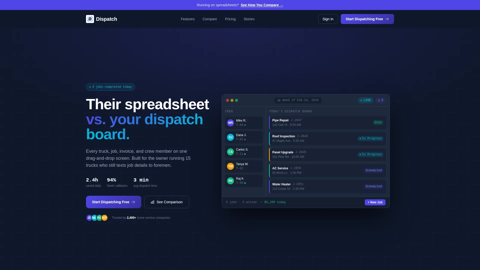
The header renders a pixel-perfect product screenshot of a weekly dispatch board. It shows eight color-coded jobs by trade, a crew sidebar with avatars and truck numbers, and an animated notification badge. Two "In Progress" status chips carry subtle pulse animations, and the entire mockup sits at a slight isometric tilt on the midnight background.
Problem versus Solution Card Grid
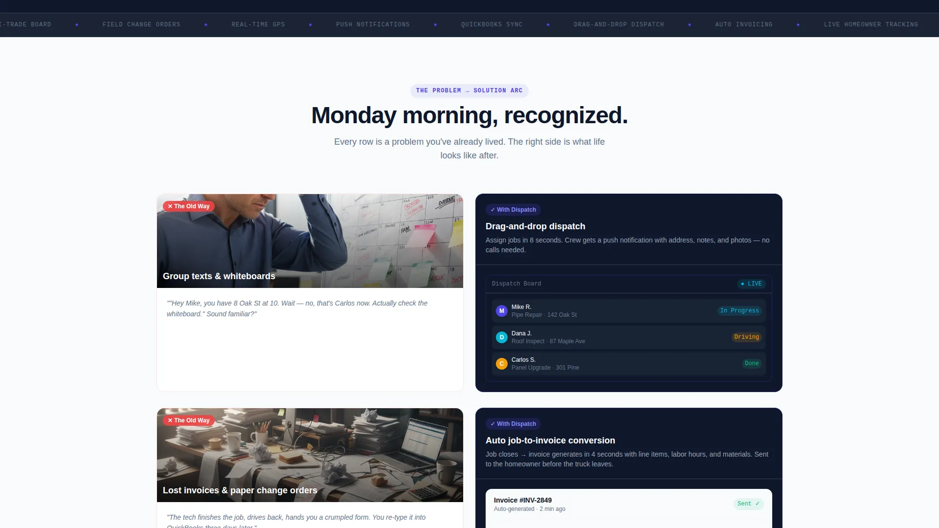
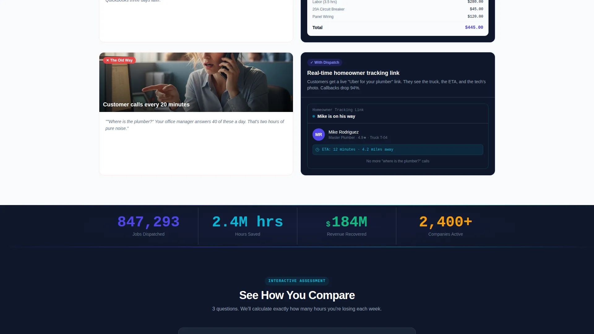
Each card row pairs a "before" state on the left with a product user interface card on the right. The sequence runs from scheduling chaos to drag-and-drop dispatch, lost invoices to automatic job-to-invoice conversion, and customer complaints to real-time homeowner tracking links. Rows compound in emotional weight as visitors scroll.
Stat Counter Pulse Bar
A single-stat counter bar sits between card rows. It pulses live-style figures for jobs dispatched, hours saved, and revenue recovered. The component reinforces the product's value claim at exactly the moment when problem fatigue peaks.
Interactive Assessment Flow
A persistent top bar links to a three-question assessment. Visitors select their number of active crews, current scheduling method, and biggest daily frustration. The tool instantly returns a personalized weekly time-saved estimate and activates the "Start Dispatching Free" call-to-action button.
Head-to-Head Comparison Table
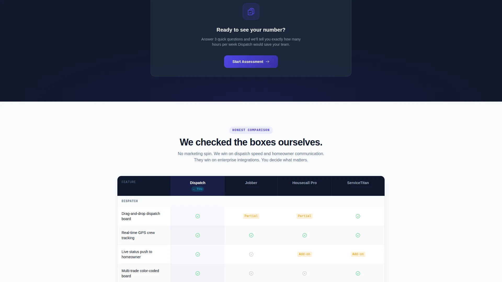
A side-by-side feature comparison table checks capabilities honestly against competing platforms in the home services software space. It highlights the specific dispatch and integration features where the product leads, giving undecided buyers a concrete reason to choose.
Modular Versus Card Layout
The card grid structure is fully modular. Each row is self-contained, making it straightforward to reorder sections, swap imagery, or add new problem-solution pairs as the product evolves without breaking the overall page flow.
Page sections overview
| Section | Purpose |
|---|---|
| Persistent Top Bar | Anchors the "See How You Compare" call to action throughout the scroll |
| Dashboard Hero | Opens with an animated dispatch board preview and headline comparison |
| Problem Arc Cards | Pairs painful "before" states with clean product user interface solutions row by row |
| Stat Counter Bar | Pulses key metrics between card rows to reinforce product value |
| Interactive Assessment | Collects three inputs and returns a personalized time-saved estimate |
| Primary call to action Block | Activates "Start Dispatching Free" after the assessment is completed |
| Comparison Table | Shows an honest side-by-side feature breakdown against competing tools |
Design & branding system
The Electric Indigo color system is the visual backbone of this template. Every palette choice is intentional and tied to a specific functional role on the page.
- Deep product indigo (#4F46E5) drives all primary buttons, navigation rails, and key heading accents
- Midnight workspace (#0F172A) sets the dashboard-style background for the hero and dark card sections, while clean drywall white (#F8FAFC) surfaces card bodies and document-style content areas
- Charged cyan (#06B6D4) fires on status badges, live pulse indicators, and hover states to signal anything active or in-progress
Mobile & speed optimization
The modular card grid structure adapts cleanly to narrower viewports. Each section is self-contained, which means the layout reflows naturally without losing the visual logic of the Problem→Solution arc.
- Versus card pairs stack vertically on small screens so the before-and-after sequence stays readable
- The isometric hero mockup and stat counter bar are designed to scale without breaking the dashboard aesthetic on tablet and mobile viewports
How this template helps you convert
Dispatch is engineered around conversion from the first pixel to the final button. Every section reduces a specific objection before it surfaces.
- The headline "Their spreadsheet versus. your dispatch board" frames the stakes immediately, so visitors self-qualify in under three seconds rather than reading a generic value proposition
- The interactive assessment creates a personalized output before asking for any commitment, which lowers the psychological cost of clicking the primary call-to-action button
- The honest comparison table closes skeptical buyers by naming competing tools directly and showing checkboxes transparently, removing the doubt that holds operators back from switching
Other information about this template
Dispatch is part of the Startup Velocity theme collection and uses the Electric Indigo color system across its full component set. It is built for the home services project management niche and fits naturally within the broader field service and home services software category.
- The template style is Card Grid (Modular), which makes individual section blocks easy to rearrange or extend
- The creative direction follows a Problem→Solution Arc, a pattern proven to resonate with skeptical buyers who have already tried other tools
- The header concept is a Dashboard Preview, placing a realistic product user interface front and center rather than a stock illustration
Theme
Startup Velocity
Creative direction
Problem→Solution Arc
Color system
Electric Indigo
Style
Card Grid (Modular)
Direction
Comparison/Versus
Page Sections
Animated Dashboard Hero Section
Problem Versus Solution Card Grid
Interactive Three-question Assessment
Stat Counter Pulse Bar
Honest Head-to-head Comparison Table
Modular Card Grid Layout
Related questions
Can I customize the versus card content for my specific product features?
Does the assessment flow require coding to connect to a live results engine?
Is this template a good fit for an early-stage software product without many customers?
Can I replace the hero dispatch board mockup with my own product screenshot?
Can I add more problem-solution card rows beyond the included set?



