Zenith — Strategic Technology Landing Page Template
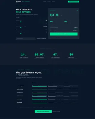
Uptime is a dark-themed IT services landing page built around a Stats-First Impact creative direction. It opens with an interactive cost-savings estimator and flows into an animated comparison table. Designed for managed IT providers, MSPs, and IT consultants, this template turns raw performance numbers into a compelling, data-led case for your services.
by Rocket studio
Quick summary
Uptime is a single-page IT services landing page template built on a Dashboard Pro theme. It leads with a live cost-savings estimator, then flows into a stat-forward comparison table that benchmarks your services against industry averages. The Midnight Blue color system and status-green accents give it the calm authority of a network operations center at full health.
Who this template is for
This template is built for IT service providers who need to communicate value quickly and credibly. It speaks the language of buyers who think in uptime percentages, ticket queues, and budget line items.
- Managed service providers (MSPs) looking for a polished, white-label-ready front end
- IT consultants and in-house IT teams pitching services to mid-market leadership
- Office managers and CTOs evaluating whether to outsource their infrastructure support
What problem this template solves
Most IT service pages bury their value in paragraphs of technical jargon. Buyers arrive with a number in their head, a budget problem on their desk, and no patience for vague promises. This template replaces that friction with math.
- Visitors can see their own projected savings before they read a headline
- The comparison table removes the need to argue benefits, letting the data gap do the work
- The click-through flow carries calculator inputs to a pricing page, keeping momentum without a form barrier
What you get with this template
You get a fully structured, single-page landing page with every section designed around conversion through evidence. There is no stock photography to swap out and no hero illustration to replace. The visitor's own numbers become the opening statement.
- An interactive cost-savings estimator with real-time output in the header section
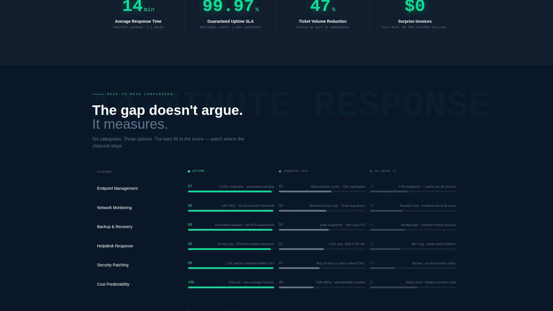
- A multi-row animated comparison table covering endpoint management, network monitoring, backup recovery, and helpdesk staffing
- Two strategically placed call-to-action (call to action) elements and a secondary email-capture exit ramp beside the estimator
Feature list
This section covers the core functional and design components built into the template.
Interactive Cost-Savings Estimator
The header opens with a slider-based estimator. Visitors input their employee count, current monthly IT spend, and weekly support ticket volume. As each slider moves, a real-time output panel displays projected annual savings, mean-time-to-resolution improvement, and downtime reduction percentage. All figures render in status-green digits against deep navy, making the visitor's own data the hero content.
Animated Comparison Table
The comparison table benchmarks the managed IT provider against industry averages and do-it-yourself in-house costs. Rows cover endpoint management, network monitoring, backup recovery, and helpdesk staffing. Each row uses micro-animations: the status-green bar fills to the provider's score while the competitor column stays in charcoal, letting the visual gap carry the argument.
Stats-First Scroll Sections
Every scroll segment leads with a bold, oversized metric before any supporting copy appears. "14-minute average response time" lands first, for example, then the explanation follows. This approach keeps skimmers engaged and anchors the narrative in measurable performance rather than marketing claims.
Dual call to action Placement
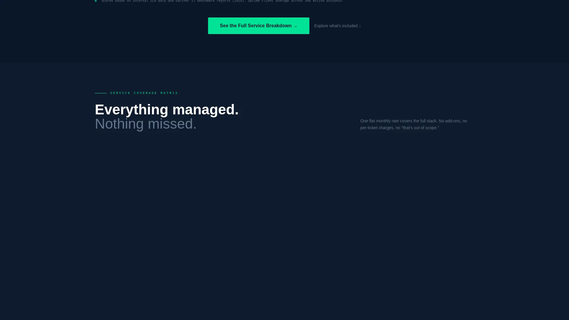
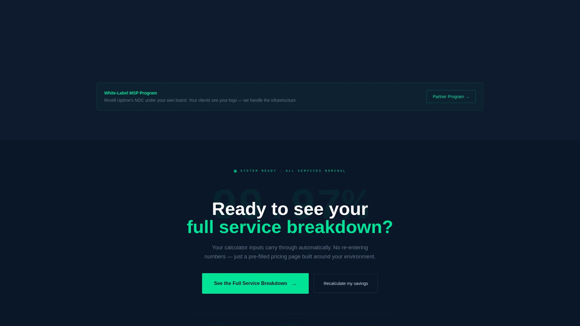
The primary call to action, "See the Full Service Breakdown," appears twice: once sticky in the top navigation after scroll begins, and once anchored directly below the comparison table. Clicking either call to action carries the visitor's calculator inputs as URL parameters to a pre-filled pricing page, removing the need for a form on this page.
Secondary Email-Capture Exit Ramp
A low-commitment secondary call to action, "Download the IT Budget Template," sits beside the estimator. It captures an email address from visitors who are not yet ready to click through to pricing. This gives the page two conversion paths without cluttering the primary flow.
Dashboard Pro Dark Theme
The entire page is styled in a Midnight Blue color system. Deep terminal navy (#0A1628) forms the base, monitoring-panel charcoal (#1B2838) separates content zones, status-green (#00E396) highlights positive metrics and interactive elements, and cool silver (#CBD5E1) carries body text and table borders. The palette is built to feel like a live network operations center dashboard.
Page sections overview
| Section | Purpose |
|---|---|
| Estimator Header | Opens with interactive cost-savings calculator |
| Real-Time Output Panel | Displays projected savings and improvement metrics |
| Oversized Stat Block | Leads each scroll segment with a bold metric |
| Comparison Table | Benchmarks provider against industry and in-house costs |
| Sticky Primary call to action | Keeps "See the Full Service Breakdown" always reachable |
| Anchored Primary call to action | Reinforces click-through directly below the table |
| Secondary Exit Ramp | Captures email with low-commitment budget template offer |
Design & branding system
The visual identity is built around a dark, data-dense aesthetic that feels like a monitoring dashboard rather than a marketing page. Every color decision reinforces the idea that everything is nominal, every system is green, and there is nothing to worry about.
- Base palette: deep terminal navy (#0A1628), charcoal (#1B2838), status-green (#00E396), and cool silver (#CBD5E1)
- Interactive elements and positive metric displays use status-green to signal active, healthy states
- No stock photography or hero illustrations; data outputs and metric displays carry all visual weight
Mobile & speed optimization
The layout is designed to translate the dashboard aesthetic cleanly to smaller screens without sacrificing the estimator or table functionality. Sliders and the real-time output panel are structured to remain usable on touch devices.
- The comparison table is structured for horizontal scroll or stacked display on narrow viewports
- Sticky navigation call to action remains accessible throughout the mobile scroll experience
- Oversized stat blocks reflow naturally to maintain their visual impact at smaller type sizes
How this template helps you convert
The page is built around a click-through conversion model. There is no form on this page, which removes the most common source of drop-off on IT service landing pages. Instead, two clear paths move visitors forward.
- The estimator makes the value proposition personal from the first interaction, so visitors arrive at the pricing page already invested in their own numbers.
- The dual call to action placement ensures the primary action, "See the Full Service Breakdown," is always one click away regardless of scroll position, reducing the chance a motivated visitor loses momentum.
Other information about this template
This template is well-suited for IT services businesses operating in competitive markets where buyers compare multiple providers before committing. It is particularly effective when paired with a detailed pricing or service breakdown page that accepts the URL parameters generated by the estimator.
- The template style is a comparison table landing page, making it a strong fit for IT services digital presence use cases
- The Dashboard Pro theme and Midnight Blue color system are consistent with professional network operations and managed services branding conventions
- The secondary "Download the IT Budget Template" call to action supports email list building as a parallel objective alongside the primary click-through goal
- This template works within the broader category of technology landing pages targeting IT services decision-makers at the office manager and CTO level
Theme
Dashboard Pro
Creative direction
Stats-First Impact
Color system
Midnight Blue
Style
Comparison Table
Direction
Click-Through
Page Sections
Interactive Cost-savings Estimator
Animated Comparison Table
Stats-first Scroll Sections
Dual Call to Action Placement with URL Parameters
Secondary Email-capture Exit Ramp
Dashboard Pro Dark Theme
Related questions
Does this template include a working estimator tool?
Is there a form on this landing page?
Can I use this template for a white-label managed IT service?
What does the comparison table cover?
Who is the ideal buyer for this template?



