The best portfolio design ideas put your work front and center with clean layouts, fast load times, and mobile-friendly structure. Use 8-12 strong projects, clear navigation, and a touch of personality to turn visitors into clients.
Strong portfolio design ideas share one quality: they make your work the undeniable focus. A clean, well-structured portfolio builds trust instantly, keeps visitors engaged, and turns your online presence into a first impression that works around the clock.
Why Portfolio Design Matters
A portfolio is more than a folder of images. The best portfolio design ideas use a clean, mobile-friendly layout, put your strongest 8–12 projects front and center, make navigation obvious, and add just enough personality to make the work memorable. For freelancers, designers, illustrators, photographers, UX/UI professionals, and other creatives building an online presence, that mix does two jobs at once: it shows what you do and gives potential clients a reason to trust you quickly.
Every element, from your homepage layout to your contact page, shapes that first impression. A portfolio site works as your digital handshake, visual resume, and proof of taste, so small design choices directly affect whether visitors stay, explore your work, and get in touch. This guide breaks down the parts that matter most: layout best practices, choosing the right template, presenting visuals well, writing stronger case studies, simplifying navigation, designing for mobile, showing personality without clutter, improving your workflow, avoiding common mistakes, and using AI-powered tools like Rocket.new to build a portfolio faster.
| Element | Why It Matters | Common Mistake |
|---|---|---|
| Homepage | Visitors decide in seconds whether to stay | Too cluttered, no clear headline |
| Work showcase | Your projects must pop visually | Low-res images or no context |
| About page | People hire people, not anonymous portfolios | Generic bio with no personality |
| Contact info | A missing contact page is a direct lost opportunity | Buried in footer only |
| Storytelling | Case studies outperform static image galleries | Showing results without showing process |
48% of freelancers report finding clients through their online portfolios or websites. That makes your portfolio one of the highest-ROI investments a creative professional can make.
Online portfolios are not a nice-to-have. They are the digital version of your handshake, your resume, and your visual resume all in one place. Good design makes people stay. Bad design makes them bounce.
Quick answer: The best portfolio design is clean, mobile-friendly, and built around your strongest work, not around visual flair. Visitors should reach your best project within two clicks of landing on your homepage.
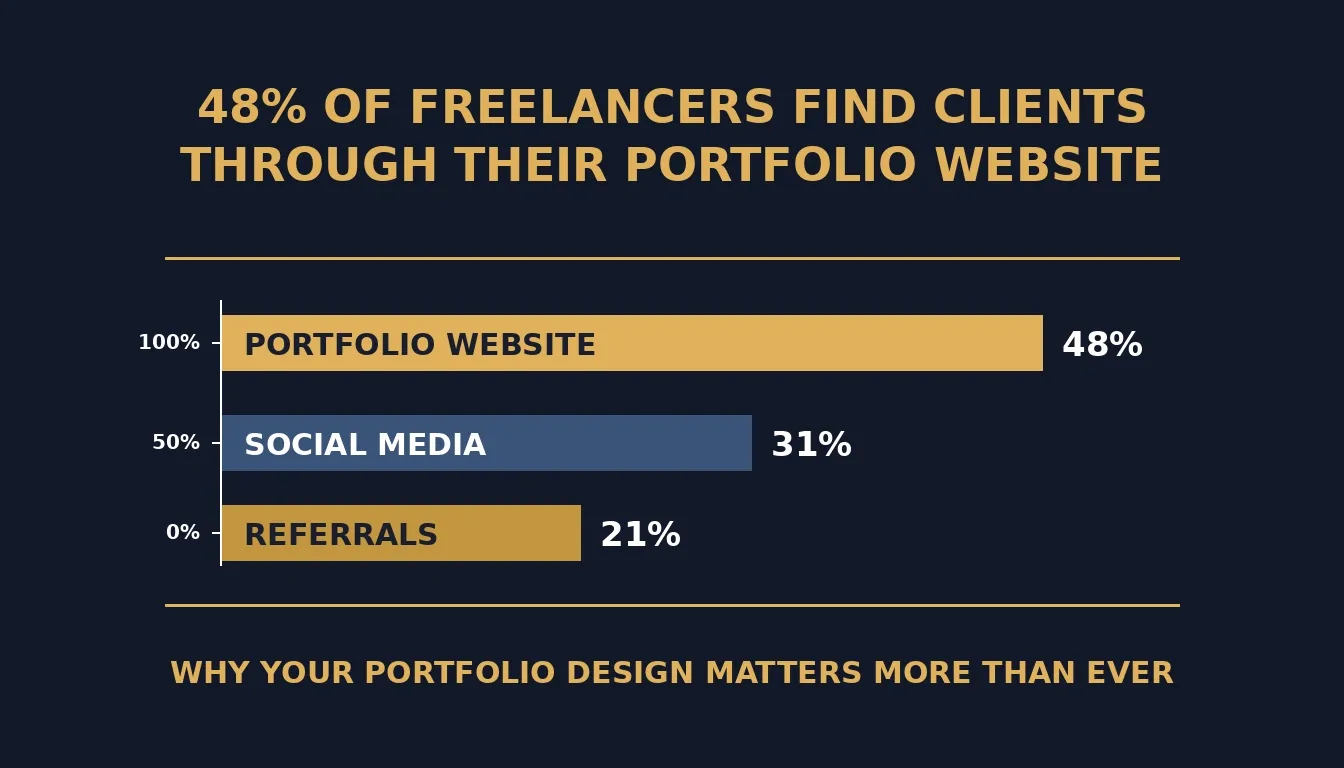
Freelancers who invest in a well-designed portfolio website consistently report it as their top client acquisition channel.
Friendly Portfolio Design Ideas That Work
Before jumping into the specifics, remember this: your portfolio is like a first date with your visitors. You want it to be memorable, easy to follow, and leave them curious for more.
1. Keep Your Homepage Clean
Your portfolio design should greet visitors with clarity, not clutter. Think big thumbnails, clear titles, simple navigation menus, and zero distractions. Let people see the main stars of your best work immediately.
- Clear branding visible above the fold
- Simple navigation with no more than five top-level items
- One main statement headline that names what you do and for whom
Having a clean homepage is like giving a warm welcome. Research consistently shows that users leave web pages within 10-20 seconds unless a clear value proposition holds their attention.
2. Use Graphic Design Portfolio Templates That Fit Your Style
A good set of portfolio templates can save significant time and still deliver a custom feel. Some templates are minimal, some are bold, and some are artsy. Pick the ones that let your work shine rather than compete with it.
- Match the template visual weight to your discipline
- Avoid anything that feels flashy for the sake of it
- Choose templates that load fast
If your portfolio feels slow or clunky, people bounce before they even see the best bits. You can also explore best portfolio website templates to find styles that match your creative niche.
3. Photography and Visual Highlights
Photography entries in your portfolio deserve space to breathe. Crisp images beat blurry screenshots every single time.
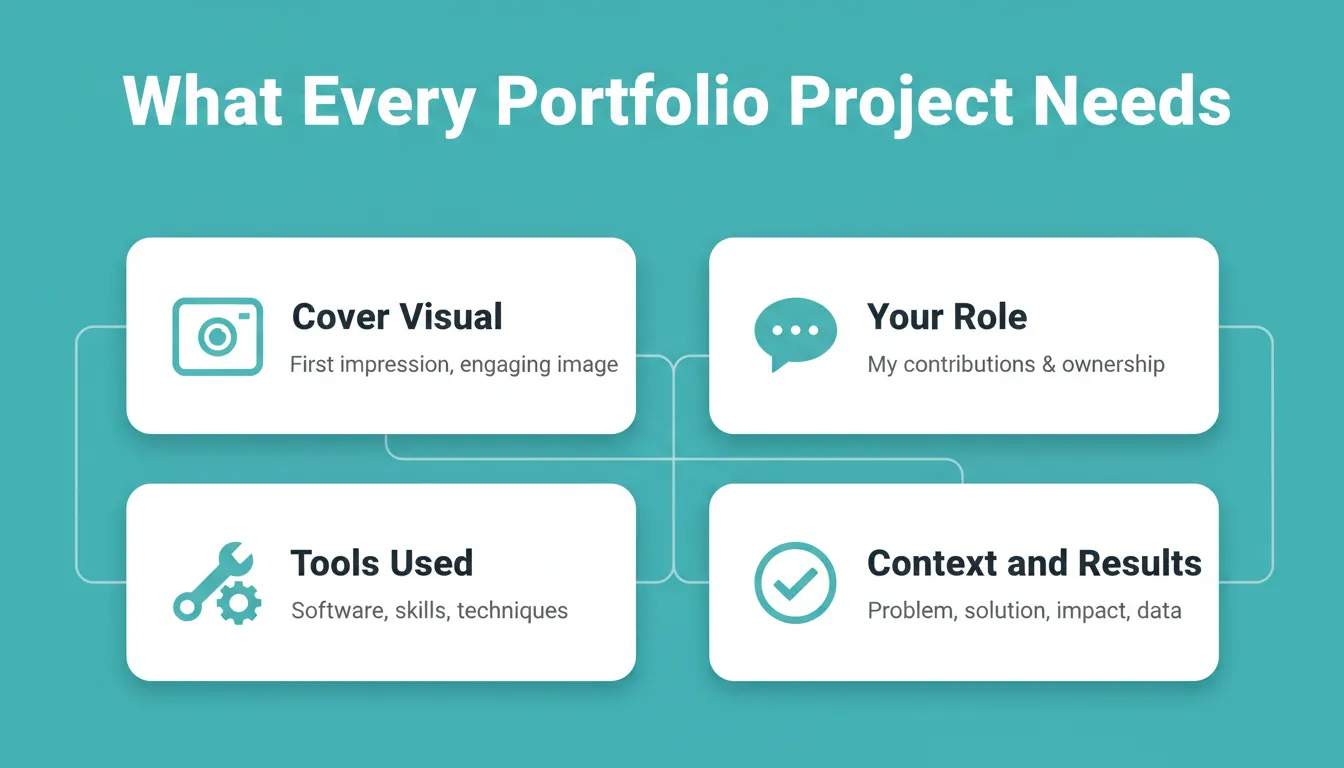
Every project entry should include a cover visual, your role, tools used, and context around the results.
Present each project with:
- A cover visual that represents the work at a glance
- Context (short, not an essay)
- Your specific role in the project
- The tools and methods you used
Designers and graphic designers who show process consistently receive better feedback than those who show only final outputs.
4. Case Studies and Storytelling
Case studies are the highest-converting content on a portfolio. Start with the challenge, show your steps, and end with the results. This demonstrates planning, execution, and thinking.
Designers often forget to show what problem they solved. If you want to build a web app without a designer to present your case studies, AI tools make that faster than ever.
5. Keep Navigation Simple
Put a clear menu so visitors know exactly where to go: Work, About, Contact, Resume (optional), Blog (optional). Add a small search bar if your portfolio has many projects.
6. Make It Mobile-Friendly
Most people check websites on phones. If your portfolio is not mobile-friendly, visitors click away in seconds, and they rarely come back.
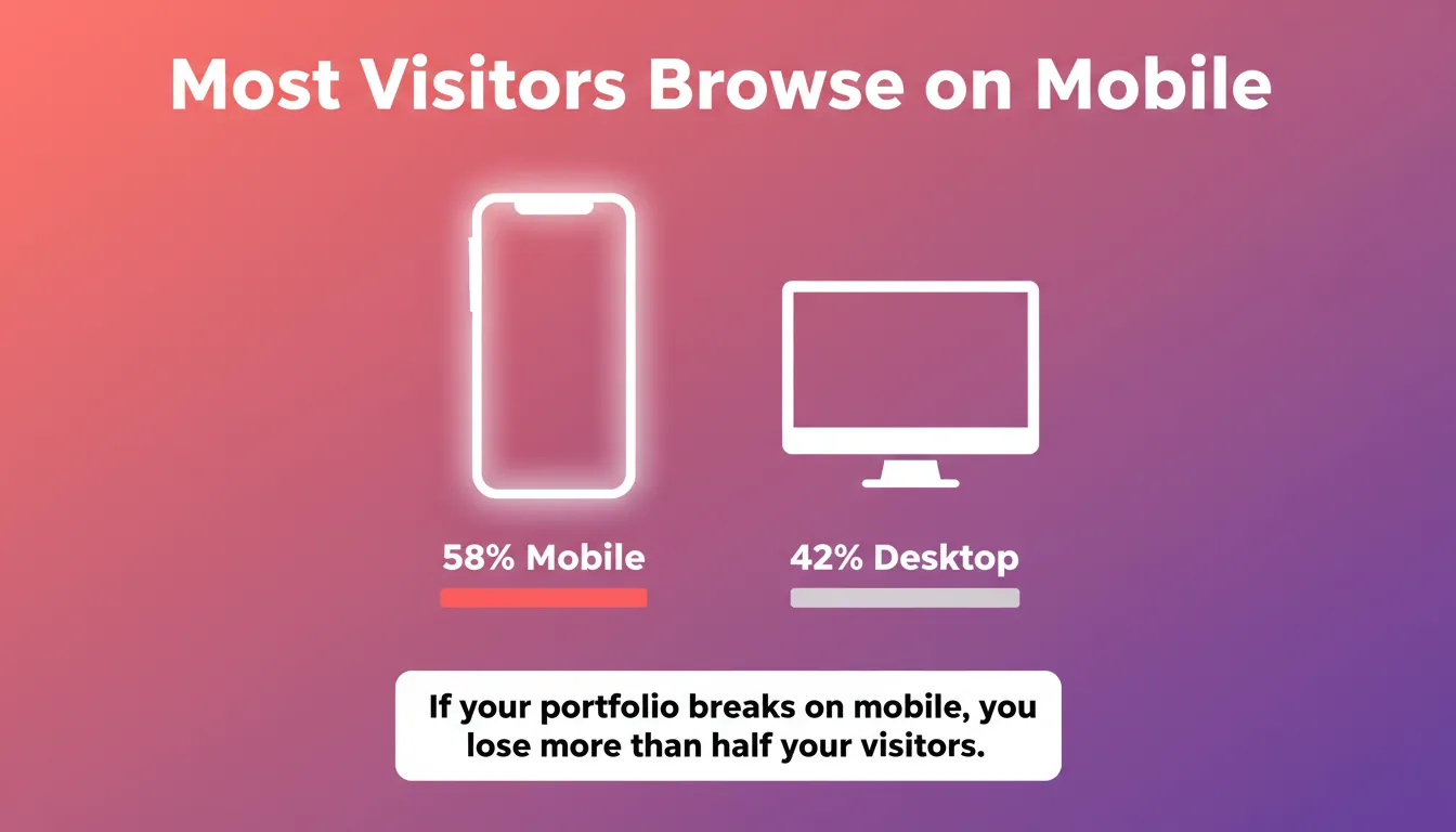
Over half of all web traffic now comes from mobile devices. A portfolio that breaks on phones loses more than half its potential clients.
- Text is large enough to read without pinching
- Images resize smoothly without cropping important details
- Navigation remains clear and tappable
7. Bring in Your Personality
Your portfolio design does not need to be stiff. Add touches that reflect who you are: a quirky bio, a tiny animated detail, a bold color pattern, or a fun hover effect on project thumbnails. Do not overdo it. But a sprinkle of personality makes your portfolio memorable.
Portfolio Design Workflow
Here is how the process of building a strong portfolio design flows from planning to launch.
- Define your goals: who is this portfolio for, and what action should visitors take?
- Choose a layout: grid, case study, one-pager, or split-screen
- Decide: template or custom design?
- Add your best case studies and projects (8-12 is the ideal range)
- Optimize images and load speed
- Test mobile responsiveness on real devices, then step away briefly and review it with fresh eyes for practical advice on weak spots.
Taking a short break during the process can improve decisions and help avoid burnout.
Design Portfolio Templates to Try
Each template below has its own style and purpose. Picking the right template can make your portfolio feel polished, organized, and ready to showcase your best work.
| Template Style | Best For | Key Strength |
|---|---|---|
| Minimal Grid Layout | Designers, illustrators | Shows volume of work cleanly |
| Dark Mode Visual Showcase | Photographers, motion designers | Makes colors and images pop |
| Case Study Layout | UX/UI designers, strategists | Tells the story behind each project |
| One Page Scroller | Freelancers with focused niches | Simple, continuous experience |
| Split Screen Projects | Creative directors, art directors | Dynamic visual and text balance |
| Interactive Hover Previews | Web designers, developers | Playful, memorable engagement |
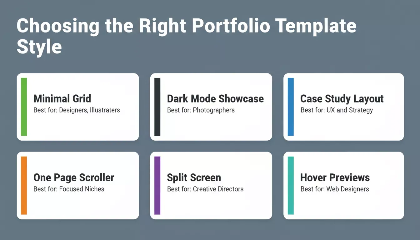
Different template styles serve different creative disciplines. Matching your template to your work type makes a significant difference in how clients perceive your portfolio.
Depending on your niche- graphic design, UX, photography, or development- some portfolio design templates perform better than others. A UX designer portfolio benefits from a case study layout that shows process; a photographer portfolio needs maximum image space with minimal chrome.
Common Mistakes to Avoid
A few mistakes can ruin a portfolio faster than bad coffee ruins a Monday morning. Here is what to watch out for:
| Mistake | Why It Hurts | Fix |
|---|---|---|
| Broken links | Signals unprofessionalism immediately | Audit all links before launch and monthly after |
| Hard-to-read text | Tiny fonts or clashing colors cause visitors to scroll past | Use 16px+ body text, high contrast, short paragraphs |
| Huge images that never load | Visitors lose patience before seeing your work | Compress images to under 200KB without visible quality loss |
| Too much text, no visuals | Portfolios are visual proof, walls of text undermine that | Balance images with short, punchy descriptions |
| Missing contact page | Interested clients have nowhere to go | Make contact accessible from every page, not just the footer |
Avoid these mistakes, follow strong visual practices, and your portfolio design will be far more effective at grabbing attention and retaining engagement.
Community Insight: What Real Creatives Say
A real conversation from Reddit highlights a common theme among designers: when showcasing your work, less website flair and more focus on actual projects tends to get better feedback.
One Reddit commenter summed it up like this:
"Your portfolio focus should be on the content, not the layout or look of the portfolio as much. Most employers want to see your work without distraction."
This thread shows that simple layouts with clean presentation help creatives get straight to what matters most: the work itself.
Rocket and Your Online Portfolio
Rocket is the world's first vibe solutioning platform, where businesses research what to build, build it, and monitor what matters, all in one place. For creatives, Rocket's Build pillar lets you describe your portfolio site in plain language and generates a production-ready site in minutes, without writing a line of code.
Rocket helps freelancers, designers, and professionals in marketing who want to skip backend complexity and get a clean, professional portfolio online faster than any traditional workflow allows, including sites that showcase campaign or branding work. Whether you are a freelancer comparing website builder options or a designer ready to ship, Rocket handles the technical side completely.
Top Build features for portfolio creators:
- Natural language to site: Describe your portfolio in plain words and Rocket builds it
- Figma-to-Code: Learn more about Figma file to production code and how Rocket preserves every spacing decision (web only)
- Pre-built templates: Ready-made portfolio, website, and dashboard templates with organized resources to help you start faster
- Backend setup: Automatic configuration of databases, login forms, and APIs via Supabase
- One-click deployment: Go live on a custom domain via Netlify
- Live preview and editing: See changes in real time as you build
- 26+ integrations: Connect Stripe, GitHub, Supabase, Mixpanel, HubSpot, Twilio, and more
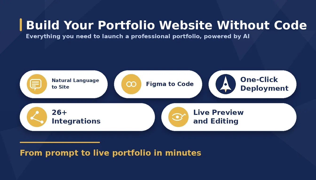
Rocket.new generates production-ready portfolio websites from plain language descriptions, with 26+ integrations and one-click deployment built in.
Rocket also includes Solve (market and business research) and Intelligence (competitor monitoring). You can also explore best AI website generator tools to compare your options before committing.
Learn more about creating a personal portfolio website with AI-powered tools.
Choosing the Best Portfolio Design
A smart portfolio design helps people find, enjoy, and remember your work. Keep things simple, clear, and focused on your best work because that is what really matters. Ensure navigation is easy, images load quickly, and text is readable.
Add just a touch of personality so visitors get a sense of who you are, but do not let it distract from your projects. Also, keep updating your portfolio regularly. An evolving portfolio shows growth, keeps visitors engaged, and makes your design portfolio feel alive rather than frozen in time.
Portfolio design trends: dark mode, hover effects, scroll animations, shift year to year. A visible last updated date signals to both visitors and search engines that the content is current.
Ready to build your portfolio without the coding headache?
Grab Start building your portfolio for free and sign up to go live today. Rocket.new is the vibe solutioning platform that lets you describe your vision in plain language and generates a production-ready site in minutes, with pre-built templates, one-click deployment to Netlify, and Figma-to-code support built in.
Table of contents
- -Why Portfolio Design Matters
- -Friendly Portfolio Design Ideas That Work
- -1. Keep Your Homepage Clean
- -2. Use Graphic Design Portfolio Templates That Fit Your Style
- -3. Photography and Visual Highlights
- -4. Case Studies and Storytelling
- -5. Keep Navigation Simple
- -6. Make It Mobile-Friendly
- -7. Bring in Your Personality
- -Portfolio Design Workflow
- -Design Portfolio Templates to Try
- -Common Mistakes to Avoid
- -Community Insight: What Real Creatives Say
- -Rocket and Your Online Portfolio
- -Choosing the Best Portfolio Design