How do you choose a website layout that truly supports user experience? Select templates aligned with goals, intuitive navigation, and clear content flow. Strong design builds comfort, credibility, and lasting trust.
What’s the best way to pick a layout without harming user experience?
Pick website templates that fit your goals, feel easy to navigate, and support clear content flow. Good design is not about flashy colors. It is about comfort, clarity, and trust.
According to a web design statistics roundup by Clutch, 94% of first impressions about a website relate to design. Visual appeal, layout, and navigation strongly influence how users judge credibility and usability.
So yes, design matters. A lot.
And choosing the right structure can quietly make or break your website.
Start With Purpose
Before browsing hundreds of templates, pause for a second. Slow down the scroll.
A website is not just about looks. It is about direction. If the purpose is not clear, even the best design will feel random.
Ask one simple question. What does this website need to do?
- Is it a portfolio?
- Is it a business site offering services?
- Is it a retail store?
- Is it a blog?
The purpose will determine the layout and pages you need. A photography portfolio will look very different from a finance consulting site. A creative art brand needs a bold layout. A professional business needs a clean structure.
Do not search for something that only looks stunning. Search for something that actually works for your goals.
One Page or Multi Page? Be Honest With Your Content
Now comes a real decision. And yes, this one matters.
The structure you pick will affect navigation, content flow, and even search performance. Be honest about how much content you actually have.
One Page
A one-page layout is simple, direct, and straight to the point. It works best when the goal is clarity, with few layers. If the message is focused and the content is not heavy, this structure keeps everything neat and easy to follow.
- Freelancers
- Simple portfolio projects
- Small events
- Personal brands
Users scroll rather than click through menus. Everything lives on one page. It feels modern and sleek. It is also easier to manage.
But here is the catch. If your business offers multiple services or detailed content, a one-page setup may start feeling cramped.
Multi Page
A multi-page layout gives breathing space. It spreads content across dedicated pages, making navigation cleaner and more organized. If the website carries depth, detail, or multiple offerings, this structure supports growth.
- You need separate pages for services
- You want a blog
- You run a retail store
- You share resources
- You need client case studies
Multi-page website templates give breathing room. They help visitors navigate clearly. They also support better content organization.
For growing business needs, a multi-page is usually the smarter long-term choice.
Check the Layout Structure Carefully
The layout is not decoration. It is the backbone of the entire site. If the structure feels off, users will notice right away.
Take a close look at how everything is arranged.
- How is the text placed?
- Where do the images sit?
- How do pages connect?
- How do users scroll and move around?
A strong layout will:
- Guide visitors naturally
- Highlight key services
- Keep content readable
- Support both mobile and desktop views
If the layout feels messy, skip it. If it feels balanced and clear, keep it on your shortlist.
Good structure makes navigation feel effortless. And that is exactly what users want.
Free vs Paid Templates
Let’s talk about the budget. Because yes, it matters. There are many free website templates available. They are great for beginners. Free templates help save money. They also let you test ideas without risk.
But not all free options are equal.
Some free templates:
- Offer limited pages
- Restrict certain features
- Require paid upgrades for advanced functions
Paid templates often include:
- Better support
- More built in pages
- Cleaner code
- Flexible css
- Consistent design quality
If this is a serious business website, paid may be worth the investment. If you are just starting a portfolio, free can absolutely do the job.
Choose based on your goals, not just price. Cheap is good. Smart is better.
Make Sure It Reflects Your Brand Identity
A site is not just a digital card. It represents personality. It speaks before you do.
The perfect template should reflect brand identity. It should match your tone, style, and audience expectations.
- A creative art portfolio needs bold typography and strong images.
- A finance business needs calm spacing and structured sections.
- A retail store may need product focused layout blocks.
Templates that do not match your brand will feel forced. And clients can sense that.
Pick a design that feels like you. If it feels fake, it probably is.
Check How Easy It is to Customize
No template is perfect straight out of the box. Some things will need tweaking. You will need to edit text, swap images, and adjust layout sections to fit your style and goals. That is normal.
Good website templates make it simple to customize colors, fonts, and content blocks without diving deep into code. The process should feel smooth, not frustrating. If basic edits feel complicated during the demo, that is a red flag.
Also, check if you can add pages, remove sections, modify the header structure, and insert blog posts easily. Flexibility gives your site room to grow. And growth is always a good sign.
Look at Navigation and User Flow
Navigation decides whether visitors stay or leave. If moving through the site feels confusing, people will not stick around. Clear direction builds trust without saying a word.
Users do not want to solve a maze. They want clarity.

Open the demo in your browser. Click around. Try to navigate from the homepage to services. Then to contact. Then back.
If you feel confused, your visitors will feel the same.
Navigation should feel natural. If users have to think too much, something is wrong.
Mobile and Desktop Compatibility
A website should look good everywhere, not just on one screen. People switch between devices all day. The experience must stay consistent.
Most users visit websites from mobile devices. Still, the desktop view remains important.
Test the template on:
- Desktop
- Mobile
- Tablet
Check how pages adjust. Look at how text wraps. Watch how images resize. Make sure buttons are easy to tap.
Multi page web design templates often handle responsiveness well, but never assume. Always test.
If it looks good only on desktop, that is a problem.
Portfolio Templates Need Special Attention
A portfolio is proof of skill. It is often the first thing clients judge. The structure and presentation require extra care.
Different fields need different structures:
- A photography portfolio needs large, clean images.
- An art portfolio needs generous white space.
- Freelancers need clear project sections and case study pages.
Look for templates that include:
- Dedicated case study pages
- Image galleries
- Project filters
- Clear text blocks for descriptions
Your portfolio should feel polished. If it looks rushed, clients may assume your work is the same.
Quick Comparison
When choosing between one-page and multi-page templates, it helps to see the difference side by side. A simple comparison makes the decision clearer and removes guesswork.
Here is a quick breakdown to guide you.
| Feature | One Page Templates | Multi Page Templates |
|---|---|---|
| Best For | Simple portfolio | Business sites |
| Navigation | Scroll based | Menu based |
| SEO | Limited | Stronger |
| Pages | Single | Multiple pages |
| Maintenance | Easy | Medium |
| Content Volume | Low | High |
Both options work well in the right situation. The smart choice depends on your content, growth plans, and how you want visitors to move through your site.
Community Insight
Real designers and founders talk about templates every day on LinkedIn. One UX professional shared this perspective on LinkedIn:
“Templates are a starting point, not a finished product. Good UX still depends on context, content, and user needs.”
A template can guide structure and layout, but thoughtful decisions still shape the final experience.
Rocket Mode: Choosing the Right Template With Rocket.new
Picking the right template can feel like scrolling forever. That is where Rocket.new fits perfectly into this conversation. Rocket.new simplifies the decision-making process with its template gallery.
Rocket.new offers a clean, organized template gallery where users can browse website templates by category and purpose.
Instead of guessing, you can visually compare layout structure, page flow, and content sections before making a choice. It helps you quickly determine whether a one-page or multi-page setup is better aligned with your goals.
Top features:
- Prompt to App Creation: Builds apps directly from single prompts
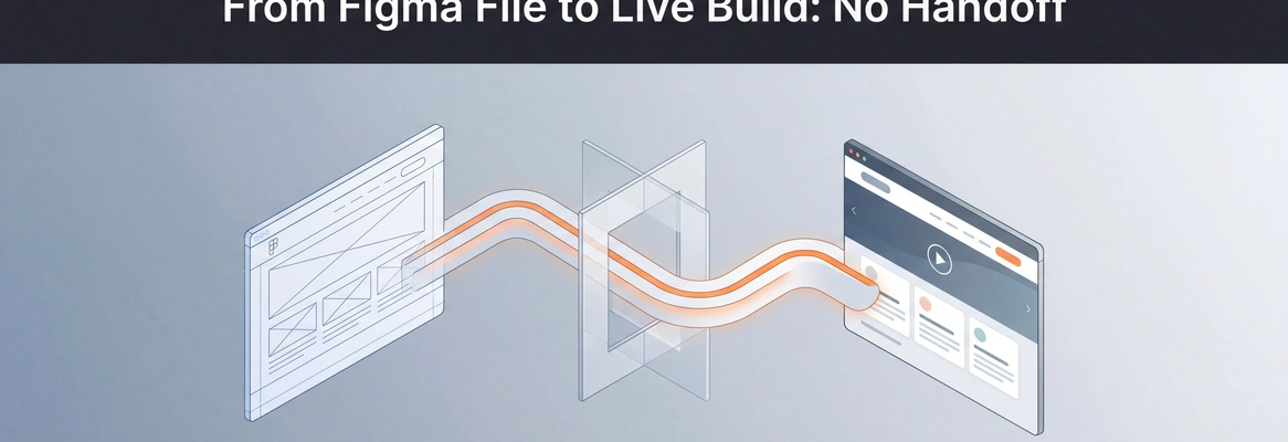
- Figma Import: Converts design files into live, editable layouts
- AI-Powered Backend: Automatically handles logic, data, and workflows
- Custom Domain Support: Publishes projects with a branded domain
- Code Export: Allows developers to extend or customize later
- Live Preview: Shows instant updates while editing
The template gallery allows users to preview the structure, check the navigation style, and review how the pages are arranged. That makes it easier to select a layout that aligns with business needs and brand personality.

Portfolio Websites
Creative professionals can choose portfolio templates with project sections, image galleries, and case study pages. Ideal for art, photography, and freelance work.
Business Websites
Users can select multi-page templates that separate services, about, blog, and contact pages. This supports better organization and smoother user flow.
Retail Store Sites
Entrepreneurs can choose store-focused templates with product pages and payment sections already structured.
Rocket.new reduces the stress of template hunting. Instead of building from scratch or guessing what works, users can browse, preview, select, and start building with confidence.
👉Build Your Website with Rocket 🚀
How To Choose Website Design Templates?
Many people pick templates based on looks alone. They forget user experience. They ignore structure. Later, pages feel cramped. Navigation feels awkward. Clients leave.
Focus on purpose. Pick a layout based on business goals. Choose between one-page and multi-page honestly. Check responsiveness. Test navigation. Customize wisely. And yes, choose website design templates that support real growth.
Good design feels simple. It feels natural. It makes visitors stay.
The right template supports brand personality, structure, and content flow. Pick with clarity, not impulse. Your future self will thank you.
Table of contents
- -Start With Purpose
- -One Page or Multi Page? Be Honest With Your Content
- -One Page
- -Multi Page
- -Check the Layout Structure Carefully
- -Free vs Paid Templates
- -Make Sure It Reflects Your Brand Identity
- -Check How Easy It is to Customize
- -Look at Navigation and User Flow
- -Mobile and Desktop Compatibility
- -Portfolio Templates Need Special Attention
- -Quick Comparison
- -Community Insight
- -Rocket Mode: Choosing the Right Template With Rocket.new
- -How To Choose Website Design Templates?