
How fast can teams create a Stripe-style dashboard? Learn the tools, structure, and usage data, showing how businesses build clean payment dashboards quickly without weeks of development time.
Want to build a Stripe-style dashboard without burning weeks on it?
Yes, it is possible to design and build a Stripe dashboard clone fast, clean, and without headaches. With the right structure, tools, and flow, teams can move from idea to working dashboard quickly.
How Many Businesses Use Stripe in 2025?
This report shows that ~1.35 million live websites use Stripe globally and provides additional context on payment volume and enterprise adoption.
Let’s break it down simply.
What Does a Stripe Dashboard Clone Really Mean?
A Stripe dashboard clone copies the core experience of the original Stripe dashboard. It shows payments, customers, balances, payouts, and account activity in one place.
The goal is not to copy every pixel. The goal is clarity.
Businesses want a dashboard that helps manage payments, accept payments, and review data without confusion. Teams want quick access. Leaders want answers fast.
A good stripe dashboard app focuses on:
- Clean layout
- Real time updates
- Easy navigation
- Clear payment status
Digital payments move fast. A clear dashboard keeps teams steady, informed, and ready to act without wasting time.
The First Section: Planning the Structure
Start with the first section of the dashboard.
This is the default view users see right after signing in. It sets the tone for the entire experience, so it must feel clear and calm.
This section usually shows:
- Current business performance
- Revenue summary
- New payments
- Balances and payouts
These numbers answer the most common questions right away.
How much money came in? What is pending? What is already on the way to the bank account?
Keep it simple. No clutter. A Stripe account user wants answers in seconds, not a puzzle to solve.
Ask one basic question while designing this screen.
What should the user notice first?
Most teams prioritize revenue, followed by failed payments and payouts. That order works well. It shows earned revenue, issues that need attention, and cash outflows. When this section feels right, the rest of the dashboard becomes easier to trust.
Core Features to Include
A stripe dashboard clone requires specific features to feel familiar and trustworthy. These features help teams move fast without second-guessing the data.
Payments and Customers
The dashboard should clearly display payments and customers.
Each payment requires details such as amount, date, and status. Customers should be easy to search for and review, especially when handling high daily volumes. The required status for the customer account should remain visible to support teams so they can resolve issues faster.
Payouts and Balances
Payouts matter. A lot.
Users want to know exactly when funds reach their bank account. The dashboard should display balances, upcoming payouts, and completed payouts in a clean layout. Daily business summaries help teams stay aligned, and many users receive them via email or instant notifications.
Refunds and Disputes
Refunds should never feel complicated.
Full or partial refunds can be processed in just a few clicks. The dashboard should also help investigate failed payments and guide teams to resolve disputes quickly. Failed payments happen, and a clear screen makes them easier to act on.
When these core features work smoothly together, the dashboard feels reliable, predictable, and easy to use, which is exactly what growing businesses expect.
Designing the Interface Without Stress
So, how should the screen look?
Clean beats clever every time. Simple cards work best for quick numbers. Tables handle data well. Filters help users find what they need without scrolling forever. Text should stay readable, even on smaller screens.
Use:
- Clear headings
- Consistent spacing
- Friendly labels
Avoid fancy tricks. No hidden actions. No confusing icons. Stripe users love clarity and predictable layouts.
Also, think about real life. Many founders check revenue on a mobile device while waiting in line for coffee. If the dashboard works well on a phone, it has already passed an important test.
Data Flow and Architecture Basics
Behind the scenes, data drives everything. If the data flow is messy, the dashboard will reflect that.
The app retrieves data from Stripe APIs via HTTPS. This keeps payment details secure and helps Stripe accounts be managed securely across the system. When users trust the flow, they use the dashboard without hesitation.
Most dev team setups include:
- Backend service to handle logic and requests
- Frontend dashboard to display data clearly
- Database to store historical data for review and reporting
This setup keeps things organized and predictable. The platform should also support multiple stripe accounts when a business runs more than one brand. Switching between accounts should feel smooth, not risky or confusing.
Example Data Table Layout
Here is a simple example of how payment data can be displayed:
| Payment ID | Customer | Amount | Status | Date |
|---|---|---|---|---|
| pay_001 | John D | $120 | Paid | Jan 10 |
| pay_002 | Sara K | $89 | Failed | Jan 11 |
| pay_003 | Alex R | $240 | Paid | Jan 12 |
This table helps you review payments quickly, spot failed payments, and track refunds without digging through multiple screens.
Building the Logic With Code
The backend handles logic. The frontend handles display. When both stay in their lane, the dashboard stays stable.
A simple flow looks like this:
- User logs in
- Account access is checked
- Stripe data is fetched
- Dashboard updates in real time
Developers often write const stripe = new Stripe (...); to initialize the client before making requests. The following code typically connects the app to Stripe services and ensures data flows smoothly.
The code handles:
- New payments
- Invoices
- Subscriptions
- Refunds
Keep logs. A log helps review errors, trace failed requests, and fix issues before users even notice them.
When the logic remains simple and predictable, the dashboard feels reliable, allowing teams to focus on the business rather than chasing bugs.
Managing Accounts and Team Access
A Stripe account is often associated with more than one person.
Founders, finance teams, and support staff all need access, but not the same level of control.
The dashboard should let admins invite team members and assign role-based access. Some team members only review data. Others manage billing or handle refunds. This setup helps manage your business without sharing passwords or creating confusion.
Account settings should include:
- Company address
- Bank account details
- Payout schedule
Clear “click add” actions make updates quick and safe. When access feels controlled and simple, teams work faster, and mistakes stay rare.
Notifications and Daily Updates
People like updates. Not spam. The goal is useful alerts, not noise.
The dashboard can send instant notifications for:
- New payments
- Failed payments
- Payout status
Many teams also receive daily business summaries by email. That saves time and enables performance reviews without logging in every day. When updates feel helpful, users actually pay attention.
Community Insight From Builders
Designers and builders often share what makes dashboards feel calm, clear, and trustworthy. One LinkedIn post breaks down the Stripe Dashboard’s UI moves, showing how small decisions improve usability and help teams interpret data faster.
A product designer highlighted things like stacked metric cards, clear badges for performance trends, a gross volume card for quick comparison, and obvious indicators for growth or issues. Each tiny UI choice shapes how users read payments, revenue, and customer trends at a glance.
Rocket.new Taking Off Faster
Rocket.new is a vibe solutioning platform that makes building dashboard apps fast and stress-free. It works smoothly with Stripe APIs and supports clean, user-friendly UI builds.
By handling the heavy setup, it lets teams focus on the features that matter most: tracking payments, managing customers, and reviewing revenue.
Top Rocket.new Features
- Ready-made dashboard layouts – Pre-designed layouts save time and give a professional look from day one. No need to start from scratch.
- Stripe-friendly API setup – Connect multiple Stripe accounts securely and pull payment, customer, and subscription data with minimal code.
- Role-based access for teams – Control who sees what. Admins, finance teams, and support staff can have tailored permissions.
- Secure HTTPS handling – All data transfers are protected, keeping sensitive payment and customer info safe.
- Mobile-ready screen designs – Dashboards work beautifully on mobile devices, letting founders check revenue or payouts on the go.
- Customizable metrics and cards – Show exactly what matters for your business: balances, failed payments, new payments, or daily business summaries.
Use Cases:
- SaaS billing dashboards – Display subscriptions, invoices, and revenue clearly without extra coding.
- Marketplace payment panels – Manage multiple customers, payouts, and transactions in one screen.
- Founder finance screens – Solo founders can quickly see balances, payouts, and daily summaries without digging through data.
Rocket.new makes building a Stripe dashboard clone fast, reliable, and scalable. Teams spend less time on setup and more time making decisions that actually move the business forward.
Testing and Review Phase
Before launching the dashboard, review everything carefully. A small oversight here can turn into big headaches later.
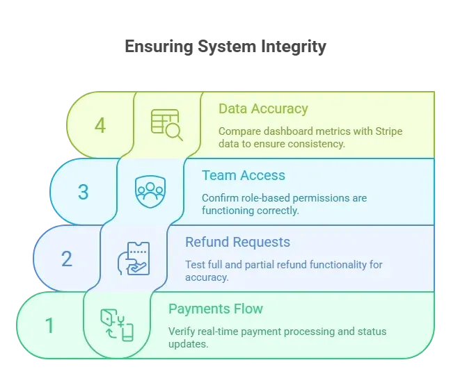
Also, confirm that bank account setup is working and that payouts are landing on time. Nothing kills trust faster than missing funds.
Finally, ask a real user to explore the screen. Fresh eyes often catch tiny issues that the dev team might have missed. A little testing now saves a lot of stress later.
Support and Long-Term Growth
After launch, support is key. A dashboard is only useful if teams can actually work with it.
The dashboard should help support teams:
- Review customer history – See past payments and interactions at a glance.
- Resolve payment issues – Handle failed payments or disputes quickly.
- Track invoices – Keep billing organized and easy to follow.
Over time, add features gradually. Import historical data, customize views, and keep the interface clean. A steady, thoughtful approach helps teams manage payments and manage their business without stress.
Consistent support and incremental improvements make the dashboard a tool people actually enjoy using, not just another screen to check.
The Stripe Dashboard
Building a Stripe dashboard clone doesn't have to be complicated. Clear structure, clean data flow, and smart tools make it simple. Focus on customers, payments, payouts, and review screens. Keep the dashboard friendly. Keep it fast. Let data speak.
With the right design and features, teams can stay on top of revenue, spot issues quickly, and make smarter decisions every day. A well-built stripe dashboard keeps everything organized without adding extra work.
Table of contents
- -What Does a Stripe Dashboard Clone Really Mean?
- -The First Section: Planning the Structure
- -Core Features to Include
- -Payments and Customers
- -Payouts and Balances
- -Refunds and Disputes
- -Designing the Interface Without Stress
- -Data Flow and Architecture Basics
- -Example Data Table Layout
- -Building the Logic With Code
- -Managing Accounts and Team Access
- -Notifications and Daily Updates
- -Community Insight From Builders
- -Rocket.new Taking Off Faster
- -Top Rocket.new Features
- -Use Cases:
- -Testing and Review Phase
- -Support and Long-Term Growth
- -The Stripe Dashboard