Education & Career Blog Specialist Blog Website Template
Abroad is a horizontal-scroll editorial landing page for a study abroad blog. It moves readers through seven data-rich panels, visa rates, living costs, credit transfer stats, and a timeline chart, building enough trust and curiosity to earn a single click to the flagship guide. The design draws from Japanese Zen minimalism and Moleskine journal aesthetics.
by Rocket studio
Quick summary
Abroad is a single-page, horizontal-scroll editorial landing page built for a study abroad blog. Seven sequential panels combine magazine typography, real student quotes, and sharp data visualizations to guide twenty-something readers toward one destination: the blog's flagship 47-page guide. The page earns the click by proving authority first, then asking for it.
Who this template is for
This template fits creators and content teams who need editorial credibility before they can earn a reader's time. It works best when the content itself is the product.
- Study abroad bloggers and independent content creators building a subscriber base
- Education-focused content marketers promoting a long-form guide or resource
- Student advisors or program coordinators who want a polished, data-forward first impression
What problem this template solves
Most blog landing pages look like every other blog landing page. They rely on generic headlines and stock imagery that give readers no reason to stay. For a study abroad audience already deep in research mode, that anonymity kills trust instantly.
- Generic layouts fail to signal that the blog has real, specific, hard-won information
- Static single-screen designs can't carry the narrative weight of a data-rich editorial story
- No clear editorial rhythm means readers scroll, feel nothing, and leave before reaching a call to action
What you get with this template
You get a fully structured seven-panel horizontal-scroll landing page ready to be customized with your own data, quotes, and guide link. Every panel has a defined role, and the layout builds momentum from hero to final call to action.
- Seven distinct content panels covering hero, data chapters, student voice, timeline, and closing call to action
- A collage-style scrapbook header composed of layered editorial elements with visible tape and paper shadows
- A minimal centered footer and a vermillion button call to action on the final panel
Feature list
Horizontal Scroll with Panel Snapping
The page advances horizontally through seven panels using CSS scroll-snap. Keyboard and mouse-wheel navigation are both supported. Active panel indicators update as the reader moves through the content, giving a clear sense of position and progress.
Collage Scrapbook Hero Panel
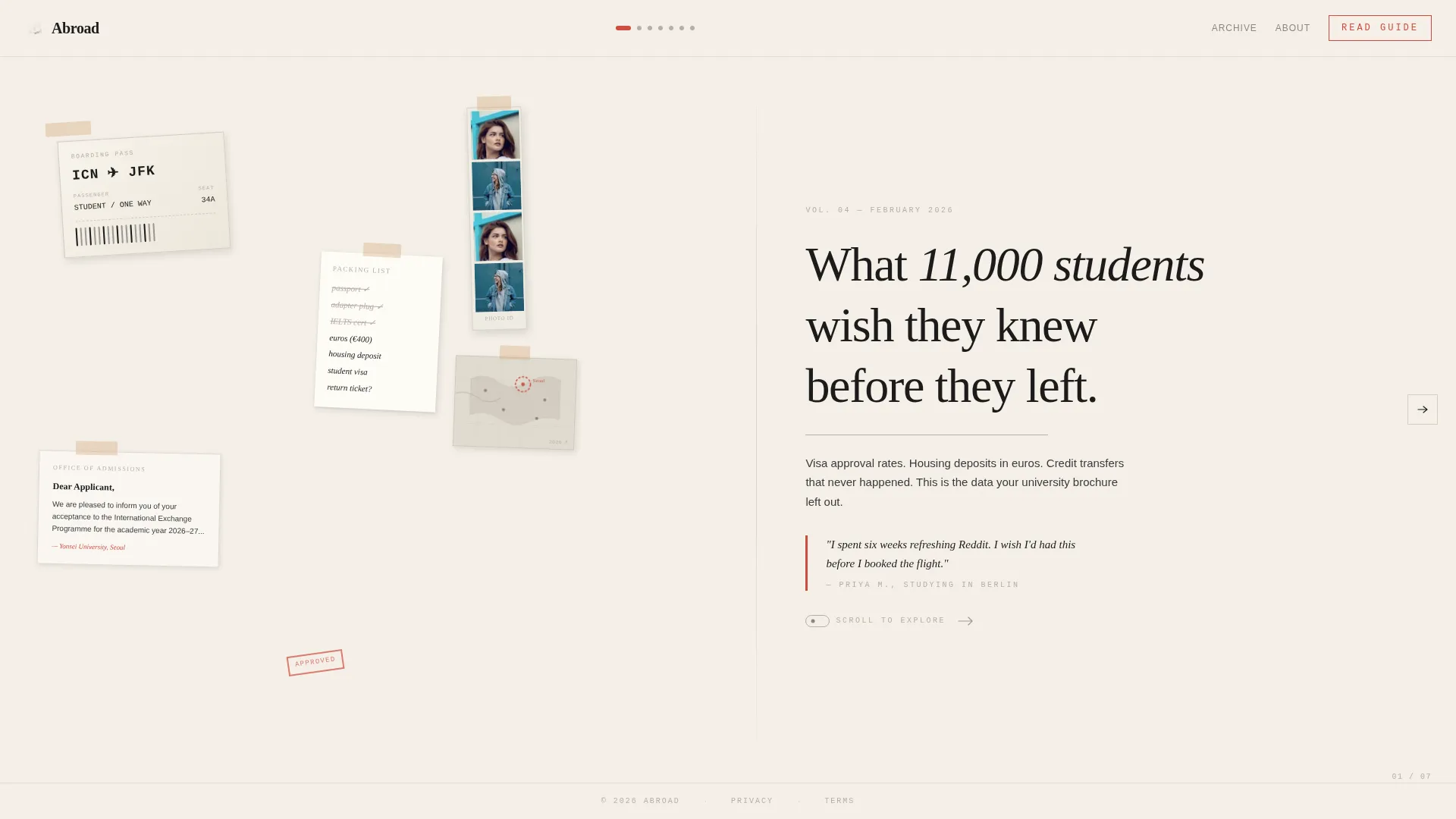
The opening panel layers a torn plane ticket stub, a handwritten packing list, a faded acceptance letter, a passport photo booth strip, and a small annotated map. Elements overlap at slight rotations with tape details and paper shadows, all on the washi cream background. A tight serif editorial headline anchors the composition.
Data Visualization Panels
Panels two, three, and six present information visually. Visa approval rates by country, monthly living costs shown as stacked data, and an application timeline Gantt chart each combine a sharp statistic with one real student quote set in handwritten script. Typography alternates between dense information and breathing space to match an editorial magazine rhythm.
Two-Stage Click-Through Call to Action
The primary call to action, "Read the Full Guide," appears first as a quiet text link after panel three. It then returns as a prominent vermillion button on the final panel beside the editorial line "47 pages. 23 countries. Zero fluff." No form and no email capture are involved. The page earns the click by building authority across panels.
Editorial Magazine Typography System
Three typefaces divide the work clearly. Fraunces handles serif display headlines. DM Sans carries body text and labels. IBM Plex Mono renders all data, statistics, and numeric values. The combination gives every panel a distinct visual hierarchy without breaking the overall editorial tone.
Staggered Entry Animations
Each panel uses staggered entry animation tied to the horizontal scroll. Elements arrive in sequence rather than all at once, giving the layout the measured pace of turning pages in a print special issue.
Page sections overview
| Section | Purpose |
|---|---|
| Hero Collage Panel | Establishes editorial identity and hooks readers with the flagship headline |
| Visa Approval Rates | Presents country-level data to signal research depth and specificity |
| Monthly Living Costs | Visualizes cost data to answer one of the most searched pre-departure questions |
| Credit Transfer Link | Shares credit transfer success data and introduces the first quiet call to action |
| Student Voice Panel | Grounds data in human experience with a handwritten quote and student portrait |
| Application Timeline Chart | Shows a Gantt-style timeline helping readers understand the full application process |
| Final Call to Action | Closes the scroll with a vermillion button and editorial proof line driving guide clicks |
Design & branding system
The visual identity follows an Editorial Magazine theme rooted in Japanese Zen minimalism. The palette is spare, intentional, and every color earns its position.
- Four-color system: washi paper cream (#F5F0E8) as base, sumi ink black (#1A1A1A) for body text, tatami warm gray (#B8AFA6) for section dividers and thin rules, and torii gate vermillion (#D14B3D) reserved for links, pull quotes, and active scroll indicators
- Section dividers use tatami gray as thin horizontal rules, and vermillion appears sparingly so each instance reads like a brushstroke
- Typography trio of Fraunces for display, DM Sans for body and labels, and IBM Plex Mono for all data and statistics
Mobile & speed optimization
The template is designed desktop-first around the horizontal scroll experience. A vertical fallback layout is included for mobile users so no reader is left behind on a smaller screen.
- Horizontal scroll uses CSS scroll-snap with no heavy external libraries, keeping the build lean and dependency-light
- Scroll-linked panel indicators and staggered entry animations are tied to native browser scroll events for smooth behavior across devices
How this template helps you convert
This template converts by making the reader feel that they already know less than the guide contains. Each panel withholds just enough to make the next click feel necessary.
- The data panels, visa rates, living costs, credit transfer percentages, prove editorial specificity early, building credibility before any call to action appears
- The quiet text-link call to action after panel three creates a low-pressure first invitation, while the final vermillion button closes the scroll with confident urgency
Other information about this template
This template is built for blog-to-guide funnels where a single flagship resource is the primary conversion goal. It suits creators who have already done the research and want the landing page to reflect that work honestly.
- The page references 11,000 students, 47 pages of guide content, and 23 countries, all drawn from the source blog's editorial positioning
- The footer follows a Superhuman-style minimal centered pattern, keeping the close of the page as unhurried as the rest of the layout
- The horizontal scroll format is uncommon in the study abroad content space, which makes it a strong differentiator for creators looking to stand apart from standard blog index pages
- This template suits the intersection of editorial blog publishing and education content marketing, particularly for the study abroad niche


Theme
Editorial Magazine
Creative direction
Industry Report
Color system
Japanese Zen
Style
Horizontal Scroll
Direction
Click-Through
Page Sections
Horizontal Scroll with Panel Snapping
Collage Scrapbook Hero Panel
Data Visualization Panels
Two-stage Click-through Call to Action
Editorial Magazine Typography System
Staggered Entry Animations
Related questions
Does this template include a form or email capture?
How does the horizontal scroll work on mobile?
Can I replace the statistics with my own data?
What typefaces does this template use?
Is this template only for study abroad content?


