Elegant Marine Science Landing Page Template
Pelagic is a Luxe Minimal marine biology blog landing page template built for digital journals that document serious fieldwork. It uses a masonry grid organized by the rhythm of a research day, a cinematic short-form video reel header, a parchment-and-rust color system, and two conversion paths designed to turn curious readers into loyal weekly subscribers.
by Rocket studio
Quick summary
Pelagic is a single-page masonry landing page template for marine biology blogs that want to feel as considered as the science they document. The design follows a Day-in-the-Life creative direction, moving readers through dawn dispatches, midday specimen cards, and evening reflections. Two built-in conversion paths collect email subscribers without disturbing the reading rhythm that earns the click.
Who this template is for
Pelagic is built for writers, researchers, and educators who need a home for rigorous sea-facing content. The template suits people who swim between academia and public communication and need a digital space that earns the trust of both audiences.
- Graduate researchers who want to publish methodology dispatches, gear breakdowns, and field notes that dive deeper than any textbook allows
- Citizen scientists exploring intertidal zones, rocky shores, and open water habitats who need a structured home base for species documentation and seasonal records
- Conservation program officers who need peer-adjacent storytelling to justify grant renewals and want a guide-quality publication format that people in their field will respect
What problem this template solves
Most blog templates are built for lifestyle content. They do not know how to hold the weight of a pre-dawn hydrophone deployment or a sediment core split open in the field. They flatten every post into the same grid and give readers no reason to follow deeper into the content. Pelagic was designed to solve exactly that problem.
- Content loses credibility when the design feels generic, and generic design is disturbing to readers who arrive from peer networks expecting something more considered
- Lead generation is hard when you ask for an email before you have shown any real value, and standard templates give you no built-in logic for earning the click first
- A masonry layout that does not adapt its density or tone across scroll duration feels mechanical, not editorial, and fails to hold the inquisitive reader who arrived for depth
What you get with this template
Pelagic delivers a complete single-page landing page structure with every section provided and ready to customize. The layout is built to protect editorial quality while still converting readers at two distinct points in the scroll journey.
- A cinematic video reel hero section, a tab-less masonry grid organized by research-day rhythm, an inline email capture prompt, a secondary species identification PDF download offer, and a minimalist footer with social media icons and legal information
- A full Parchment and Rust design system with four named colors, two typefaces, card hover states, scroll-linked animations, and a sticky bottom bar that appears after sixty percent scroll depth
- Two conversion path components: a primary "Get the Field Dispatch" email-only form placed between masonry rows three and four, and a secondary form that requests email plus research affiliation in exchange for a free downloadable species identification guide
Feature list
This section covers the core built-in capabilities of the template as specified in the design brief. Every feature below is grounded in the source structure.
Cinematic Short-Form Reel Hero
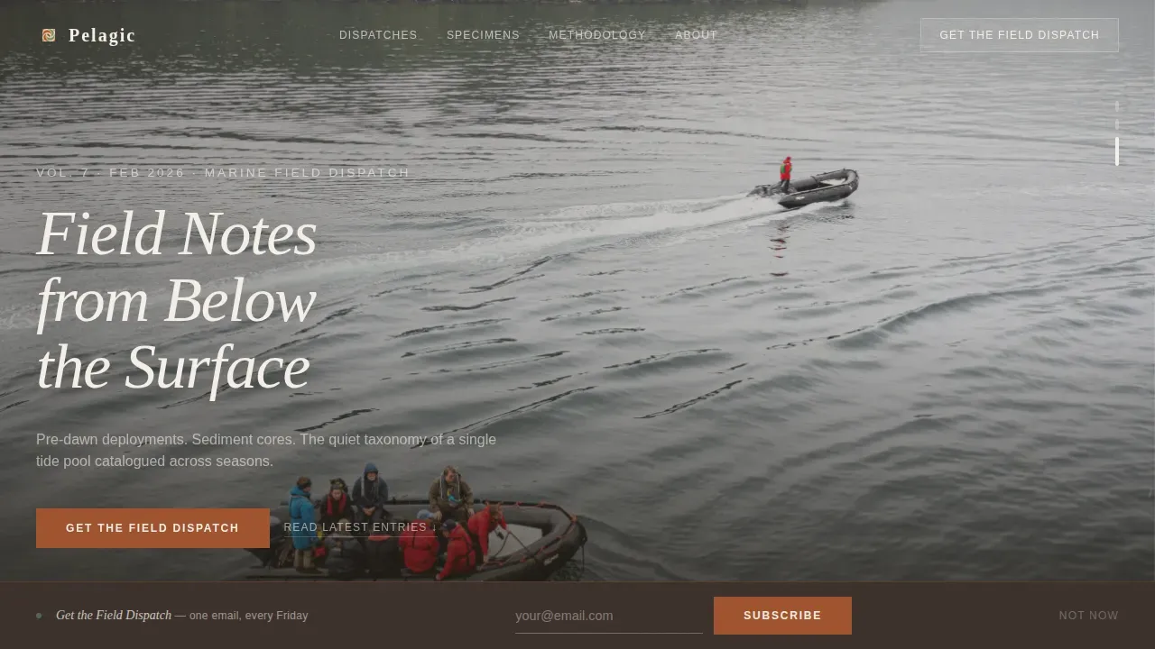
The header opens with a fifteen-second handheld video reel that loops seamlessly and cuts between three moments in a marine biologist's morning. Gloved hands lower a plankton net into slate-gray open water, bioluminescent dinoflagellates pulse in a darkened lab dish, and a wide pull-back shot reveals a lone researcher on a zodiac against an enormous kelp forest. Ambient hydrophone audio carries the scene: clicks from the deep sea, fragments of whale song, and the mechanical whir of a winch. No narration disturbs the atmosphere. The headline "Field Notes from Below the Surface" appears in a thin serif over the final wide shot, giving first-time visitors an immediate sense of where they have arrived and what kind of content lives here.
Day-in-the-Life Masonry Grid
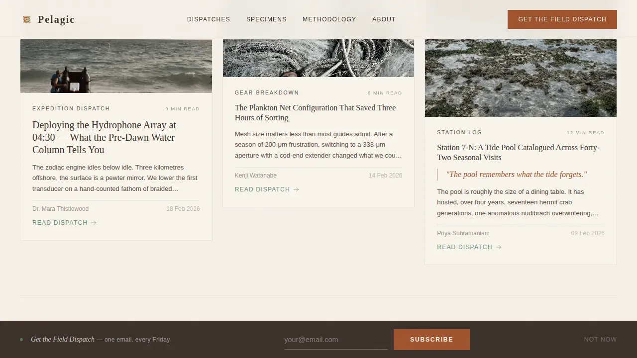
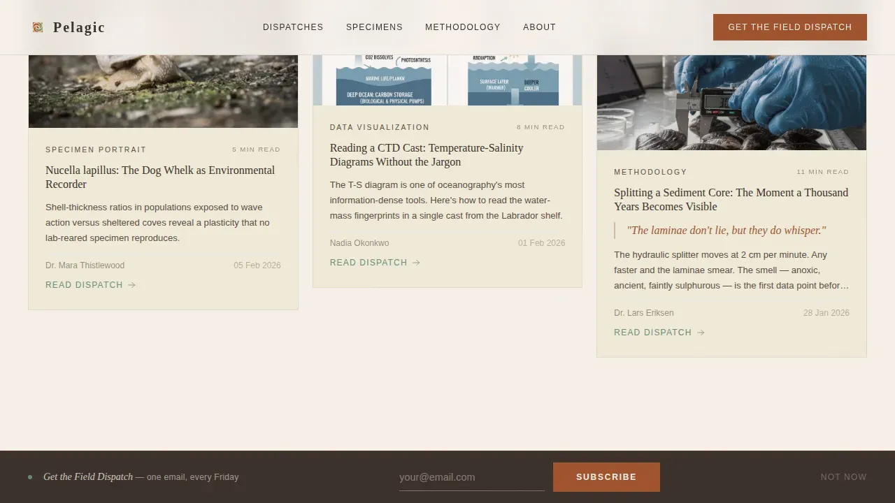
The masonry grid is the structural engine of Pelagic. It organizes content not by category but by the rhythm of a single research day, so the reading experience feels chronological and immersive rather than archival. Dawn cards are pale and wide, designed to carry expedition dispatches and gear breakdowns. Midday cards tighten into square specimen portraits and data visualizations. Evening cards darken toward the estuary mud tone and hold long-form reflections and peer interviews. As visitors scroll, the grid subtly shifts density, mimicking the compression of a day winding down. This creates one-more-card momentum that keeps inquisitive readers engaged far longer than a standard blog index would. The grid operates without tabs or category filters, keeping the editorial flow uninterrupted and the design clean.
Two-Path Lead Generation System
Pelagic earns the email before it asks for it. The template gives readers three complete ungated masonry rows, enough content to prove that the writing is worth a weekly inbox slot. The primary conversion component, "Get the Field Dispatch," appears as a minimal inline prompt between the third and fourth masonry rows. It asks for email only, keeping friction low. A secondary conversion path appears later in the scroll and offers a free downloadable species identification PDF in exchange for email plus research affiliation. This two-step approach lets you build a base of general subscribers and a deeper segment of verified researchers in a single page view.
Sticky Scroll-Triggered Bottom Bar
A sticky bottom bar appears after the reader crosses the sixty percent scroll depth threshold. It presents the primary call to action again without interrupting the reading experience. The bar is designed to be clearly actionable and contrasting against the parchment background, following the principle that a focused call to action must be visually distinct to convert. The trigger timing is intentional: by sixty percent, the reader has seen enough content to want more. The bar gives them a low-friction path to subscribe without requiring them to scroll back to the top.
Scroll-Linked Animations and Card Hover States
The template includes medium-complexity scroll-linked animations that reveal text word by word as the reader moves down the page. Masonry cards stagger into view in sequence, reinforcing the chronological rhythm of the Day-in-the-Life direction. Card hover states shift images from grayscale to full color, a subtle interaction that rewards the inquisitive reader who pauses to explore. The verdigris accent color appears on hover states and linked citations, functioning like something alive briefly surfacing from the depths. These interactive elements enhance user engagement without disturbing the clean editorial atmosphere.
Minimalist Footer with Social Proof
The footer follows a horizontal ultra-minimal pattern with social media icons and legal information kept unobtrusive. Social proof elements, including field dispatch subscriber count, citation mentions, and contributor credentials, are positioned to reassure visiting researchers that this is a credible, active publication. The footer does not compete with the content above it. Navigation links are stripped down to essentials, keeping the reader's attention on the writing and the two conversion paths rather than on secondary pages or distracting menus.
Page sections overview
| Section | Purpose |
|---|---|
| Cinematic Video Hero | Opens with looping reel and serif headline overlay |
| Masonry Rows One to Three | Ungated dawn, midday, and evening content cards |
| Inline Email Prompt | Primary "Get the Field Dispatch" capture form |
| Masonry Rows Four and Five | Continued chronological editorial scroll |
| Species ID Offer | Secondary PDF download form with affiliation field |
| Minimalist Footer | Social links, legal text, and subscriber social proof |
Design & branding system
Pelagic uses a Parchment and Rust color system that feels like a copper instrument left in a maritime museum: patinated, warm, and scholarly without being sterile. Typography pairs Fraunces, an elegant serif, for headlines and pull-quotes, with DM Sans, a clean sans-serif, for body text. This combination follows the principle that typography on a marine biology landing page should balance readability with a sense of learned authority. The overall aesthetic is Luxe Minimal, which means ample white space dominates and imagery does the heavy lifting. Extensive use of empty space creates a breathing room effect that emphasizes the luxury feel and reduces cognitive load for readers who arrive already tired from a day of research.
- Four named brand colors: parchment (#F5F0E8) for backgrounds and card surfaces, oxidized rust (#A0522D) for headlines and pull-quotes, estuary mud (#3B302A) for body text, and muted verdigris (#6B8F7A) reserved for hover states and linked citations only
- Card hover interactions shift images from grayscale to full color, and the verdigris accent appears only on interaction, making the color palette feel alive and responsive rather than flat
Mobile & speed optimization
The template is designed desktop-first, reflecting the reality that its primary audience of graduate researchers and conservation officers typically work at workstations. However, the layout maintains a solid mobile fallback to ensure that citizen scientists exploring species from the field on a phone can still read and subscribe without difficulty. Responsive design is a core principle here: the layout must remain clean and functional across all devices to ensure a seamless user experience. Images are lazy-loaded to keep the initial view fast. The video reel autoplays muted and loops to avoid blocking the page load on slower connections.
- Lazy-loaded images across all masonry card rows keep the page feeling immediate even as the grid expands with content
- The muted autoplay video loop in the hero section ensures the cinematic opening does not require user interaction to begin, and the sticky bar trigger fires at sixty percent scroll depth rather than on page load, keeping the experience non-intrusive on smaller screens
How this template helps you convert
Pelagic approaches conversion the way a field researcher approaches data: patiently, with evidence gathered before any conclusion is drawn. The page earns trust through content before it asks for anything, and the two conversion paths are placed exactly where the reader is most ready to act.
- Three full ungated masonry rows give first-time visitors enough high-quality sea-facing content to evaluate the writing before the first email prompt appears, reducing the psychological cost of subscribing and making the "Get the Field Dispatch" ask feel earned rather than presumptuous
- The secondary species identification PDF offer introduces a second conversion moment deeper in the scroll, targeting the more committed reader who has already passed the first prompt and is clearly engaged, and the affiliation field in that form helps you understand whether your growing subscriber base skews toward researchers, educators, or field practitioners
Other information about this template
Pelagic sits at the intersection of rigorous science communication and considered visual design. It is built for people who believe the ocean deserves writing as careful as the fieldwork that produced it. The following points cover additional context about the template's scope, design philosophy, and the broader publishing environment it is designed for.
- The template's design philosophy draws from the visual aesthetics of marine biology blogs where high-definition full-bleed images of marine life are used to let powerful imagery speak before text does, and where a minimal aesthetic is achieved by using a clean layout with ample white space to highlight content rather than fill it
- Dolphins, whales, intertidal species found on rocks along the west and east coast, bioluminescent organisms from open water columns, and deep-sea creatures documented from boat-based research vessels all represent the kinds of subject matter this template is built to present with visual dignity; the template gives every species and every dispatch the same generous card treatment regardless of whether the subject swims in the shallows or at crushing depths
- The Day-in-the-Life creative direction means that readers who follow the page from early morning dispatches through to evening reflections experience something closer to immersive storytelling than a standard blog index; this approach is particularly effective for inquisitive audiences who enjoy exploring ideas at their own pace and who view long-form field journalism as a window into research they cannot access firsthand
- Conservation-focused publications can use Pelagic to protect the credibility of their editorial voice while still building a measurable subscriber base; the two-path lead generation system provides complete coverage of both casual readers and verified researchers without requiring two separate pages
- People who document seasonal changes in species found on rocks along the southern coast, or who follow dolphin behavior across a region over time, will find the masonry grid's chronological rhythm a natural fit for content that builds meaning across a series of dispatches rather than standing alone
- The color system, with its parchment-dominant background and rust-anchored headlines, creates a strong contrast between text and surface without resorting to the dark navy or black backgrounds that some marine biology blog templates use by default; the verdigris hover accent provides an additional layer of contrast on interactive elements, making linked citations and card interactions feel deliberate
- Divers, boat-based researchers, and shore-based observers who document species characteristics across varied habitat zones from shallow tidepools to open water columns and deeper benthic zones will all find relevant card formats in the masonry system
- The template is provided as a fully designed single-page structure; no-code tools and platforms make it straightforward to customize colors, swap imagery, and update copy without needing to dive into extensive programming; the design is shown at its best with high-resolution underwater photography and real field imagery rather than stock placeholders
- Technology in marine biology education promotes awareness of conservation issues through interactive and engaging content; Pelagic supports this goal by making long-form dispatches readable and shareable, and by offering a species identification guide as a secondary lead magnet that provides direct educational value to readers exploring intertidal and open water habitats
- Online platforms that connect researchers with broader audiences are increasingly important for science communication; Pelagic gives those platforms a home base that feels credible to a peer audience while remaining accessible to the curious general reader who discovered the journal through a shared field photograph or a cited dispatch
- AI-powered tools can help users create and manage blog content more efficiently, and the clean editorial structure of Pelagic is designed to accommodate regularly produced dispatches without the layout becoming cluttered; the masonry grid handles new content gracefully, displaying cards at regular intervals as new field notes are added over time
- The "pelagic luxe minimal marine biology blog landing page template" name reflects both the open-water habitat zone the journal inhabits intellectually and the design register it occupies visually: far from shore, far from generic
- Davis Strait cetacean surveys, southern hemisphere kelp forest documentation, and west coast intertidal monitoring programs are all examples of the kind of field work this template is designed to present; whether the subject swims in warm southern shallows or navigates the cold depths of a northern sea, the template applies the same visual care to every dispatch
- The duration of reader engagement is extended by the scroll-linked animation system and the masonry density shift, which together make the page feel alive rather than static; readers are shown more content as they scroll deeper, and the experience is designed to reward the time they invest
Theme
Luxe Minimal
Creative direction
Day-in-the-Life
Color system
Parchment & Rust
Style
Masonry/Pinterest
Direction
Lead Generation
Page Sections
Cinematic Short-form Reel Hero
Day-in-the-life Masonry Grid
Two-path Lead Generation System
Scroll-triggered Sticky Bottom Bar
Scroll-linked Animations and Hover States
Minimalist Footer with Social Proof
Related questions
Who is this landing page template designed for?
Can I use this template if I am not a professional researcher?
How does the two-path lead generation system work?
What design style and typography does this template use?
Does the template include video footage and field photography?


