Hardware Accelerator Program Comparison Website Template
Accelerate is a hardware accelerator comparison landing page template built for deep-tech founders who need clear, honest data before choosing a program. It delivers a structured side by side comparison of leading accelerator programs, a problem-arc narrative, a week-by-week ideal trajectory, and a three-step qualifier that converts curious visitors into qualified leads without friction.
by Rocket studio
Quick summary
Accelerate is a single-page comparison template designed for hardware founders at the prototype or pre-production stage. It presents a data-dense, side by side comparison of accelerator programs across equity, manufacturing support, cohort fit, and placement rates. The page guides visitors from problem awareness through structured comparison to a clear call to action, all within a dark iridescent visual system that feels purpose-built for deep-tech audiences.
Who this template is for
This template speaks directly to people making high-stakes program decisions. It does not assume prior knowledge of accelerator structures, but it does assume the visitor is serious and ready to compare.
- Deep-tech founders holding a working prototype who need to evaluate equity terms, cohort size, and manufacturing access side by side.
- Operations leads at corporate innovation labs who are scouting cohort programs for their portfolio companies and want structured details fast.
- Solo inventors at the pre-production stage who need a clear framework to determine which program fits their hardware category and stage.
What problem this template solves
Hardware founders waste weeks digging through program websites that only highlight advantages and bury the hard details. No accelerator's own marketing page would publish its equity take next to a competitor's. That asymmetry is exactly the problem this comparison page solves.
- Founders have no honest, structured resource to compare equity, prototyping budgets, manufacturer access, and post-program placement in one place.
- The process of evaluating programs is fragmented across forums, alumni networks, and outdated blog articles, leaving founders waiting and guessing.
- Without a clear framework, founders often pick the most-marketed program rather than the best-fit program for their hardware category and stage.
What you get with this template
The template delivers a complete, scroll-driven comparison page. Every section serves a specific job in moving the visitor from confusion to confidence.
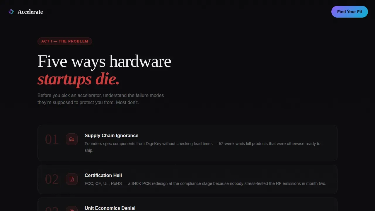
- A full five-failure Problem Arc section that names the real ways hardware startups die, from supply chain ignorance to demo day without distribution.
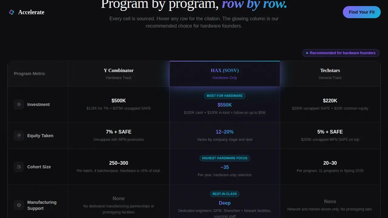
- A structured comparison table with programs as columns and rows covering equity take, cohort size, manufacturing partnerships, prototyping budget, placement rate, and geographic focus, with a glowing recommended column.
- A week-by-week ideal trajectory section that reframes comparison data into a narrative of what a good accelerator arc actually looks like, from bill-of-materials optimization through pilot production.
Feature list
This section covers the core design features and functional elements built into the template.
Atmospheric Hero with Pulsing Glow
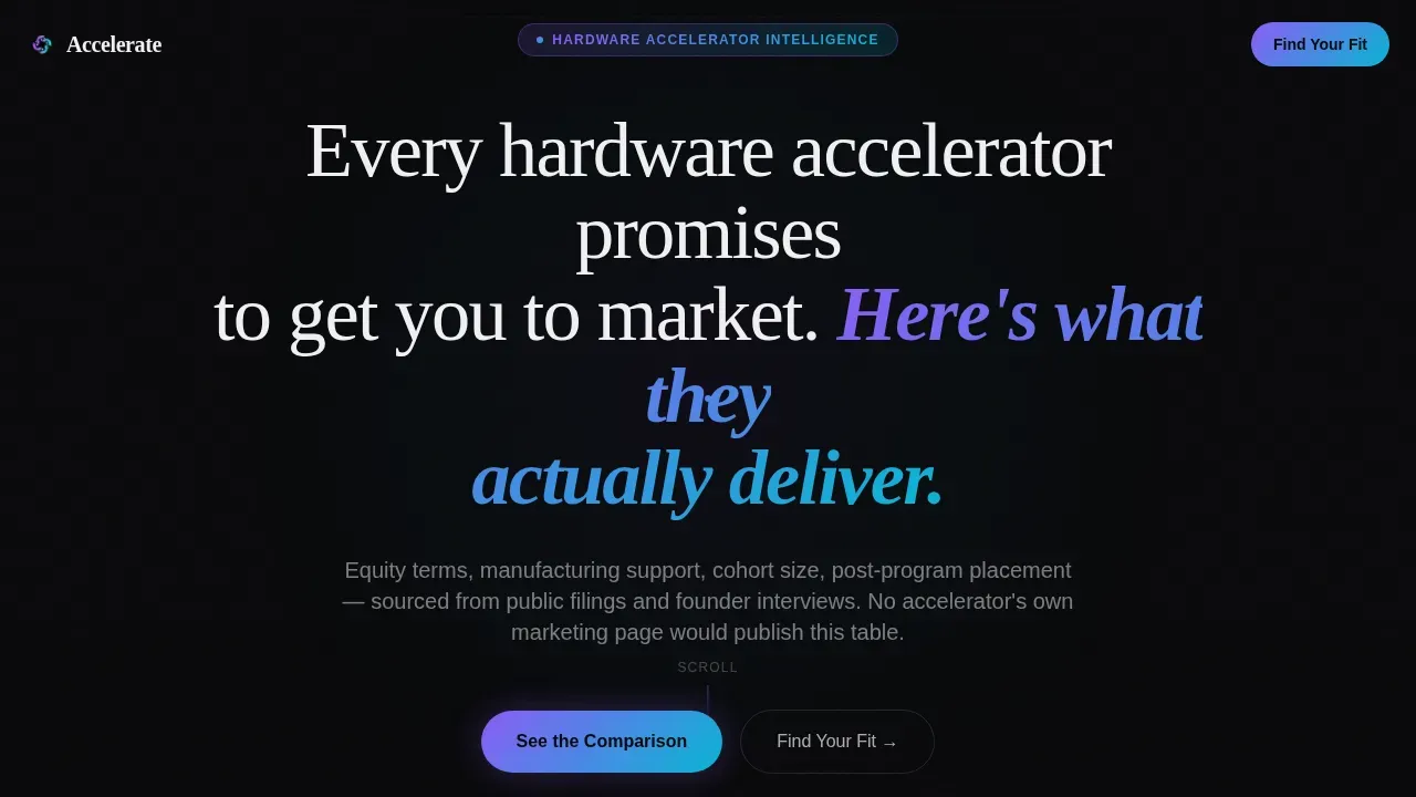
The hero section is a full-bleed void black canvas with a single centered headline and a soft radial glow that pulses once from violet to cyan. The animation mimics a component powering on, drawing the visitor's eye immediately downward. No imagery, no navigation, and no distractions compete for attention on this screen.
Structured Accelerator Comparison Table
The centerpiece of the page is a multi-column comparison table. Programs are displayed as columns and evaluation criteria as rows, making the side by side comparison readable at a glance. Each cell is designed to be sourced and linked, and the recommended column renders with a faint edge glow to highlight the strongest fit without forcing a conclusion.
Problem Arc with Red-Shifted Icons
Five hardware startup failure modes are listed in a short, direct section just below the hero. Each failure mode is a single sentence paired with a red-shifted icon. This section creates urgency and earns trust by naming problems the visitor already feels but has not seen articulated clearly on a comparison page before.
Ideal Trajectory Week-by-Week Section
The third act of the page transforms comparison data into a forward-looking narrative. It shows what a strong accelerator path looks like week by week, from bill-of-materials work through pilot production. This section gives visitors a concrete mental model, not just a table, helping them connect program features offered to real outcomes.
Sticky Bottom Bar with Three-Step Qualifier
A sticky call to action bar appears after the visitor scrolls past the comparison table. Clicking it opens a three-step modal: stage selector, hardware category selector, and email capture. This qualifier flow is the primary conversion path, filtering prospects by stage and category before they enter the lead pipeline.
PDF Lead Capture Path
A secondary conversion path lets visitors download the full comparison as a portable document by entering only an email address. This path captures prospects who want the data but are not yet ready to commit to the qualifier flow. Both paths are enabled within the same page layout without requiring a separate landing surface.
Page sections overview
| Section | Purpose |
|---|---|
| Hero with Glow | Sets tone and draws the eye downward with a single promise headline |
| Problem Arc | Lists five hardware failure modes to create urgency and build trust |
| Comparison Table | Delivers the side by side program data as the page centerpiece |
| Ideal Trajectory | Reframes comparison details into a week-by-week narrative arc |
| Sticky call to action Bar | Triggers the three-step qualifier modal after the table scroll point |
| PDF Capture Path | Secondary email form for visitors who want the comparison as a download |
| Footer | Single-row linear footer with minimal links |
Design & branding system
The visual system is built around a dark silicon aesthetic. The palette references the look of a GPU die under magnification: deep void backgrounds interrupted by iridescent traces that shift between violet and cyan depending on where the eye lands.
- Colors: void black (#09090B) for all backgrounds, signal white (#F0F0F3) for typography and table borders, holographic violet (#8B5CF6) and plasma cyan (#06B6D4) reserved exclusively for interactive elements, hover states, toggle switches, and the recommended-column glow.
- Typography: DM Sans is used for all body text and user interface elements; Fraunces is used for display headlines, giving the page a contrast between technical precision and editorial depth.
- Animation: scroll-triggered reveals on each section, a magnetic call to action on the sticky bar, and a pulsing violet-to-cyan glow on the hero and recommended column, all rendered with performance in mind.
Mobile & speed optimization
The template is built desktop-first because comparison tables require horizontal screen space to render all columns without truncation. A responsive mobile fallback is included for visitors on smaller devices.
- Server components handle all static sections, including the hero, problem arc, and trajectory, keeping the initial page load fast even on slower connections.
- Client components are scoped to the qualifier modal, sticky bar logic, and animated elements, so interactivity does not block the rest of the page from loading efficiently.
- JavaScript execution during scroll events is optimized to maintain smooth playback of animated transitions without degrading performance on lower-powered devices.
How this template helps you convert
A comparison page earns conversion by being more useful and more honest than any single program's own marketing. This template is structured to do exactly that.
- The Problem Arc section creates immediate emotional resonance, making visitors feel seen before asking them to do anything. This trust layer is what keeps them scrolling rather than waiting for a reason to leave.
- The comparison table is the most data-dense resource these founders will find on the web. By presenting sourced details in a clean layout, the page becomes the reference they bookmark and share, which increases return visits and referral traffic.
- The two-path conversion system, qualifier modal and PDF download, lets visitors self-select their readiness level. Prospects who are ready to move forward engage the qualifier. Those still in research mode leave their email for the PDF. Both actions feed the same pipeline without friction.
Other information about this template
This section covers additional context about the template's architecture, technical approach, and broader landscape relevant to hardware founders using it.
The template's animation layer uses CSS transforms and hardware accelerated compositing to keep transitions smooth. Specifically, properties like translate3d() promote animated elements to their own GPU layer, enabling hardware acceleration for scroll reveals and hover states. This approach uses the GPU to speed up rendering processes without creating too many layers, which can lead to degraded performance and increased memory usage. In most browsers, hardware acceleration is enabled by default for GPU compositing, making these transitions reliable across devices.
GPU acceleration improves the performance of animated web content, including smooth playback of scroll-triggered reveals. GPU compositing is an effective optimization for web browsers because it allows faster rendering of visual elements. Accelerated compositing works by offloading compositing tasks from the central processor to the GPU, reducing the time the browser spends waiting to render each frame. Overusing layers in GPU compositing can lead to performance issues, so the template's animated elements are scoped carefully.
The notion of hardware acceleration extends beyond the web. Hardware acceleration uses the GPU to speed up rendering processes across applications, from video playback and editing to inference workloads. The broader hardware accelerator market is rapidly growing, with the AI Accelerator Market projected to exceed $26 billion in 2026. The landscape is divided between versatile GPUs and specialized units. GPUs typically have a lower upfront cost but higher power consumption compared to ASICs. ASICs offer the highest performance-per-watt but are fixed and cannot be repurposed. For flexibility or prototype development, FPGAs are preferred. For low-latency inference, ASICs or NPUs are recommended. For edge or battery-powered devices, NPUs are suggested. Dedicated hardware can reduce processing wait times for live data in latency-sensitive applications.
Key differentiators between hardware accelerators include balancing flexibility, efficiency, and time-to-market. GPUs are highly programmable with mature software ecosystems, offering flexibility for diverse workloads. Development time varies, as GPUs have shorter cycles due to high-level language support compared to ASICs, which can take a year or more. Throughput and latency are important metrics, with GPUs often excelling in throughput while NPUs or FPGAs may offer lower latency. Compute density is measured using metrics like FLOPS for raw computing power and Memory Bandwidth for data access speed.
This template is worth mentioning as a good example of comparison page best practices applied to a high-consideration B2B audience. Creating a well-designed comparison page lies between effective communication and user-centric design. Most effective comparison pages use a side-by-side comparison table to help users absorb and process information. Comparison pages guide potential buyers during their purchasing journey by providing detailed information about program features and benefits. Highlighting the advantages of one option over competition is essential, and this template does so through sourced data rather than opinion.
- The accelerate hardware accelerator comparison landing page template is categorized under Startup & Launch, Accelerator & Incubator, and the Hardware Accelerator niche.
- The template style is Comparison Table with a Directory & Discovery theme.
- The creative direction follows a Problem to Solution Arc with a Dark Full-Bleed and Glow header concept.
- The page is desktop-first with a responsive mobile fallback and a linear single-row footer pattern.

Theme
Directory & Discovery
Creative direction
Problem→Solution Arc
Color system
AI Iridescent
Style
Comparison Table
Direction
Comparison/Versus
Page Sections
Atmospheric Hero Section with Glow Animation
Multi-column Accelerator Comparison Table
Five-failure Problem Arc Section
Week-by-week Ideal Trajectory Section
Sticky Bar with Three-step Qualifier Modal
Secondary PDF Download Lead Capture
Related questions
What is this template designed to do?
Who is the primary audience for this page?
Does the page include a lead capture mechanism?
How does the comparison table work?
Is this template built for a single-page layout?


