Corporate Startup Accelerator Application Conversion Website Template
Accelerate is a scroll-reveal corporate accelerator landing page built on a Tech Glass visual system with a Carbon Fiber color palette. It moves visitors from first impression to application click through four kinetic reveal sections, a social-proof logo header, animated outcome metrics, and a scarcity-driven call to action. No form fields. One destination: the program application.
by Rocket studio
Quick summary
Accelerate is a single-page, click-through landing page for a corporate accelerator program. It opens with a credential-first logo bar, then walks visitors through four scroll-triggered reveal sections that build urgency and proof. The design runs on a Carbon Fiber palette with ignition blue reserved for every interactive moment. One primary call to action drives visitors to the full application.
Who this template is for
This template is built for enterprise innovation teams that run internal venture programs and need a landing page that commands immediate credibility. It speaks directly to the people who sponsor and run these programs inside large organizations.
- Innovation vice presidents who need to attract serious internal founders to their cohort
- Corporate development leads who must demonstrate portfolio proof points before board review season
- Intrapreneurs and skunkworks team leads ready to pitch a structured scaling program to leadership
What problem this template solves
Most corporate accelerator programs lose potential applicants because their pages look like internal intranet documents or generic startup templates. The program's credibility never lands, and qualified candidates leave before they ever reach the application. This template fixes that directly.
- Pilots and internal ventures die in committee partly because the program itself lacks visible momentum and social proof
- Innovation leads have no ready-made page that converts curiosity into a committed application click
- There is no scarcity mechanism or urgency signal to push qualified candidates from "interested" to "applied"
What you get with this template
You get a fully structured, single-page landing page with four scroll-triggered content reveals, a fixed call-to-action bar, and a visual system designed to feel like a launch sequence in motion. Every section has a defined purpose and a clear handoff to the next.
- A logo bar header with animated Fortune 500 alumni credentials and a bold proof-point headline
- Four progressive reveal sections covering the problem, program architecture, testimonials, and outcome metrics
- Two conversion touchpoints: a fixed bottom call-to-action bar and a full-width application section after the metrics reveal
Feature list
This template is built around one job: moving a qualified visitor to click "Apply to Cohort 9" before they leave the page. Every feature serves that goal directly.
Scroll-Triggered Progressive Reveal
Each of the four main content sections detonates into view with a kinetic upward motion as the visitor scrolls. The effect mimics a staged ignition sequence, making the page feel like it is accelerating rather than simply loading.
Animated Logo Bar Header
The header opens with a horizontal parade of Fortune 500 alumni logos rendered in monochrome white against a carbon-black background. The logos drift left in a continuous animation, and a single oversized mono-spaced headline displays the program's proof-point statistics above them.
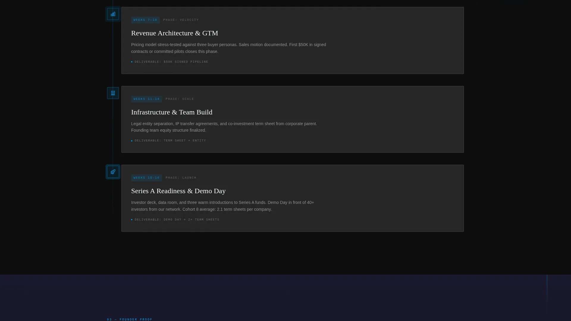
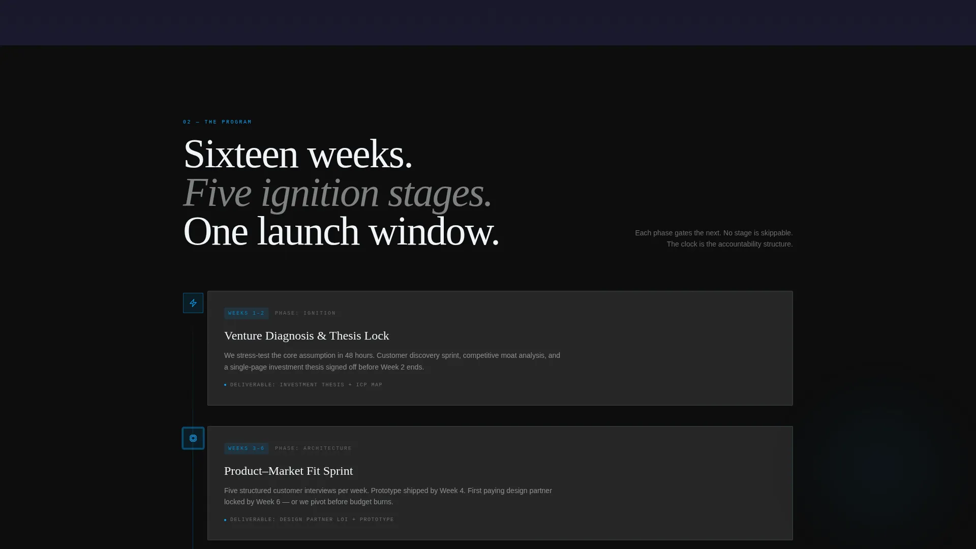
Vertical Program Timeline
The program architecture section renders as a vertical timeline with glowing checkpoint markers. This gives visitors a clear visual of the sixteen-week journey from slide deck to Series A traction without requiring them to read dense paragraph text.
Auto-Play Testimonial Video Section
Founder testimonials appear as short, auto-playing video clips lit in ignition blue tones. This section arrives as the third scroll reveal, adding human credibility at the exact moment a visitor's trust is being evaluated.
Viewport-Triggered Metric Animations
Outcome metrics animate from zero to their real values the moment they enter the visitor's viewport. This creates a live-data feel that makes the numbers feel earned rather than static.
Scarcity-Driven Dual Call to Action
The primary call-to-action button reads "Apply to Cohort 9" in ignition blue. It first appears as a fixed bottom bar after the logo header scrolls out of view, then reappears as a full-width section after the metrics reveal. A qualifying line beneath the button states the application deadline and remaining spots.
Page sections overview
| Section | Purpose |
|---|---|
| Logo Bar Header | Opens with alumni credentials and a proof-point headline to establish instant authority |
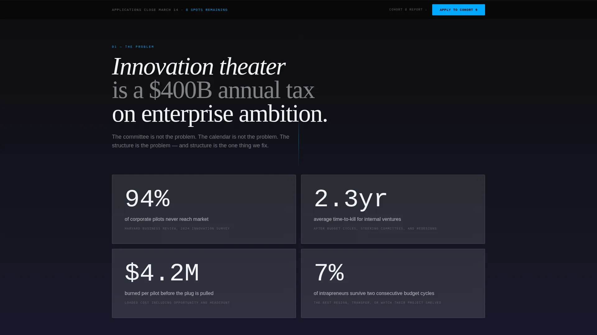
| Fixed call to action Bar | Persistent bottom bar that appears after the header clears, keeping the application click always visible |
| Problem Reveal | First scroll reveal presenting innovation theater statistics and corporate pilot kill rates |
| Program Timeline | Second scroll reveal showing the sixteen-week architecture as a vertical glowing checkpoint timeline |
| Testimonial Videos | Third scroll reveal with auto-playing founder video clips rendered in ignition blue lighting |
| Metrics Reveal | Fourth scroll reveal with animated outcome numbers counting up from zero on viewport entry |
| Full-Width call to action | Standalone application section with primary button, deadline line, and secondary outcomes report link |
Design & branding system
The visual identity runs on a Tech Glass aesthetic built from a Carbon Fiber color system. The overall effect is aerospace-grade: matte darkness with an engineered sheen that only reveals itself under direct attention.
- Core colors: deep carbon black (#0D0D0D) for backgrounds, woven graphite (#1A1A2E) for layered depth, translucent panel gray (#E0E0E0 at 12% opacity) for surface panels, and cool white (#F0F4F8) for all body text
- Ignition blue (#00A8FF) is used exclusively for call-to-action elements, hover states, progress bars, scroll indicators, and any data in motion
- Typography uses oversized mono-spaced type for the hero proof-point headline, reinforcing the program's technical and data-driven personality
Mobile & speed optimization
The scroll-reveal architecture and fixed call-to-action bar are structured to work across screen sizes. The layout priorities remain consistent whether a visitor is on a desktop monitor or a mobile device.
- The fixed bottom call-to-action bar is designed to remain accessible and readable on smaller screens throughout the scroll journey
- Progressive reveal animations are sequenced so that each section loads its content as it enters the viewport, keeping the experience focused and uncluttered on any device
How this template helps you convert
This landing page is engineered as a click-through page with one conversion goal: getting a qualified visitor to tap the application button. Every structural decision supports that outcome.
- The logo bar header uses live social proof and a statistical headline to establish credibility before a single word of program copy appears, so visitors arrive at the application button already convinced the program is legitimate
- The dual call-to-action placement, fixed bar plus full-width section, means the application button is never more than a glance away regardless of how far the visitor has scrolled
- The scarcity line beneath the button, stating the application deadline and the number of remaining spots, converts passive interest into a time-sensitive decision without requiring any form fields on this page
Other information about this template
This template is purpose-built for the corporate accelerator and incubator niche within the broader startup and launch category. It is a strong fit for enterprise innovation programs that operate on a cohort model and need a public-facing page that feels different from a standard corporate microsite.
- The secondary call-to-action link, "Download the Cohort 8 Outcomes Report," is designed to capture leads who are not yet ready to apply but will engage with proof before the next cohort opens
- The template style is Scroll Reveal (Progressive), meaning content sections are hidden on load and revealed with motion as the visitor scrolls, which suits programs that want to build narrative tension before the ask
- The header concept is a Logo Bar, which works particularly well for programs with recognizable alumni or sponsor organizations whose names carry weight with the target audience
- The landing page direction is Click-Through, so there are no embedded forms; all data capture happens on the linked application page

Theme
Tech Glass
Creative direction
Launch Energy
Color system
Carbon Fiber
Style
Scroll Reveal (Progressive)
Direction
Click-Through
Page Sections
Scroll-triggered Progressive Reveal
Animated Alumni Logo Bar
Glowing Vertical Program Timeline
Auto-play Founder Testimonials
Viewport-triggered Metric Counters
Dual Scarcity Call-to-action System
Related questions
Does this template include a form for collecting applications?
Can I update the cohort number, deadline, and remaining spots in the call-to-action section?
What video format works best in the testimonial section?
Is the logo bar header suitable for a program in its first cohort?
How does the scarcity line work without a live inventory system?


