Design System & Component Library Professional Website Template
Access is a modular card-grid landing page template built for accessibility-first design systems. It showcases a living library of ARIA-ready user interface components that work with React, Vue, and Svelte out of the box. The Tech Glass visual theme, animated component grid, live contrast checker, and freemium signup flow make it easy to present a compliant component library with instant credibility.
by Rocket studio
Quick summary
Access is a single-page landing page template designed for accessibility-focused design systems and component libraries. It uses a modular card grid to present ARIA-ready user interface components across three tiers. A dark Tech Glass visual identity, animated launch sequence, and a freemium signup flow make it the right starting point for any team shipping compliant software fast.
Who this template is for
This template is built for technical teams who need to communicate compliance confidence quickly. It speaks directly to the people responsible for building or evaluating accessible software products.
- Front-end engineers who received a compliance ticket and need to ship WCAG 2.2 AA-conformant components under deadline pressure
- Design-system leads building a token library from scratch and needing a clear, structured way to document components
- Product managers whose software-as-a-service application is being evaluated by a government procurement team with Section 508 requirements
What problem this template solves
Teams building accessible software often spend more time explaining compliance than actually delivering it. A scattered or poorly presented component library erodes trust before any code is reviewed.
- Removes the need to retrofit components after the fact by presenting a library that signals compliance from the first scroll
- Replaces passive documentation with interactive proof points, including live mini-previews and a real-time contrast checker widget
- Bridges the gap between engineers and stakeholders by using a clear visual language that makes accessibility legible to non-technical buyers
What you get with this template
This template delivers a fully structured landing page built around a modular component grid with progressive reveal animations and conversion-focused layout patterns.
- A Dark Full-Bleed header with a single animated component card, a screen-reader transcript scroll, and a typewriter headline
- A tiered modular card grid covering atomic elements, molecular components, and full interaction patterns, each card with a live mini-preview, accessibility score badge, and framework icons
- A sticky bottom bar with a primary call-to-action button, a two-step signup flow for framework selection and account creation, and an inline install command for zero-friction access
Feature list
This template is packed with design-led and interaction-forward features grounded in the source brief. Each feature supports a specific moment in the visitor journey.
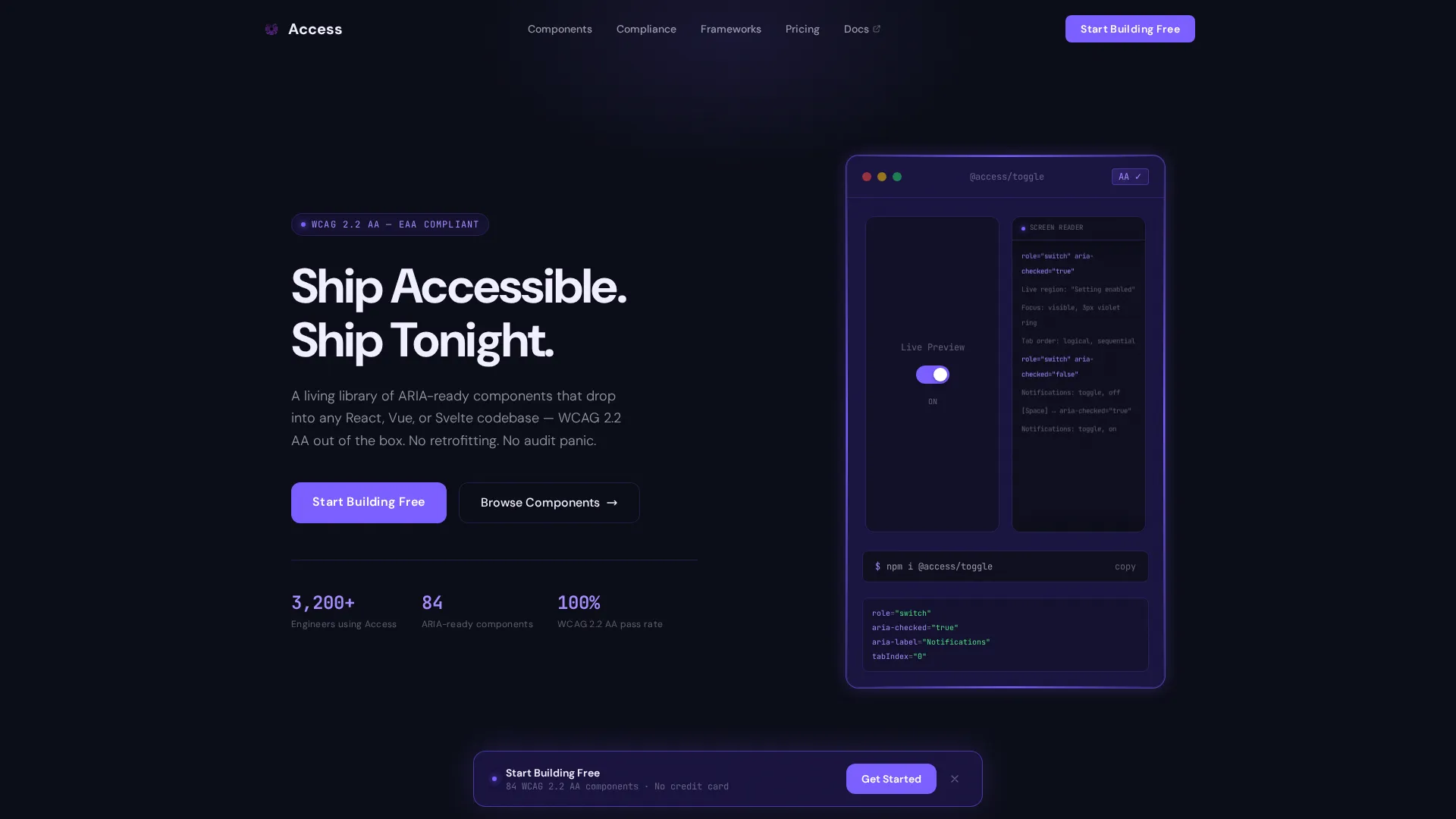
Animated Header with Live Component Card
The header opens on a void-black canvas. A single component card materializes with a violet glow tracing its border. Inside the card, a live toggle switch animates between states while a monospace screen-reader transcript scrolls beside it, proving the component announces itself correctly to assistive technology.
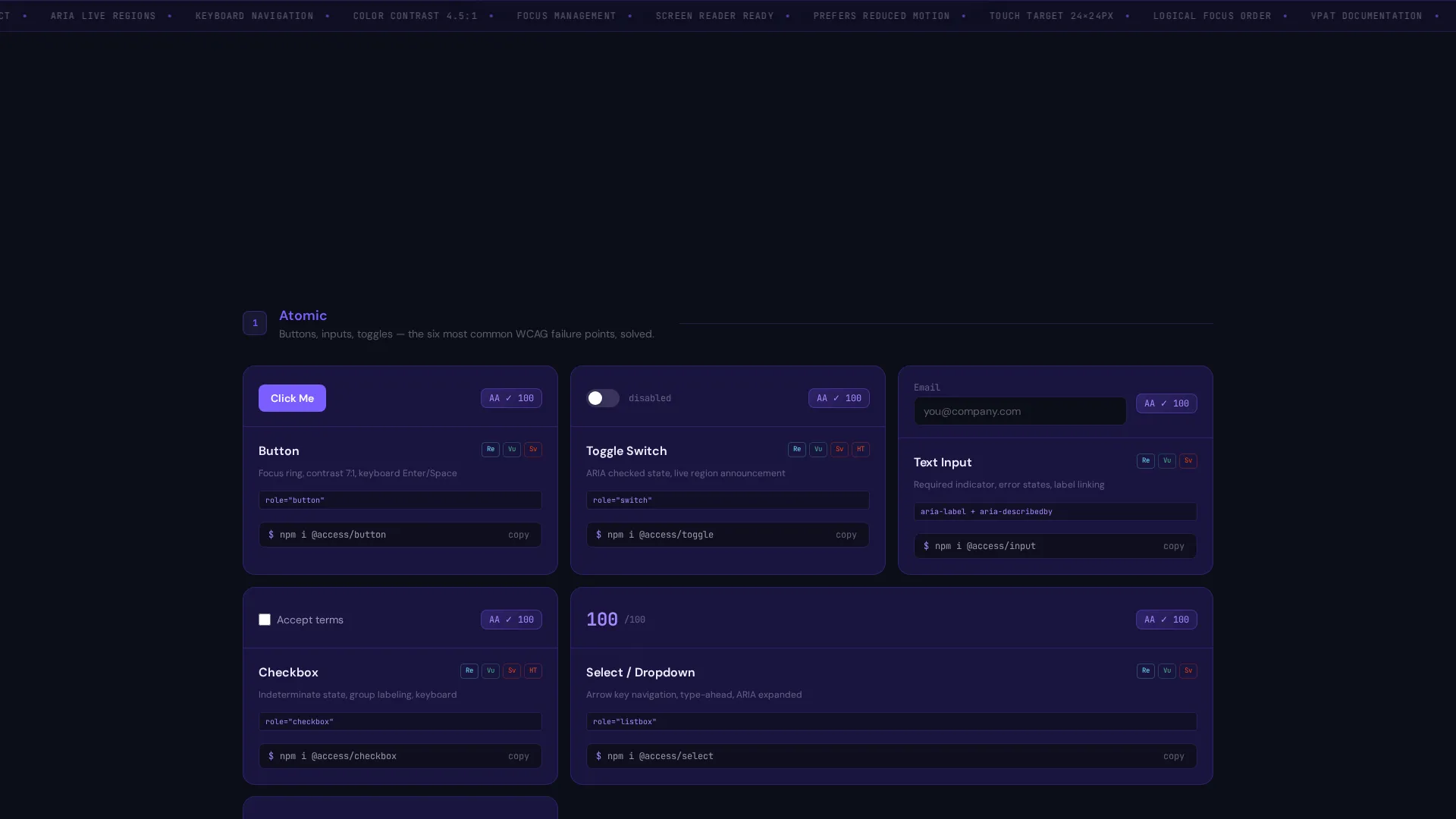
Tiered Modular Component Grid
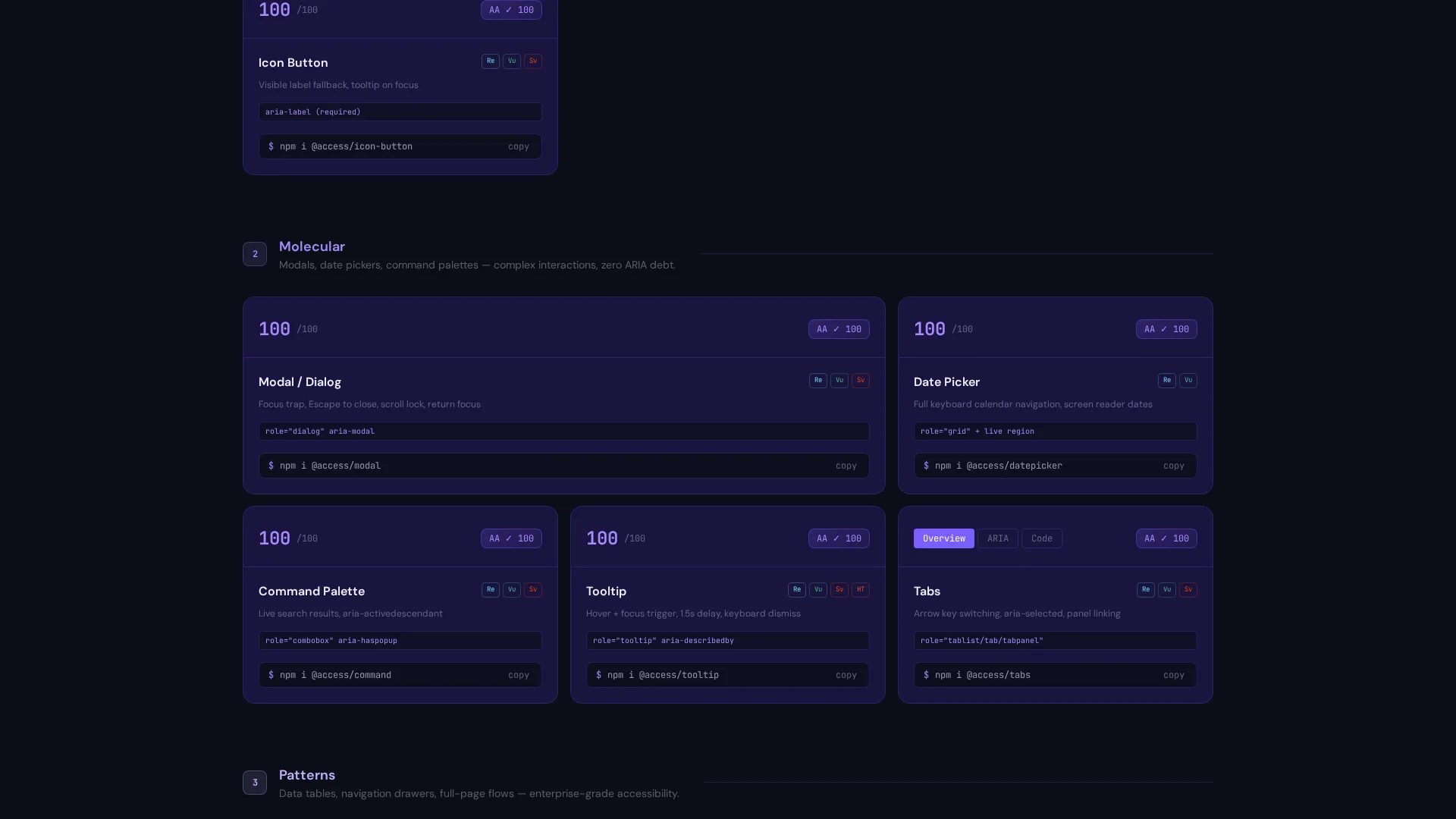
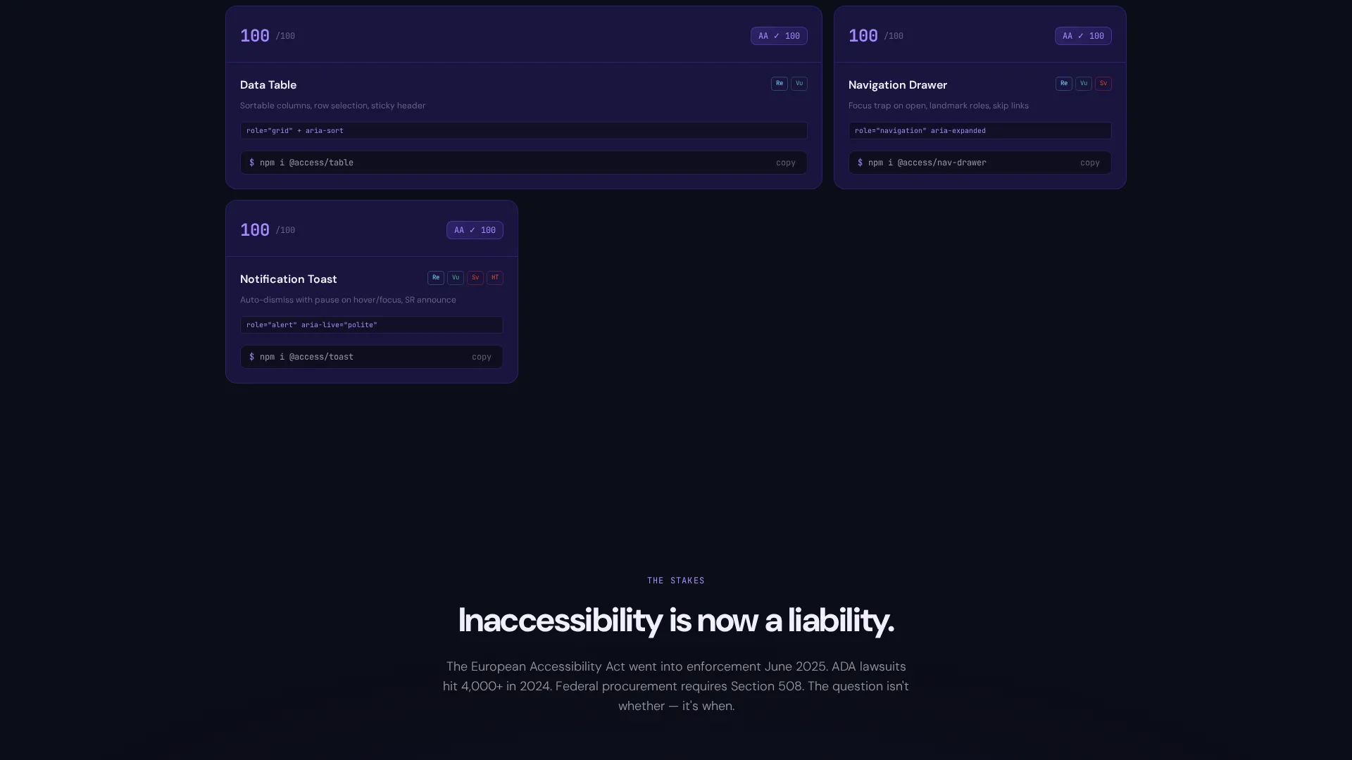
After the header, the viewport fills with a staggered spring-animated card grid. Components appear in three tiers: atomic elements such as buttons, inputs, and toggles; molecular components such as modals, date pickers, and command palettes; then full interaction patterns such as data tables and navigation drawers. Each tier feels like unlocking a new level.
Hover-Reveal Card Previews
Every component card glows on hover to expose a live mini-preview of the component in action. The card also surfaces an accessibility score badge and framework icons, giving engineers an instant read on compatibility and compliance status before they click through.
Live Contrast Checker Widget
Midway through the page, a contrast-checker widget lets visitors paste their own hex color codes and watch compliance scores calculate in real time. This interactive section turns passive reading into active participation, keeping visitors engaged and reinforcing the template's accessibility-first positioning.
Sticky Freemium Conversion Bar
A sticky bottom bar appears after the first grid section. It pins a violet-glow "Start Building Free" button to the viewport. Clicking the button opens a two-step signup flow: first, a framework selection screen for React, Vue, Svelte, or plain HTML; then an email and password entry screen.
Inline Install Command on Every Card
Each component card displays a copyable install command such as npm i @access/toggle. Visitors can grab and run it before creating an account. This gives immediate value and makes account creation feel like an upgrade rather than a gate.
Page sections overview
| Section | Purpose |
|---|---|
| Full-Bleed Header | Introduce the library with a single animated card ignition and typewriter headline |
| Atomic Components Grid | Present base-level elements: buttons, inputs, and toggles with hover previews |
| Molecular Components Grid | Showcase compound components: modals, date pickers, and command palettes |
| Full Pattern Grid | Display complete interaction patterns: data tables and navigation drawers |
| Contrast Checker Widget | Let visitors test their own hex codes against live compliance scores |
| Sticky Conversion Bar | Pin the primary call-to-action and two-step signup flow to the viewport |
Design & branding system
The visual identity uses a Tech Glass theme built on an Electric Indigo color system. Every design decision reinforces the feeling of a precision engineering environment at night.
- Core palette: void black (#0B0D17) for the canvas, deep indigo glass (#1A1440) for card surfaces, electric violet (#7B5EFF) for focus rings and interactive glow states, and accessibility-white (#F0EEFF) for text and iconography
- Typography and user interface details follow a dark-mode IDE aesthetic, with monospace ghost fonts used in the screen-reader transcript and a cursor-blinking violet typewriter effect for the headline
- Hover and focus states use a phosphorescent violet glow that traces component borders, creating a visually precise and high-contrast interactive layer
Mobile & speed optimization
The modular card grid layout is designed to reflow cleanly across screen sizes. The staggered spring animations are structured to maintain visual clarity at narrower viewports.
- Card grid columns collapse progressively on smaller screens so component cards remain readable and tap-friendly
- The sticky bottom conversion bar is built to stay accessible and visible on mobile viewports without obscuring page content
- Inline install commands on each card are displayed in a format that is easy to copy on both desktop and touch devices
How this template helps you convert
The page is built around a freemium model that gives visitors something useful before asking for anything in return. Every section moves the visitor closer to a decision.
- The animated header and tiered grid build confidence early by showing the library in motion, so visitors arrive at the call-to-action already convinced the problem is solved
- The inline install command on every card gives engineers immediate hands-on value, making the signup step feel like a natural upgrade rather than a barrier
- The sticky bottom bar ensures the "Start Building Free" call-to-action is always one scroll away, and the two-step signup flow reduces friction by asking for framework preference before account details
Other information about this template
This template is categorized under Documentation and Support, with a subcategory focus on design systems and component libraries. It is purpose-built for the accessibility component guide niche.
- The template is structured as a single landing page with a card grid layout, making it straightforward to adapt for any component library that needs a public-facing showcase
- The Electric Indigo color system and Tech Glass theme are editorial choices that signal technical seriousness without sacrificing visual appeal
- The two-step signup flow supports a freemium or free-trial product model and is designed to reduce drop-off by separating framework preference from account creation
- The screen-reader transcript and accessibility score badges are visual storytelling devices that communicate WCAG 2.2 AA and Section 508 compliance intent to both technical and non-technical audiences
Theme
Tech Glass
Creative direction
Launch Energy
Color system
Electric Indigo
Style
Card Grid (Modular)
Direction
Freemium/Trial
Page Sections
Animated Header with Typewriter Headline
Tiered Modular Component Grid
Hover-reveal Live Card Previews
Live Contrast Checker Widget
Sticky Freemium Conversion Bar
Inline Install Commands on Cards
Related questions
Who is this landing page template designed for?
What frameworks does this template support for component installation?
Can visitors try a component before creating an account?
Does the template include the contrast checker widget?
Is this template suitable for a dark-mode product presentation?


