Curated Property Investment Landing Page Template
The Ledger warm artisan real estate investing newsletter landing page template is a horizontal-scroll waitlist page built for serious investors. It unfolds across five chapter panels, guiding readers from editorial hook to email signup. Washi cream tones, sumi ink type, and ink-wash data illustrations create a field-journal aesthetic that earns subscriber trust before asking for anything.
by Rocket studio
Quick summary
Ledger is a weekly real estate investing newsletter landing page with a warm artisan soul. The template uses a horizontal scroll layout to walk visitors through five editorial chapters, building anticipation before the "Reserve My Copy" waitlist form appears. Every design choice, from the Japanese Zen color palette to the editorial serif fonts, is deliberate and polished.
Who this template is for
This newsletter template was built for real estate publishers and media creators who want their landing page to feel as considered as the content inside. It serves builders who value storytelling over noise.
- Solo landlords managing four to twelve doors who want to attract an informed audience of buyers, sellers, and homeowners
- Syndicators and real estate agents launching a professional newsletter to generate warm leads and connect with off-market deal finders
- FIRE-movement investors and independent publishers who want to promote a weekly or monthly real estate newsletter with editorial credibility
What problem this template solves
Most real estate newsletters look like every other newsletter template on the market. The layout is generic, the content feels thin, and readers drop off before reaching the signup form. Agents and publishers who are worried about standing out find it hard to communicate genuine expertise at a glance.
- Generic real estate newsletter templates fail to grab the attention of sophisticated investors who can find better resources elsewhere
- Standard newsletter template designs do not match the tone of premium, research-driven real estate newsletters
- Landing pages with cluttered layouts make it difficult to engage potential buyers and convert passive readers into subscribers
What you get with this template
This template gives you a fully structured, professional landing page ready to promote a real estate investing newsletter. Every panel is a crafted chapter. Each section earns the next, so visitors feel the value before you ask them to subscribe.
- Five horizontal-scroll chapter panels with snap-point transitions, a sticky call-to-action element, and a final centered waitlist form
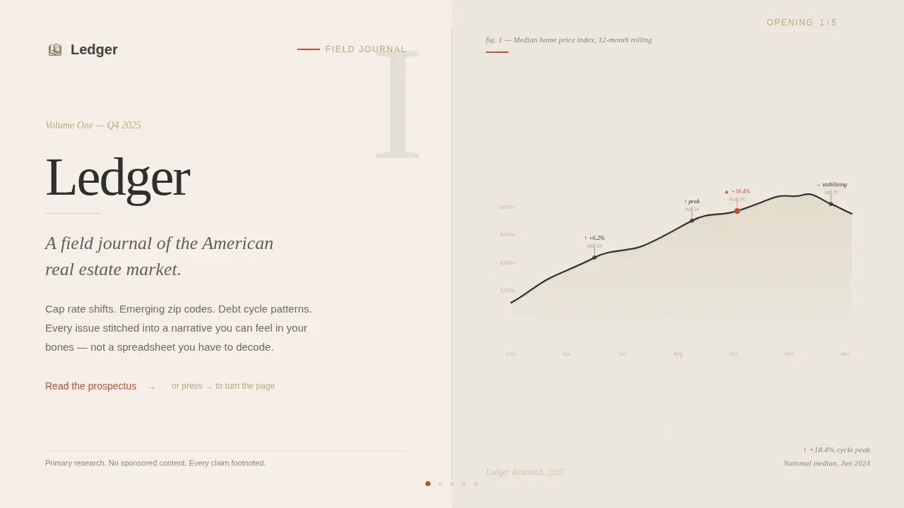
- Ink-wash SVG data illustration in the hero panel, showing a rolling trendline rendered as a brushstroke mountain range
- A door-count selector input (0, 1 to 4, 5 to 12, 13+) alongside the email capture form to help segment your audience from day one
Feature list
This template is packed with practical design decisions and interactive components. Each one serves the core goal: build trust with serious real estate readers and convert them into founding subscribers.
Horizontal Scroll Chapter Layout
Five full-viewport panels snap into place as visitors scroll horizontally. The layout metaphor is a scroll or linen-bound journal. Each chapter earns the next, rewarding readers who invest their attention. The design is desktop-first with a vertical mobile fallback.
Ink-Wash Hero Visualization
The hero panel features an SVG data illustration styled as an ink-wash brushstroke mountain range. It maps a twelve-month median home price trendline with handwritten annotations at key inflection points. No stock photos are used anywhere in the template.
Editorial Serif Typography System
Fraunces handles all headlines and chapter titles, giving the newsletter template an eye-catching editorial weight. DM Sans handles body copy and interface elements. Together, these fonts create a polished mix of warmth and clarity that elevates the reading experience.
Sticky and Final-Panel Call to Action
A torii vermillion "Reserve My Copy" call-to-action element sticks to the right edge during the scroll journey. It then reappears as a full centered moment in the final chapter panel. This two-stage placement keeps conversion intent present without interrupting the editorial flow.
Minimal Waitlist Capture Form
The signup form asks only for an email address, keeping friction low. An optional tap-to-select row lets visitors share how many doors they own. This smart segmentation approach helps publishers send targeted, relevant content to the right readers from the first send.
Chapter-by-Chapter Narrative Structure
The template includes four content chapters beyond the hero. Chapter one names the problem. Chapter two presents editorial philosophy. Chapter three previews three sample newsletter segments with growing ink-wash illustrations. Chapter four introduces the team and closes with the waitlist form.
Page sections overview
| Section | Purpose |
|---|---|
| Hero Chapter Opening | Introduces the newsletter name, editorial subtitle, and ink-wash price trendline |
| Chapter One Panel | Frames the core problem: data is abundant, but real insight is scarce |
| Chapter Two Panel | Presents editorial philosophy, primary research, and no-sponsor policy |
| Chapter Three Panel | Previews three sample newsletter segments with miniature ink-wash illustrations |
| Chapter Four Panel | Reveals the team, delivers the waitlist form, and closes with founding subscriber offer |
| Footer Row | Minimal single-row footer with essential links |
Design & branding system
The design language borrows from Japanese Zen calligraphy studios and linen-bound field journals. A warm color palette built on muted, earthy tones creates a sophisticated yet welcoming environment. Clean, uncluttered layout choices elevate the premium feel throughout.
- Colors: washi paper cream (#F5F0E8) for backgrounds, sumi ink charcoal (#2C2C2C) for body text, torii gate vermillion (#C84B31) for interactive accents and call-to-action states, tatami straw (#BDA87E) for borders and divider lines
- Typography: Fraunces editorial serif for chapter headings and display text, DM Sans for body copy and user interface elements, with generous leading that lets each sentence breathe
- Visual style: paper grain texture on the hero spread, alternating cream and stone white (#EDE8DF) panel backgrounds, ink-wash SVG illustrations with staggered fade-in reveals driven by IntersectionObserver
Mobile & speed optimization
The template is built desktop-first to honor the horizontal scroll experience. A vertical fallback layout is included for mobile visitors so no lead is lost on smaller screens. CSS scroll-snap powers the panel transitions for smooth, native-feeling navigation.
- Horizontal scroll snap is handled with CSS scroll-snap, keeping transitions smooth without heavy JavaScript overhead
- Staggered fade-in animations use IntersectionObserver to reveal content as each panel enters view, keeping the experience feeling deliberate and alive
- The vertical mobile layout preserves all chapter content and the waitlist form so readers on any device can find and complete the signup
How this template helps you convert
The template is engineered around a single goal: earn the email address. It does this by demonstrating editorial taste and depth before the call to action ever appears. By the time readers reach the form, they have already read something worth subscribing to.
- The horizontal chapter structure builds narrative tension across five panels, so readers feel invested and ready to subscribe when the form appears
- The sticky call-to-action element keeps "Reserve My Copy" visible throughout the scroll without interrupting the reading flow, making it easy to act at any moment
- The founding subscriber promise, "Volume One ships to inboxes Q4 2025, founding subscribers receive every future issue free," creates urgency and positions early adopters as part of an exclusive community
Other information about this template
This template is a strong starting point for any publisher ready to create a high-quality real estate newsletter presence. It fits naturally alongside other newsletter templates in the real estate newsletters category, and it is easy to edit and adapt for similar publishing projects.
- You can edit the chapter copy, swap in your own real estate newsletter ideas, and add photos or professional illustrations to personalize each panel
- The layout is built to match the tone of premium real estate newsletters that position agents and publishers as trusted advisors rather than salespeople
- Publishers who want to send a monthly real estate newsletter or a weekly digest can adapt this template equally well, since the structure supports any cadence
- Canva provides free templates and Mailchimp can be used to manage e-newsletter distribution after you capture leads with this landing page
- Tools like Follow Up Boss and GraphicRiver offer additional real estate newsletter templates and resources for publishers who want to download complementary assets or track subscriber engagement
- The template supports real estate newsletter ideas centered on market recaps, listings updates, new home trends, and community content for homeowners, buyers, and sellers
- It works as a polished companion to other newsletter templates in a larger content strategy, helping agents and publishers promote services, share articles, and connect with potential clients and happy clients alike


Theme
Warm Artisan
Creative direction
Vision & Mission
Color system
Japanese Zen
Style
Horizontal Scroll
Direction
Waitlist/Coming Soon
Page Sections
Horizontal Scroll Chapter Navigation
Ink-wash Hero Data Illustration
Editorial Serif Typography Pairing
Sticky and Final-panel Call to Action Design
Minimal Segmented Waitlist Form
Chapter-structured Content Panels
Related questions
Can I edit the chapter copy and illustrations to match my newsletter brand?
Is this template suitable for a monthly real estate newsletter or only a weekly one?
Does the horizontal scroll layout work on mobile devices?
How does the door-count selector help me as a publisher?
Can I use this template alongside other newsletter templates in a broader content strategy?


