Education & Career Blog Blog Website Template
Admit is a college admissions blog landing page built for the readers who need real guidance, not recycled checklists. A single-column scroll surfaces featured longform articles, a tactical article grid, and a trust-first newsletter signup. The design draws from an Ink and Paper aesthetic, quiet and literary, so the content always leads.
by Rocket studio
Quick summary
Admit is a single-column landing page for a college admissions blog. It pairs a cinematic hero with a carefully sequenced reading list, two featured longform articles, a tactical article grid, and an inline newsletter signup form. The design is built on a Japanese Zen color palette that keeps the writing at the center of every section.
Who this template is for
This template fits creators who lead with voice and earn trust through genuine insight before asking for anything in return. It is built for editorial-first content, not transactional marketing.
- College admissions bloggers and independent counselors who publish longform guidance
- Independent writers running niche education newsletters with a loyal, growing readership
- School counselors or college consultants who want a content hub that reflects their expertise
What problem this template solves
Most blog templates force writers to compete with their own layout. Cluttered sidebars, aggressive pop-ups, and mismatched fonts pull focus away from the words. For a college admissions blog, that friction is costly. Readers arrive anxious and time-poor, and they leave the moment the page feels like a sales pitch.
- A layout built around writing means readers stay long enough to trust the voice
- A trust-first conversion flow places the email signup after the reader has already consumed real value
- Category tags and estimated read times help readers self-select without friction
What you get with this template
This template delivers a complete, publication-ready landing page that sequences content the way a literary magazine would. Every section is deliberate, and every design choice serves the writing rather than competing with it.
- A hero section with a type-over-image headline set over an essay-draft photograph
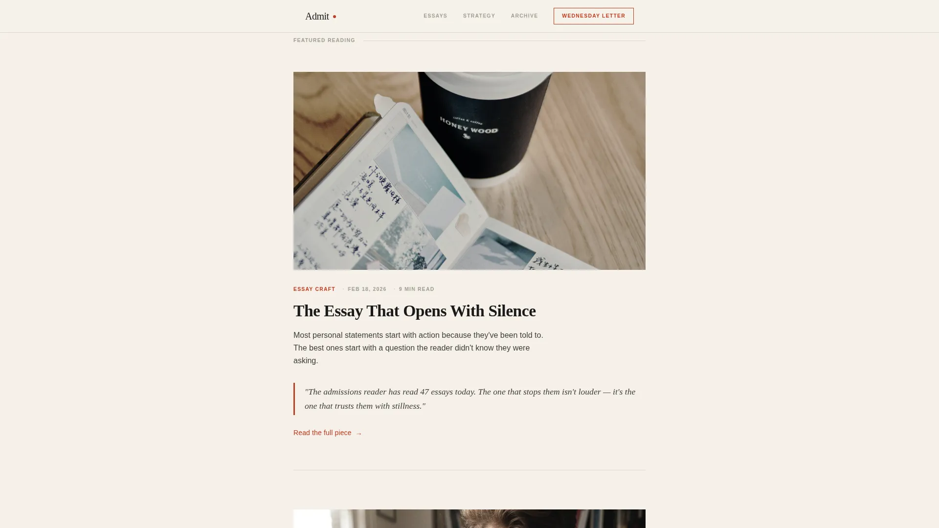
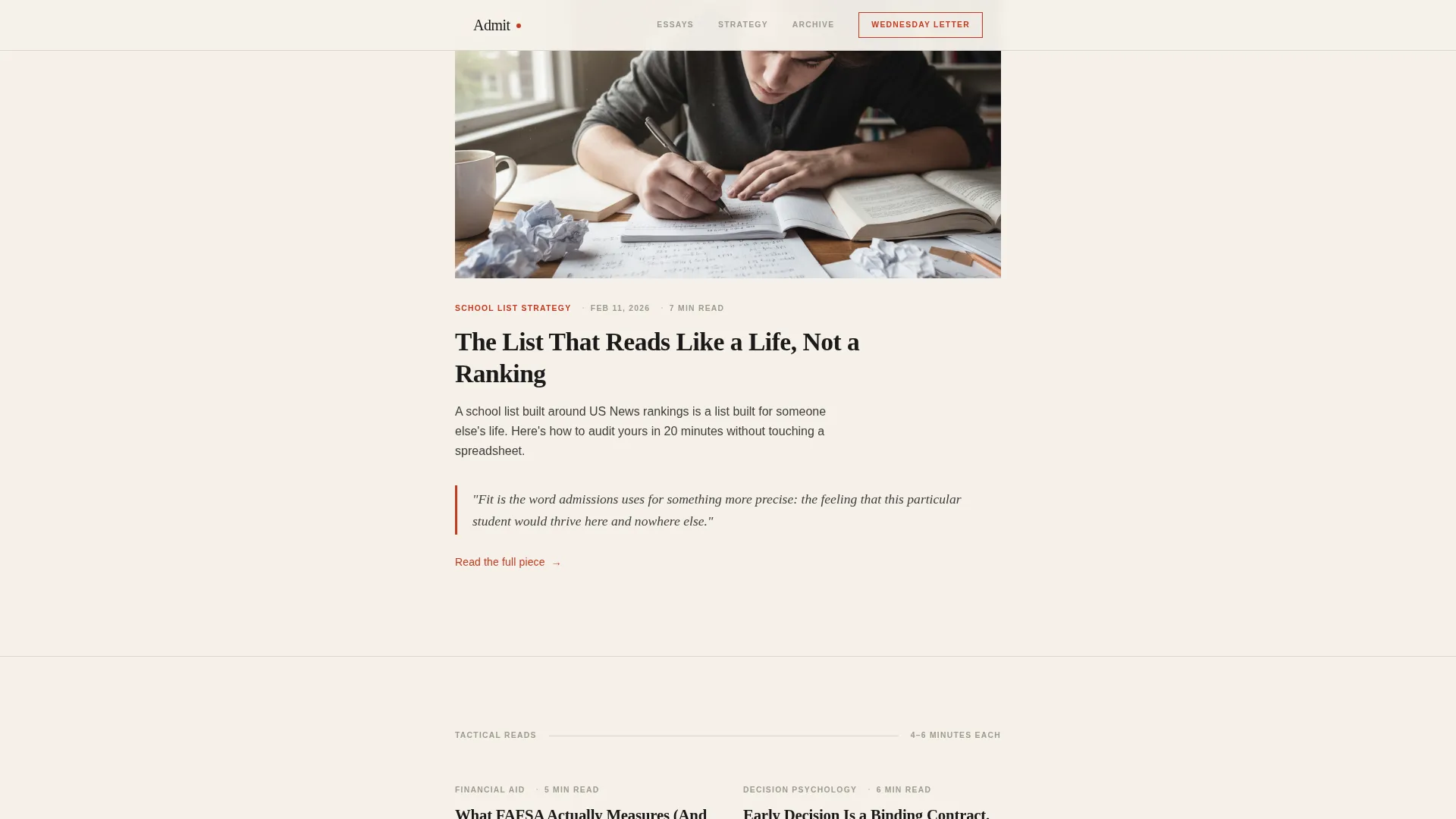
- Two featured longform article cards with pull quote borders and Fraunces serif display treatment
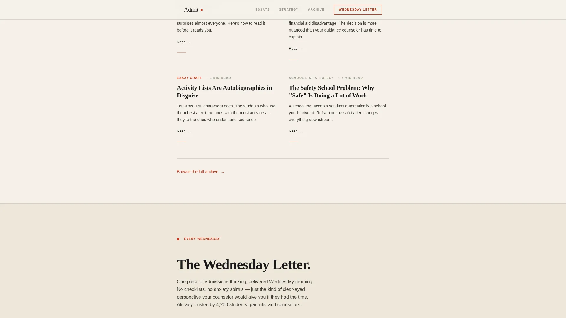
- A four-card tactical article grid with category tags and estimated read times
- An inline newsletter signup form asking only for a first name and email
- A secondary conversion path offering a free downloadable PDF diagnostic gated behind the same email field
- An asymmetric bento grid of three additional articles and an ultra-minimal footer
Feature list
This template is built around a small set of deliberate, well-executed components. Each one serves the reader first and the conversion goal second.
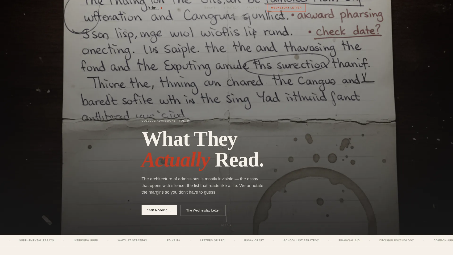
Type Over Image Hero
A softly desaturated photograph of a handwritten essay draft anchors the hero section. A bold serif headline reads directly over the image at chapter-title scale, creating an intimate, editorial opening without any illustration or iconography.
Curated Article Reading Flow
The scroll unfolds like a carefully sequenced reading list. Featured longform pieces alternate with tighter tactical grids, so the rhythm feels like a literary magazine rather than a content feed.
Pull Quote Borders
Featured articles surface with pull quote borders accented in vermillion seal red. This typographic treatment signals editorial quality and gives readers a reason to pause before clicking through.
Trust-First Newsletter Form
The inline email form appears after the third article card, once the reader has already encountered genuine value. It asks only for a first name and email in a single-row layout, reducing the friction of signing up.
Free PDF Diagnostic Path
A secondary conversion path offers a downloadable personal statement diagnostic gated behind the same email field. This gives readers who are not yet ready to subscribe a concrete reason to share their contact details.
Category Tag and Read Time System
Every article card carries a category tag (Essay Craft, School List Strategy, Financial Aid, or Decision Psychology) and an estimated read time. These signals help readers navigate without a sidebar or search bar.
Page sections overview
| Section | Purpose |
|---|---|
| Hero headline | Opens with a type-over-image chapter title that sets editorial tone immediately |
| Featured longform | Two anchor articles with pull quote borders signal depth and voice |
| Tactical article grid | Four shorter cards with tags and read times offer quick, actionable reads |
| Newsletter signup | Inline first-name-and-email form placed after earned trust |
| PDF diagnostic offer | Secondary conversion path using the same email field |
| Extended reading grid | Asymmetric bento layout surfaces three more articles |
| Minimal footer | Ultra-minimal horizontal footer closes the page without distraction |
Design & branding system
The visual identity follows an Ink and Paper theme built on a Japanese Zen color system. The palette feels like a calligraphy practice sheet: unhurried negative space and deliberate marks.
- Warm washi cream (#F5F0E8) as the base background, sumi ink black (#1A1A1A) for all primary text
- Stone garden gray (#9B9B8E) for secondary text and hairline rule dividers between sections
- Vermillion seal red (#C23B22) reserved for links, active states, and pull quote borders only
- Fraunces serif for display headlines and article titles; DM Sans for body copy and interface elements
Mobile & speed optimization
The template is built mobile-first, which reflects the reality that most readers arrive on their phones late at night. The layout is a single-column flow, so it adapts naturally to small screens without restructuring.
- Server Components handle all static content, keeping the JavaScript footprint minimal
- Scroll reveal animations use low-to-medium weight transitions with stagger effects and no heavy animation library overhead
- Hover states on article cards and the email form are the only interactive elements requiring client-side behavior
How this template helps you convert
The conversion strategy is built on a simple idea: give away the best thinking first, then ask. The template earns the email subscription rather than demanding it.
- The hero and first three article cards expose readers to genuine, ungated insight before any call to action appears, making the newsletter feel like a natural continuation of what they have already read.
- The inline form appears at exactly the right moment in the scroll, after trust has been established, and asks for only a first name and email to minimize drop-off.
- The free PDF diagnostic gives fence-sitters a concrete, immediate reason to subscribe, so the page supports two distinct decision paths without adding visual clutter.
Other information about this template
This template sits within the Blog and Editorial category, specifically the Education and Career Blog subcategory. It is designed for the college admissions niche, where voice and credibility matter more than visual spectacle.
- The template style is Single Column Flow, which keeps mobile reading comfortable and the editorial hierarchy clear
- The header concept is Type Over Image, using a real essay draft photograph rather than stock illustration
- The creative direction follows a Curated Collection approach, sequencing content like a print editorial spread
- Sections are separated by generous whitespace and thin hairline rules, never by color blocks, keeping the reading experience calm and focused
- The footer follows an ultra-minimal horizontal pattern, so the page ends cleanly without heavy navigation or promotional noise
- Article read counts appear alongside category tags as lightweight social proof signals
Theme
Ink & Paper
Creative direction
Curated Collection
Color system
Japanese Zen
Style
Single Column Flow
Direction
Content/Resource
Page Sections
Type Over Image Hero Section
Curated Longform and Tactical Article Layout
Trust-first Inline Email Form
Free PDF Diagnostic Download
Asymmetric Bento Reading Grid
Editorial Category Tag System
Related questions
Who is the target audience for this template?
How does the newsletter signup work in this template?
Can I launch this template without a large content archive?
What makes this different from a standard blog template?
How customizable is the color and typography system?


