Podcast Landing Page Template, Heritage Masonry Layout
Aircheck is a heritage-styled masonry landing page built for a podcast-about-podcasting YouTube channel. It pairs a newspaper masthead header with a scrollable episode archive that shifts from sepia to full color as you browse. Two lead-generation paths, an email digest sign-up and a YouTube subscribe button, work together to convert curious visitors into loyal listeners.
by Rocket studio
Quick summary
Aircheck is a single-page masonry layout for a podcast-about-podcasting channel. It opens with a broadsheet-style masthead, unspools a 147-episode archive through a sepia-to-color scroll journey, and closes two conversion loops: an email digest called "Get the Rundown" and a persistent YouTube subscribe prompt. The design feels like a well-loved public-radio archive, warm and immediately trustworthy.
Who this template is for
This template suits creators and producers who want their podcast channel to feel like a serious editorial project, not just a feed of uploads. It is built for people who have something substantial to say about the craft of audio storytelling.
- Independent podcast creators running shows from home studios, whether they have ten listeners or ten thousand
- Mid-career audio producers at podcast networks who want a craft-focused home for ongoing conversation
- Hobbyist podcasters ready to present their growing archive with intention and visual depth
What problem this template solves
A growing episode archive is hard to present as a coherent body of work. Most channel pages show a flat list. Aircheck solves the problem of depth: it makes a long archive feel like a curated journey worth exploring.
- Visitors arrive, scan a few cards, and leave without grasping how much the show has evolved
- There is no natural moment on a plain channel page for an email capture that feels earned rather than abrupt
- A show with real craft credentials deserves a visual identity that signals that seriousness from the first scroll
What you get with this template
You get a complete single-page layout with a heritage publication aesthetic. Every major section is already structured, styled, and ready for your episode content.
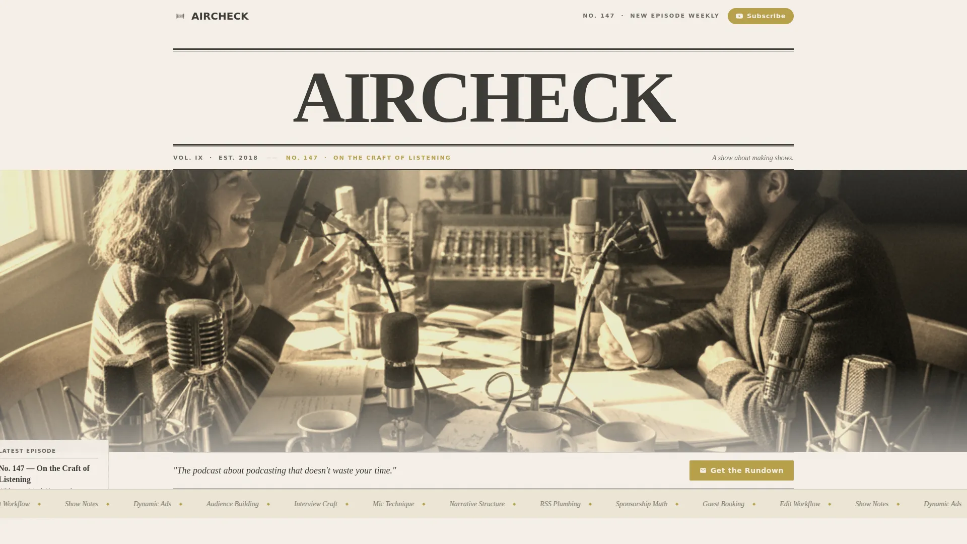
- A full-width newspaper masthead header with episode dateline, sepia studio photo, and italic subhead
- A two-phase masonry episode grid that shifts from desaturated early cards to full-color later cards as visitors scroll
- Two integrated lead-generation touchpoints: a sticky banner and a full-width interstitial email form with audience segmentation
Feature list
This section describes the core built-in capabilities of the Aircheck template.
Newspaper Masthead Header
The header spans the full page width and is set in a heavy display serif, styled like a broadsheet banner. It includes a hand-drawn-style episode dateline, a sepia-toned studio photo, a ruled separator line, and an italic subhead reading "A show about making shows."
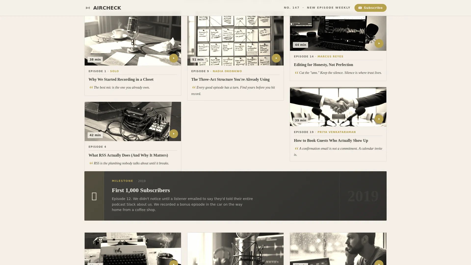
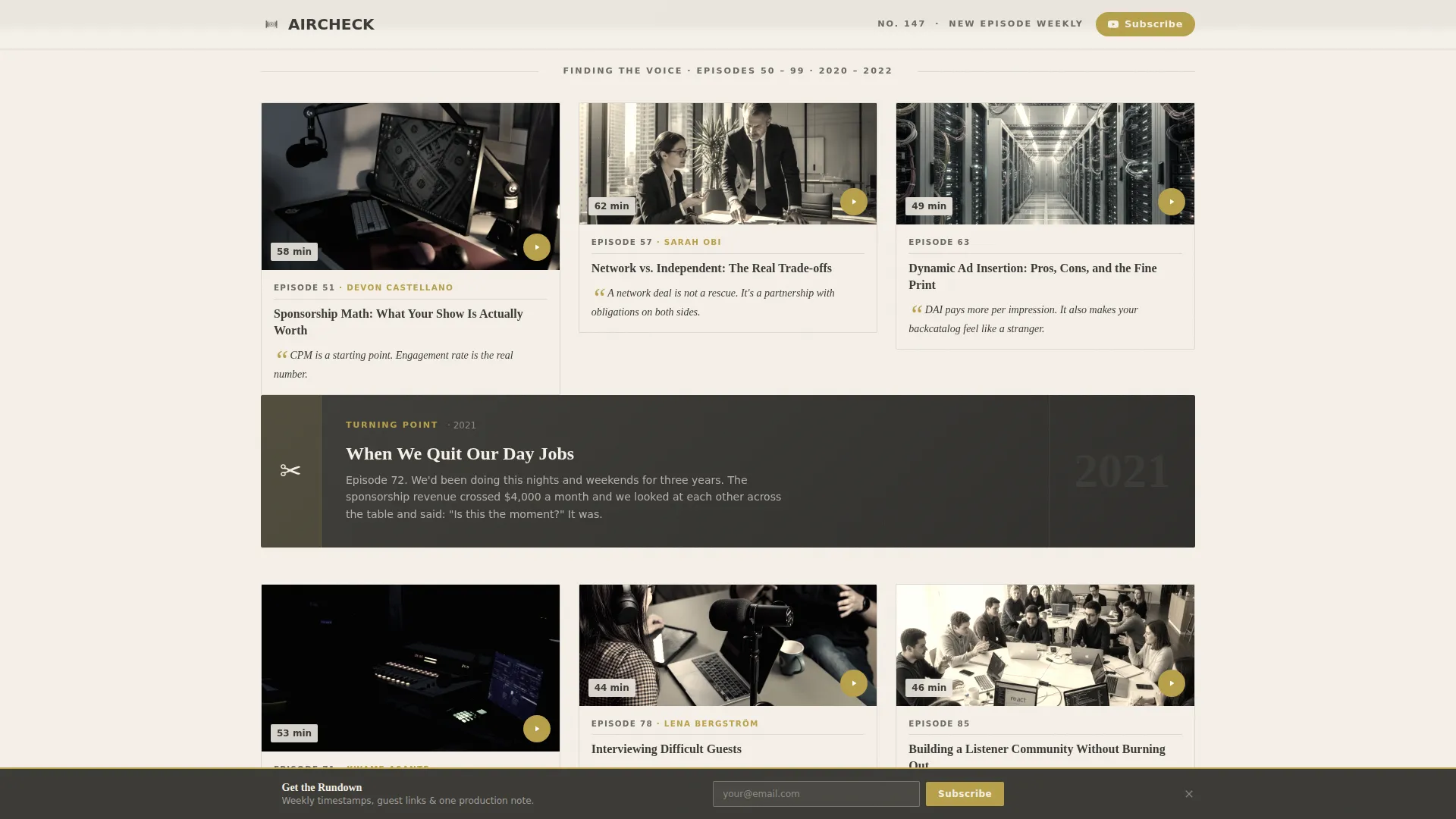
Sepia-to-Color Masonry Archive
The episode grid begins with desaturated, near-sepia cards representing early episodes and gradually shifts to full-color cards as the visitor scrolls forward in time. Each card holds a thumbnail, episode number, a pull-quote in italic, and a guest name, styled like a torn-out magazine page.
Milestone Cards
Wider two-column cards are interspersed throughout the grid to mark turning points in the show's history. Examples include "First 1,000 subscribers" and "When we quit our day jobs." These cards give the archive a narrative spine, not just a content list.
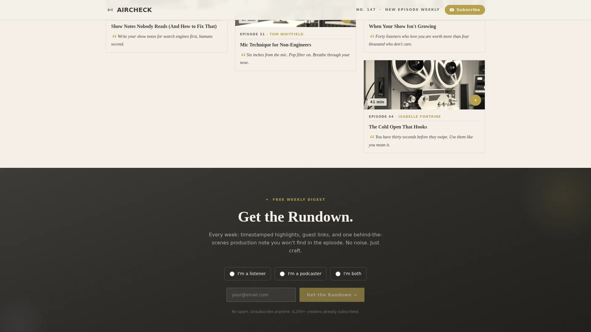
"Get the Rundown" Email Capture
The primary lead-generation form collects an email address and asks a single radio-button segmentation question: "I'm a listener / I'm a podcaster / I'm both." It appears as a sticky banner after two scroll-depths and again as a full-width interstitial after the episode 50 milestone card.
Persistent YouTube Subscribe Button
A brass-gold pill button in the top navigation stays visible throughout the entire scroll. Visitors who are not ready to share their email can still convert on attention by subscribing to the channel directly.
Heritage Color and Typography System
The Soft Mist palette uses parchment cream for backgrounds, faded ink charcoal for body text, whisper lilac as a secondary accent, and aged-brass gold for links, play buttons, and subscribe prompts. Fraunces display serif pairs with DM Sans body text throughout.
Page sections overview
| Section | Purpose |
|---|---|
| Newspaper Masthead Hero | Establishes show identity with broadsheet header, episode dateline, and studio photo |
| Early Archive Masonry | Displays desaturated episode cards for episodes 1 through 49 with first milestone card |
| "Get the Rundown" Interstitial | Full-width email capture with audience segmentation after the episode 50 milestone |
| Later Archive Masonry | Displays full-color episode cards for episodes 51 through 147 |
| Final Call to Action | Repeats email capture and YouTube subscribe prompt to close the page |
| Footer | Horizontal flow footer with brass-gold links |
Design & branding system
The visual identity is built around a Heritage and Story theme. Every design decision references the warmth and texture of analog media production, from public-radio pledge posters to hand-annotated reel-to-reel sleeves.
- Soft Mist color system: parchment cream (#F5F0E8) background, faded ink charcoal (#3B3A36) text, whisper lilac (#C6B9CD) secondary accents, and aged-brass gold (#B8A04A) for all interactive elements
- Typography pairing: Fraunces display serif for headings and datelines, DM Sans for all body copy and card labels
- Card styling follows a torn magazine page aesthetic, with sepia tones on early episodes that transition to full color as the archive progresses
Mobile & speed optimization
The template is designed desktop-first around the masonry grid layout, with a fully responsive fallback that collapses the grid into a clean single-column stack for smaller screens.
- Masonry grid reconfigures to a single-column card stack on mobile, preserving the sepia-to-color progression
- Scroll-reveal animations and the sticky banner trigger are handled by client-side components, keeping static episode cards lightweight on first load
- Server Components power the static episode card grid, while scroll observer and sticky behavior are isolated to client components for efficiency
How this template helps you convert
Aircheck earns the click by building trust through depth before asking for anything. By the time a visitor reaches the first form, they have already browsed a meaningful portion of a 147-episode archive.
- The sticky banner appears only after two scroll-depths, so visitors have already seen enough episode cards to understand the show's value before they are invited to sign up
- The interstitial email form sits directly after the episode 50 milestone card, a natural pause point where the show's evolution is already visible and the promise of a weekly digest feels genuinely useful
- The persistent YouTube subscribe pill in the top navigation offers a low-commitment conversion path for visitors who prefer to follow before they commit their email address
Other information about this template
The Aircheck template is category-aligned with Blog and Editorial publishing formats, specifically the niche of podcast-about-podcasting content. It suits any YouTube channel or independent podcast that publishes consistently and wants to present that consistency as a body of work.
- The template supports an Origin Story creative direction, meaning the scroll itself tells the show's history from scrappy first episode to polished production
- The layout is built within a Masonry and Pinterest-style grid structure, making it well suited for content-heavy archives where browsability matters
- The "Get the Rundown" digest promise includes timestamps, guest links, and one behind-the-scenes production note per episode, giving subscribers a concrete reason to sign up
- The template is localized for English (US) with standard date formatting and no currency fields
Theme
Heritage & Story
Creative direction
Origin Story
Color system
Soft Mist
Style
Masonry/Pinterest
Direction
Lead Generation
Page Sections
Newspaper Masthead Hero Header
Sepia-to-color Masonry Episode Grid
Milestone Cards for Show History
Segmented Email Capture Form
Persistent Youtube Subscribe Pill
Heritage Soft Mist Visual System
Related questions
Can I use this template for a podcast that is not specifically about podcasting?
How does the sepia-to-color card transition work?
What does the radio-button segmentation question on the email form do?
When does the sticky banner appear during the scroll?
Does the template include the footer section?


