Editorial Nonprofit Podcast Landing Page Template
Airwave is a cinematic dark editorial landing page built for nonprofit podcast networks. It uses an asymmetric 60/40 grid, a chapter-by-chapter scroll structure, and a waitlist form with a live subscriber count. The design channels the feel of a printed quarterly journal, deep black, warm parchment, and amber reserved for every call to action.
by Rocket studio
Quick summary
Airwave is a single-page editorial landing page template designed for nonprofit podcast and media networks. It opens as a book spread, moves through four numbered chapters, and closes on a full-width waitlist form. The cinematic dark palette, serif headlines, and asymmetric grid give it the weight of a serious media institution from the first scroll.
Who this template is for
This template is built for organizations that treat audio journalism as editorial work, not just content. It suits nonprofits, social-sector media projects, and mission-driven podcast networks that want to launch with authority and build a founding audience before going live.
- Nonprofit podcast networks preparing a waitlist or coming-soon launch
- Editorial teams producing long-form audio for funders, practitioners, and board members
- Social-sector media projects that need a professional home before Issue One drops
What problem this template solves
Most nonprofit media projects launch with a generic email signup page that does nothing to earn trust. Airwave solves the credibility gap. It gives a podcast network the visual and editorial gravitas of a print institution, so early visitors feel like they are joining something worth reading, not just another newsletter.
- Program officers and development directors scroll past pages that feel like press releases
- A coming-soon page rarely communicates editorial vision or why a project matters
- Early audience building stalls when there is nothing compelling to read or feel on the page
What you get with this template
You get a fully structured editorial landing page with four distinct chapter sections, a book-spread hero, contributor profile layouts, a methodology timeline, and a three-field waitlist form. Every section is designed to build the case for the project before asking for an email address.
- A chapter-based page structure with four named sections and scroll-linked reveals
- A waitlist conversion section with email input, role dropdown, and an optional editorial prompt field
- A live founding subscriber count that gives early joiners a sense of being on the masthead
Feature list
A single paragraph introduces the feature set: Airwave packs a dense editorial experience into one focused page. Each feature below comes directly from the template brief and serves a specific job in the page's chapter-by-chapter conversion flow.
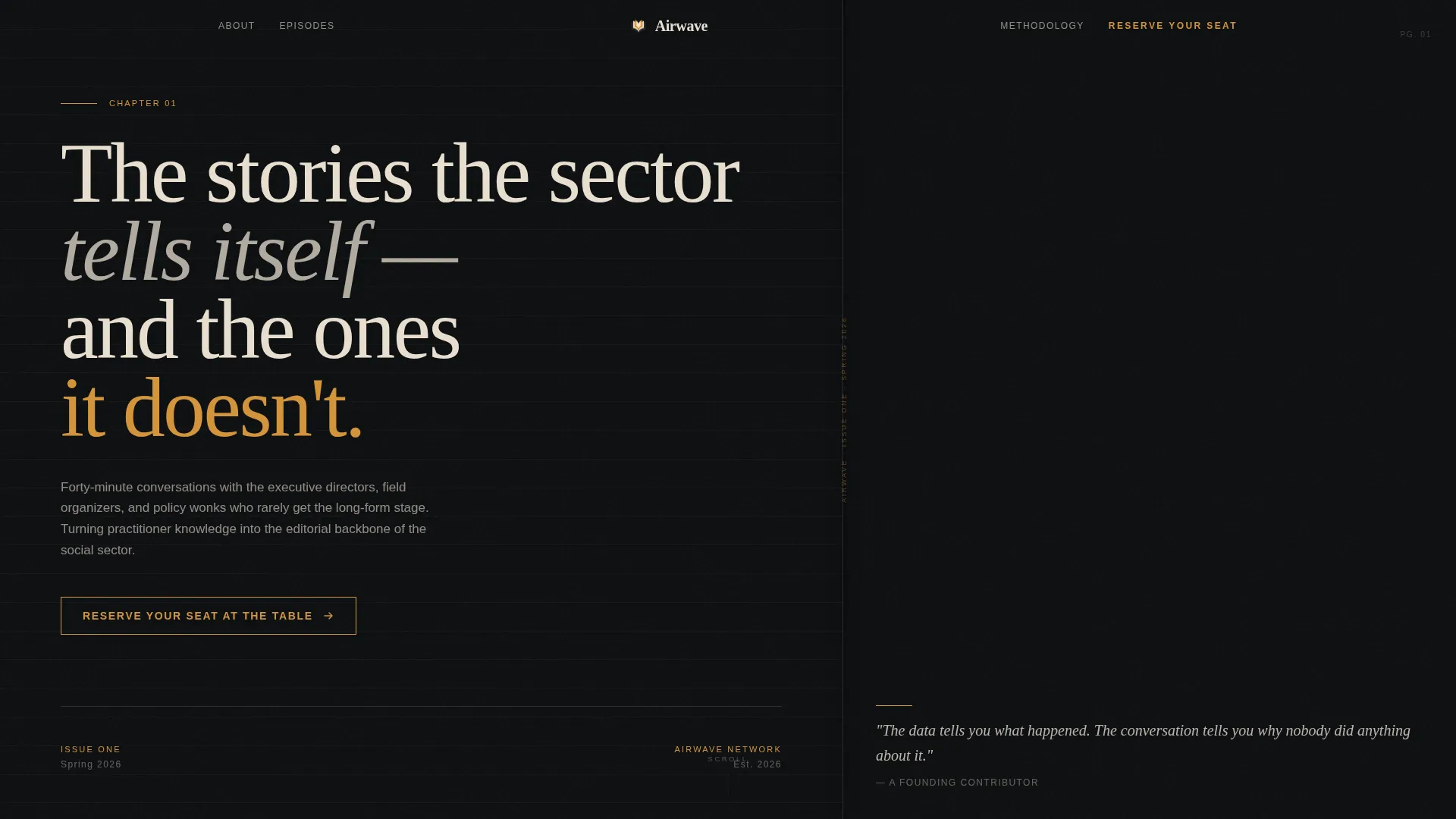
Book-Spread Hero Section
The viewport opens as a literal book spread with a spine visible at center screen. The left page carries a chapter number and a large provocative serif headline. The right page holds a grain-heavy cinematic photograph with warm amber key light. No play button appears, just stillness and editorial intent.
Chapter-Based Scroll Structure
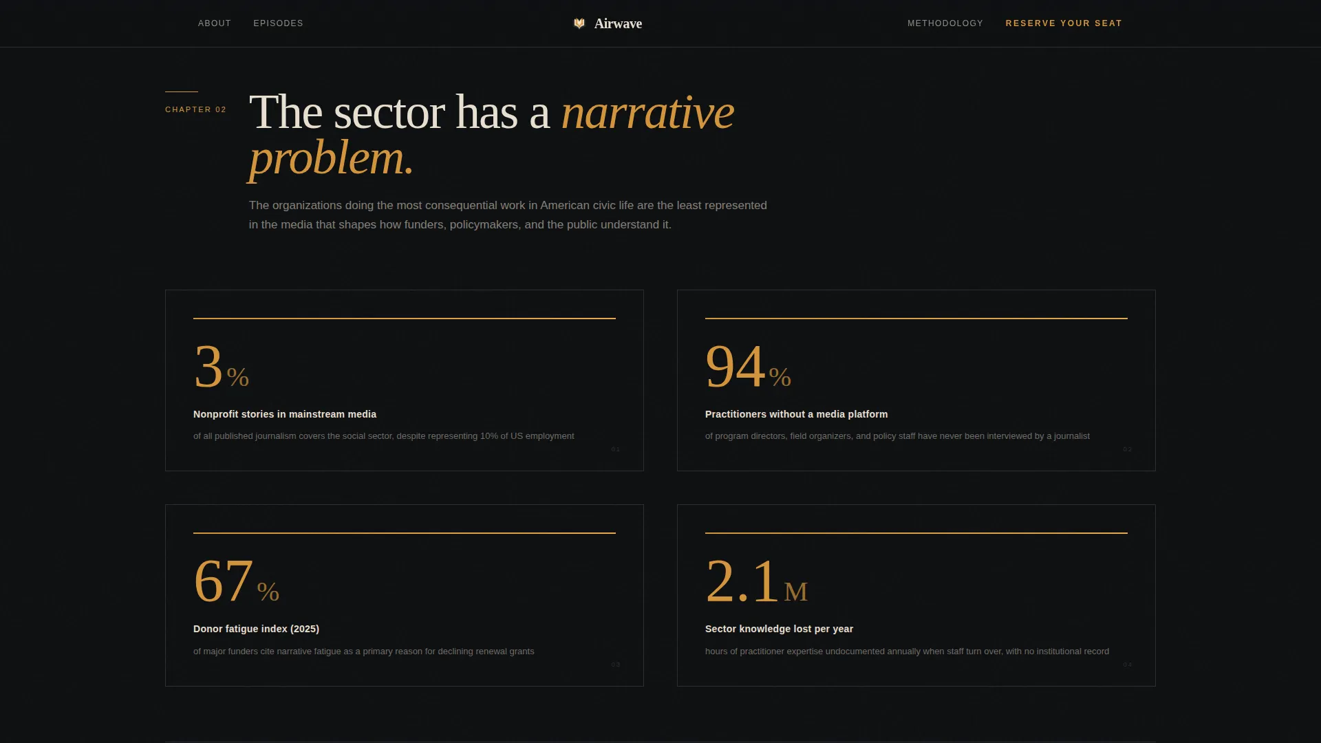
The page unfolds across four numbered chapters, each with its own thesis and visual treatment. Chapter 02 uses amber-on-black data visualizations to frame the problem landscape. Chapter 03 presents contributor profiles as pull-quote magazine spreads. Chapter 04 lays out the production methodology as a vertical editorial timeline.
Asymmetric 60/40 Grid Layout
The 60/40 column split runs through the contributor and editorial sections. Photography bleeds into the wider column while text anchors the narrow one. This creates the visual rhythm of a printed magazine feature spread rather than a standard web layout.
Three-Field Waitlist Form
The conversion form collects an email address first, then a role via dropdown (funder, practitioner, board member, journalist, or other), and finally an optional open text field asking "What story should we tell first?" The optional field qualifies interest while generating editorial leads at no extra friction cost.
Live Founding Subscriber Count
A small-caps line beneath the form reads "Issue One drops Spring 2026" alongside a live subscriber count. This gives early visitors the feeling of joining a founding masthead rather than an anonymous email list. The counter is rendered as a client-side interactive component.
Persistent Amber Call-to-Action System
The primary call to action, "Reserve Your Seat at the Table," appears three times across the page. It shows first as a text link in the top navigation, then as a full-width parchment band after Chapter 03, and finally as the closing spread of the book metaphor. Amber is used exclusively for interactive states and this call to action to preserve its signal value.
Page sections overview
| Section | Purpose |
|---|---|
| Chapter 01 Hero | Opens as a book spread with a cinematic photo and a serif headline |
| Top Navigation | Carries the persistent amber waitlist call to action text link |
| Chapter 02 Problem | Frames donor fatigue and coverage gaps with amber data visualizations |
| Chapter 03 Lineup | Presents contributor pull quotes and episode abstracts in 60/40 spreads |
| Chapter 04 Methodology | Shows the production process as a vertical editorial standards timeline |
| Waitlist call to action Band | Full-width parchment section with the three-field form and subscriber count |
| Page Footer | Arc Browser Split pattern with logo and tagline left, links right |
Design & branding system
The palette is built around a screening-room aesthetic. Deep editorial black covers roughly eighty percent of the canvas, warm parchment breathes in text-heavy zones, and projection-room amber appears sparingly enough to feel like a genuine signal every time it appears.
- Colors: deep editorial black (#0D0F11) as the dominant canvas, warm parchment (#E8DFD0) for pull-quote blocks and form sections, and projection-room amber (#D4943A) reserved for interactive states and calls to action
- Typography: DM Serif Display for headlines, IBM Plex Sans for body copy, and Fraunces for pull quotes
- Animation: staggered fadeInUp on load, scroll-triggered chapter reveals, and grayscale-to-color hover transitions on contributor photography
Mobile & speed optimization
The template is designed desktop-first to match the primary audience of program officers at their desks and board members on laptops. The layout remains fully responsive so commuters listening on mobile can still reach the waitlist form without friction.
- Static sections use server-rendered components for fast initial load
- The waitlist form and live subscriber counter run as client-side interactive components
- The asymmetric grid reflows cleanly for smaller screens without losing the editorial hierarchy
How this template helps you convert
Airwave is structured so that every scroll builds the case before the ask arrives. The page earns trust section by section, then presents the form at the moment of highest editorial buy-in.
- The chapter structure creates narrative momentum, so visitors who reach the waitlist band have already read the argument for why this project matters and feel ready to join.
- The three-field form adds a role dropdown and an optional editorial question, which increases the quality of early signups and makes subscribers feel like active contributors rather than passive recipients.
- The live founding subscriber count adds visible social proof at the moment of decision, giving hesitant visitors a reason to join now rather than wait for the official launch.
Other information about this template
Airwave is categorized under Blog and Editorial, specifically the Nonprofit Blog and Media subcategory, with a niche focus on nonprofit podcast and media projects. It is a strong fit for teams building a coming-soon presence that needs to feel as credible as the work it represents.
- The template style is Asymmetric Grid (60/40) under an Editorial Magazine theme
- The creative direction follows an Industry Report structure with a Chapter/Book header concept
- The color system is classified as Cinematic Dark, drawing from a screening-room visual reference
- The landing page direction is Waitlist and Coming Soon, optimized for founding audience capture


Theme
Editorial Magazine
Creative direction
Industry Report
Color system
Cinematic Dark
Style
Asymmetric Grid (60/40)
Direction
Waitlist/Coming Soon
Page Sections
Book-spread Hero with Cinematic Photography
Chapter-based Scroll Structure
Asymmetric 60/40 Grid Layout
Three-field Waitlist Conversion Form
Live Founding Subscriber Count
Persistent Amber Call-to-action System
Related questions
Can I edit the chapter titles and body copy in this template?
Does the waitlist form work out of the box?
Is this template suitable for a podcast network that is already publishing?
What fonts are included in this template?
Who is the primary audience this template is designed to attract?


