Retail Blog & Media Blog Website Template
Aisle is a bold retail landing page template built for podcast and media brands in the physical retail trade space. It uses a masonry research-wall layout, a typographic manifesto header, and a Parchment and Rust color system to front-load editorial value before asking for a click. The result feels like a worn trade journal left on a shop counter, authoritative, specific, and impossible to skim past.
by Rocket studio
Quick summary
Aisle is a single-page landing page template for retail podcast and media brands. It pairs a typographic manifesto header with a masonry content grid to deliver episode clips, pull-stats, mini-essays, and downloadable one-pagers in one scrollable research wall. Every section earns the visitor's next click before asking for one.
Who this template is for
This template is built for operators and content creators who work at the sharp end of physical retail. It suits anyone producing trade-grade content for a professional retail audience.
- Independent store owners, district managers, and direct-to-consumer founders studying brick-and-mortar retail
- Podcast hosts, visual merchandisers, buyers, and supply-chain professionals publishing regular content for a trade vertical
What problem this template solves
Most podcast landing pages look like generic streaming directories. They list episodes without context and ask for a subscription before proving the show is worth a minute of anyone's time. This template solves that problem by leading with value.
- Visitors land on a bold editorial manifesto and pull-quotes from the latest episode before they see any call to action
- The masonry grid surfaces stats, insights, and episode depth the way a research wall does, making the content feel earned rather than promoted
What you get with this template
You get a fully structured, single-page layout that functions as an editorial media hub and podcast subscription driver. Every section is purpose-built for a retail trade audience.
- A typographic hero section with a manifesto quote, latest episode title, guest name, and a rust-colored play button
- A masonry research wall with episode tiles, pull-stat cards, mini-essays, and downloadable one-pager slots
- A persistent bottom call-to-action bar, a thirty-second manual-play audio snippet section, and a themed archive horizontal scroll
Feature list
This template ships with a focused set of components matched to the needs of a retail media brand landing page.
Typographic Manifesto Hero
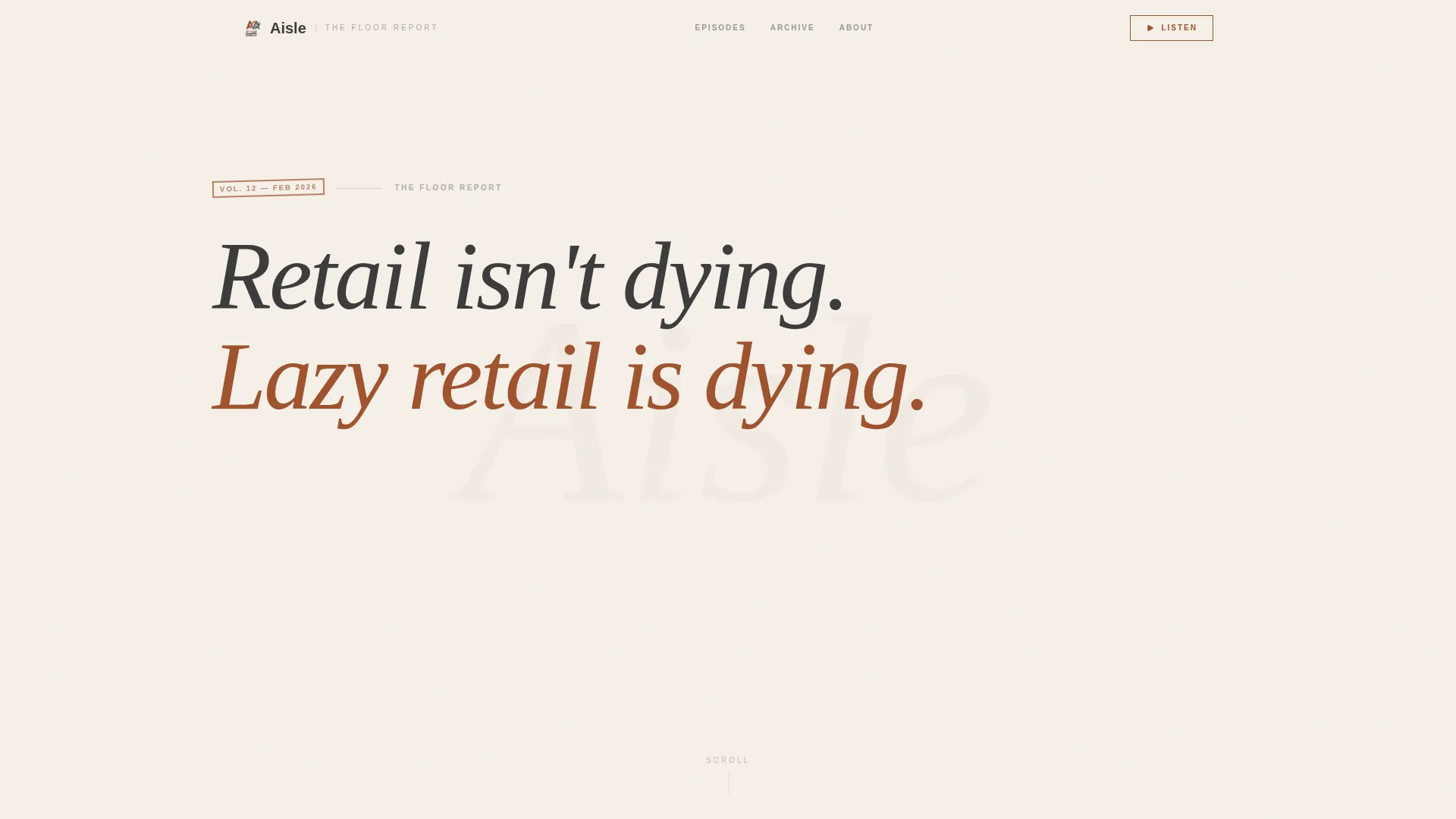
The header is full-width with no imagery. It opens with a sharp editorial statement set in Instrument Serif against bare parchment, followed by the latest episode title, guest name, and a rust-colored play button in graphite small caps. Conviction and negative space do the work.
Masonry Research Wall Grid
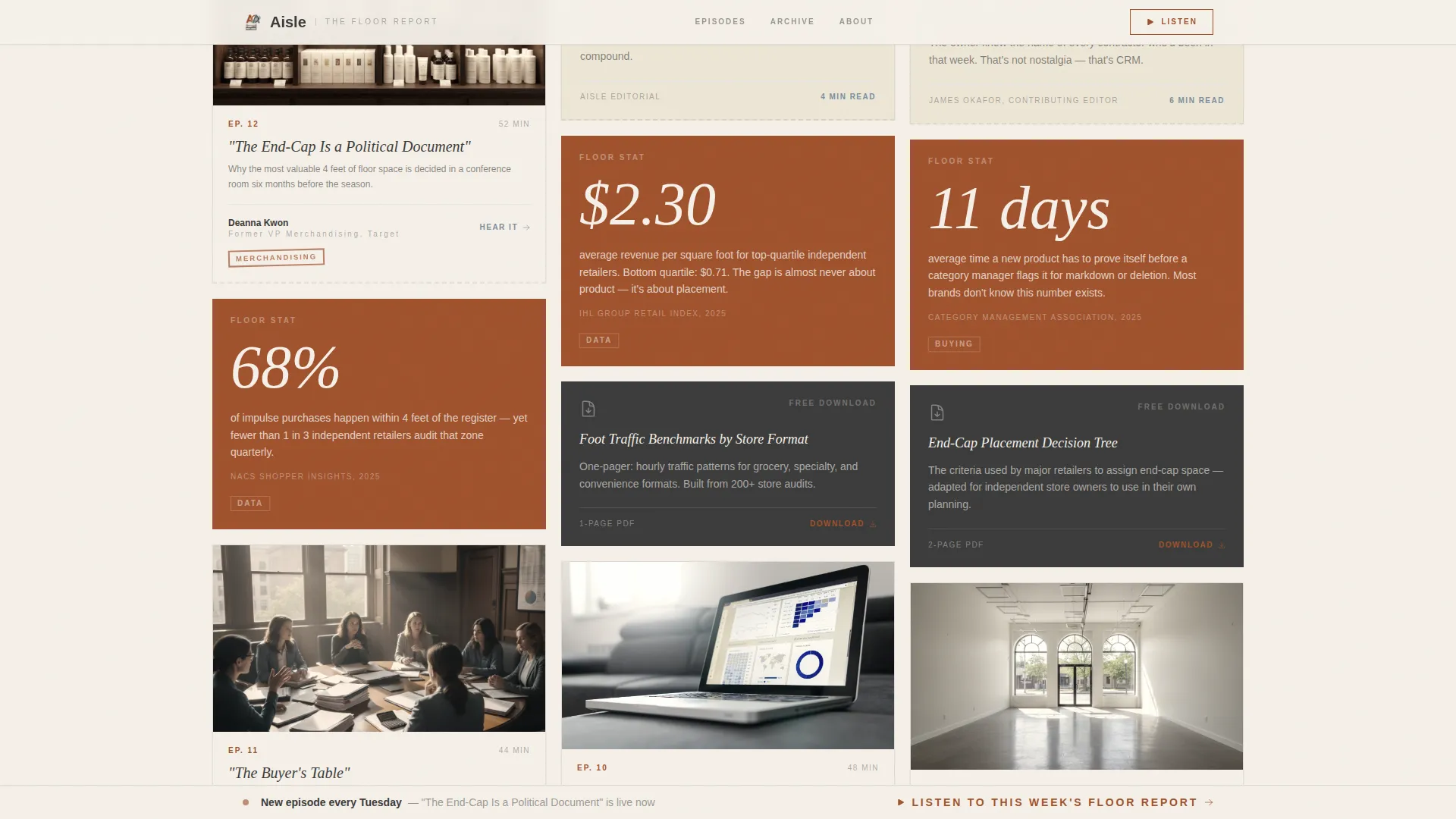
The main content area uses a masonry grid that clusters cards by theme, retail category, or season as the visitor scrolls. Cards include episode tiles with guest headshots and one-line takeaways, pull-stat cards, mini-essays on seasonal merchandising, and downloadable one-pager slots. Each card carries one sharp insight, not a summary.
Pull-Quotes Triptych Section
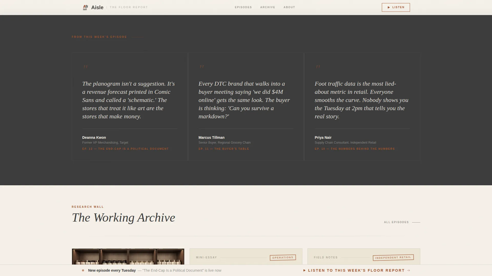
Three pull-quotes from the latest episode appear as a dedicated triptych block below the hero. They front-load editorial credibility and give first-time visitors a reason to keep scrolling before touching a call to action.
Manual-Play Audio Snippet Player
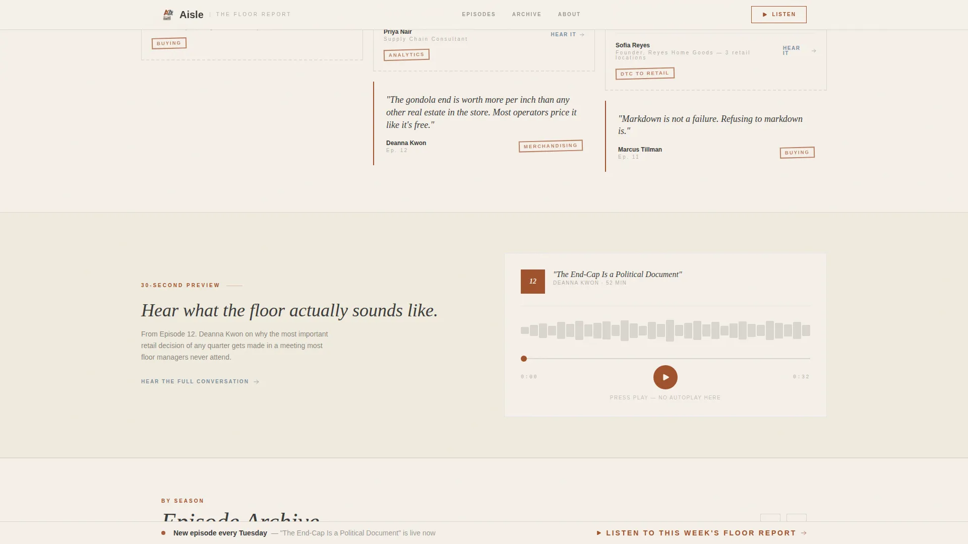
A thirty-second audio preview loads on the page but does not autoplay. The visitor presses play on their own terms. This respects the user's context while still putting the show's voice directly on the page.
Persistent Call-to-Action Bar
After the first scroll fold, a bottom bar stays visible with the primary call to action in rust on parchment. It routes to the podcast player or membership landing page without a form on the page.
Archive Horizontal Scroll
Older content is organized into a horizontal scroll section clustered by theme and season. It creates a sense of depth and archive, giving returning visitors a clear path to past episodes and resources.
Page sections overview
| Section | Purpose |
|---|---|
| Hero Manifesto | Opens with editorial quote, latest episode title, guest name, and play button |
| Pull-Quotes Triptych | Three episode quotes that front-load value before any call to action |
| Masonry Research Wall | Cards with episodes, pull-stats, mini-essays, and downloadable one-pagers |
| Audio Snippet Player | Thirty-second manual-play preview that puts the show's voice on the page |
| Archive Horizontal Scroll | Themed, seasonal archive of past episodes and resources |
| Footer | Horizontal flow footer pattern with navigation and subscription links |
Design & branding system
The visual identity follows an Atelier Studio theme built around a Parchment and Rust color system. Every color choice references a physical object from a working retail back office.
- Parchment (#F5F0E8) dominates backgrounds like raw canvas; rust (#A0522D) anchors headlines and pull-quotes; graphite (#3B3B3B) carries body text; receipt blue (#7B8FA1) surfaces on links, hover states, and interactive tiles
- Typography uses Instrument Serif for headlines and pull-quotes to carry editorial weight, while DM Sans handles body copy and labels with clean, readable density
Mobile & speed optimization
The template is built desktop-first to serve district managers and store owners working at a desk, but the layout is fully responsive for commuters listening with earbuds in.
- The masonry grid reflows cleanly for smaller screens, keeping episode tiles and stat cards readable on mobile without losing the research-wall feel
- Scroll-triggered animations use clip-path reveals and stagger effects at a medium intensity, and the audio snippet does not autoplay on any device
How this template helps you convert
Every structural decision on this page is aimed at earning the click rather than demanding it.
- Value arrives before the ask: the manifesto, three pull-quotes, and a visible pull-stat all appear above the primary call to action, giving visitors a reason to trust the show before being asked to subscribe or join.
- The persistent bottom bar keeps the primary call to action in view across the full scroll without interrupting the editorial reading experience, reducing friction at the moment a visitor decides they want more.
Other information about this template
This template is part of a retail media and editorial category designed for trade-vertical content brands. A few additional details worth knowing before you build:
- The footer uses a Vercel Horizontal Flow pattern for clean navigation and subscription link placement
- Animation intensity is set to medium, with clip-path reveals and scroll-triggered stagger effects; no autoplay audio is used anywhere on the page
- The page routes all clicks to an external podcast player or a separate membership landing page; there is no form or data-capture component on this page
- The template is localized for English-language content and the United States retail market
- Secondary calls to action on individual episode cards read "Hear the Full Conversation" and route to the same player or membership destination
Theme
Atelier Studio
Creative direction
Industry Report
Color system
Parchment & Rust
Style
Masonry/Pinterest
Direction
Click-Through
Page Sections
Typographic Manifesto Hero
Masonry Research Wall Grid
Pull-quotes Triptych Block
Manual-play Audio Snippet
Persistent Bottom Call to Action Bar
Archive Horizontal Scroll
Related questions
Does this template include a podcast player embedded on the page?
Can I use this template for a retail newsletter or media brand that is not a podcast?
Is there a sign-up form or email capture on this landing page?
What layout style does the main content area use?
How is the Parchment and Rust color system applied across the template?



