PropTech Startup Portfolio Website Template
Allocate is a PropTech investor relations landing page template built for real estate fund managers and syndication sponsors. It replaces static quarterly reports with a live-dashboard experience. The template uses an interactive comparison table, an animated product screenshot hero, and a sample portfolio explorer to convert skeptical fund managers into demo requests before they leave the page.
by Rocket studio
Quick summary
Allocate is a single-page PropTech investor relations template designed for real estate fund managers running $50M to $500M in commercial assets. It leads with a full-width dashboard screenshot, walks visitors through an animated three-column comparison table, and closes with a secondary conversion path that lets visitors import their own portfolio data before committing to a demo.
Who this template is for
This template is built for professionals in real estate fund management who need to present live portfolio performance to their limited partners. It speaks directly to the people who feel the pain of manual investor reporting every quarter.
- Fund managers and REIT sponsors managing $50M to $500M in commercial assets who need to rebuild LP confidence
- Investor relations coordinators who spend late nights exporting data and reformatting reports by hand
- Emerging syndication sponsors who want an institutional-grade presentation before they have an institutional-sized team
What problem this template solves
Static quarterly PDFs and attached spreadsheets erode LP trust over time. Capital call emails that arrive with a spreadsheet attached signal manual effort, not operational strength. This template replaces that perception with a live, data-driven presentation that feels like refreshing a dashboard.
- Limited partners stop reading PDF reports, so fund managers lose the credibility window they worked hard to earn
- IR coordinators waste hours toggling between data exports and design tools just to produce a report that feels outdated the moment it lands
- Emerging sponsors cannot afford to look scrappy when competing for LP attention alongside established funds
What you get with this template
You get a fully structured, single-page landing page built around the comparison-table conversion pattern. Every section is designed to prove value before asking for a commitment, so visitors experience the product logic before they fill out a form.
- A full-width animated hero with a dashboard product screenshot, floating metric cards, and a live-loading progress bar
- An interactive three-column comparison table with hover micro-interactions per row and staggered scroll-cascade animations
- An interactive portfolio explorer, a sticky demo call-to-action bar, a two-field demo modal, social proof with fund manager testimonials, and a CSV import secondary conversion path
Feature list
This template ships with six purpose-built components. Each one serves a specific role in the comparison-to-conversion flow.
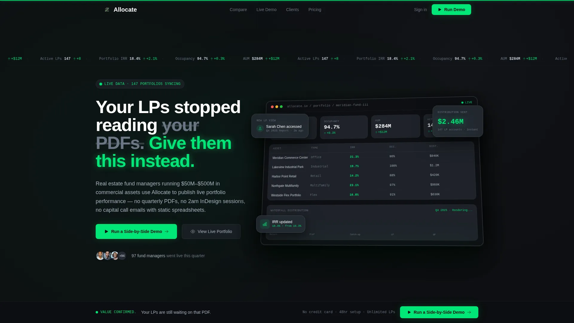
Animated Dashboard Hero
The hero opens on a full-width product screenshot of the Allocate dashboard mid-session. Numbers appear mid-animation, partially resolved, caught in the act of calculating. A thin signal-green progress bar crawls across the top as if live data is still loading. The headline fades in over the screenshot on a subtle isometric tilt with a soft parallax shadow.
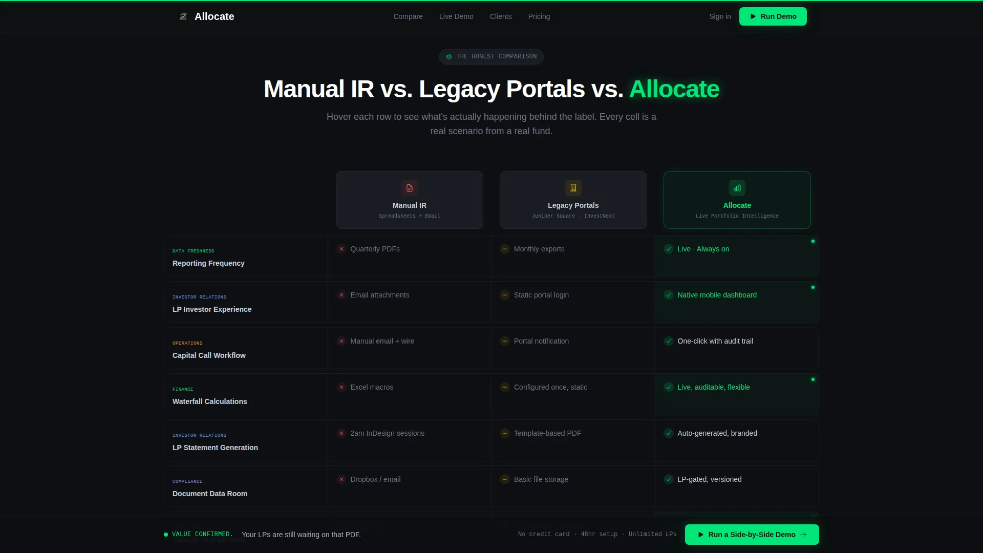
Interactive Comparison Table
A three-column versus layout pits Manual IR, Legacy Portals, and Allocate against each other row by row. Each row is a micro-interaction. Hovering on a reporting-frequency row triggers a calendar animation in the manual column and a live-ticker stream in the Allocate column. Rows cascade in on scroll with a staggered bounce that reinforces the Dynamic Motion theme throughout.
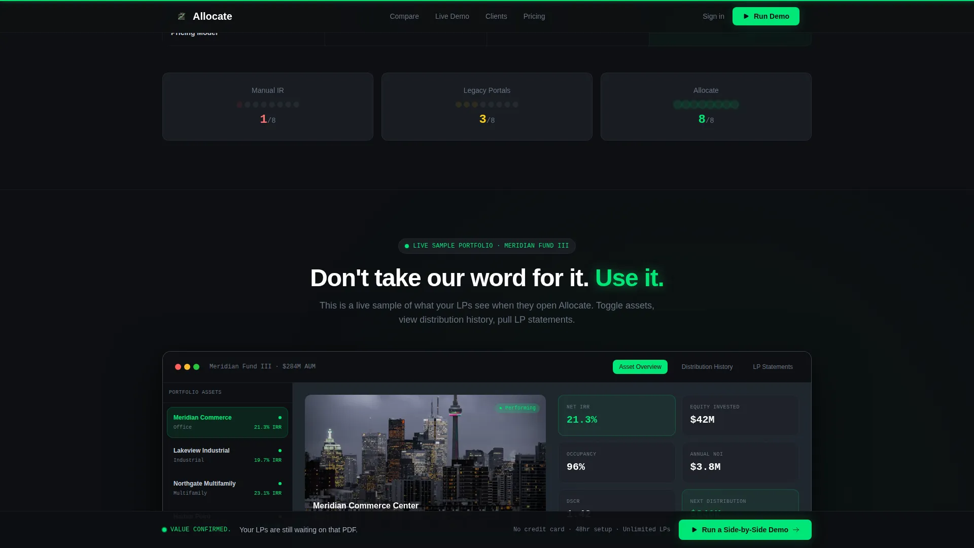
Interactive Portfolio Explorer
Below the comparison table, visitors can click through a sample portfolio and toggle between asset views, distribution history, and LP statements. The explorer turns a claimed advantage into a demonstrated one, letting visitors interact with the product logic before requesting a demo.
Sticky Demo Call-to-Action Bar
A persistent call-to-action bar appears once the visitor scrolls past the third comparison table row. It anchors the primary action, "Run a Side-by-Side Demo," at the moment visitors have seen enough proof to act. The bar stays visible as visitors continue scrolling.
Two-Field Demo Request Modal
Clicking the primary call to action opens a lightweight modal with two fields: work email and current IR tool, selected from a dropdown. The dropdown includes common tools fund managers already use, so the form signals that the product understands their workflow from the first interaction.
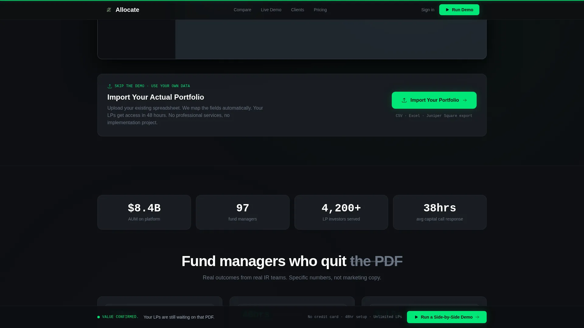
CSV Portfolio Import Path
A secondary conversion path sits beneath the portfolio explorer and targets visitors who are already convinced. It requires only a CSV upload and an email address, letting visitors see their own portfolio data inside the product immediately without scheduling a call first.
Page sections overview
| Section | Purpose |
|---|---|
| Hero dashboard screenshot | Establishes live-data credibility immediately on arrival |
| Comparison table | Proves advantage over manual and legacy reporting methods |
| Portfolio explorer | Demonstrates product value through hands-on interaction |
| Social proof strip | Builds trust with fund manager testimonials and AUM figures |
| CSV import call to action | Captures high-intent visitors ready to act without a call |
| Sticky demo bar | Keeps the primary conversion action visible throughout scroll |
| Footer | Provides single-row navigation and legal closure |
Design & branding system
The visual identity follows a Dynamic Motion theme using a Carbon Fiber color system. Every surface is matte and dark so that the illuminated data elements hit harder when they appear. Signal green is used sparingly, which means when it does appear, the eye reads it as confirmation rather than decoration.
- Colors: deep cockpit black (#0D0F12) for backgrounds, woven graphite (#1E2229) for surface layers, brushed titanium (#A8B2C1) for body text, and signal green (#00E676) reserved for positive deltas, upward arrows, and primary call-to-action elements
- Typography: DM Sans handles all primary interface and body copy, while JetBrains Mono is applied to data figures and numerical values throughout the dashboard and comparison table
Mobile & speed optimization
The template is designed desktop-first because fund managers review portfolio data at a desk and the comparison table requires a wide viewport to display all three columns clearly. Performance is handled through a component architecture that separates static and interactive rendering responsibilities.
- Server Components handle static sections to reduce page load overhead, while Client Components power the interactive comparison table, portfolio explorer, and modal interactions
- Animation intensity is high but purposeful, with staggered table row cascades, a live-ticker progress bar crawl, floating card parallax, and bounce-entry animations kept to interactive zones rather than applied globally
How this template helps you convert
The conversion strategy is built on earning the click rather than demanding it. Visitors experience the product value across multiple touchpoints before any form appears in their path.
- The animated dashboard hero sets an immediate live-data expectation, and the comparison table rows prove the advantage row by row before the sticky call-to-action bar surfaces at row three
- The interactive portfolio explorer lets visitors toggle through a real sample portfolio, so the comparison is demonstrated rather than just stated, lowering the barrier to requesting a demo
- The CSV import path captures high-intent visitors who do not want to schedule a call, offering a direct route into the product with only an email and a file upload
Other information about this template
This template is built specifically for the PropTech investor relations niche and the comparison-versus landing page pattern. It is relevant to fund managers and sponsors who are evaluating purpose-built IR platforms against the tools they currently use.
- The template is categorized under Startup and Launch, PropTech Startup, and is optimized for the PropTech investor relations page niche with an intersection match score of 13
- The page uses English copy, USD currency formatting, and US date format conventions throughout, making it production-ready for North American real estate fund operations
- This template is well-suited as a starting point for teams migrating away from tools such as Juniper Square, InvestNext, or AppFolio, since the comparison table dropdown already references those tool names in the demo modal
Theme
Dynamic Motion
Creative direction
Interactive Explorer
Color system
Carbon Fiber
Style
Comparison Table
Direction
Comparison/Versus
Page Sections
Animated Dashboard Hero Section
Interactive Three-column Comparison Table
Sample Portfolio Explorer
Sticky Demo Bar and Modal
CSV Portfolio Import Path
Social Proof Section
Related questions
Who is this template designed for?
What sections does the template include?
Is this template desktop-first or mobile-first?
Do I need to build the animations from scratch?
What is the primary conversion goal of this template?


