Investor Discovery Comparison Table Landing Page Template
Allocate is a dark-terminal investor discovery landing page built for Series A through C founders, fund associates, and CFOs. It presents a filterable comparison table of growth investor profiles, a side-by-side comparison block, and a CRM export view. The design follows a Midnight Blue, data-dense aesthetic that drives visitors toward a clear app download call to action.
by Rocket studio
Quick summary
Allocate is a single-page investor discovery platform template built around a comparison table at its core. It gives founders and fund teams a Bloomberg-style interface to filter, compare, and act on investor data. The design is dark, data-dense, and purpose-built to convert browser sessions into app downloads.
Who this template is for
This template is designed for founders and finance professionals who are actively navigating growth-stage fundraising. It is not a generic pitch tool. It is a precision instrument for people who already know what they need and want to move faster.
- Startup Chief Executive Officers building Series A, B, or C investor target lists under time pressure
- Seed fund associates mapping co-investor networks and tracking portfolio overlap across funds
- Chief Financial Officers benchmarking term sheet norms and financial projections before partner meetings
What problem this template solves
Finding the right potential investors is not a research problem. It is a filtering and comparison problem. Founders waste hours across multiple tools trying to reconcile check sizes, sector theses, and stage preferences that live in disconnected spreadsheets and databases.
- There is no single interface that lets users filter, compare, and export investor profiles in one session
- Managing investor tracking gets messy fast, and one missed follow-up can turn a warm conversation into a cold thread
- 40% of companies fail to track active shareholders after they stop investing, leading to lapsed relationships and missed update cycles
What you get with this template
This template delivers a fully structured, five-section landing page that mirrors the actual investor discovery workflow. Each section increases in specificity, moving the visitor from browsing to comparing to acting. The template is ready to customize without rebuilding the layout from scratch.
- A glowing hero with a live-looking investor table fragment and a sticky mobile call to action bar
- An interactive filterable mini-table with an unlock modal that surfaces mid-scroll
- A side-by-side comparison block, a CRM export view, and a social proof metrics section with App Store and Google Play badges
Feature list
This template includes a focused set of design features and interactive components. Each one is grounded in the source brief and delivers a specific part of the investor discovery experience.
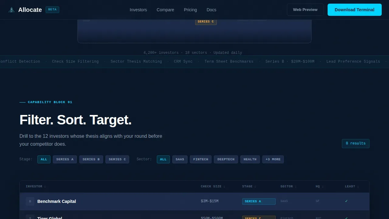
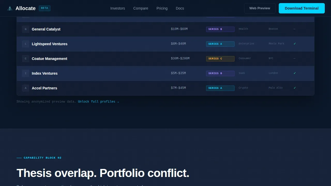
Filterable Investor Comparison Table
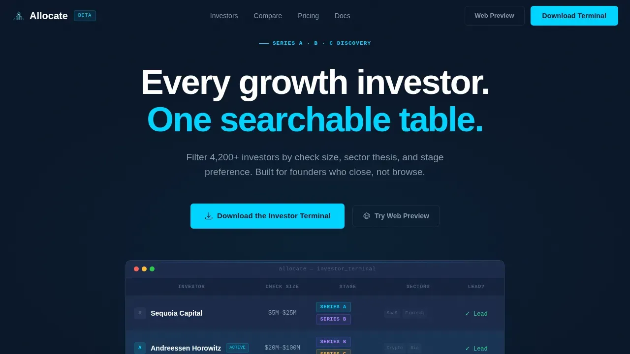
The core comparison page block displays investor profiles in labeled columns: check size, stage, sector, and lead preference. Users can sort and filter the table interactively. A column sort animation triggers on interaction, making the data feel live and responsive. This is the primary tool visitors use to analyze the investor landscape before downloading the app.
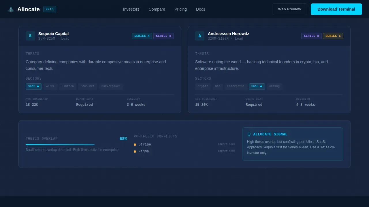
Side-by-Side Investor Profile Comparison
A dedicated comparison block lets visitors place two investor profiles next to each other. It highlights thesis overlap and flags portfolio conflict detection. This side by side comparison format helps founders understand core differences between investors at a glance, supporting faster and more informed decisions during active fundraising.
Interactive Unlock Modal
When a visitor attempts to filter a third column or save a row in the live mini-table, a modal appears: "Unlock full profiles in the app." This friction-light gate lets the platform demonstrate value before asking for a commitment. It is one of the most effective customer acquisition mechanics built into the template structure.
CRM Export and Saved List View
The export block shows a saved investor list ready for output. It demonstrates how users move from comparison to action by connecting their curated investor shortlist to a broader workflow. This section reinforces the platform's value proposition: discovery is only the first step, and the tool supports the full process through to outreach.
Sticky Mobile Call to Action Bar
On mobile, a persistent bottom bar carries the primary call to action: "Download the Investor Terminal." It is paired with App Store and Google Play badges. This element ensures the conversion path stays visible regardless of scroll depth, which is critical for mobile-first users who may be reviewing investor plans late at night.
Glowing Hero with Data-as-Visual Design
The hero section uses no stock photography. Three investor rows with real-looking data columns emerge from a deep navy background. The active row pulses with a soft cyan underglow. This design approach makes the data itself the visual statement, immediately communicating the platform's density and focus to anyone who lands on the page.
Page sections overview
| Section | Purpose |
|---|---|
| Hero with Table | Introduce the platform with a glowing investor table fragment and primary call to action |
| Live Mini-Table | Let visitors filter real-looking investor data and trigger the unlock modal |
| Comparison Block | Show a side-by-side investor profile comparison with thesis and portfolio signals |
| Export and CRM View | Demonstrate how saved investor lists connect to a broader outreach workflow |
| Metrics and Final Call to Action | Display social proof numbers and App Store and Google Play download badges |
Design & branding system
The visual identity follows a Directory and Discovery theme executed through a Midnight Blue color system. The aesthetic reads like satellite imagery of a city at night: vast dark fields punctuated by sharp points of data-light.
- Background is deep terminal navy (#0A1628), card surfaces use desaturated slate (#1B2A4A), secondary text and gridlines render in phantom gray (#8899AA), and electric cyan (#00D4FF) activates on hover states and data highlights
- Typography pairs DM Sans for interface headlines and navigation with JetBrains Mono for all data values, reinforcing the terminal-grade density without sacrificing readability
- Animation is driven by GSAP ScrollTrigger: table row pulse, column sort animation, and a cursor glow effect that radiates from the active table outward into the dark edges
Mobile & speed optimization
The template is built mobile-first, with the sticky bottom call to action bar as the primary conversion element on smaller screens. The desktop path adds a secondary "Try the Web Preview" link for users who want to explore the platform before downloading.
- Server Components handle static sections for consistent load behavior, while Client Components manage the interactive filterable table and modal unlock flow
- The sticky mobile call to action bar remains visible at all scroll depths, keeping the download prompt accessible without interrupting the data browsing experience
- Each section is a discrete capability block, which keeps the page structure modular and easy to adapt for different screen sizes and use cases
How this template helps you convert
A well-structured comparison page serves as a powerful tool in the sales funnel. This template is engineered to guide visitors through a natural progression from curiosity to conviction before they reach the download prompt.
- The hero section establishes the value proposition immediately. The glowing data table signals depth and specificity before the visitor reads a single line of body copy, earning attention in the first second.
- The live mini-table creates a hands-on taste of the product. Visitors interact with real-looking investor data, and the unlock modal appears only after they have already experienced enough value to want more, reducing resistance at the point of conversion.
- The comparison block and export view complete the story. They show that the platform supports the full fundraising process, from building a target list to acting on it, giving visitors the confidence to take the next step and download the app.
Other information about this template
This template sits at the intersection of investor discovery, fintech product design, and growth-stage fundraising strategy. It is built for teams that need a professional digital presence without rebuilding a layout from scratch.
- The allocate investor discovery comparison table landing page template is suitable for platforms that help founders raise capital across Series A through C funding rounds
- B2B SaaS marketing templates like this one help startups create professional collateral quickly without hiring designers, and using structured marketing plans can reduce customer acquisition costs
- Companies with consistent, high-quality investor communications are 40% more likely to secure follow-on funding at favorable terms, making the investor tracking and export sections especially valuable
- Investment performance tracking templates enable users to make informed decisions about portfolio rebalancing and asset allocation, and this template supports that process through its comparison and export blocks
- A good investment proposal includes key components such as a market analysis, business model, financial projections, and a clear solution narrative; this template provides the structural shell for presenting that story to potential investors
- The page is compatible with workflows that already use google sheets for investor tracking, and teams can connect google analytics to monitor visitor behavior and optimize conversion over time
- Advanced integrations with CRM platforms and financial software are supported by the export block's design, which mirrors the output format used in professional investor relations workflows
- The template can support a pitch deck companion strategy, where the landing page handles initial investor discovery and the pitch deck handles the follow-up meeting; both assets align on the same market analysis and financial projections narrative
- Allocation performance metrics and portfolio allocation data can be surfaced through the comparison table columns, giving visitors a data-driven view of how invested capital flows across different fund strategies
- The competitive advantage of this template is its terminal-grade visual density combined with a conversion structure that guides visitors from browsing to acting without requiring them to leave the page
- Free templates in this category tend to offer generic layouts; this template is purpose-built for the growth-stage investor discovery niche, with every section mapped to a real step in the fundraising process
- Valuation context, market size signals, and internal rate of return benchmarks can all be incorporated into the comparison table columns, giving the platform genuine analytical depth
- The ai powered filter logic and the venture capital discovery workflow are natural extensions of the platform's core use case, and the template's structure supports both
- Customer testimonials and institutional social proof, including logos from recognized funds and testimony from respected financial professionals, can be added to the metrics section to strengthen trust signals
- Setting goals for each fundraising round becomes easier when founders can analyze the full investor landscape in one place, rather than managing data across multiple tools
Theme
Directory & Discovery
Creative direction
Spec Sheet
Color system
Midnight Blue
Style
Comparison Table
Direction
App Download
Page Sections
Filterable Investor Comparison Table
Side-by-side Investor Profile Comparison
Interactive Unlock Modal
CRM Export and Saved List View
Sticky Mobile Call to Action Bar
Glowing Hero with Data-as-visual Design
Related questions
Who is this template designed for?
Can I customize the investor table columns?
How does the unlock modal work?
Does this template support a companion pitch deck strategy?
Can the export block connect to a CRM platform?


