Agriculture Report Landing Page Template
Almanac is an editorial agriculture landing page template built for a premium weekly intelligence report. It combines a broadsheet-inspired visual identity with a scroll-driven origin story, a two-column sample excerpt layout, and a waitlist form with a county dropdown and live signup counter. The template is designed to earn trust before asking for commitment.
by Rocket studio
Quick summary
Almanac is a single-page editorial template for an agricultural intelligence report pre-launch. It opens with a bold broadsheet hero, walks visitors through a founder origin story, showcases a sample article excerpt, and closes with a waitlist form. The design draws from century-old land deed aesthetics: aged vellum tones, iron-gall ink type, and rust-colored accents.
Who this template is for
This template is built for agricultural publishers, newsletter founders, and independent agronomic journalists who are preparing a pre-launch waitlist for a premium weekly report. It speaks directly to an audience that values editorial depth over algorithmic summaries.
- County extension agents and grain elevator operators who need actionable yield and policy data
- Fund managers and commodity traders who rely on ground-truth reporting to supplement financial models
- Agricultural media founders launching a subscription-based intelligence dispatch before public release
What problem this template solves
Most agriculture report landing pages fail to demonstrate credibility before asking for a sign-up. They present data without context and copy without conviction. This template solves the trust gap by letting the writing and the editorial method do the persuading.
- Existing ag report pages rarely show readers what they will actually receive before committing
- Founder voice and origin story are absent, leaving visitors with no reason to believe the source
- Generic form pages do not segment early readers by growing zone, making early list data less useful
What you get with this template
You get a fully structured pre-launch landing page that builds toward a waitlist conversion through layered editorial storytelling. Each section earns the next scroll before the ask is made.
- A broadsheet hero section with a stamped serif masthead and a "Coming Soon" dateline label
- A scroll-reveal origin story section that moves from the founder's handwritten notebook phase to the editorial method
- A two-column magazine excerpt layout with marginalia annotations, a live signup counter, a county/region dropdown, and a PDF proof-of-value trigger on form submission
Feature list
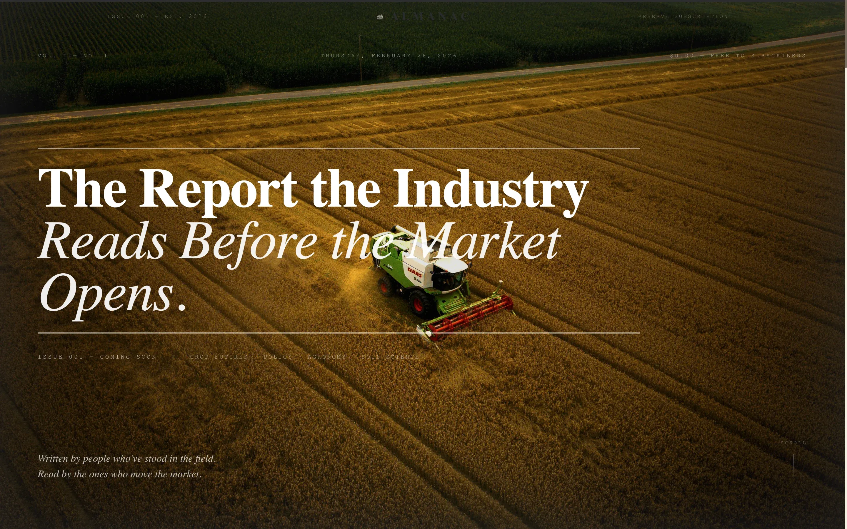
Broadsheet Hero with Stamped Masthead
The header uses a full-width aerial photograph of combine lines cutting through a golden field at dusk. A bold serif headline is pressed into the image like ink on cotton stock. No animation or gradient overlay is applied. The dateline reads "Issue 001, Coming Soon" in a monospaced label style.
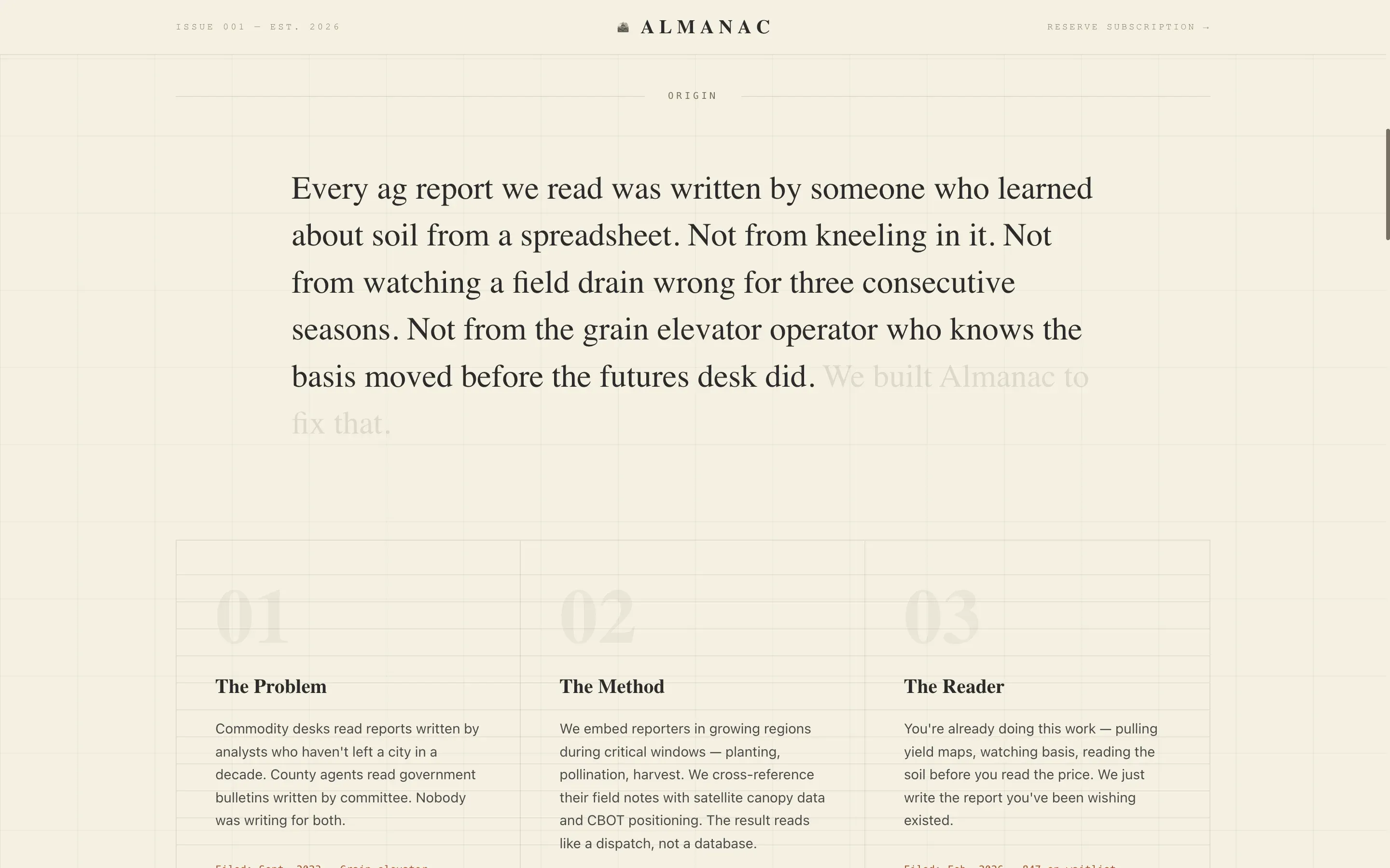
Scroll-Reveal Origin Story
As the visitor scrolls, the founder's handwritten notebook sketches dissolve into typeset paragraphs. The section explains the editorial philosophy: field-level reporting married to satellite analytics. This narrative sequence builds credibility before any conversion element appears.
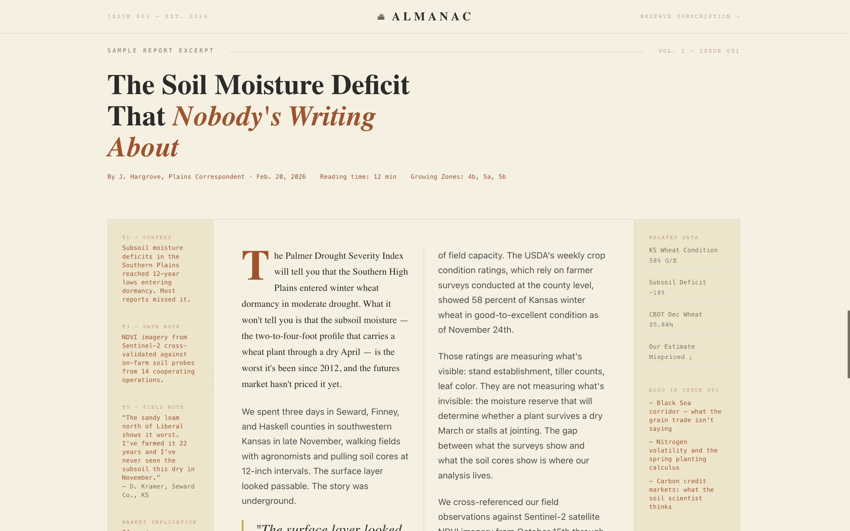
Two-Column Sample Excerpt Layout
A full sample article is presented in a two-column magazine layout. Marginalia annotations appear in the outer column, mimicking the kind of handwritten notes a working agronomist might leave in a field guide. This section lets the writing make the argument for subscription.
Waitlist Form with County Dropdown
The conversion section includes a single email input field paired with a county/region dropdown. Early readers self-segment by growing zone at the point of sign-up. This makes the early waitlist data immediately useful for regional editorial planning.
Live Signup Counter
A running counter displays the current number of waitlist registrations in real time. This social proof element builds urgency without manufactured pressure. It works alongside the reader archetype portraits to reinforce that real professionals are already joining.
PDF Proof-of-Value Delivery
When a visitor joins the waitlist, they immediately receive one complete sample report as a downloadable PDF. This removes the barrier of asking for trust before demonstrating value. The report itself becomes the most persuasive argument for the subscription.
Page sections overview
| Section | Purpose |
|---|---|
| Broadsheet Hero | Establish editorial identity and dateline |
| Origin Story | Reveal founder voice and editorial mission |
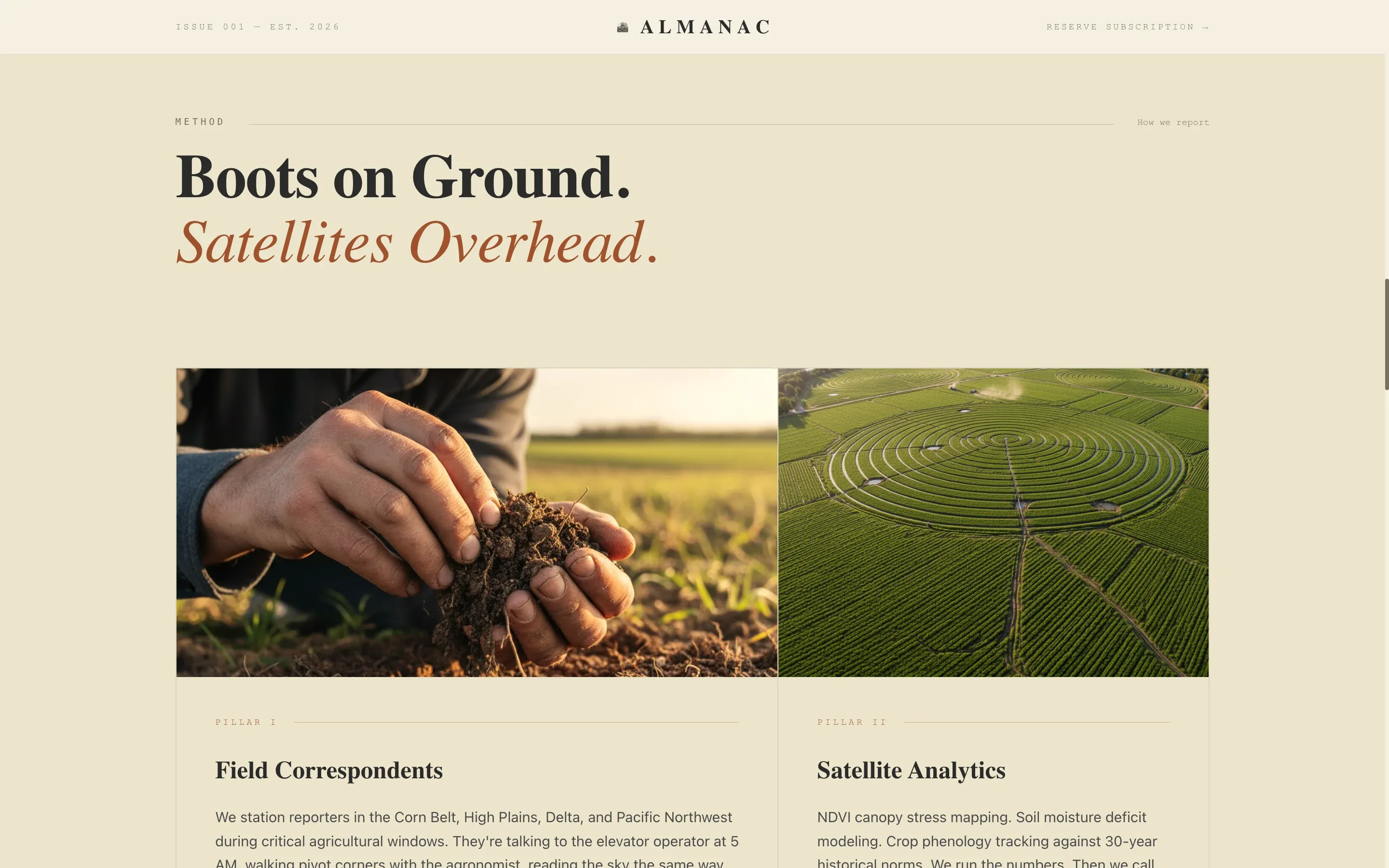
| The Method | Show boots-on-ground plus satellite analytics approach |
| Sample Excerpt | Demonstrate writing quality with annotated layout |
| Waitlist Call to Action | Capture email, region, and deliver PDF proof |
| Footer | Single-row linear links and publication details |
Design & branding system
The visual identity follows an Ink and Paper theme built around a Parchment and Rust color palette. Every design choice reinforces the feeling of a worn, trusted field guide rather than a polished digital product.
- Color palette: aged vellum (#F5F0E1) for backgrounds, iron-gall ink (#2B2B2B) for body text, oxidized fence wire (#A0522D) for accents, and dried wheat stalk (#D4A843) reserved for pull quotes and hover states
- Typography trio: Cormorant Garamond for serif headlines, DM Mono for datelines and labels, and DM Sans for body copy
- Visual texture references a century-old land deed found in a courthouse drawer, yellowed and authoritative at every edge
Mobile & speed optimization
The template is built desktop-first, reflecting its primary audience of county agents at kitchen tables and commodity traders at desks. Mobile layout remains solid and fully readable without compromising the editorial structure.
- Scroll-reveal animations use intersection observer logic to keep interactions lightweight and non-blocking
- All non-form content is structured as static-first server components, keeping page delivery lean
- The two-column magazine excerpt adapts gracefully to single-column display on smaller screens
How this template helps you convert
The page earns the waitlist click through a layered sequence of trust-building before the form ever appears. Each section reduces a specific objection a potential subscriber might have.
- The origin story and editorial method sections address credibility by showing the reporting philosophy in full, so visitors understand who is behind the report and why it is different before they are asked for anything.
- The sample excerpt layout gives away real content in the page itself, and the PDF download on sign-up removes any remaining doubt about editorial quality.
- The county/region dropdown on the waitlist form signals to early readers that the report will be relevant to their specific growing zone, increasing the perceived personal value of joining.
Other information about this template
This template is part of a Blog and Editorial category collection focused on agricultural media and industry report publishing. It is designed for the agriculture industry report blog niche and is well-suited for newsletter founders operating in the commodity and agronomy sector.
- The template style is Editorial/Magazine, following an Origin Story creative direction with a Type Over Image header concept
- The landing page direction is Waitlist/Coming Soon, optimized for pre-launch audience building in the United States market with county-level segmentation
- Imperial measurements, US growing zone references, and USD pricing context are embedded in the editorial framing throughout the template
Theme
Ink & Paper
Creative direction
Origin Story
Color system
Parchment & Rust
Style
Editorial/Magazine
Direction
Waitlist/Coming Soon
Page Sections
Broadsheet Hero with Stamped Masthead
Scroll-reveal Origin Story
Two-column Sample Excerpt Layout
Waitlist Form with County Dropdown
Live Signup Counter
PDF Proof-of-value on Sign-up
Related questions
What type of publication is this template designed for?
Does the template include the PDF sample report content?
Can I customize the county and region dropdown for my growing zones?
Is this template suitable for an ongoing publication, or only a pre-launch?
How do the scroll-reveal animations behave on mobile devices?


