Curated Artisan Marketplace Landing Page Template
Homestead is a hub-and-spoke landing page template built for homesteading blogs. It blends a warm artisan aesthetic with a Japanese Zen color system, a full-viewport hero image, a pinned anchor nav, and a five-question inline quiz that delivers a personalized "First Season Plan" to every visitor. The result is a deeply intentional site that converts curious readers into committed community members.
by Rocket studio
Quick summary
Homestead is a single landing page template designed for homesteading blogs that want to do more than publish post after post. The page opens with a full-viewport kitchen garden photograph and a manifesto headline. A sticky anchor nav guides visitors across five themed content spokes. An inline quiz captures each reader's story and delivers a curated reading path. A footer email form closes the loop with a weekly Almanac letter.
Who this template is for
This template speaks directly to people who have traded spreadsheets for seed catalogs and corner offices for kitchen gardens. It was built for the homesteading blogger who has real knowledge to share and needs a website that matches the depth of that knowledge.
- Suburban escapees managing a half-acre plot and searching for a clear place to start their homestead journey online
- Second-generation farmers reconnecting with root cellar methods and wanting a site that honors family history and land-based wisdom
- Remote workers who closed the laptop and opened a seed catalog, now ready to build an active community around their blog and share what they are learning
What problem this template solves
Most homesteading blog websites scatter their best content across dozens of pages with no clear entry point. New visitors land, feel overwhelmed, and leave before they find anything worth staying for. The result is high bounce rates, low email sign-ups, and a community that never quite forms.
This template solves that problem by organizing every post and resource into five focused content spokes, giving each visitor a single guided path through the site rather than an open-ended archive. The inline quiz removes the guesswork entirely.
- Visitors arrive on a page with clear structure and a benefit-driven headline that immediately connects with their emotions, so they stay and explore instead of leaving
- The quiz transforms passive readers into active participants by answering the question every new homesteader asks: "Where do I begin on my own land?"
- The sticky anchor nav keeps all five content spokes within one click at all times, so no one gets lost searching through menus and buried pages
What you get with this template
You get a fully structured, single landing page that functions as the front door to your entire homesteading website. Every visual, every section, and every interactive element was designed with a specific purpose in mind. The page feels like a conversation between philosophy and practice, never letting visitors settle into passive consumption.
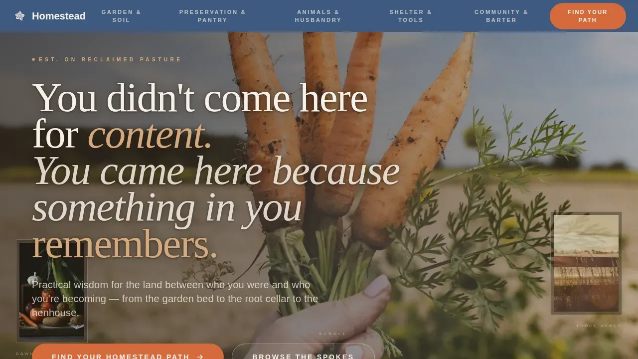
- A full-viewport hero section with a kitchen garden photograph and a manifesto headline set in a heroic warm serif, left-aligned in rice paper cream with a subtle text shadow
- Five hub-and-spoke content sections covering Garden and Soil, Preservation and Pantry, Animals and Husbandry, Shelter and Tools, and Community and Barter, each with article card grids, recipe pulls, and short video loop placeholders
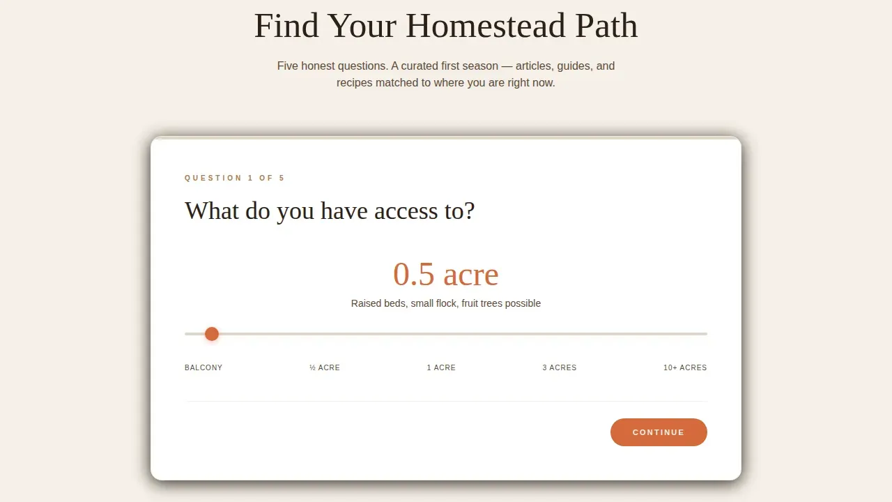
- An inline five-question quiz with illustrated questions, a climate zone selector, an acre count slider, and a results section that delivers a personalized First Season Plan with email capture for a printable PDF
Feature list
This template packages several carefully considered features into one cohesive homestead landing page. Each feature serves a specific purpose in the visitor journey, from the first emotional hit of the hero image to the quiet closing note of the Almanac subscription form.
Full-Viewport Manifesto Hero
The hero section fills the entire browser window with a kitchen garden photograph shot at magic hour. Hands pull a dirt-caked carrot from dark soil. Shallow depth of field blurs a chicken coop and wood-fenced orchard in the background. Over this image, a warm serif headline reads at heroic scale: "You didn't come here for content. You came here because something in you remembers." The text is left-aligned in rice paper cream with a subtle text shadow that lets every word breathe against the photograph. This hero fold is built to create an immediate emotional connection with visitors. It tells your story before a single article card appears on screen.
Pinned Anchor Navigation Bar
A sticky top navigation bar sits in washed indigo and pins to the browser window as soon as visitors scroll past the hero. Each of the five spoke labels is clickable, scrolling the page directly to its corresponding content hub. Implementing a sticky menu this way enhances user navigation dramatically, keeping the full site structure accessible at all times. Visitors never feel lost. The bar is always present and always useful, whether someone is searching through the Garden and Soil section or reading down into Community and Barter.
Inline Five-Question Quiz
The primary call to action on this homestead landing page is a quiz that opens inline rather than as a modal overlay. It asks five illustrated questions: what land access does the visitor have, what subject calls to them first, how their mornings currently begin, what they are most afraid of, and what climate zone they live in. The acre count slider and the image-select grid make the form feel tactile and personal. Results deliver a curated First Season Plan through the blog's spokes, and email capture sends the full plan as a printable PDF. This quiz is the single most powerful conversion tool on the page.
Hub-and-Spoke Content Spokes
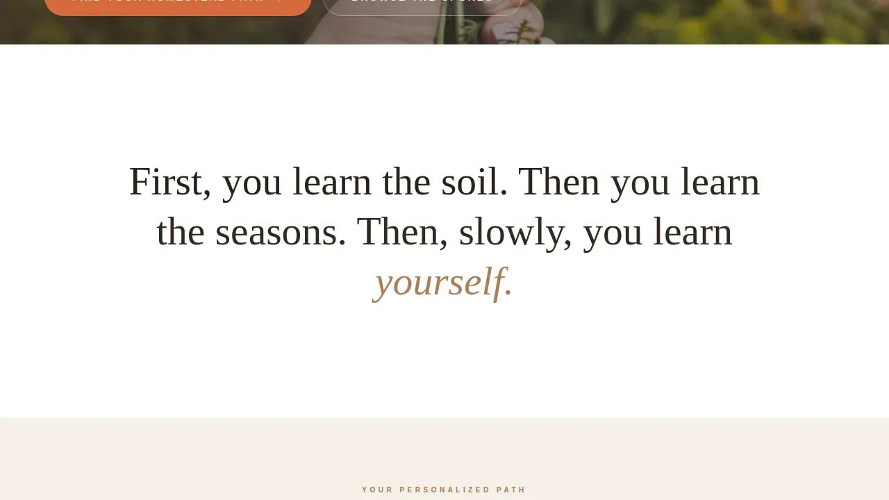
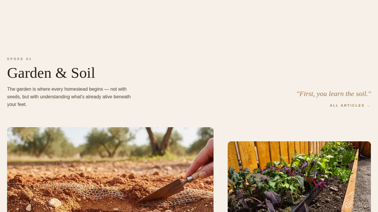
Five themed content hubs fan out beneath the anchor nav like seed packets on a table. Each spoke opens with a short manifesto line that sets the emotional tone, then moves into a dense grid of article card thumbnails, recipe pulls, and short video loop placeholders. The rhythm alternates between quiet philosophy and dense, practical content. Garden and Soil, Preservation and Pantry, Animals and Husbandry, Shelter and Tools, and Community and Barter each form a self-contained world that visitors can explore at their own pace. This structure makes it easy for a blog to showcase its full range of posts and services without overwhelming anyone.
Floating Persistent Call-to-Action Button
After the visitor scrolls past the second content spoke, a floating persimmon button appears and follows them down the page. It invites them to begin the "Find Your Homestead Path" quiz at any point. This persistent element removes the need to scroll back up and keeps the primary conversion action visible without being intrusive. The button disappears once the quiz section is actively in view, so the experience never feels cluttered.
Footer Almanac Subscription Form
The page closes with a charred cedar footer section that frames the email sign-up as a weekly letter rather than a newsletter. The copy calls it the Almanac. This framing matters. A newsletter feels like a broadcast. A letter from a neighbor feels like community. The distinction resonates with readers who are already searching for genuine human connection in the homesteading world. The form is simple: one field, one button, one clear line of expectation-setting copy.
Page sections overview
| Section | Purpose |
|---|---|
| Hero with Manifesto | Opens with full-viewport kitchen garden photo and a heroic serif headline to form an immediate emotional bond with visitors |
| Sticky Anchor Nav | Pins washed indigo nav bar with five spoke labels to the top so visitors can jump to any content hub at any point |
| Inline Quiz Block | Delivers the "Find Your Homestead Path" assessment inline with five illustrated questions and personalized First Season Plan results |
| Garden and Soil | First content spoke with manifesto lead line, article card grid, recipe pulls, and short video loop placeholders |
| Preservation and Pantry | Second spoke covering food preservation, canning, and pantry-building content cards and resources |
| Animals and Husbandry | Third spoke focused on chickens, heritage breeds, and livestock care with article cards and video loops |
| Shelter and Tools | Fourth spoke covering house repair, barns, hand tools, and workshop resources in a card grid format |
| Community and Barter | Fifth spoke centered on neighbors, local food exchange, and building meaningful community around the homestead |
| Floating call to action Button | Persimmon floating button that appears after the second spoke and follows visitors down the page |
| Footer Almanac Form | Charred cedar footer with a single email capture field framed as a weekly Almanac letter subscription |
Design & branding system
The visual identity follows a Warm Artisan theme filtered through a Japanese Zen color system. Every color decision was made to feel restrained, tactile, and deeply warm without tipping into rustic kitsch. The palette feels like a handmade ceramic bowl sitting on a linen cloth beside a window where winter light falls in.
- Rice paper cream (#F5F0E8) dominates the background like stretched canvas; washed indigo (#3D5A80) anchors the sticky nav bar; unglazed clay (#C4956A) warms the section dividers; charred cedar (#2B2118) grounds every line of body text in quiet authority; persimmon (#D46A3C) activates buttons and all interactive states
- Typography pairs Cormorant Garamond at heroic scale for headlines with DM Sans for body text and labels, creating a contrast between ancestral warmth and modern clarity that matches the homesteading subject perfectly
- The layout uses short paragraphs and ample whitespace throughout, making every section easy to scan without clutter, and close-up imagery of hands working the land emphasizes authenticity at every scroll point
Mobile & speed optimization
The template was designed desktop-first with full mobile responsiveness built into every section. Many users access sites via smartphones today, and the template accounts for this across the quiz, the content card grids, and the floating call-to-action button. The sticky nav collapses cleanly on smaller screens so the five spoke labels remain accessible without crowding the viewport.
- Animations use GPU-accelerated CSS transforms only, keeping scroll interactions smooth across devices without heavy rendering overhead
- The inline quiz, the floating button, and the anchor nav are all tested for touch interaction, so the experience on a phone is as intentional as it is on a wide desktop monitor
- Native CSS smooth scroll handles all anchor navigation, removing the need for heavy JavaScript scroll libraries and keeping the page feeling light and responsive
How this template helps you convert
A beautiful homestead landing page that does not convert is just a photograph. Every structural decision in this template was made to move visitors toward a meaningful action: completing the quiz, capturing their email, and beginning a reading path through the blog.
- The hero manifesto headline delivers a benefit-driven emotional hit in the first seconds, connecting with visitors on a personal level before a single article is shown, which keeps them on the page long enough to discover the quiz and the content spokes below
- The inline quiz makes conversion feel like a personal service rather than a form submission, because visitors receive something genuinely useful in return for their email address: a curated First Season Plan built around their own land, climate zone, and interests
- The footer Almanac subscription frames email capture as a weekly letter from a friend rather than a marketing broadcast, which resonates with the community-oriented homesteading audience and produces sign-ups that stay subscribed
Other information about this template
This template sits at the intersection of several important traditions in both homesteading culture and thoughtful web design. Understanding those roots makes it easier to appreciate what the template is doing and why it works.
- The history of homesteading in Indiana reflects a broader story that this template honors. The first European American settlers in Indiana came primarily from Kentucky, North Carolina, Virginia, and Tennessee. Pioneer families raised hogs and grew corn on small family farms. The settlement patterns were characterized by tight-knit communities centered around churches and schools. Early settlers often relied on communal activities like house-raisings and log-rollings to support one another, reflecting the same cooperative spirit that the Community and Barter spoke celebrates today. The Upland South culture shaped how those families related to the land, and that relationship between people and the soil they tend forms the emotional core of this template.
- The act of naming a homestead has always carried deep meaning. Homesteaders throughout history have chosen names that reflect personal stories or family history, honoring loved ones or significant life events. Some names point to the natural features of the land: the trees on the property, the hills behind the house, the creek through the south woods. Others lean into humor or whimsy to express personality. The process of choosing a name is a fun and creative activity for families, and it marks the moment when a piece of land becomes home. This template's design gives that named homestead a professional home on the web as well.
- Naming your homestead website and building it around a clear identity is one of several reasons that a hub-and-spoke structure works so well for this niche. Many families in the homesteading community find that a scattered blog with no clear entry point fails to build the audience it deserves. This template solves that problem by giving every post a home within a spoke and every visitor a guided path through it.
- Community-focused landing pages benefit most when they emphasize family and community themes in both imagery and copy. Social proof on these pages is strengthened by including testimonials with real names and portraits rather than anonymous quotes. The template includes article card thumbnails and quote pull blocks throughout the content spokes for exactly this purpose. Local contact information in the footer supports recognition in specific regions, including homesteading communities across Ohio, Tennessee, and other parts of the country where the land-based lifestyle has deep historical roots.
- Place names carry meaning in the homesteading world. A blog based in southern Ohio may resonate differently with readers than one based in rural Tennessee, and the template's climate zone selector in the quiz acknowledges this geographic reality. Readers from the woods of the north and the warm south alike can find a First Season Plan that fits their specific land and growing conditions.
- The homestead warm artisan hub spoke landing page template is built for content creators who are serious about building both a blog and a community resource. The template features a conversion-focused structure with multiple email opt-in points, a shop-ready content card format, and the clean aesthetic with rustic warmth that suits this audience perfectly. Users can personalize the color palette and typography to reflect their own homestead's identity without altering the underlying structure. The template blends vintage charm with modern restraint, making it suitable for both beginner bloggers and experienced content creators who want a professional site that grows with their audience.
- The template is designed to be approachable and inviting. Short paragraphs, ample whitespace, and a cohesive color palette ensure that every page of content feels comfortable to read. Displaying the process of homesteading through hands-at-work imagery and video loop placeholders demonstrates authenticity to every new visitor who arrives searching for real guidance.
- Article cards within each spoke can be used to sell digital products, link to services, or direct readers toward a course or guide. The footer form and the quiz result screen are both natural points for offering a free digital download as an incentive, which increases email capture rates. Sign-up rates improve further when the incentive is framed as a practical resource rather than a generic gift, and the First Season Plan format accomplishes exactly that.
- The template's social proof elements include article thumbnails, community metrics, and quote pulls that can be gathered from real reader responses over time. As the blog grows, these elements fill in naturally and build trust with every new visitor who arrives on the site. Active community members who share their own homestead stories add credibility that no single author voice can achieve alone.
- This template can support a business that sells homesteading products, workshops, or digital guides alongside the editorial content. The card grid format within each spoke is well-suited to showcasing both posts and products in the same visual language. Readers do not notice a hard line between content and commerce because the design treats both as part of the same useful, honest resource.
Theme
Warm Artisan
Creative direction
Manifesto
Color system
Japanese Zen
Style
Hub & Spoke (Anchor Nav)
Direction
Quiz/Assessment
Page Sections
Full-viewport Manifesto Hero Section
Pinned Five-spoke Anchor Navigation
Inline Homestead Path Quiz
Hub-and-spoke Content Card Grids
Floating Persistent Call to Action Button
Footer Almanac Email Form
Related questions
Who is this template best suited for?
Does the quiz work out of the box?
Can I rename the five content spokes to fit my homestead topics?
Is this template suitable for a homestead with chickens, a kitchen garden, and a small orchard?
Can I use this template to grow an email list for my homesteading community?



