Auto & Mobility Blog Blog Website Template
Apex is a single-page editorial landing page built for motorsport blogs that demand depth over noise. The asymmetric 60/40 grid, Japanese Zen color palette, and lead-generation structure work together to present your analytical voice with authority, then convert serious readers into newsletter subscribers through a focused "Get the Debrief" email capture flow.
by Rocket studio
Quick summary
Apex is a precision-crafted editorial landing page for motorsport and auto racing blogs. It pairs a stark, full-bleed serif hero with a disciplined 60/40 asymmetric grid to showcase deep analytical content. The page moves readers from philosophy to proof, then captures them with a minimal email form promising weekly post-race analysis.
Who this template is for
This template is built for writers and editors who treat motorsport as a discipline, not a pastime. It suits creators who want their editorial voice to carry the same weight as the data they publish.
- Sim racers and weekend karting enthusiasts running content-led newsletters
- Armchair strategists and technically obsessed fans building a loyal readership
- Independent motorsport journalists seeking a professional editorial home online
What problem this template solves
Most blog templates are built for lifestyle content. They lead with hero images, bold color blocks, and generic call-to-action buttons that feel out of place for a serious analytical publication. Apex removes that mismatch entirely.
- Generic templates dilute the editorial identity of niche, data-driven motorsport writing
- Readers who arrive for depth leave when the page feels shallow or visually cluttered
- Converting casual visitors into newsletter subscribers requires trust, built through craft before asking for an inbox
What you get with this template
You get a complete single-page layout designed for editorial authority and newsletter lead generation. Every section has a defined role, from the philosophy-setting hero down to the archive preview that earns trust before the final ask.
- A full 60/40 asymmetric grid layout with a manifesto column and a margin-notebook timeline column
- A minimal two-field email capture form embedded at scroll midpoint and repeated as a fixed bottom bar after 60 percent scroll depth
- Five distinct content sections plus a linear single-row footer, ready to populate with your editorial material
Feature list
A short paragraph introduces what makes this feature set distinct. Every component below comes directly from the template structure. Nothing is speculative.
Giant Centered Serif Hero
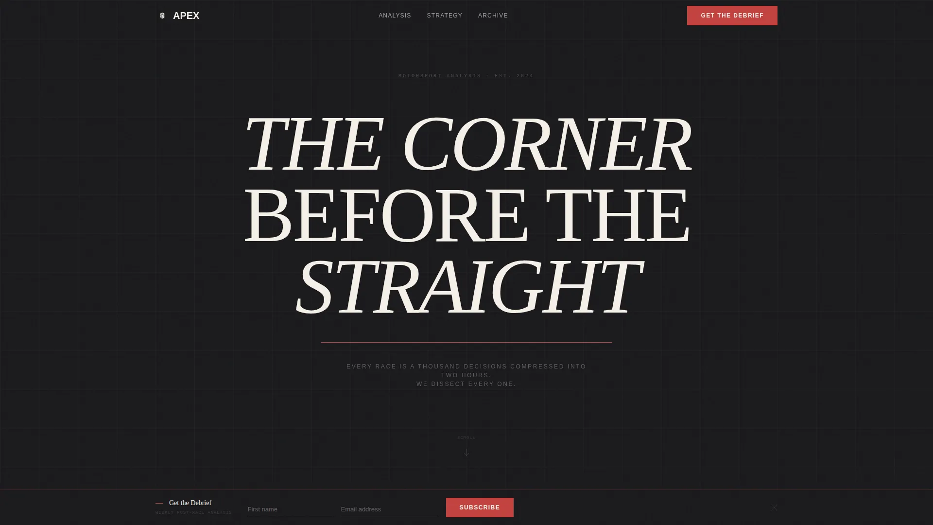
The hero section uses an enormous Fraunces serif headline set in washi cream against a full-bleed sumi ink black background. A thin vermillion rule sits beneath the headline, and a single tracked-out sans-serif subline states the blog's thesis. No imagery, no video, just typographic authority and deliberate negative space.
Asymmetric 60/40 Editorial Grid
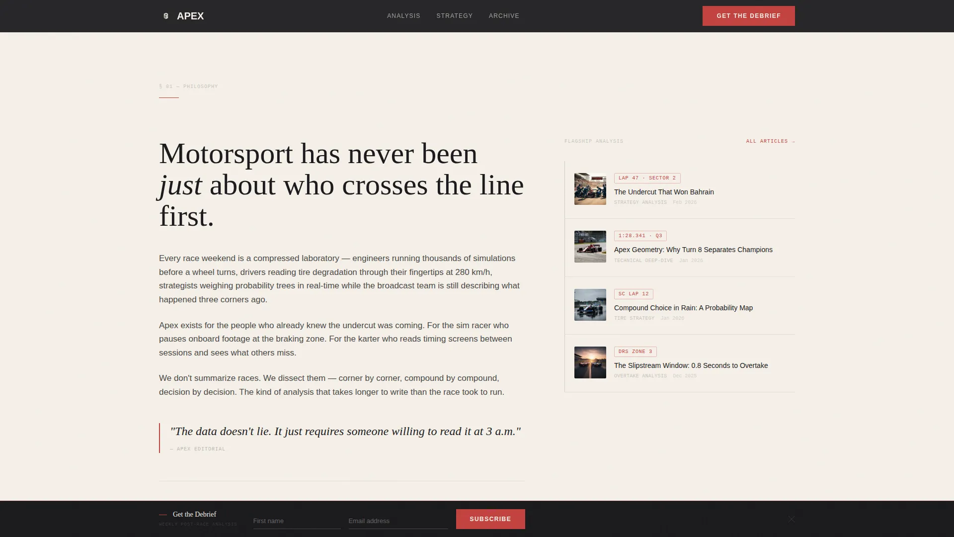
The manifesto section splits into a 60-column for longform editorial text and a 40-column for a vertical article timeline with thumbnail crops and lap-time data points. This layout keeps primary content dominant while secondary navigation sits in the margin like a race engineer's notebook.
Inline and Fixed Email Capture
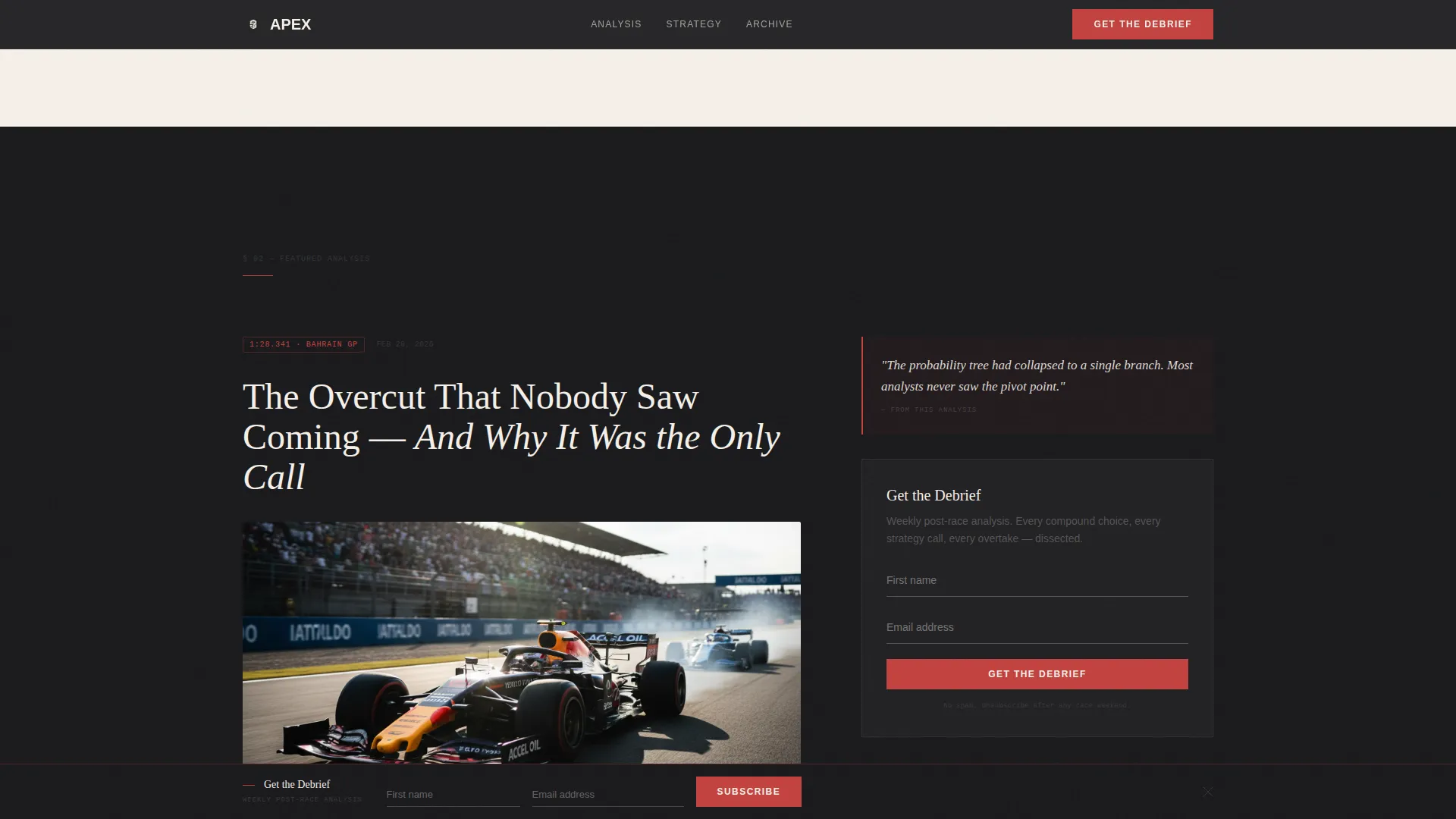
The "Get the Debrief" call to action appears twice. First as an inline form embedded after the strongest editorial sample, asking only for a first name and email address. Then as a fixed bottom bar that appears after 60 percent scroll depth, keeping the conversion path visible without interrupting reading.
Mission Bento Grid
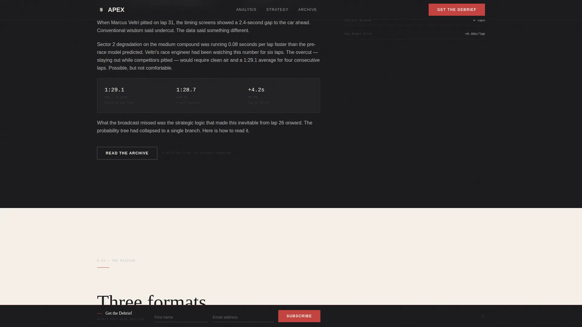
An asymmetric bento-style section presents the blog's three content pillars: weekly race breakdowns, technical deep-dives, and strategy simulations. Each cell has its own visual weight, reinforcing the range of analytical work the publication covers.
Archive Preview with Trust Path
Three full article cards give skeptical visitors a sample of the writing craft before any commitment is requested. A secondary "Read the Archive" call to action sits alongside, offering a low-pressure path for readers who need more proof before subscribing.
Scroll-Triggered Animations
Character reveal animations and scroll-triggered fades add kinetic rhythm without overwhelming the minimal aesthetic. The fixed bottom bar activates at the 60 percent scroll threshold, timed to appear when reader intent is highest.
Page sections overview
| Section | Purpose |
|---|---|
| Hero Headline | Sets editorial authority and blog thesis |
| Manifesto 60/40 | Introduces voice and article timeline |
| Featured Analysis | Showcases editorial sample with inline form |
| Mission Bento Grid | Outlines weekly, technical, and strategy content |
| Archive Preview | Builds trust with three article cards |
| Linear Footer | Delivers single-row closing navigation |
Design & branding system
The visual identity follows an Atelier Studio approach rooted in Japanese Zen minimalism. Every color and type choice is deliberate, and negative space is treated as an active design element, not empty real estate.
- Four-color palette: washi paper cream (#F5F0E8), sumi ink black (#1A1A1D), stone garden gray (#4A4A48), and torii vermillion (#C3423F) reserved for accent lines, active states, and the primary call to action
- Typography trio: Fraunces for serif display headlines, Manrope for sans-serif body text, and JetBrains Mono for lap-time data and race statistics
- Alternating section backgrounds between washi cream and sumi black, with body text adapting to stone gray on light sections and cream on dark
Mobile & speed optimization
The template is designed desktop-first to match the large-screen habits of sim racers and analysts, with full mobile support included. The layout adapts without losing the editorial hierarchy that makes the desktop experience feel considered.
- The 60/40 grid stacks cleanly on smaller screens, keeping the manifesto column primary
- Scroll-triggered interactions and the fixed bottom bar are supported across device sizes
- Server Components handle static content sections, keeping JavaScript usage minimal throughout
How this template helps you convert
The page is structured as a trust-building funnel. Philosophy comes first, proof follows, and the ask arrives only after the reader has been given real value. This sequence is built into the template's section order.
- The manifesto and featured analysis sections demonstrate editorial depth before any form appears, earning attention through craft
- The inline email capture form arrives at the natural scroll midpoint, directly after the strongest content sample, reducing friction at peak engagement
- The fixed bottom bar re-engages readers who scroll past the inline form, maintaining a visible conversion path without disrupting the reading experience
Other information about this template
This template is a strong fit for content creators who already have a defined editorial voice and want a visual identity that matches their analytical ambition. It is built for a single-page flow and does not include multi-page routing or a content management system connection.
- The archive preview section supports three article cards; expanding this count would require layout customization
- Social proof elements are built into the layout, including article timestamps, lap-time data points, and a reader count metric display area
- The template is categorized under Blog and Editorial, specifically the Auto Racing and Motorsport Blog niche, making it a precise fit for that audience
- Animation intensity is set to medium, using character reveals and scroll-triggered fades that suit the disciplined pace of the editorial content
Theme
Atelier Studio
Creative direction
Vision & Mission
Color system
Japanese Zen
Style
Asymmetric Grid (60/40)
Direction
Lead Generation
Page Sections
Giant Centered Serif Hero
Asymmetric 60/40 Grid Layout
Dual-point Email Capture Flow
Mission Bento Grid Section
Archive Preview Trust Path
Scroll-triggered Animation System
Related questions
What kind of blog is this template designed for?
How does the email capture work on this landing page?
Can I use this template if I am just starting my motorsport blog?
Is this template suitable for desktop-heavy audiences?
What sections are included in this landing page template?



