Local Legal & Policy Blog Blog & Content Website Template
Briefs is a hub and spoke legal journalism landing page built for editorial brands that take the law seriously. It opens as an open-book tableau, unfolds through five anchor-navigated chapter sections, and closes with an adaptive legal fluency quiz. The Parchment and Rust color system and Cormorant Garamond typography give every scroll a lamplit, law-library feel that builds trust before asking for anything.
by Rocket studio
Quick summary
Briefs is a single-page editorial hub designed for legal news and analysis publishers. It delivers law review depth with Sunday longread accessibility across five anchor-navigated chapters. The landing page earns reader trust through philosophical editorial sections, margin-annotation testimonials, and a curated archive grid before inviting visitors into an adaptive legal fluency quiz that converts through intellectual engagement rather than pressure.
Who this template is for
This landing page is built for legal editorial brands, independent legal journalists, and law-focused media publishers who want a home that feels as considered as their writing. It suits publishers who serve readers ranging from junior associates to senior in-house counsel.
- Junior associates and law students who need precedent explained clearly and without condescension
- In-house counsel scanning for regulatory exposure before high-stakes meetings
- Legal journalists, editors, and freelance writer contributors building a credible editorial brand online
What problem this template solves
Most legal content websites look like a law firm website built in a rush: generic layouts, unclear editorial identity, and calls to action that push before they earn trust. This landing page solves that problem by making the editorial philosophy visible from the first scroll, so casual visitors understand the publication's value before they are ever asked to subscribe.
- Readers arrive without context and leave before the writing proves its worth
- Most firms and editorial publishers miss the chance to turn casual visitors into loyal subscribers because the page fails to build trust early
- There is no structured process for communicating sourcing rigor, editorial standards, and reader community in a single cohesive flow
What you get with this template
You get a fully structured hub and spoke landing page that guides visitors through five named chapters using a scroll-triggered anchor ribbon navigation. Every section is designed to build credibility and then convert through a quiz rather than a hard sell.
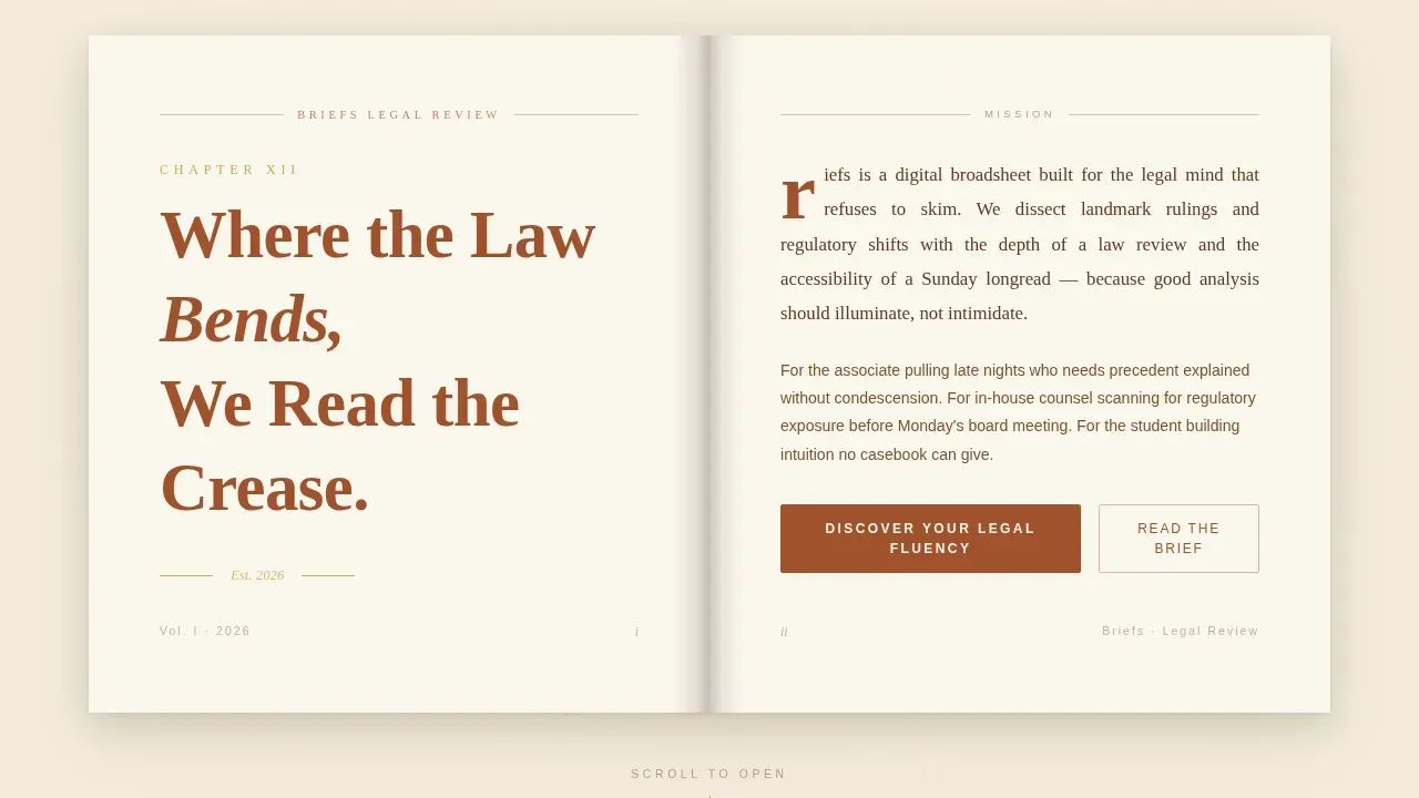
- An open-book hero tableau with cursor-reactive paper grain, chapter number display, dropped-cap mission statement, and a gutter shadow dividing the spread
- Five anchor-navigated chapter sections: Our Lens, Our Standard, Our Readers, Our Archive, and Our Invitation, each with page-turn fade transitions and brass-accented pull-quote blockquotes
- An adaptive five-step legal fluency quiz that opens without requiring an email, then offers a soft modal for full results and a weekly brief after the assessment is complete
Feature list
This landing page packs deliberate editorial and conversion craft into every section. Below are the key elements that make it work.
Chapter Book Hero Tableau
The hero opens as a full-viewport open-book spread. The left page displays a hand-lettered chapter number and a serif headline. The right page holds a short mission paragraph in justified type with a dropped cap. A gutter shadow runs down the center, and the paper grain shifts subtly as the cursor moves, as though lamplight is playing across the page. This compelling headline format communicates the firm's expertise and editorial voice before a single scroll.
Scroll-Triggered Anchor Ribbon Navigation
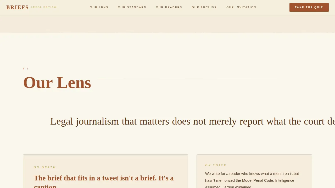
No navigation is visible on arrival. After the first scroll, the anchor ribbon slides in from the top like a bookmark. It stays visible as users move through sections, giving clear navigation between all five chapters without cluttering the opening tableau. This approach mirrors how a sticky sidebar keeps key actions accessible without overwhelming the reading experience.
Brass-Accented Pull Quote System
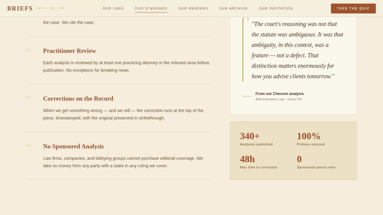
Throughout the page, pull quotes appear inside brass-accented blockquotes styled as if penciled by a prior reader. These act as visual anchor points that break up long editorial passages. They also serve as natural trust signals, reinforcing sourcing rigor and editorial principles in a format that feels organic rather than promotional.
Margin Annotation Testimonial Section
The Our Readers chapter presents client testimonials styled as margin annotations, complete with reader names and roles. This format transforms social proof into something that feels hand-authored rather than curated. Client testimonials presented this way build trust more naturally than a standard review carousel, and named reader roles add the credibility that potential clients and new readers need to commit.
Landmark Archive Bento Grid
The Our Archive chapter displays a curated grid of landmark legal analyses. The bento grid layout gives visitors a fast visual scan of the publication's depth and range across practice areas including constitutional law, corporate law, criminal matters, regulatory shifts, family law, personal injury cases, and intellectual property. Case studies and archived analyses visible here act as proof of the publication's sustained editorial standard.
Adaptive Legal Fluency Quiz
The Our Invitation chapter anchors the primary conversion mechanism. The quiz opens with a single warm question about which area of law the visitor finds most pressing, then progressively reveals five scenario-based questions that adapt in complexity. No email is required to start. After results are generated, a soft modal offers the full analysis and a weekly brief, asking only for email address and role. This process respects the reader's intelligence and earns the click before requesting anything in return.
Page sections overview
| Section | Purpose |
|---|---|
| Hero Book Tableau | Opens full-viewport open-book spread with cursor-reactive paper grain, chapter number, serif headline, and dropped-cap mission paragraph |
| Our Lens Chapter | Explains editorial philosophy and why legal journalism matters; sets the intellectual tone |
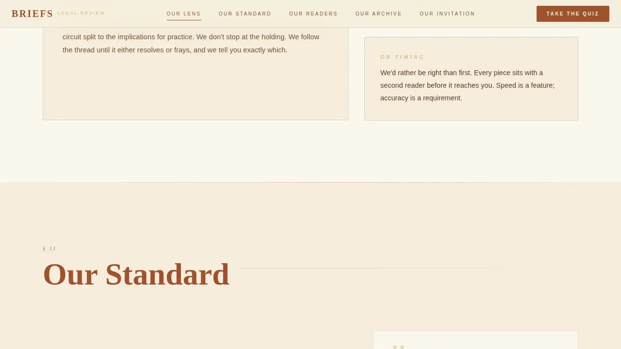
| Our Standard Chapter | Details sourcing rigor and editorial principles using brass pull-quote blockquotes |
| Our Readers Chapter | Presents testimonials styled as margin annotations with named reader roles for social proof |
| Our Archive Chapter | Curated bento grid of landmark analyses spanning multiple practice areas |
| Our Invitation Chapter | Hosts the adaptive legal fluency quiz and soft email capture modal |
| Footer Arc Split | Logo and tagline on the left, navigation links on the right |
Design & branding system
The Warm Artisan theme places aged vellum as the dominant background tone, with rust bleeding into section dividers and brass appearing only where the eye needs pulling. Typography pairs Cormorant Garamond for display and DM Sans for interface text, creating a strong contrast between editorial depth and functional clarity.
- Color palette: aged vellum (#F5EDDC) background, deep rust (#A0522D) for headlines and anchor highlights, worn leather brown (#5C3A21) for body text and borders, tarnished brass (#C9A84C) for hover states and pull-quote marks
- Typography: Cormorant Garamond for all display headlines and pull quotes; DM Sans for body text, navigation labels, and quiz interface elements
- Animation and texture: cursor-reactive parallax on the hero paper grain, scroll word-reveal entrances, page-turn fade transitions between chapters, and staggered section entry animations throughout
Mobile & speed optimization
The template is built desktop-first to suit the late-night reading context of its primary audience: junior associates and law students working after hours. Mobile responsiveness is layered in so the editorial experience holds across all screen sizes.
- Layout adapts cleanly from the wide open-book hero to a single-column reading flow on smaller screens
- Animations use native CSS scroll behavior and IntersectionObserver triggers to keep rendering smooth without heavy JavaScript overhead
- Mobile optimization ensures the anchor ribbon, quiz modal, and archive grid all remain functional and legible on touch devices
How this template helps you convert
A well-structured law firm landing page drives one specific desired action. This landing page is built around the same principle: every section builds toward quiz completion and email capture, in a process that earns trust before requesting anything.
- The five-chapter editorial arc builds credibility and reader investment across Our Lens, Our Standard, Our Readers, and Our Archive before the quiz call to action appears, so visitors arrive at the conversion point already persuaded
- The adaptive quiz functions as the primary call to action, making visitors feel intellectually seen rather than sold to, which increases the likelihood that casual visitors complete the flow and provide their email for the full results
- The soft post-quiz modal presents a simple form asking only for email and role, reducing friction and following the same principle that a clear, informative consultation form on a landing page increases submissions
Other information about this template
This template is built for a specific intersection of legal journalism craft and digital publishing effectiveness. Several additional points are worth noting for publishers and editorial teams evaluating this template.
- The editorial hub structure makes it straightforward to create landing pages for specific practice areas, such as a separate landing page for regulatory coverage or a separate landing page dedicated to family law analysis, without disrupting the main hub flow
- The anchor ribbon navigation supports multiple calls to action placed at each chapter transition, giving users multiple entry points to the quiz and reducing the drop-off that most firms and publishers experience on long-form pages
- Attorney bios and author credentials can be incorporated into the Our Standard section to establish authority, following the principle that short bios of journalists and attorneys help build credibility on legal journalism sites
- The bento archive grid supports high quality images alongside case headlines, reinforcing the fact that high-quality imagery on a law firm landing page reinforces credibility and supports brand authority
- The quiz can support lead generation goals beyond newsletter sign-up: the role selection in the post-quiz modal (Student, Associate, Counsel, Curious Citizen) allows publishers to segment their audience for targeted content marketing and direct messaging campaigns
- The template supports trust badges and credential markers in the footer and Our Standard section, which strengthen authority and reinforce legitimacy in the same way trust signals do on strong law firm landing pages
- Publishers running Google Ads campaigns to specific legal topics can point traffic to a separate landing page variant built from this template's quiz section, improving the quality score of those campaigns by tightening the match between ad copy and landing page intent
- The Briefs authoritative legal journalism hub landing page template is designed to serve legal editorial publishers who want law review depth paired with accessible, modern digital publishing standards
Theme
Warm Artisan
Creative direction
Vision & Mission
Color system
Parchment & Rust
Style
Hub & Spoke (Anchor Nav)
Direction
Quiz/Assessment
Page Sections
Chapter Book Hero with Cursor Parallax
Scroll-triggered Anchor Ribbon Navigation
Brass Pull-quote Blockquote System
Margin Annotation Testimonial Display
Landmark Analysis Bento Archive Grid
Adaptive Five-step Legal Fluency Quiz
Related questions
Who is this landing page template designed for?
Does the quiz require visitors to provide an email upfront?
Can I adapt the archive section to cover different areas of law?
Is this template suitable for driving traffic from paid campaigns?
How does the testimonial section build reader trust?



