Assay - Precision Biotech Landing Page Template
Assay is a scroll-reveal landing page template built for biotech pre-seed startups. It pairs a Tech Glass visual identity with a Feature Matrix creative direction to present multiplex immunoassay platform data in a precise, high-trust format. The layout is optimized to move qualified investors, pharma business development leads, and research scientists toward a single gated data-room call to action.
by Rocket studio
Quick summary
Assay is a single-page, scroll-reveal landing page template designed for biotech pre-seed startups. It leads with a high-fidelity product render, builds credibility through an animated capability comparison grid, and drives qualified visitors toward one clear action: requesting the data package. Every design decision reinforces precision, restraint, and technical confidence.
Who this template is for
This template is built for early-stage life-science companies that need to communicate deep technical differentiation to a sophisticated audience. It is not a general-purpose startup template. It speaks the language of validation data, limit of detection, and platform integration before it ever asks for a click.
- Biotech pre-seed founders pitching multiplex diagnostic or immunoassay platforms to venture partners and life-science investors
- Pharma business development leads evaluating platform acquisitions who need hard performance numbers before a conversation
- Translational research principal investigators assessing whether a new assay technology fits existing liquid-handling workflows
What problem this template solves
Most startup landing pages dilute technical credibility with lifestyle photography and vague benefit claims. For a biotech pre-seed company, that approach repels exactly the audience it needs. Sophisticated investors and pharma partners do not respond to aspirational copy. They respond to data.
- The template removes the credibility gap between a startup's actual performance and how it presents online
- It replaces generic hero sections with a product-first render and real performance numbers visible before any scroll
- It structures the persuasion arc so that each scroll reveal adds a new technical proof point, making the data room request feel earned rather than premature
What you get with this template
You get a fully structured, single-page layout that moves from product render to performance comparison to gated call to action in one continuous, purposeful flow. The design system is pre-configured and every section serves the conversion goal.
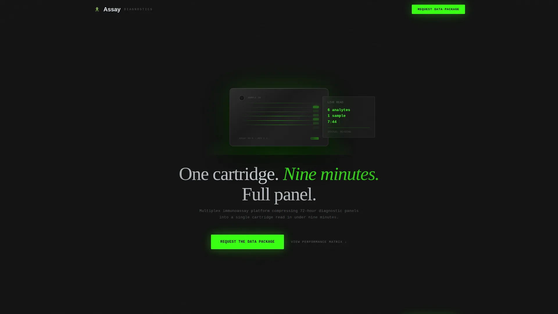
- A product screenshot header section featuring a cartridge-and-reader render on a deep graphite field with a reactive-green emission glow and a monospaced live-read data overlay
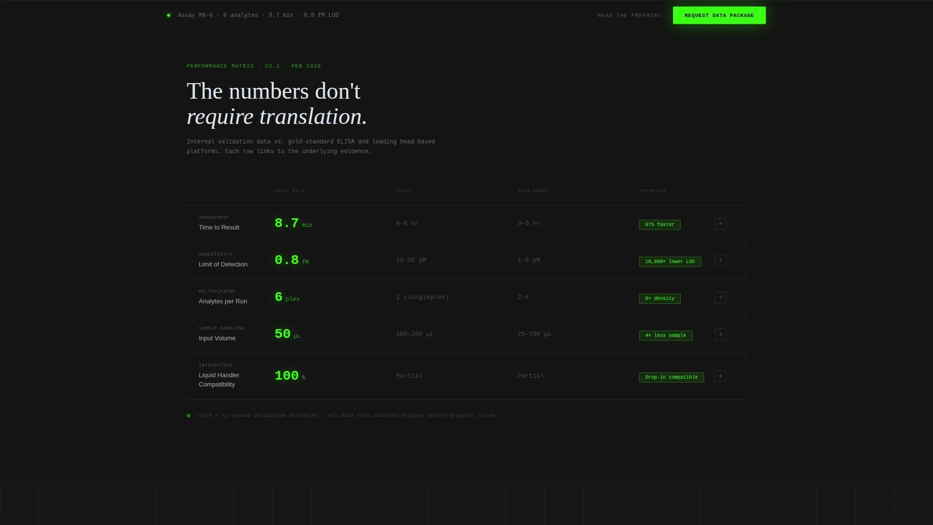
- A scroll-triggered Feature Matrix section that animates platform metrics row by row, comparing throughput, sensitivity, sample volume, and time-to-result against legacy enzyme-linked immunosorbent assay and competing bead-based platforms
- A persistent bottom call to action bar that locks in after the second scroll reveal, keeping the "Request the Data Package" action visible throughout the remainder of the page
Feature list
A brief overview of what makes this template technically and strategically distinct from a standard startup page.
Scroll Reveal Progressive Layout
The page uses a scroll reveal progression, not a static layout. Each section enters the viewport on cue, building the technical case step by step. The pacing mimics the logic of a scientific argument: establish the finding, add supporting evidence, invite the next action.
Animated Feature Matrix with Metric Rows
Each scroll tick reveals a new row in an expanding capability grid. Numbers animate in as the row enters the viewport, green digits against carbon backgrounds. This makes the performance comparison feel live rather than static, which holds attention longer at the critical decision point.
Product Screenshot Header
The header opens with a high-fidelity cartridge-and-reader render floating on a pure graphite field. A soft green emission glow suggests an active assay read. A monospaced data readout displays real platform metrics. The tagline fades in two seconds after load, giving the visual time to register first.
Persistent Bottom call to action Bar
After the second scroll reveal, the primary call to action locks into a slim bar at the bottom of the viewport. Visitors never lose sight of the next step, regardless of how deep they scroll into the comparison data.
Expandable Footnote Links per Metric Row
Each metric row in the capability grid links to an expandable footnote citing internal validation data. A secondary text link, "Read the preprint," sits beside each validation row. This dual-evidence structure accommodates visitors who require published proof before they will engage.
Click-Through Gated Data Room Routing
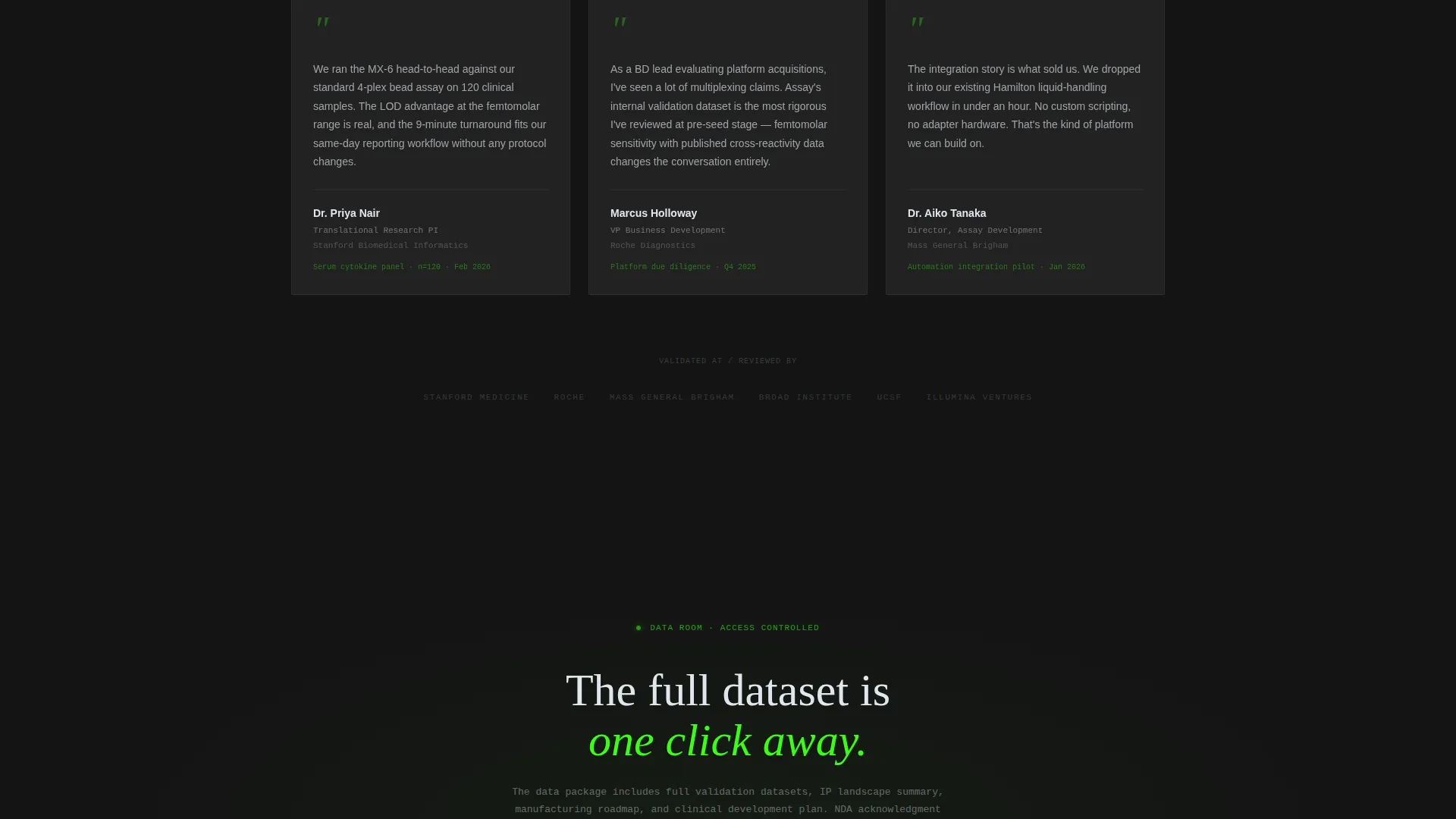
There is no form on this page. The primary call to action routes directly to a gated landing that handles the NDA acknowledgment, email capture, firm name, and role selector. The landing page earns the click first by showing real performance numbers, then passes a qualified, motivated visitor to the gate.
Page sections overview
| Section | Purpose |
|---|---|
| Header product render | Establishes platform identity and live-read data immediately on load |
| Primary call to action block | Drives the first "Request the Data Package" click below the header |
| Speed advantage row | Introduces the time-to-result comparison as the first scroll reveal |
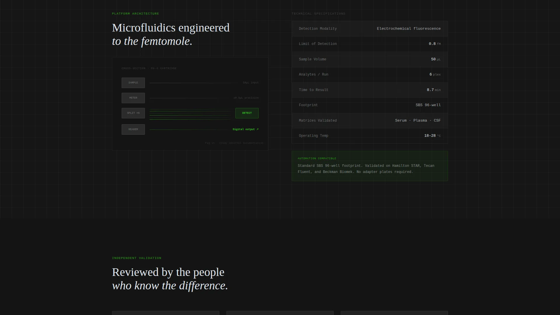
| Sensitivity metric row | Animates femtomolar limit-of-detection data against legacy benchmarks |
| Multiplexing density row | Presents analyte count and sample volume advantages in the grid |
| Automation integration row | Shows compatibility with standard 96-well liquid-handling workflows |
| Persistent call to action bar | Locks the primary action into a slim bottom bar after the second reveal |
Design & branding system
The visual identity uses a Tech Glass theme built on a Carbon Fiber color system. The palette feels like holding a matte-black diagnostic cartridge up to fluorescent lab light. Every color assignment has a specific function, and nothing is decorative.
- Background layers stay in the deep graphite (#141414) to woven carbon (#2B2B2B) range; body text uses borosilicate glass-white (#E0E7EE) for high contrast without harshness
- The reactive-green accent (#39FF14) appears on no more than one element per viewport, reserved exclusively for interactive states, animated data digits, and the primary call to action so it reads like a positive control signal every time it appears
- Typography uses monospaced type for data readouts and platform metrics, reinforcing a lab-instrument aesthetic that resonates with the technical audience
Mobile & speed optimization
The scroll reveal architecture is designed to perform cleanly across screen sizes. The Feature Matrix rows reflow gracefully on smaller viewports so the comparison data stays readable without horizontal scrolling.
- Section-by-section reveal pacing is structured to work on touch-scroll devices, ensuring the progressive animation logic functions as intended on mobile
- The single-page layout and absence of embedded forms reduce page weight, keeping load time lean for visitors arriving from investor emails or conference links
- The persistent bottom call to action bar adapts to mobile screen real estate, maintaining visibility without obscuring the content rows underneath
How this template helps you convert
The conversion strategy is deliberate and sequential. The page does not ask for anything until it has given enough to justify the ask.
- The header renders the product as the first impression, putting real performance numbers in front of the visitor before a single line of marketing copy appears, which establishes credibility immediately with a technical audience.
- The Feature Matrix builds a cumulative technical case across multiple scroll reveals, raising the evidence bar with each row until the remaining question is simply how to get access, at which point the persistent call to action bar is already visible and waiting.
Other information about this template
This template is part of the Startup and Launch category, specifically designed for the Biotech Pre-Seed Startup niche. It is a strong fit for founders who need a high-trust first impression before a pitch deck conversation.
- The template style is Scroll Reveal (Progressive), the theme is Tech Glass, the color system is Carbon Fiber, the creative direction is Feature Matrix, the header concept is Product Screenshot, and the landing page direction is Click-Through
- The page is intentionally minimal in copy volume. The design trusts performance data to carry the persuasion weight, which aligns with how life-science investors and pharma business development professionals actually evaluate early-stage platforms
- Because the call to action routes to a separate gated landing rather than embedding a form, the Assay template stays focused and fast, with no friction before the qualifying step
Theme
Tech Glass
Creative direction
Feature Matrix
Color system
Carbon Fiber
Style
Scroll Reveal (Progressive)
Direction
Click-Through
Page Sections
Scroll Reveal Progressive Layout
Animated Feature Matrix Grid
Product Screenshot Header
Persistent Bottom Call to Action Bar
Expandable Footnote and Preprint Links
Click-through Data Room Routing
Related questions
Does this template include the gated data room page?
Can I replace the cartridge render with my own product imagery?
Is this template suitable for a platform that is not an immunoassay product?
How do I update the performance numbers in the comparison grid?
How does the reactive-green accent behave on mobile screens?



