Assay - Rapid Biotech Landing Page Template
Assay is a bento grid landing page template built for Series A biotech startups. It showcases a wet-lab platform that compresses target validation from twelve months down to ninety days using CRISPR screening arrays and machine-learning hit-calling. The design uses a surgical Monochrome Steel palette with a live interactive header dashboard that puts the product front and center before the visitor scrolls.
by Rocket studio
Quick summary
Assay is a single-page bento grid landing page template designed for Series A biotech startups. It leads with a live hit-calling dashboard in the header, organizes platform capabilities into comparison-driven tiles, and guides scientifically minded visitors toward one clear action: running a screen. Every design choice prioritizes signal over decoration.
Who this template is for
This template is built for a very specific founder. If you are a Chief Scientific Officer at a Series A biotech company with a lead program stuck in phenotypic screening, this page speaks your language directly.
- Biotech founders and CSOs preparing board decks with tight runway timelines
- Wet-lab platform teams who need to communicate speed and scientific rigor at once
- Early-stage life science startups replacing legacy CRO workflows with proprietary technology
What problem this template solves
Traditional landing pages rely on stock photography and generic copy. They cannot communicate the difference between a twelve-month CRO engagement and a ninety-day CRISPR screening sprint. Assay solves this gap by making the product the hero, not a placeholder image.
- Visitors leave pages that cannot quickly prove scientific credibility
- Comparison context is buried in PDFs instead of visible on the page
- Lead capture forms ask the wrong questions and lose qualified pipeline contacts
What you get with this template
You get a fully structured bento grid landing page where every tile is a proof point. The layout is built around contrast: legacy timelines versus Assay speed, manual constructs versus automated guide libraries, spreadsheet triage versus machine-learning ranked outputs.
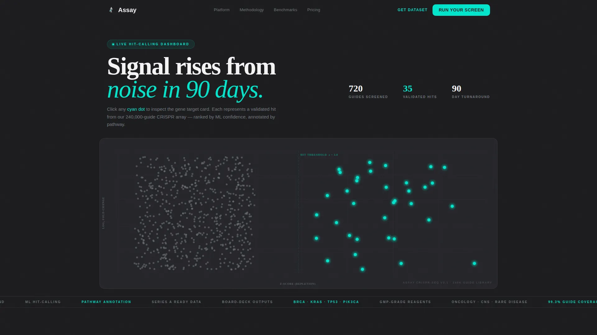
- An interactive scatter-plot header dashboard with clickable gene target cards and confidence scores
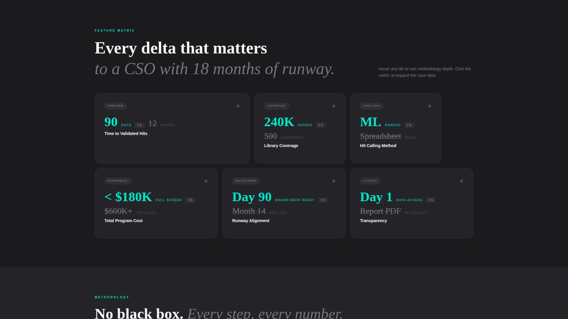
- A comparison-driven feature matrix with hover-expand tiles showing methodology depth and case metrics
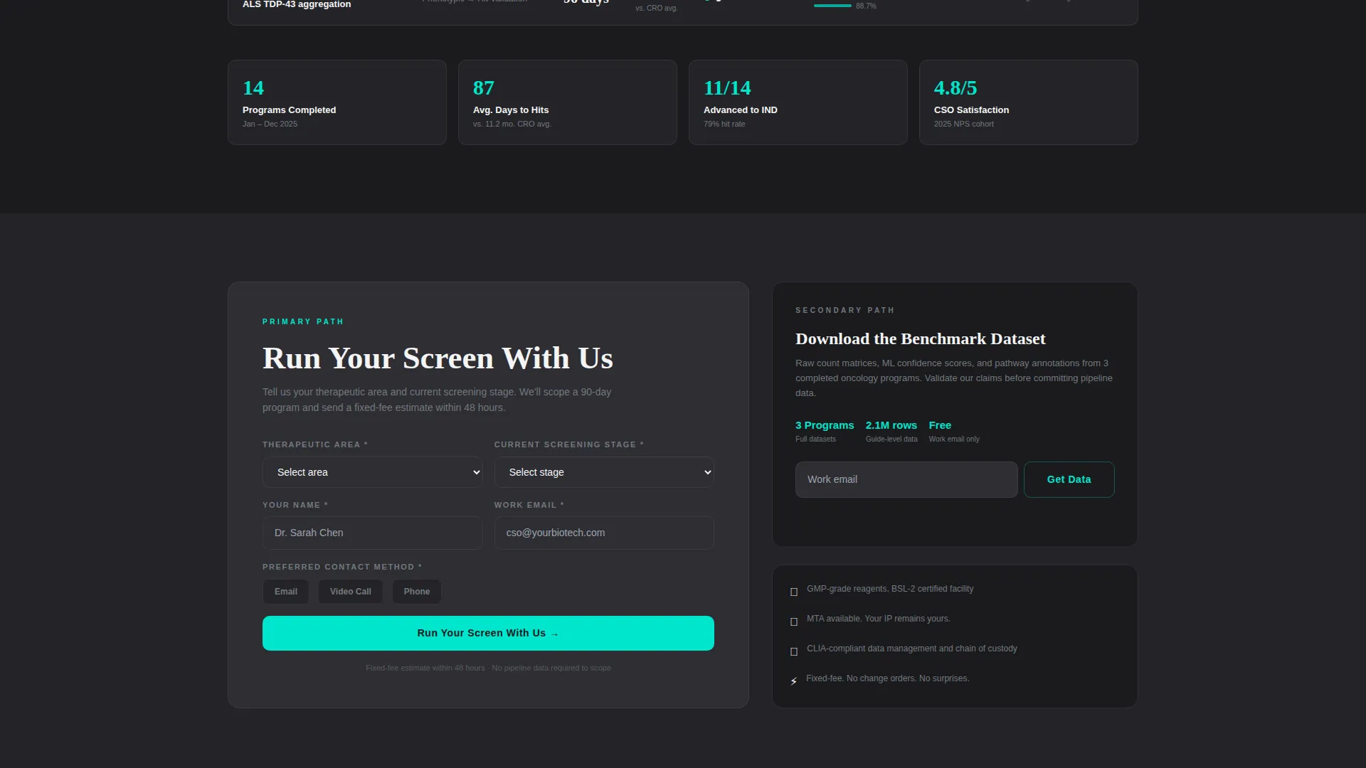
- A dual-path conversion section with a primary contact form and a gated benchmark dataset download
Feature list
This template includes purpose-built sections that work together as a complete conversion system for a technical audience.
Live Hit-Calling Dashboard Header
The header renders a functioning miniature of the platform's hit-calling dashboard directly in the viewport. Scatter-plot dots populate in real time, with gray noise clustering left and cyan-highlighted validated hits separating right. Each dot is clickable and reveals a mock gene target card showing confidence scores and pathway annotations.
Comparison Bento Grid Tiles
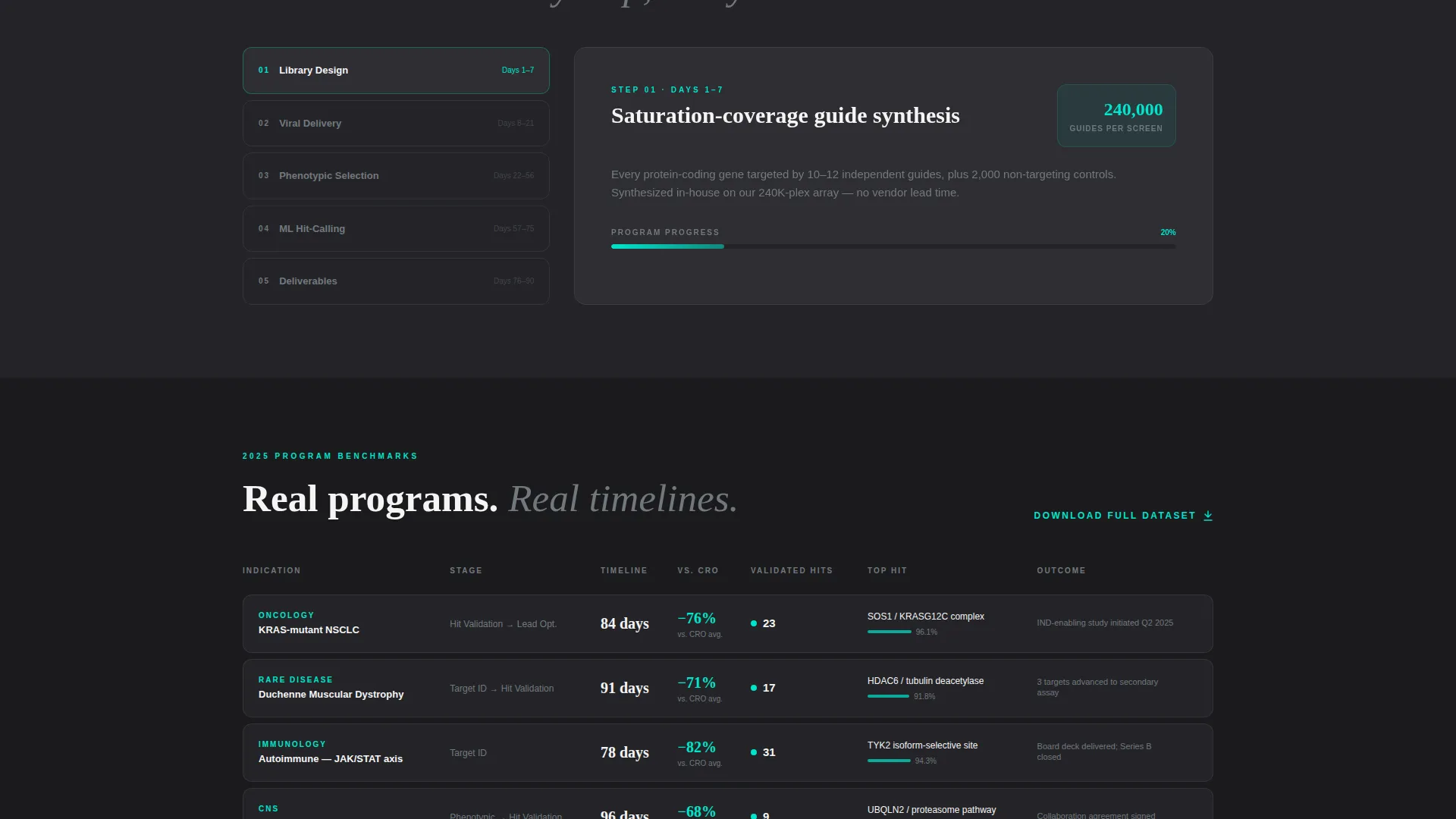
Below the header, the bento grid organizes platform capabilities into discrete, clickable tiles of varying size. Each tile pairs an Assay metric against a legacy CRO benchmark, such as ninety days versus twelve months or two hundred forty thousand guides versus five hundred manual constructs. Tiles expand on hover to reveal methodology depth and a supporting case metric.
Machine-Learning Hit-Calling Showcase
A dedicated tile communicates the shift from spreadsheet triage to ranked, machine-learning output. The visual language reinforces that hits are not just found faster but scored and prioritized with confidence. This section is designed to resonate with a CSO who has already run a failed manual screen.
Dual-Path Lead Capture
The primary call to action, "Run Your Screen With Us," triggers a short form that asks for therapeutic area, current screening stage, and preferred contact method. A secondary path, "Download the Benchmark Dataset," captures earlier-stage visitors using only a work email field. Both paths serve different levels of buyer readiness.
Monochrome Steel Visual System
The entire page uses a four-color palette: surgical steel, deep graphite, instrument white, and a single reactor cyan accent reserved for interactive states and data highlights. No stock photography appears anywhere on the page. The product interface is the only visual content.
CRISPR Screening Proof Tiles
Specific tiles communicate the scale of the proprietary CRISPR screening library, the speed of the ninety-day validation cycle, and the structured output format. Each tile is self-contained and can be read independently, letting a scientist browse proof the way they browse a plate reader.
Page sections overview
| Section | Purpose |
|---|---|
| Interactive Dashboard Header | Renders live scatter-plot hit-calling to establish product credibility immediately |
| Comparison Bento Grid | Contrasts Assay metrics against legacy CRO timelines tile by tile |
| CRISPR Scale Tile | Communicates the 240,000-guide library versus 500 manual constructs |
| ML Hit-Calling Tile | Shows machine-learning ranked output versus spreadsheet triage |
| Timeline Contrast Tile | Visualizes 90-day validation versus 12-month CRO engagement |
| Primary call to action Form | Captures qualified leads with therapeutic area and screening stage fields |
| Benchmark Dataset Download | Gated secondary path requiring only a work email address |
Design & branding system
The visual identity follows a Startup Velocity theme built entirely on the Monochrome Steel color system. Every color choice reinforces scientific precision and sterile focus. There is no decorative imagery anywhere on the page.
- Surgical steel (#71797E), deep graphite (#1B1B1E), and instrument white (#F4F4F5) form the base palette
- Reactor cyan (#00E5CC) appears only on interactive states, data highlights, and validated hit markers
- Typography and spacing are kept tight and purposeful, reflecting the inside of a biosafety cabinet at 2 a.m.
Mobile & speed optimization
The bento grid layout is structured to reflow cleanly across screen sizes. Tile hierarchy adjusts for smaller viewports so the most critical comparison data remains readable without horizontal scrolling.
- Varying tile sizes collapse into a readable single-column stack on mobile devices
- The interactive dashboard header is designed to load as a self-contained viewport element
- Lean color usage and absence of photography reduce overall page weight significantly
How this template helps you convert
Every section of this page builds cumulative evidence. By the time a visitor reaches the call to action, they have already seen the product running, compared it against their current workflow, and identified the metric that matters most to them.
- The live dashboard header creates immediate proof before any scrolling happens, setting a high credibility baseline.
- The comparison tiles let a technically minded visitor self-select the data point most relevant to their current program stage, building personal resonance faster than linear storytelling.
- The dual-path conversion section meets visitors at two different levels of readiness, capturing both ready-to-engage CSOs and early-stage researchers who need one more data point before committing.
Other information about this template
This template is specifically designed for the Biotech Startup and Biotech Series A Startup niche within the Startup and Launch category. It is a strong fit for teams preparing for board reviews, partnering conversations, or Series B fundraising where scientific differentiation needs to be communicated quickly to non-technical stakeholders.
- The template style is Bento Grid, optimized for non-linear browsing by scientific audiences
- The header concept is Interactive Preview, making the platform interface the first and only hero element
- The creative direction is Feature Matrix, structuring capability proof as browsable discrete tiles
- The landing page direction is Comparison/Versus, building evidence through repeated delta framing
- The theme is Startup Velocity, reflecting urgency and forward momentum without sacrificing rigor
Theme
Startup Velocity
Creative direction
Feature Matrix
Color system
Monochrome Steel
Style
Bento Grid
Direction
Comparison/Versus
Page Sections
Live Hit-calling Dashboard Header
Comparison Bento Grid Tiles
CRISPR Screening Scale Proof
Dual-path Lead Capture Section
Monochrome Steel Visual Identity
Non-linear Browsing Layout
Related questions
Who is this landing page template designed for?
Does this template require design or coding skills to use?
Can the comparison tiles be customized for different screening stages?
What makes the dual-path lead capture approach effective for this audience?
Is this template suitable for a platform that is still in early validation?



