Heritage Craft Architecture Blog Landing Page Template
Atelier is a hub-and-spoke architecture landing page built for heritage craft editorial. It combines a cinematic reel header, five anchor-nav spoke sections, and a lead-generation flow that gives readers rich data freely before gating a downloadable PDF report. The Parchment and Rust design system and Fraunces serif typography create an interior design website that feels like a Victorian field notebook come to life.
by Rocket studio
Quick summary
Atelier is a single-page editorial landing page template for architecture and interior design journals. It pairs a short-form video header with five anchor-navigated spoke sections covering material trends, preservation data, studio spotlights, regional indexes, and reader survey results. A sticky lead-generation bar and inline micro-forms capture reader interest without interrupting the editorial flow.
Who this template is for
This landing page is built for practitioners who value depth over decoration. It suits anyone running a data-backed editorial site where construction and craft intersect.
- Junior architects and interior design professionals who need citable precedent research fast
- Interior designers building mood boards for heritage-listed renovation projects
- Heritage homeowners who want to understand the construction history of their own spaces
What problem this template solves
Most architecture website templates treat editorial content as an afterthought. Blog landing page designs rarely match the authority that practitioners expect when they arrive for real research. This template solves that gap directly.
- Readers leave generic architecture blog pages because the design fails to signal credibility
- Practitioners need a page structure that guides them from broad trends to specific case studies without dead ends
- Standard construction website layouts bury lead-generation forms in ways that feel aggressive rather than earned
What you get with this template
You get a fully structured, single-page architecture landing page that earns trust before it asks for anything. Every section is pre-built and ready to fill with your own editorial content.
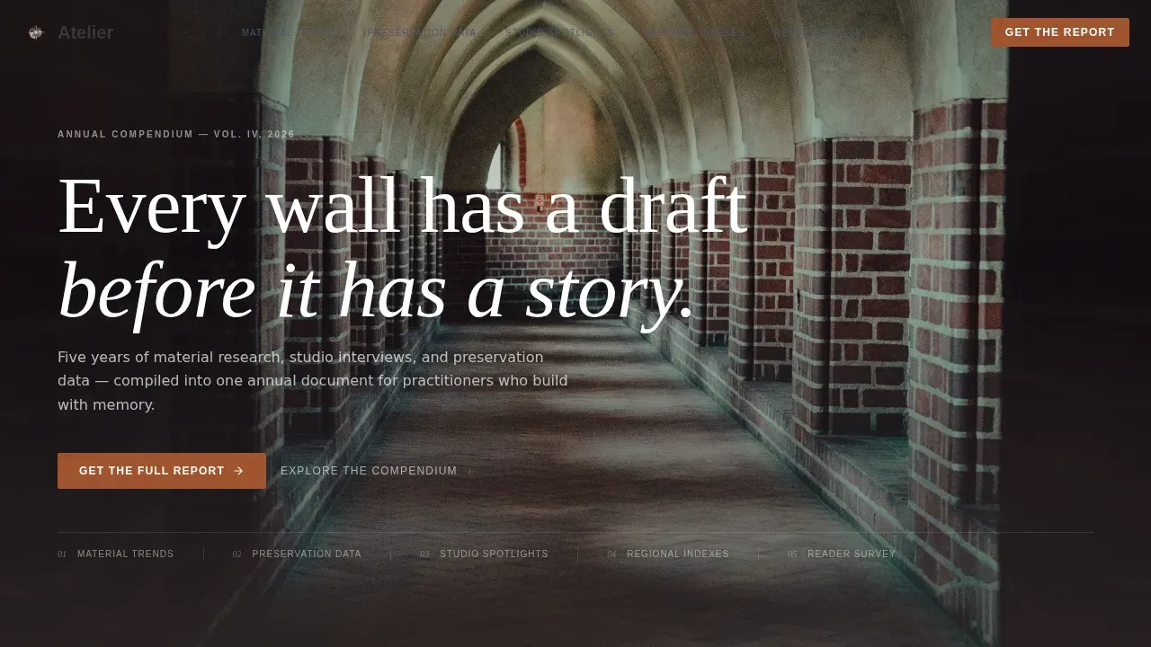
- A cinematic 15-second reel header with ambient sound and a closing typographic line
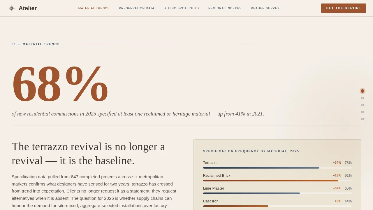
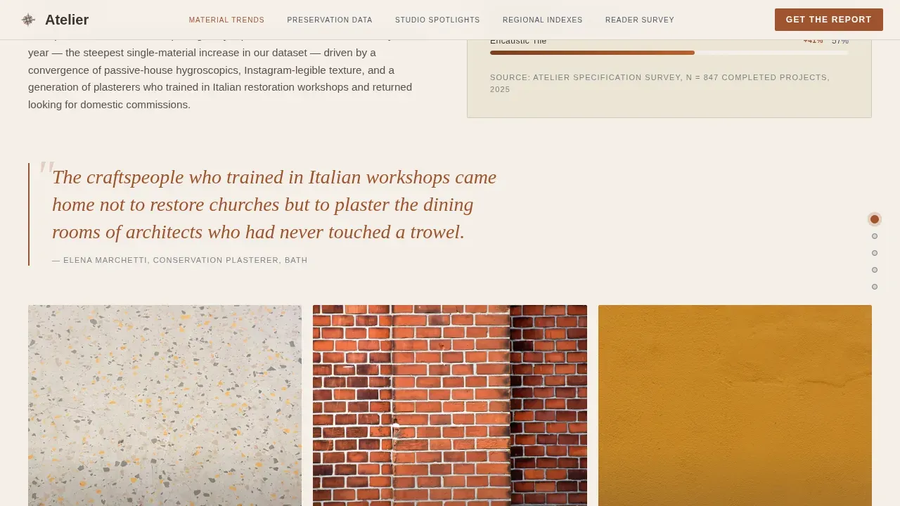
- Five spoke sections with anchor navigation, oversized stat typography, embedded chart placeholders, and captioned photography slots
- A sticky "Get the Full Report" bar plus inline "Bookmark this chapter" micro-forms with role-toggle and optional firm-name field
Feature list
This template's standout features reflect the craft-forward editorial brief from the ground up.
Cinematic Reel Header
The header plays a 15-second vertical-format short film. It opens on hands tracing exposed brickwork, cuts to a dovetail joint being tapped home, then pulls wide to a Georgian hallway in morning light. Handheld footage and ambient site sound set the editorial tone without music or voiceover.
Hub-and-Spoke Anchor Navigation
Five spoke sections pin to an anchor nav with active-state dots styled in faded indigo. Visitors click any spoke to jump directly to Material Trends, Preservation Data, Studio Spotlights, Regional Indexes, or Reader Survey Results. This keeps the page easy to scan on a long editorial scroll.
Oversized Stat Typography with Editorial Analysis
Each spoke opens with a large data finding rendered in kiln-fired terracotta type. The stat unfolds into editorial analysis, embedded chart placeholders with indigo data lines on parchment fields, and captioned images. This structure guides visitors from a striking number into a full narrative.
Dual Lead-Generation Forms
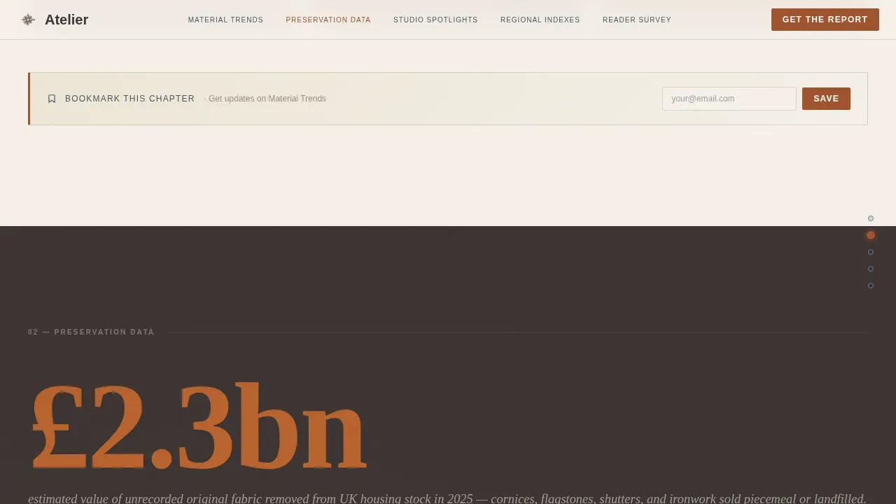
The sticky bar appears after the second spoke and offers the downloadable PDF in exchange for an email address, a role-toggle selection, and an optional studio name. Inline micro-forms inside each spoke collect a single email and tag the lead by interest area, reducing friction while improving list segmentation. Minimizing form fields this way keeps conversion rates healthy.
Parchment and Rust Design System
The full color set includes aged vellum for backgrounds, terracotta for headlines and pull-quotes, wrought-iron charcoal for body text, and faded indigo for nav accents and hover states. Fraunces serif handles all headings, while DM Sans carries body and interface text. This pairing conveys heritage and keeps interior design content highly readable.
GSAP ScrollTrigger Animations
Word reveals, parallax layers, and sticky navigation are all driven by GSAP ScrollTrigger. Scrolling through the page feels like paging through an annual architecture compendium. Each animation fires on scroll so the page load stays clean.
Page sections overview
| Section | Purpose |
|---|---|
| Hero Reel Header | Opens with cinematic film and anchor nav |
| Material Trends Spoke | Stat, chart, and editorial analysis |
| Preservation Data Spoke | Data findings and inline bookmark form |
| Studio Spotlights Spoke | Case study photography and editorial |
| Regional Indexes Spoke | Geographic breakdown with visual indexes |
| Reader Survey Results | Mirror data and sticky report call to action trigger |
| Linear Footer Row | Single-row footer with essential links |
Design & branding system
The design language draws from a Victorian architect's field notebook left on a sun-bleached windowsill. Every color choice and type decision serves the heritage craft narrative.
- Color set: vellum (#F5F0E8) background, terracotta (#A0522D) headlines, charcoal (#3B3331) body text, indigo (#4A5568) navigation accents and hover states
- Typography: Fraunces classic serif for headings to convey heritage, DM Sans clean sans-serif for body and user interface text for readability
- Spacing and layout follow a clean grid with generous white space, evoking a high-end architecture studio publication
Mobile & speed optimization
The template is designed desktop-first for practitioners at workstations, with full mobile support across all devices. Architecture and interior design visitors increasingly browse on phones, so the layout adapts cleanly at every breakpoint.
- Sticky nav, forms, and spoke sections reflow cleanly for smaller screen sizes
- Static editorial sections use server-side rendering while the sticky bar and forms load client-side, keeping the initial page display fast
- Videos in the reel header are optimized for vertical-format playback so the cinematic experience holds on mobile devices
How this template helps you convert
This landing page is designed to move architecture visitors from awareness to interest to action without pressure. The best way to think about it is a generosity model: give seventy percent freely, gate the rest.
- Readers access rich editorial data across all five spokes before they see a lead-generation ask, which builds the trust needed to act on the "Get the Full Report" offer
- Inline micro-forms let visitors bookmark a chapter of interest with a single email click, tagging each lead by spoke so follow-up communication can match their specific needs
- The sticky bar appears at the right scroll position, after the reader has already found value in the content, keeping conversion rates higher than a top-of-page pop-up would
Other information about this template
This template sits in a broad market where many architecture website templates serve very different needs. Atelier is built specifically for editorial and data-led construction content rather than portfolio or property sales. It is worth knowing how it fits the wider landscape.
- The atelier heritage craft architecture blog landing page template is a single-page hub-and-spoke design, distinct from multi-page architecture website templates aimed at construction businesses or property sales
- Many website builders offer customizable templates for architecture websites, but no-code tools allow users to create architecture website pages without extensive coding knowledge, and this template can be adapted inside those environments depending on your platform
- Architecture website templates vary widely in price and purpose; some cater to construction website portfolios, others to interior design website editorial work like Atelier
- The html template base makes it straightforward to update text, swap images, and add or copy sections; an architecture studio team can launch quickly without deep development work
- Trust signals such as testimonials, awards mentions, and heritage association badges can be added inside the spoke sections to strengthen credibility on the landing page
- AI tools can streamline website development for architecture projects and help generate content, making it easier to fill editorial sections and manage inquiries at scale
- Contact forms within the spoke sections can handle reader inquiries and be set up to route interest by type, depending on your editorial services structure
- Search visibility for this type of architecture website benefits from the structured editorial depth that spoke sections naturally provide
Theme
Heritage & Story
Creative direction
Industry Report
Color system
Parchment & Rust
Style
Hub & Spoke (Anchor Nav)
Direction
Lead Generation
Page Sections
Cinematic Short-form Reel Header
Hub-and-spoke Anchor Navigation
Oversized Stat and Editorial Analysis Layout
Dual-path Lead Generation Forms
Parchment and Rust Design System
GSAP Scrolltrigger Animation Suite
Related questions
Who is this landing page template designed for?
Can I change the colors and typography?
How do the lead-generation forms work?
Is this template suitable for a construction website?
Do I need coding skills to use this template?



