Curated Discovery Newsletter Landing Page Template
Curate is a cinematic dark editorial newsletter landing page built for weekly curated link digests. It combines a broadsheet masthead, manifesto-style scroll, and a Pinterest-style masonry card grid to turn past issues into living proof of value. The single-field sign up form and a curtain-red subscribe button keep the subscription process frictionless for busy, discerning readers.
by Rocket studio
Quick summary
Curate is a newsletter landing page template designed for editors and curators who send a tight weekly digest of hand-picked links. The page opens like a broadsheet front page, rolls through a manifesto that earns trust before asking for anything, then lets a masonry grid of past issues do the convincing. One email field. One button. No noise.
Who this template is for
This template speaks directly to newsletter creators who believe curation is an editorial act, not an algorithm. It is built for people who have something worth reading and need a landing page that reflects that quality without compromise.
- Senior designers, product managers, and indie founders running a curated newsletter for a high-signal target audience
- Content strategists and digital marketers who rely on email marketing to build an engaged, loyal readership
- Independent editors who want to convert visitors into subscribers without a bloated sign up form or distracting navigation bar
What problem this template solves
Most newsletter landing pages look like marketing collateral wearing a trench coat. They list features, promise value, and beg for clicks. Potential subscribers scroll past without feeling anything. The problem is not the newsletter; it is the page failing to prove what the newsletter already delivers.
- The template replaces generic feature lists with actual past issues rendered as masonry cards, giving visitors proof instead of promises
- It removes every obstacle in the subscription process by asking only for an email address, immediately setting the right expectation that joining is effortless
- It positions the curated newsletter as a go to resource by leading with a manifesto that states an editorial philosophy before ever mentioning a subscribe button
What you get with this template
You get a complete, single-page newsletter landing page that covers every conversion milestone from first impression to email capture. Each section is purposeful. Nothing competes for attention. The primary goal of the page, collecting email sign ups, is reinforced at every scroll depth without repeating the same call to action twice in identical form.
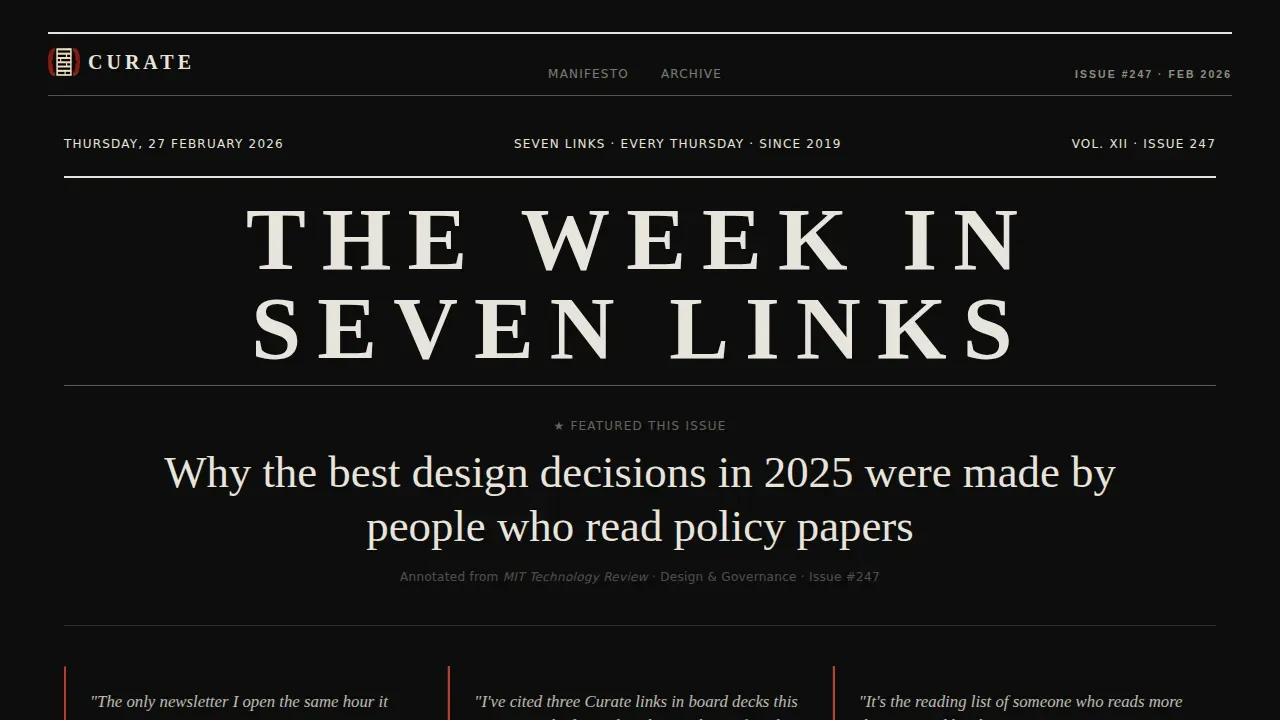
- A broadsheet hero masthead with issue number, dateline, featured headline, and pull-quotes that function as social proof without requiring a subscriber count widget
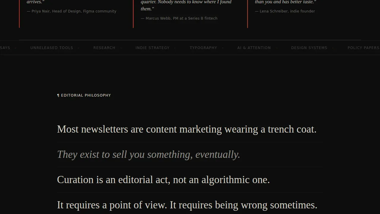
- A full manifesto section in oversized title-card type, followed by a masonry grid of past issue cards showing headline, source, annotation, and category tag
- Two positioned subscribe prompts: one beneath the manifesto and one as a sticky bar that appears after three scroll-depths, each featuring a single email field and the curtain-red button
Feature list
This template is built around key elements that convert visitors into subscribers through editorial credibility and deliberate design. Each standout feature below is grounded in what the template actually delivers, pulled directly from the brief.
Broadsheet Hero Masthead
The header presents as a newspaper front page. A bold headline reads "THE WEEK IN SEVEN LINKS" in tight high-contrast serif type, accompanied by an issue number, a dateline, and a single featured headline from the latest edition. Three pull-quotes from past issues sit below the fold line in italic cream, each attributed like wire credits. This section provides measurable social proof without relying on subscriber numbers or external widgets. The bold headline and typographic density immediately set the editorial tone, giving visitors clear expectations before they read a single word of body copy.
Manifesto Declaration Section
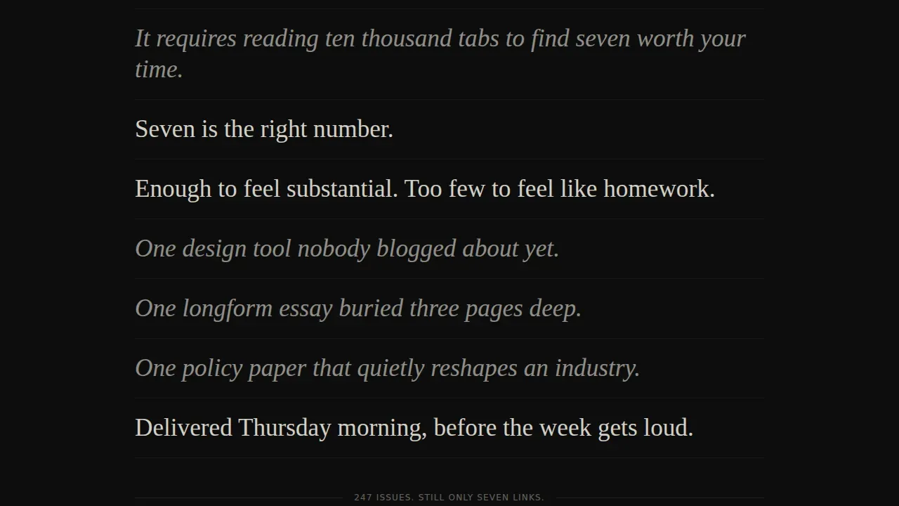
The scroll begins with a declaration, not a feature list. Oversized title-card text states why most newsletters are content marketing in disguise, why editorial curation differs from algorithmic aggregation, and why seven links per week is the right number. Each line lands like a film title card. This section earns the value proposition before asking for anything. It speaks directly to the target audience's interests and builds the kind of brand loyalty that a bullet-point benefits list never could. Persuasive copy at this scale converts visitors not by explaining the newsletter but by making them feel the gap it fills.
Masonry Card Grid
Below the manifesto, the page exhales into a Pinterest-style masonry grid of actual past issue cards. Each card displays a bold headline, a source favicon, a one-line annotation, and a category tag. Hovering a card reveals a hairline cream border as if selecting a film frame. The grid gives potential subscribers a sneak peek at real content from past issues, letting skeptics self-qualify before committing. Prominently displaying real editorial work in this format means the density of the grid itself becomes the argument. Readers do not need to be told the newsletter is good; the cards show it, issue after issue.
Frictionless Email Capture
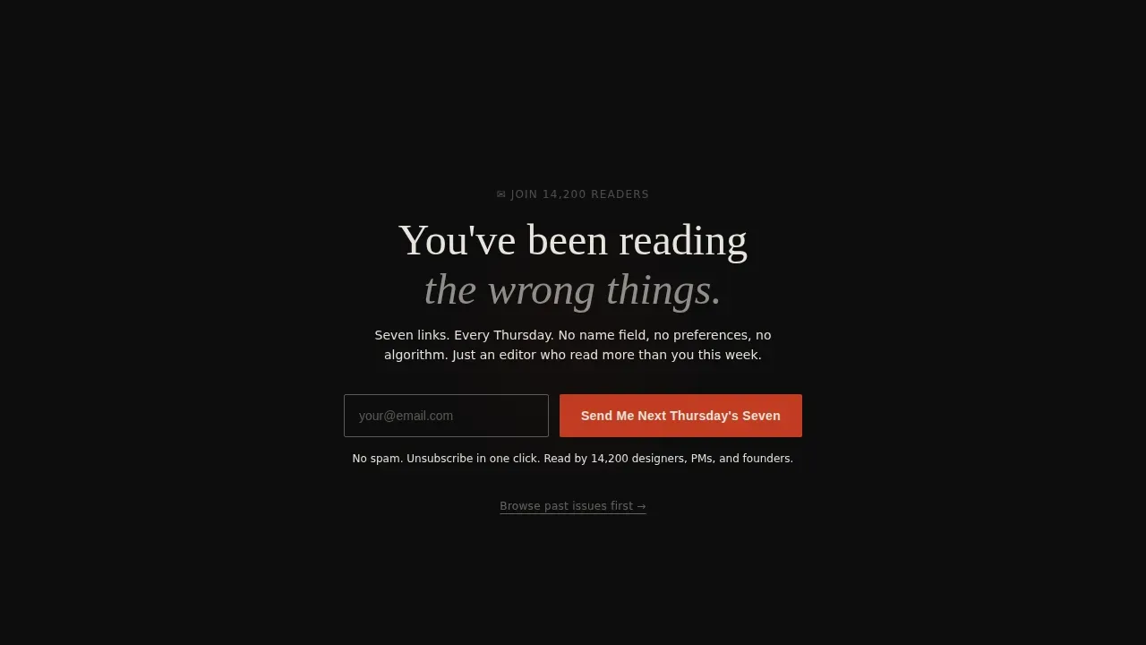
The sign up form is as short as possible: a single email field and a curtain-red button reading "Send Me Next Thursday's Seven." No name field. No preference toggles. The subscription process is deliberately minimal to reduce friction and protect conversion rates. The subscription form appears twice: once beneath the manifesto where intent is highest, and once as a sticky bar triggered after three scroll-depths, giving visitors who needed more convincing a second clear path to sign up. A secondary text link to a full archive preview lets skeptics browse before committing.
Archive Preview Path
A "Browse Past Issues" text link offers a secondary path for visitors who want more proof before subscribing. This approach lets different groups of visitors self-select their own conversion journey. Skeptical readers can browse recent articles and past editions before entering their email. This archive preview functions as a try-before-you-subscribe mechanism, reinforcing the newsletter's track record and demonstrating the quality of curation across multiple issues. Giving visitors a secondary route keeps the primary subscription goal clean while still serving readers who need more context.
Sticky Subscribe Bar
After three scroll-depths, a sticky bar rises into view carrying the email field and the curtain-red subscribe button. The button stands in contrast against the dark background, making the call to action visible without interrupting reading flow. This behavior increases newsletter sign ups by catching readers at the moment of peak engagement rather than forcing them to scroll back to the top. The sticky bar disappears if dismissed, keeping the experience respectful and the page clean.
Page sections overview
| Section | Purpose |
|---|---|
| Hero Masthead | Broadsheet front page with bold headline, issue number, dateline, and pull-quote social proof |
| Manifesto Declaration | Oversized title-card text stating editorial philosophy and earning the value proposition |
| Masonry Card Grid | Past issue cards with headline, favicon, annotation, and category tag as proof of curation quality |
| Subscribe Call to Action | Single email field and curtain-red button beneath the manifesto for immediate sign ups |
| Archive Preview | Text link path to past issues for skeptics who want to self-qualify before subscribing |
| Sticky Subscribe Bar | Scroll-triggered persistent bar for catching high-intent readers mid-page |
| Footer | Linear single-row footer with minimal links |
Design & branding system
The visual design draws from a cinematic dark color system that feels like a film noir title sequence. Typography is the photography here. No decorative images are used. Bold typography does all the visual heavy lifting, and every color decision reinforces editorial authority.
- Projection-black (#0D0D0D) backgrounds, warm charcoal (#1A1A2E) card surfaces, faded cream (#E8E4DC) body text, and curtain-red (#C23B22) reserved for links, hover states, and the subscribe button, producing a structured layout with immediate visual consistency
- Fraunces serif display type for mastheads, manifesto lines, and card headlines; DM Sans for body annotations and form labels, creating bold typography contrast that guides the eye without competing elements
- Masonry cards float on projection-black with hairline cream borders that appear only on hover, so every card feels like a film frame waiting to be selected, reinforcing the cinematic editorial theme
Mobile & speed optimization
The template is built desktop-first to serve a senior professional audience who typically engages on larger screens. However, the single-column manifesto and responsive masonry grid mean the page adapts cleanly across mobile devices without losing its editorial weight.
- The sign up form collapses to a full-width single-column layout on mobile devices, keeping the subscription process clear and the button easy to tap
- Static content is handled through server components with minimal JavaScript, so the page stays light and the masonry grid loads without layout shift on smaller screens
- Scroll-reveal animations use staggered timing to remain smooth across mobile devices without relying on heavy animation libraries
How this template helps you convert
A newsletter landing page converts when it earns trust before asking for action. This template is engineered around that principle at every scroll depth.
- The manifesto opens the page in such a way that the intended audience feels recognized and respected before they reach a single call to action, immediately setting up belief in the newsletter's editorial judgment and making the value proposition feel earned rather than claimed
- The masonry grid of past issues removes the need to assert quality by prominently displaying real editorial work, giving potential subscribers actionable insights into what they will receive every Thursday, which raises click through rates and conversion rates because the evidence speaks for itself
- The sticky subscribe bar captures high-intent readers at peak engagement mid-scroll, while the archive preview path serves skeptics who need more convincing, so both audiences find a clear path to sign ups without the page resorting to pressure tactics
Other information about this template
This section covers practical context that helps you evaluate the template for your specific setup and marketing goals.
- This is the Curate Editorial Masonry Curated Links Newsletter Landing Page Template, built for the Newsletter and Publication subcategory within Blog and Editorial, and optimized specifically for the curated links newsletter niche
- The template is designed to generate sales of audience attention over time by building a qualified subscriber list through email marketing, one of the most proven channels for reaching potential clients and building brand loyalty
- Email marketing has a strong track record for ROI compared to other marketing channels, making a well-structured newsletter landing page one of the highest-leverage investments for digital marketers focused on long-term audience growth
- The absence of a navigation bar keeps attention on the subscription goal, while external links in the archive preview are deliberately limited to past issue samples so visitors stay focused
- A "no spam" reassurance note beneath the call to action button is included in the template to provide clear expectations and address privacy concerns for every new subscriber
- The subscriber count display within the masthead social proof section provides prominently displaying reader numbers as measurable evidence of the newsletter's longevity, supporting trust for each new subscriber who arrives at the page
- The template can support ongoing A and B testing of the manifesto copy, card grid order, and button label to identify which elements increase sign ups over time, supporting continuous optimization of conversion rates
- For newsletter creators who want to easily create and publish landing pages, the template structure is compatible with drag and drop editor workflows on platforms that offer a drag and drop interface, so you can customize colors, type, and card content without writing code
- An email builder with drag and drop capability makes it straightforward to adapt the card grid content to reflect new issues as they publish, keeping the page current without rebuilding from scratch
- Social media platforms can be used to drive traffic to this newsletter landing page, complementing organic and search-driven sign ups; the manifesto-led design performs well when shared as a link across social media because the opening copy functions as a hook before the form appears
- This template works well for digital marketers who treat email communication as a primary channel and want a focused page that speaks directly to a niche readership rather than broadcasting to different groups indiscriminately
- The page is structured in such a way that every section either builds the value proposition, demonstrates it, or captures it, with no filler sections diluting the intended audience's path to subscribing
- For creators looking at best examples of newsletter landing pages in the editorial and publication space, publications like the New York Times and similar editorial brands demonstrate that bold typography, a clean layout, and prominently displaying subscriber numbers are consistent markers of credibility; this template applies those same principles to an independent newsletter context
- Final thoughts on this template: it is a focused page built for one outcome, and every design and copy decision serves that outcome without compromise
Theme
Editorial Magazine
Creative direction
Manifesto
Color system
Cinematic Dark
Style
Masonry/Pinterest
Direction
Lead Generation
Page Sections
Broadsheet Masthead with Social Proof
Manifesto-led Conversion Flow
Pinterest-style Masonry Card Grid
Minimal Single-field Sign Up Form
Scroll-triggered Sticky Subscribe Bar
Archive Preview Secondary Path
Related questions
What kind of newsletter works best with this template?
Does the sign up form require more than an email address?
How does the page handle visitors who are not ready to subscribe?
Can I customize the colors and type in this template?
How does the sticky subscribe bar work?



