Education & Career Blog Blog Website Template
Awarded is an editorial-style scholarship and financial aid landing page built for blogs that guide students toward unclaimed grant money. It combines a giant centered headline, an anchor navigation system, deadline tracking sections, a FAFSA walkthrough, an essay clinic, and a lead-generation subscription form, all styled in a quiet broadsheet palette that earns reader trust before asking for an email address.
by Rocket studio
Quick summary
Awarded is a hub-and-spoke landing page template for scholarship and financial aid blogs. It opens with a bold editorial headline, organizes content into five anchor-linked spokes, and converts readers through a three-field subscription form and a secondary free-checklist download. Every section is built to establish credibility before making any ask.
Who this template is for
This template is built for education content creators and financial aid publishers who want their blog to feel like a trusted newsroom rather than a content farm. It suits anyone running a scholarship-focused editorial site with real data, real deadlines, and real student outcomes to share.
- High school counselors or education bloggers publishing weekly scholarship roundups and deadline alerts
- First-generation student advocates who need a professional home for FAFSA guides and grant databases
- Community college resource hubs looking to surface micro-grant opportunities for transfer students
What problem this template solves
Scholarship information is scattered, buried, and often arrives too late to act on. Students with the most to gain frequently have the least guidance. A generic blog layout does nothing to communicate urgency, authority, or trust. This template solves those problems by giving financial aid content a structured, editorial frame that signals credibility from the first scroll.
- Readers land on a page that immediately states the size of the unclaimed aid problem, making the content feel urgent and worth their time
- The anchor navigation keeps students oriented so they can jump directly to deadlines, FAFSA steps, or essay help without losing their place
- The lead-generation form appears early and repeats as a sticky bar, capturing subscribers without interrupting the reading experience
What you get with this template
You get a fully designed, single-page editorial hub with five content spokes, two conversion paths, and a visual system built for clarity. Every layout decision supports the editorial mission: give real information first, earn the subscription second.
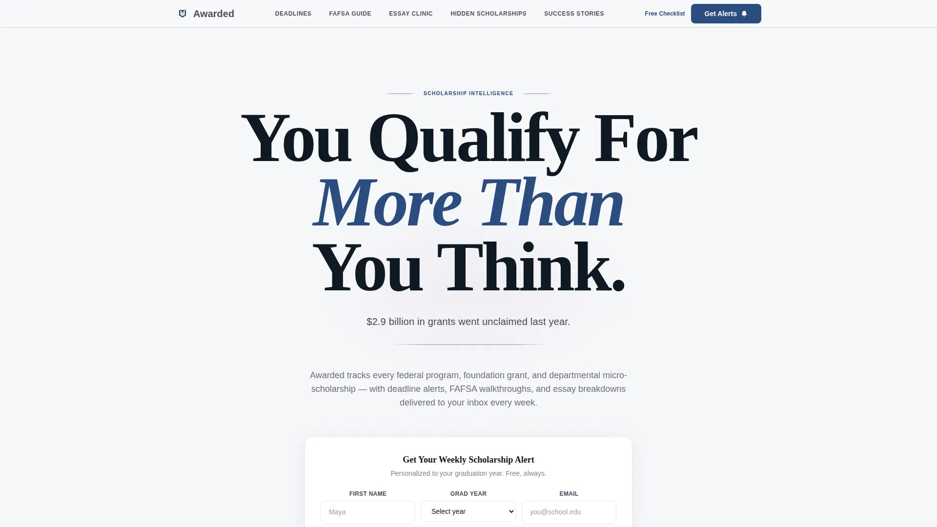
- A hero section with a giant centered headline, a supporting statistic line, a lavender rule divider, and an inline three-field subscribe form
- Five anchor-linked editorial sections covering monthly deadlines, FAFSA guidance, essay clinic content, hidden scholarship listings, and student success stories
- A sticky bottom call-to-action bar that reappears after the second spoke and a secondary download path for a free FAFSA checklist
Feature list
This template is built around a specific set of components. Each one supports the editorial and lead-generation goals described in the brief.
Giant Headline Hero Section
The hero fills roughly eighty percent of the viewport with large Fraunces serif type. A single supporting statistic sits below in pencil-lead gray, followed by a thin lavender rule. No imagery competes with the message. The typography carries all the visual weight.
Pinned Anchor Navigation
The anchor nav pins to the top of the viewport on scroll and highlights the active section. Five editorial spokes are linked directly: Deadlines This Month, FAFSA Step-by-Step, Essay Clinic, Hidden Scholarships, and Success Stories.
Deadline Tab Switcher
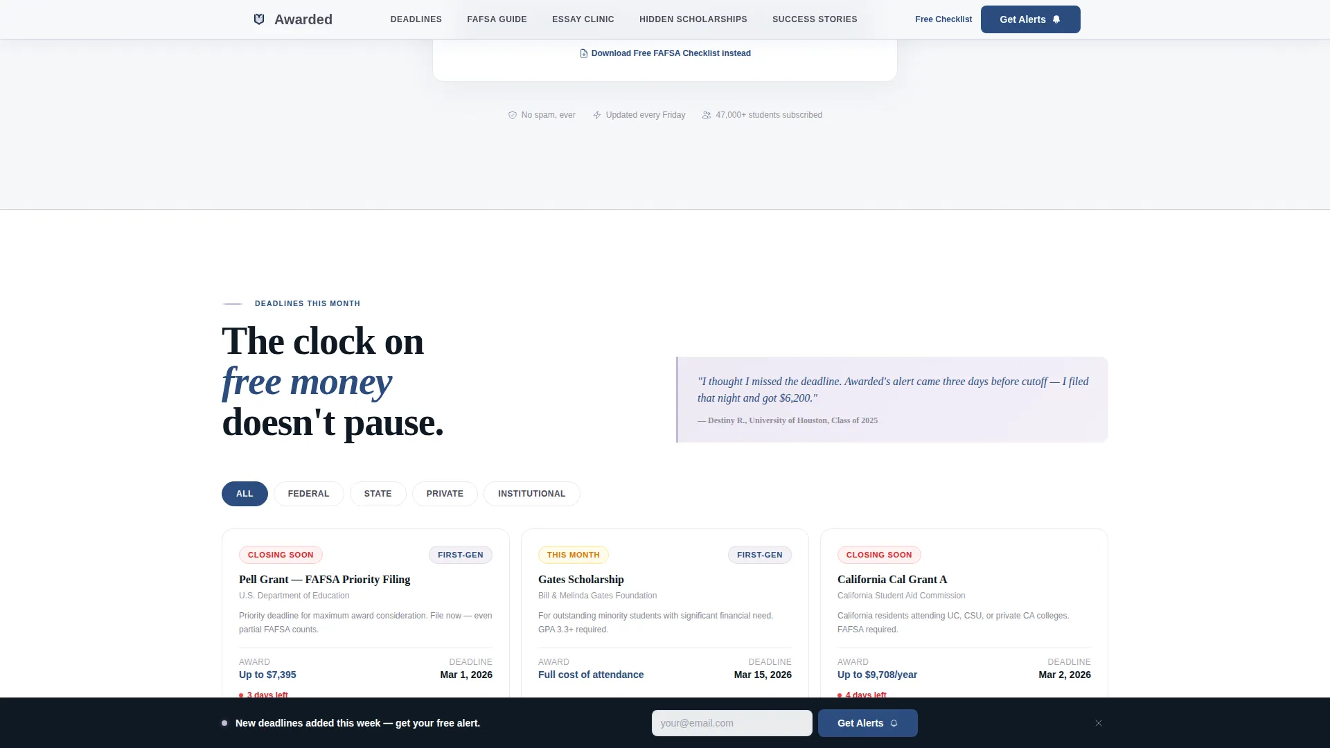
The deadlines section includes a tab-switcher organized by funding category: Federal, State, and Private. Each tab surfaces deadline cards with urgency indicators so readers can act on time-sensitive opportunities quickly.
Split Bento Content Panel
The Essay Clinic and Hidden Scholarships spoke uses a split bento layout. Essay excerpts appear on the left side and a micro-grant database listing appears on the right, giving two types of high-value content equal visual weight.
Three-Field Progressive Subscribe Form
The primary lead-generation form collects first name, graduation year, and email address. It appears inside the hero section and repeats as a sticky bottom bar after the second spoke, offering two natural moments to subscribe without forcing the ask.
Student Success Story Cards
The success stories section uses overlapping, rotated photo cards styled after a testimonial pattern that suggests real acceptance envelopes and real outcomes. Award amounts, acceptance letter excerpts, and tuition gap numbers give the social proof section editorial authority.
Page sections overview
| Section | Purpose |
|---|---|
| Hero Headline | Stops the scroll with an oversized serif statement and surfaces the subscribe form immediately |
| Deadlines This Month | Tab-switched deadline cards sorted by Federal, State, and Private funding categories |
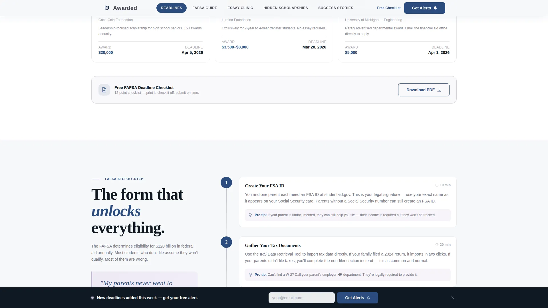
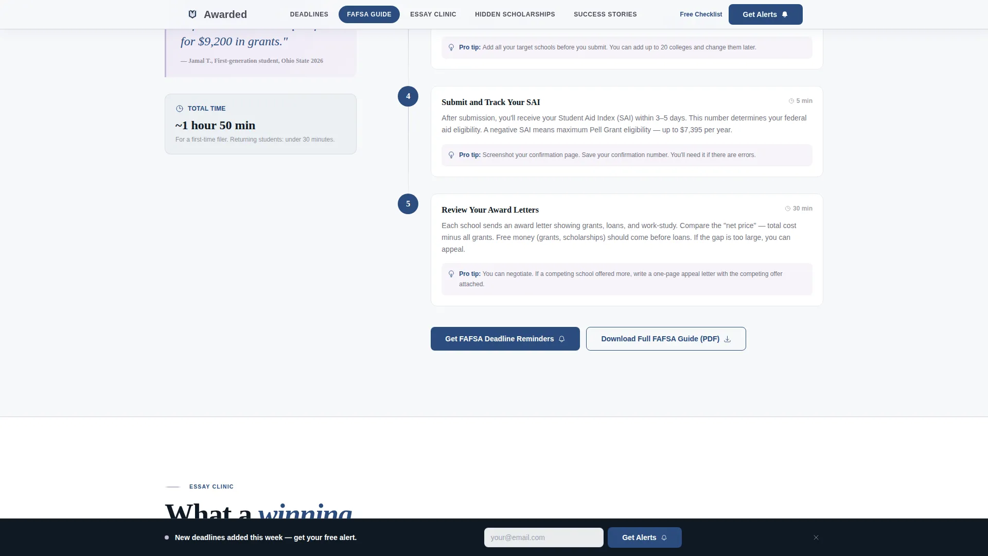
| FAFSA Step-by-Step | Editorial walkthrough with drop cap, pull quote, and progressive step layout |
| Essay Clinic | Left-side essay excerpts paired with a right-side hidden micro-grant database |
| Success Stories | Overlapping rotated photo cards with real award amounts and tuition gap data |
| Sticky Subscribe Bar | Repeating call-to-action bar that reappears after the second spoke |
| Minimal Footer | Horizontal flow footer with essential links and secondary checklist download path |
Design & branding system
The visual identity follows an Editorial Magazine theme built on the Soft Mist color system. The palette references a freshly printed broadsheet on a library table at dawn: quiet authority, generous whitespace, nothing decorative without purpose.
- Color palette: morning fog white (#F7F8FA) for backgrounds, pencil-lead gray (#4A4A5A) for body text, muted lavender (#C4B8D4) for section dividers and pull-quote backgrounds, and confident ink blue (#2B4C7E) reserved for links, calls to action, and the anchor nav active state
- Typography: Fraunces serif for all headlines and drop caps, DM Sans for body text and interface elements
- Visual tone: generous whitespace, no illustrations or hero images, typographic confidence as the primary visual statement
Mobile & speed optimization
This template is designed with a mobile-first approach because the target reader is a student checking scholarship deadlines on a phone late at night. Every layout decision prioritizes legibility and tap-friendliness on small screens.
- Static sections are built with server components for fast initial rendering, while interactive elements such as the anchor nav, tab switcher, and sticky call-to-action bar use client components
- GSAP scroll reveals with blur transitions add editorial polish without heavy resource costs, keeping the experience smooth on mid-range mobile devices
How this template helps you convert
Conversion is earned, not forced. This template builds trust by delivering real value before presenting any subscription request. The creative direction moves from problem awareness through editorial credibility to proven outcomes, which is the sequence that moves undecided readers into committed subscribers.
- The hero section leads with a credibility-building statistic about unclaimed aid and puts the subscribe form in immediate view, so readers who arrive ready to act can convert without scrolling
- Real deadline data, essay excerpts, and student award amounts are visible above the fold, proving the weekly alert is worth opening before the reader ever commits to sharing their email address
Other information about this template
This template suits any scholarship and financial aid blog that wants to position itself as a serious editorial resource rather than a generic aggregator site. A few additional details worth knowing before you build:
- The anchor navigation organizes five editorial spokes with active-state styling in ink blue, making the page feel like a structured publication with a clear reading path
- The secondary conversion path, a free FAFSA checklist download, gives hesitant visitors a low-commitment first step while still capturing lead intent
- The Vision and Mission creative direction means early sections establish the problem context (unclaimed aid, predatory loan defaults, information gaps) before the template shifts to methodology and outcomes
- The FAQ-style accordion interaction is available within the template as an additional interactive component for FAFSA walkthrough or essay guidance content
- This template is localized for United States audiences, using USD currency formatting and MM/DD/YYYY date conventions throughout the deadline cards and form fields
Theme
Editorial Magazine
Creative direction
Vision & Mission
Color system
Soft Mist
Style
Hub & Spoke (Anchor Nav)
Direction
Lead Generation
Page Sections
Giant Centered Headline Hero
Pinned Anchor Navigation
Deadline Tab Switcher
Split Bento Content Layout
Sticky Subscribe Bar
Social Proof Story Cards
Related questions
Can I use this template without a large backlog of scholarship content?
Does the subscription form connect to an email platform?
Is this template suitable for community college transfer students?
What makes this different from a standard blog layout?
Can I adjust the anchor nav to reflect my own editorial sections?



