Certified Hobby & Passion Content Portfolio & Case Study Website Template
Balsa is an editorial hub-and-spoke landing page built for model airplane builders and flying enthusiasts. It delivers a magazine-grade reading experience with build logs, photo essays, step-by-step techniques, and a community photo gallery. A fixed anchor navigation, a low-friction subscribe banner, and a "Submit Your Build" form turn readers into loyal contributors.
by Rocket studio
Quick summary
Balsa is a single-page editorial destination for the model aviation community. It pairs a bold broadsheet visual identity with five content-rich spoke sections, a subscriber capture banner, and a community contribution form. The result feels like cracking open a well-loved hobby magazine, authoritative, tactile, and built for long reading sessions.
Who this template is for
This template suits anyone who runs a serious model aviation community, hobby publication, or enthusiast content hub. It works equally well for a solo expert blogger and a club with hundreds of active contributors.
- Experienced scratch-builders, contest pilots, and retired engineers who want a publication-grade home for their knowledge
- Hobby club organizers looking to grow a subscriber base and crowdsource build photography
- New builders and ARF (Almost-Ready-to-Fly) kit assemblers seeking a welcoming editorial community to join
What problem this template solves
Most hobby blogs look like ordinary WordPress sites. They do not carry the visual authority the subject deserves, and they give visitors no clear reason to subscribe or contribute.
- Readers arrive, browse a few posts, and leave without any lasting connection to the community
- Builders with years of experience have no obvious place to share build logs, photo essays, or technique guides
- Club sites and niche editorial projects struggle to present rich content in a way that feels credible and magazine-worthy
What you get with this template
You get a complete, single-page hub-and-spoke layout organized around five clearly defined content spokes. Every section is designed to deepen reader engagement rather than scatter it.
- A full-viewport editorial hero with a fixed anchor navigation bar linking directly to each spoke section
- A slim, low-friction subscribe banner positioned between spokes, plus a fixed footer ribbon that persists on scroll
- A community contribution form that lets readers submit build photos and short descriptions, seeding future content volumes
Feature list
A brief summary of the template's core features follows below. Each one is drawn directly from the brief and reflects what you will find inside the template.
Full-Viewport Editorial Hero
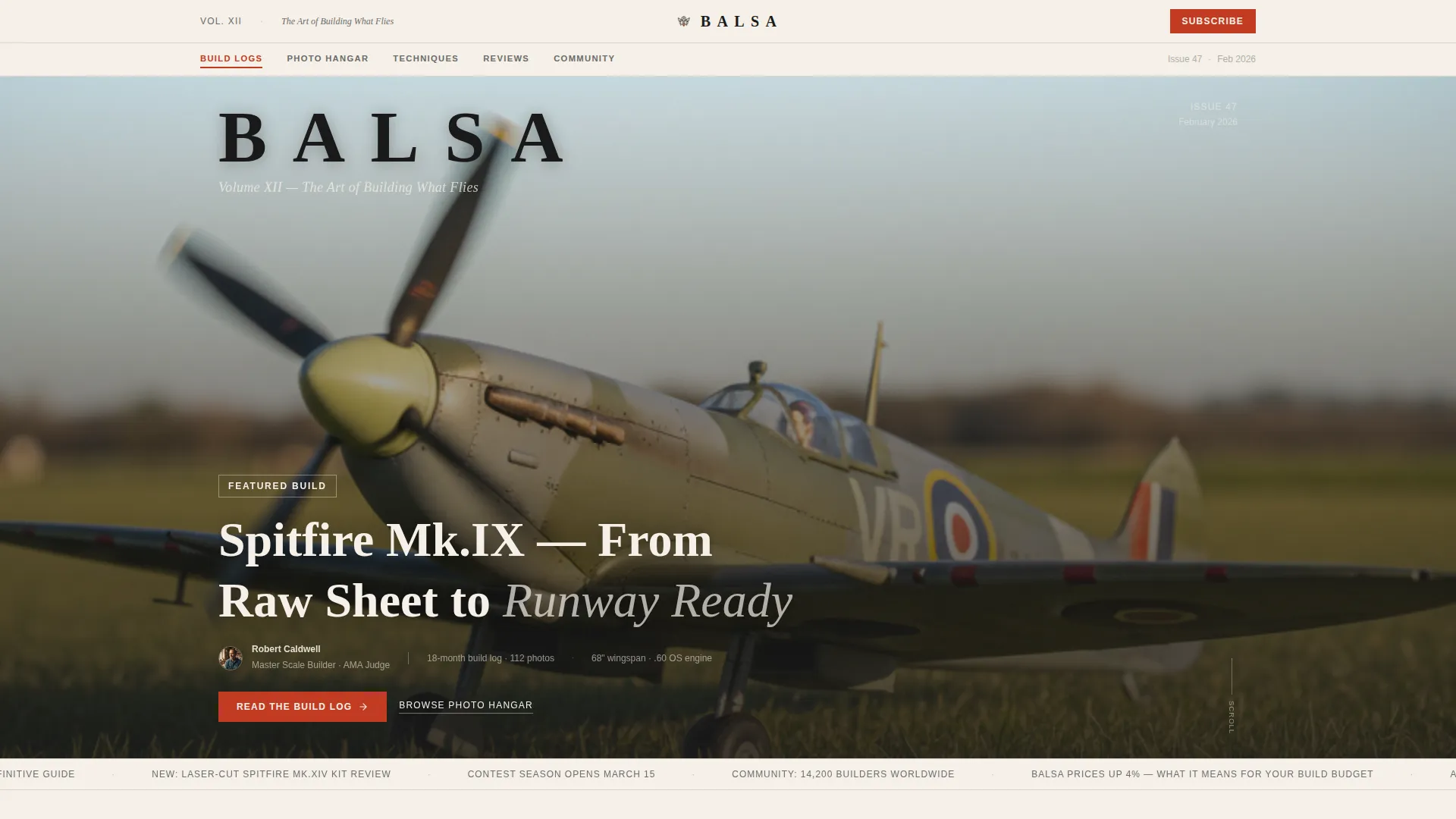
The header opens as a Chapter/Book spread. A large-format photograph fills the full viewport at shallow depth of field, with a tracked-out serif masthead and an italic chapter-style subtitle. A Ken Burns animation plays across the hero image, giving the opening spread a slow, cinematic quality.
Fixed Anchor Navigation
A table-of-contents style navigation bar sits fixed beneath the masthead throughout the entire scroll. It links to five spokes: Build Logs, Photo Hangar, Techniques, Reviews, and Community. Margin-note red highlights active and hovered items, keeping orientation effortless on a long editorial page.
Build Logs Spoke with Hero Cards
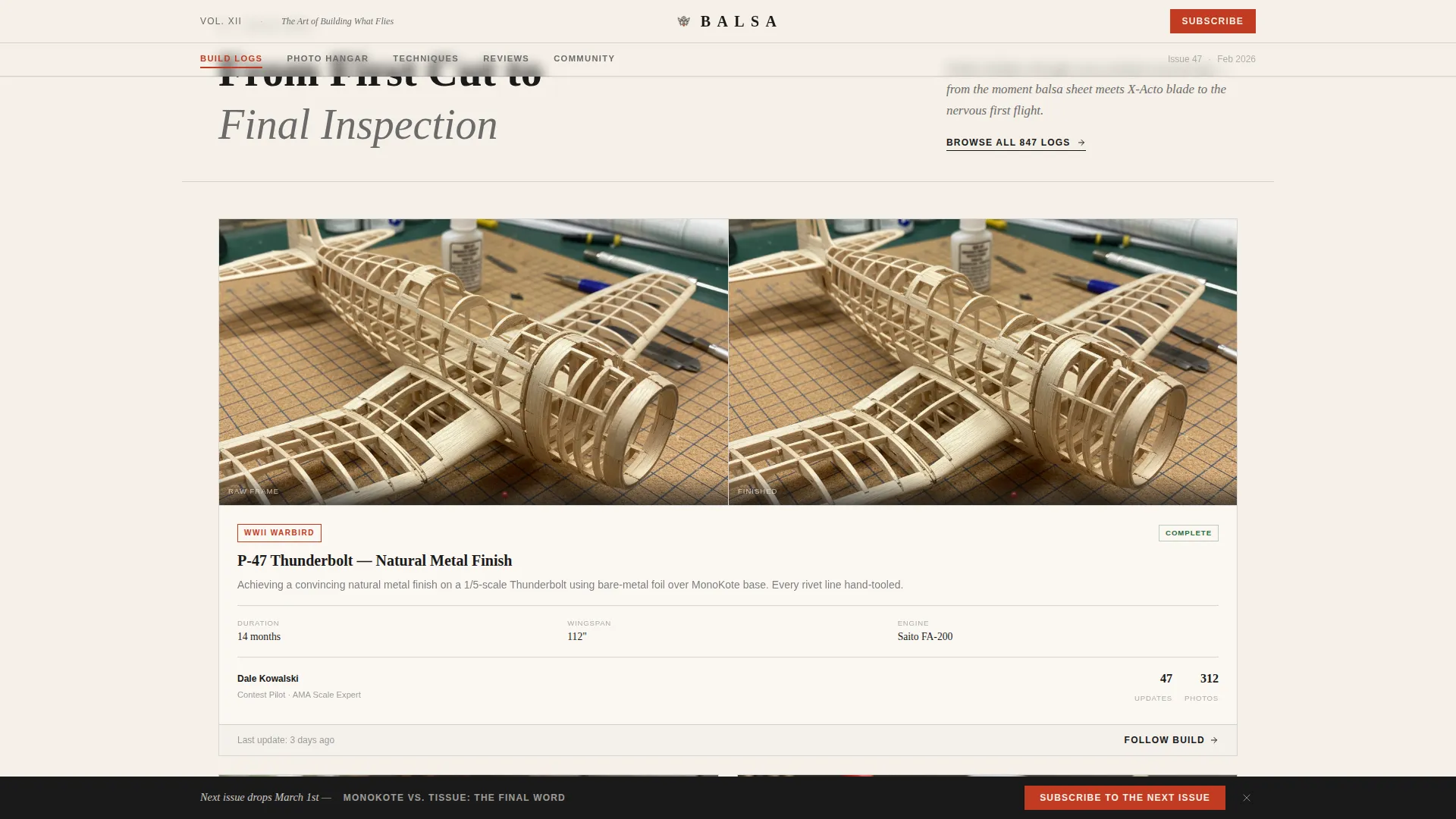
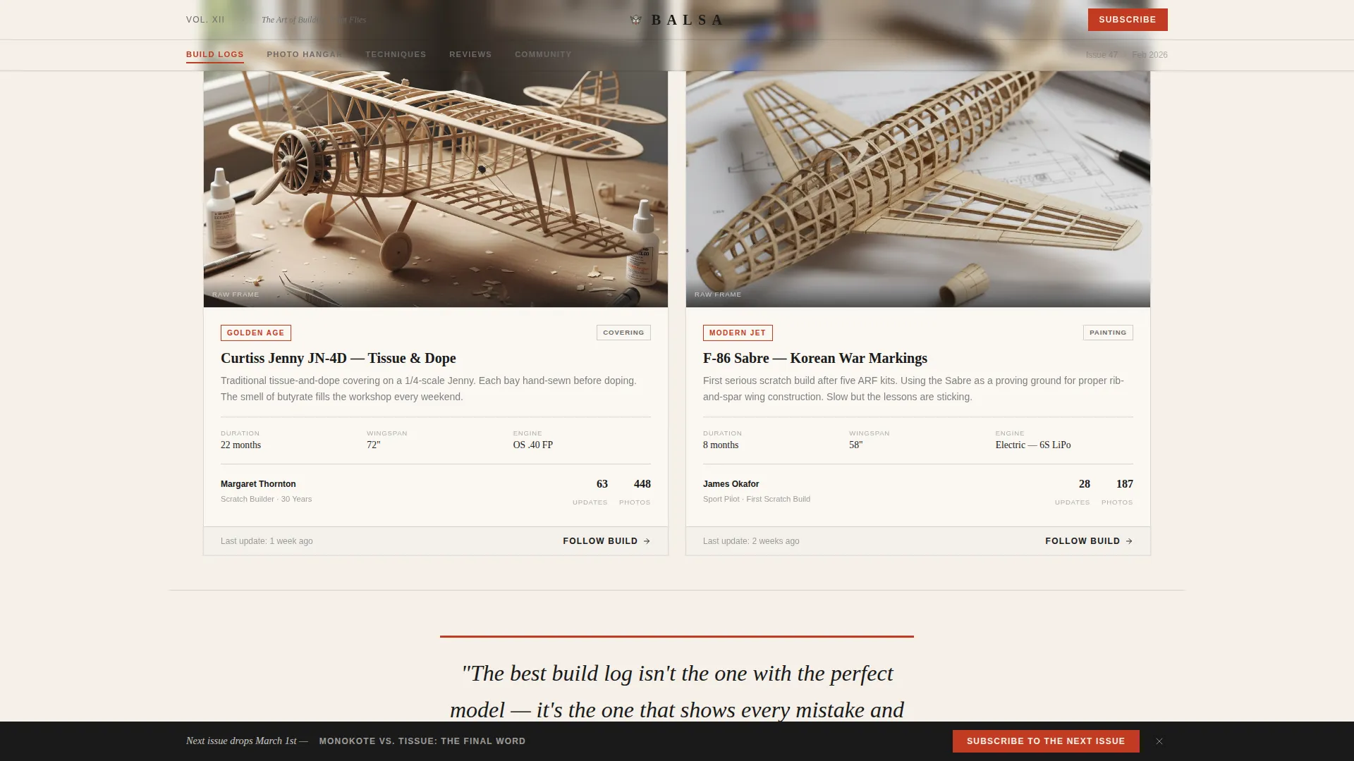
The Build Logs section opens with large hero cards. Each card pairs a raw-wood skeleton shot beside its finished paint scheme, giving visitors an immediate before-and-after editorial narrative. Featured build previews load in a scrollable, magazine-spread rhythm.
Techniques Section with Photo Sequences
Step-by-step photo sequences are laid out like magazine how-tos with numbered captions. The section uses masked text reveal animations and scroll-triggered IntersectionObserver effects to pace the reader through each technique without overwhelming them.
Photo Hangar Masonry Grid
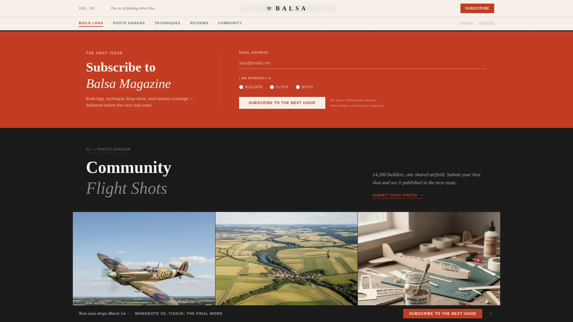
Community-submitted flight shots are displayed in a masonry grid. Each image expands on hover and opens into a full editorial feature on click. The layout balances density and breathing room, alternating between information-rich spreads and full-bleed photography with a single pull quote.
Low-Friction Subscribe and Contribution Forms
The subscribe banner asks only for an email address and a single radio selection: Builder, Flyer, or Both. A secondary contribution path invites visitors to submit a build with a photo upload and a short description field. Both forms keep friction minimal so more readers cross the threshold into active community membership.
Page sections overview
| Section | Purpose |
|---|---|
| Editorial Hero | Establish authority with full-viewport Spitfire photography, masthead, and chapter subtitle |
| Fixed Anchor Nav | Let readers jump directly to any spoke section from anywhere on the page |
| Build Logs | Showcase skeleton-to-finished hero cards and featured build previews |
| Subscribe Banner | Capture emails with a slim, low-friction ribbon between spokes |
| Techniques Section | Guide builders through step-by-step photo sequences with numbered captions |
| Photo Hangar Grid | Display community flight shots in an expandable masonry layout |
| Community Spoke | Surface social proof, contributor credits, and AMA Nationals references |
| Footer Ribbon | Repeat the subscribe call to action as a persistent scroll-fixed strip |
Design & branding system
The visual identity follows an Editorial Magazine theme built on the Ink and Paper color system. Every design decision reinforces the feeling of a freshly printed broadsheet laid on a drafting table.
- Color palette: deep typeset black (#1A1A1A), warm newsprint cream (#F5F0E8), pencil-sketch graphite (#6B6B6B), and margin-note red (#C23B22) reserved for navigation highlights, pull quotes, and category tags
- Typography: Fraunces display serif for headlines and chapter titles, paired with DM Sans for body text and interface elements
- Animations include a Ken Burns hero effect, masked text reveals, a marquee ticker, and scroll-triggered section reveals using IntersectionObserver
Mobile & speed optimization
The template is designed desktop-first for long reading sessions, but it maintains solid usability on smaller screens. Layout decisions prioritize sharp photography and readable typography across devices.
- Static images and CSS-based animations keep the page lean without relying on heavy JavaScript libraries
- The masonry grid, anchor navigation, and subscribe forms reflow cleanly for tablet and mobile viewports
How this template helps you convert
Every structural choice on this page moves a reader closer to subscribing or submitting a build. The conversion path is clear, low-pressure, and editorially integrated rather than feeling like a marketing overlay.
- The fixed footer ribbon keeps the "Subscribe to the Next Issue" call to action visible throughout the entire scroll journey, so readers can act the moment they feel ready
- The slim subscribe banner placed between the second and third spokes catches readers at peak engagement, right after they have absorbed two full content sections
- The "Submit Your Build" form turns passive readers into active contributors, increasing both community investment and the volume of user-generated content for future issues
Other information about this template
This template is built specifically for the model aviation niche and carries details that reflect the community's real culture, from AMA Nationals references to contributor photo credits and community build counts used as social proof.
- The Gallery Walk creative direction means each spoke section feels like a distinct room the visitor strolls into, with its own visual rhythm and editorial tone
- The Content/Resource landing page direction prioritizes depth and trust over hard-sell conversion tactics, which suits an audience of technically minded hobbyists
- The hub-and-spoke anchor navigation structure makes it straightforward to extend the template with additional spoke sections as the community grows
Theme
Editorial Magazine
Creative direction
Gallery Walk
Color system
Ink & Paper
Style
Hub & Spoke (Anchor Nav)
Direction
Content/Resource
Page Sections
Full-viewport Editorial Hero
Fixed Anchor Navigation Bar
Build Logs with Hero Cards
Photo Hangar Masonry Grid
Low-friction Subscribe Banner
Community Contribution Form
Related questions
Can I replace the hero and section photography with my own images?
How does the subscribe form collect reader information?
Is this template a good fit for a community that is just getting started?
Does the anchor navigation remain visible throughout the full page scroll?
What type of community or publication is this template best suited for?



