Beacon — Predictive Medical Device Landing Page Template
Pulse is a healthtech landing page template built for growth-stage clinical AI platforms targeting VP-level hospital decision makers. It opens with a live ROI calculator, flows through a frosted comparison table and evidence layer, and closes with a personalized demo booking call to action. The Tech Glass design system gives every section a clinical, data-driven visual authority.
by Rocket studio
Quick summary
Pulse is a single-page, click-through landing page template designed for growth-stage healthtech platforms selling to hospital operations leaders. It leads with an interactive ROI estimator, moves through a structured evidence narrative, and ends with a personalized demo booking flow. The frosted glass visual system makes data feel precise and trustworthy from the first scroll.
Who this template is for
This template is built for clinical AI and healthtech software-as-a-service companies at the growth stage. It is specifically shaped around selling to senior hospital decision makers who evaluate tools on measurable operational outcomes, not feature lists.
- VP of Operations, Chief Medical Officers, and Chief Nursing Officers at regional hospital systems
- IT and electronic health record integration leads comparing platform compatibility
- Healthtech founders and marketing teams preparing outbound sales collateral for enterprise prospects
What problem this template solves
Hospital decision makers receive dozens of vendor pitches every quarter. Most landing pages show the same generic screenshots and bullet points that do nothing to address the specific financial and clinical pressures each system faces. A generic page forces a busy VP to translate your value proposition into their own context, and most will not bother.
- Visitors leave before understanding the direct financial impact on their specific hospital
- Competitor comparisons are buried or missing, leaving evaluation to chance
- There is no mechanism to create a personalized, data-led conversation before a sales call
What you get with this template
Pulse gives you a complete, production-ready landing page structured around the buying psychology of senior hospital administrators. Every section is sequenced to build credibility and urgency before the call to action appears.
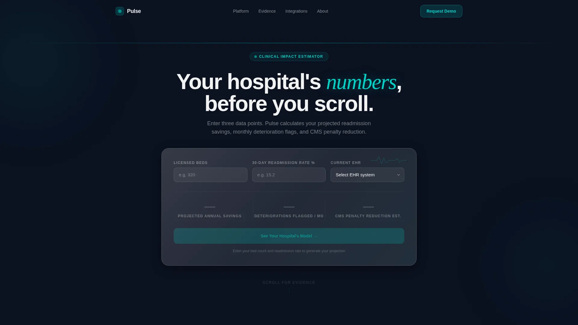
- A live ROI calculator header that outputs personalized annual savings, monthly flagged deteriorations, and Centers for Medicare and Medicaid Services (CMS) penalty reduction estimates
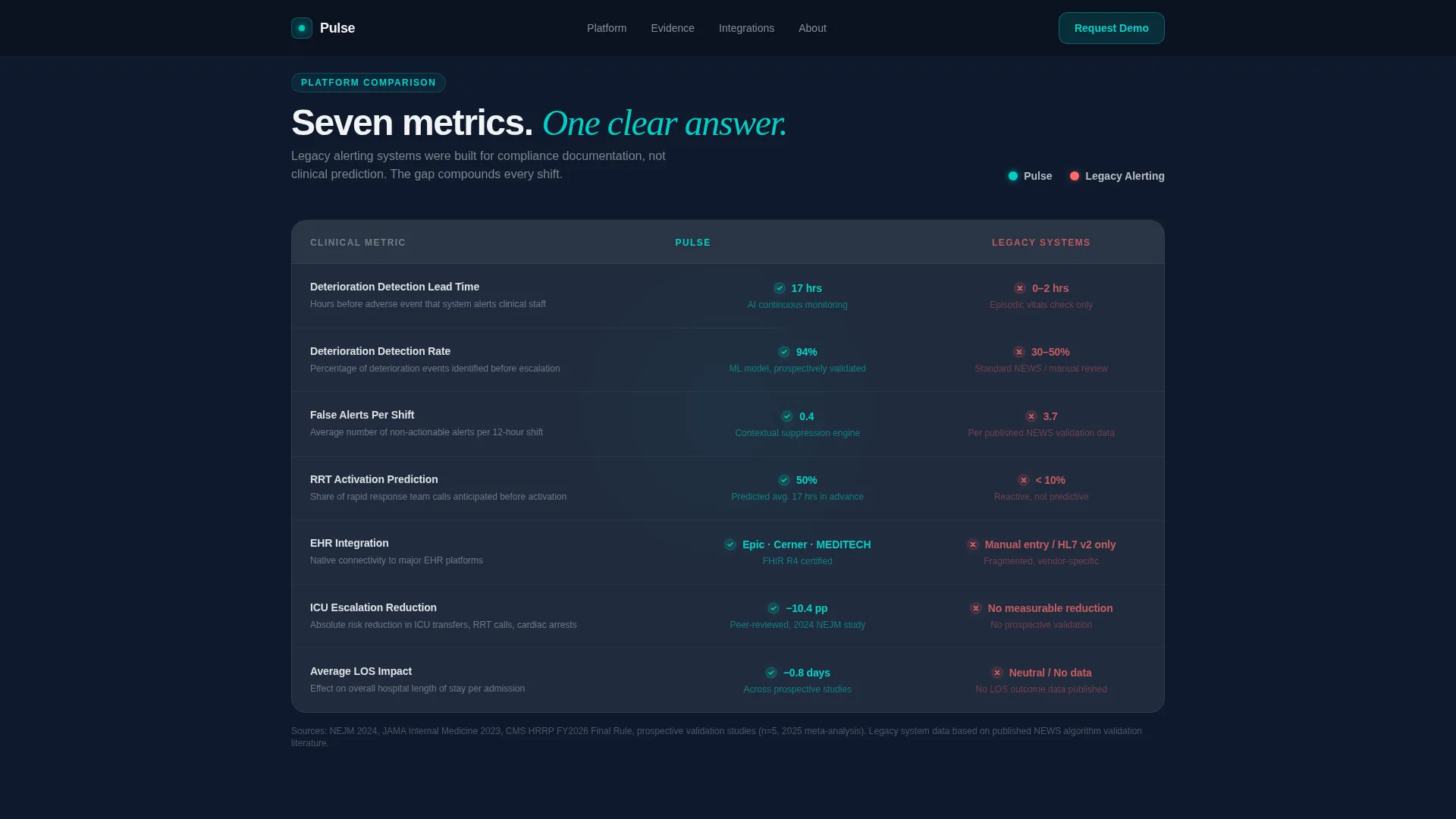
- A frosted glass comparison table contrasting your platform against legacy alerting systems across seven clinical metrics
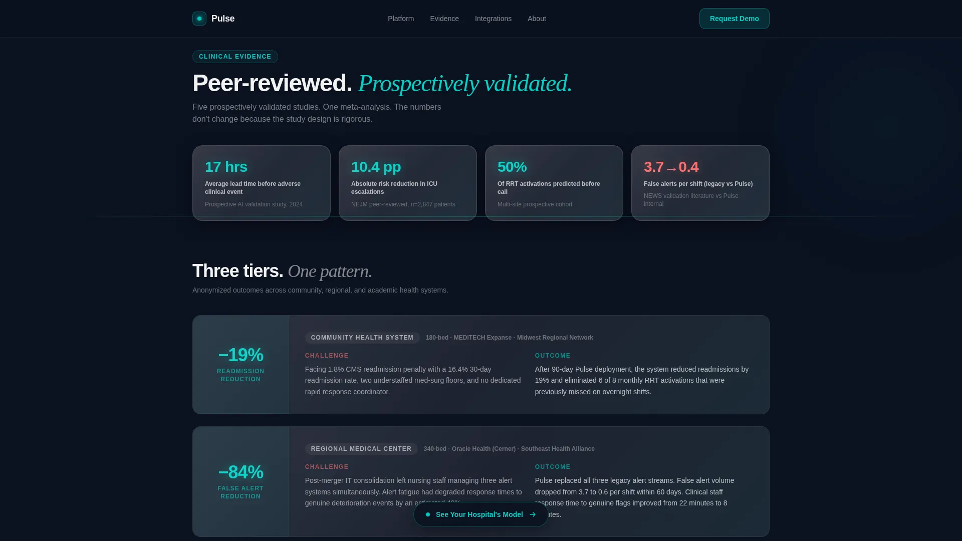
- An evidence layer with peer-reviewed outcome data cards and three anonymized case studies across community, regional, and academic health system tiers
Feature list
This template ships with a focused set of interactive and visual components grounded in the brief.
Live ROI Calculator Header
The page opens with a frosted glass estimator card. Visitors enter their hospital bed count, average readmission rate, and current electronic health record (EHR) vendor from a dropdown. The tool animates projected annual savings, deterioration flags per month, and CMS penalty reduction in real time, with numbers ticking upward in clinical teal like a vitals monitor.
Frosted Comparison Table
A structured seven-metric comparison table renders Pulse against legacy alerting systems. Teal checkmarks float on glass rows for Pulse strengths, while coral indicators mark competitor gaps. Hover states activate on each row, keeping senior evaluators engaged as they scan the clinical differentiators.
Evidence Layer with Data Cards
Outcome statistics are presented as glowing data cards that sharpen into focus as they enter the viewport. Three anonymized case studies, drawn from community, regional, and academic health system tiers, give prospects recognizable peer contexts without exposing protected data.
Loop-Back Personalized Call to Action
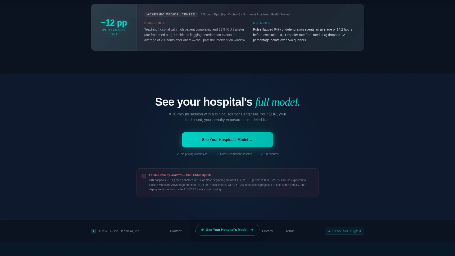
The final section pulls the visitor's calculator output back into view. The personalized numbers reappear alongside the demo booking form, making the conversion step feel like a continuation of an already-started analysis rather than a cold ask.
Persistent Frosted Pill Navigation
After a visitor scrolls past 40 percent of the page, a frosted pill call-to-action button appears in the bottom navigation bar. It stays visible throughout the rest of the session, ensuring the primary action remains accessible without interrupting the reading flow.
Qualifying Demo Booking Form
Clicking the primary call to action lands visitors on a short form: name, title, health system name, and a single radio selector for their current EHR system. The form is intentionally minimal to reduce friction while collecting the qualification data the sales team needs.
Page sections overview
| Section | Purpose |
|---|---|
| ROI Calculator Header | Personalize savings output instantly |
| Comparison Table | Contrast Pulse against legacy systems |
| Evidence and Outcomes | Present peer-reviewed clinical proof |
| Anonymized Case Studies | Build tier-matched peer credibility |
| Loop-Back Call to Action | Re-anchor personalized numbers for conversion |
| Demo Booking Form | Qualify and capture high-intent prospects |
| Footer | Single-row linear navigation closure |
Design & branding system
The visual language follows a Tech Glass theme built to feel like a sterile cleanroom viewed through glass. Every surface carries a faint gradient sheen, cards stack with frosted blur borders, and the color system creates an immediate sense of clinical precision.
- Deep surgical navy (#0B1120) as the full-page background, frost white at 8 to 12 percent opacity for glass card layers, and clinical teal (#00D2C6) on all interactive elements and data highlights
- Soft warning coral (#FF6B6B) reserved exclusively for competitor-column metrics and risk indicators in the comparison table
- DM Sans for body copy and interface elements, paired with Fraunces in serif italic for accent typographic moments
Mobile & speed optimization
The template is designed desktop-first, reflecting the reality that VP-level buyers evaluate platforms on workstations during operations meetings. It is also built to respond cleanly on tablets for reviewers working outside the office.
- Static page sections are structured as server components to reduce client-side load for non-interactive content
- The live calculator runs as an isolated client component, keeping interactivity contained without burdening the full page
- Staggered card reveal animations and viewport-triggered sharpening effects are scoped to visible content, avoiding unnecessary rendering overhead
How this template helps you convert
The page is structured as a click-through funnel. Each section progressively builds the case, and the primary call to action appears at exactly the moments when buyer intent is highest.
- The calculator delivers a personalized financial projection at the very top of the page, replacing generic value claims with numbers specific to the visitor's own hospital and creating an immediate reason to keep scrolling.
- The comparison table and evidence layer provide the peer-reviewed and competitive proof needed to satisfy a VP-level buyer before they agree to invest time in a live demo.
- The loop-back call to action reintroduces the visitor's own projected numbers alongside the booking form, so the final conversion step feels like completing an analysis already in progress rather than responding to a generic sales pitch.
Other information about this template
Pulse is built for healthtech platforms operating in a regulated, high-scrutiny buying environment. Several details in the template reflect that context directly.
- The CMS regulatory framing, including readmission penalty language and scorecard references, is built into the copy structure and section sequencing
- The EHR vendor dropdown in the calculator includes selectors for the major platforms commonly evaluated in hospital procurement cycles
- No stock photography or hero illustrations are used anywhere on the page; the interactive calculator output serves as the visual centerpiece and the primary hook
- The page uses no pricing section and no free trial offer, reflecting a sales motion built around demo qualification rather than self-serve conversion
- Animation behavior includes counter tick-up on calculator outputs, viewport sharpening on data cards, and staggered card reveals on the evidence layer
- The footer follows a Pattern 1 linear single-row layout, keeping navigation minimal and focused
Theme
Tech Glass
Creative direction
Industry Report
Color system
Glassmorphic
Style
Comparison Table
Direction
Click-Through
Page Sections
Live ROI Calculator with Real-time Output
Seven-metric Frosted Comparison Table
Viewport-triggered Evidence Data Cards
Loop-back Personalized Call to Action
Persistent Frosted Pill Navigation Button
Short Qualifying Demo Booking Form
Related questions
Who is the primary buyer this template is designed to reach?
Does the template include a pricing section?
Can the EHR vendor options in the calculator be customized?
What makes the comparison table different from a standard feature grid?
Is this template suitable for a pre-launch healthtech company?



