Hobby & Passion Content Reviews Website Template
Bellows is a masonry-style landing page template built for an accordion playing blog and community. It pairs an Editorial Magazine aesthetic with an Origin Story narrative flow, guiding visitors from a founder memoir into a tiling grid of article previews and member spotlights. The primary goal is newsletter signups, captured through a torn-paper email card and a sticky bottom bar.
by Rocket studio
Quick summary
Bellows is a single-page, masonry-layout template for an accordion playing blog and community. It uses an Ink and Paper color system, a Collage and Scrapbook hero, and a scroll narrative that widens from a personal founder story into a chorus of member voices. The end goal is simple: turn curious visitors into newsletter subscribers.
Who this template is for
This template is built for niche editorial creators who want their passion to feel like a publication, not a generic blog. It suits anyone running a music-focused community site where the writing quality is the product.
- Self-taught accordion hobbyists who want to build a community around technique and shared experience
- Conservatory students or lapsed players looking to publish tutorials, transcriptions, or personal essays
- Independent editorial bloggers in hobby and passion niches who need a structured, conversion-ready layout
What problem this template solves
Most blog templates treat content as a feed. Bellows treats content as a narrative. Players at every level struggle to find a space that honors beginner frustration and advanced obsession equally, and generic templates do nothing to communicate that editorial commitment.
- A flat, scrollable blog gives no visual sense of depth or community
- Standard newsletter prompts feel like interruptions; this template weaves them into the story
- Without a defined visual identity, a passion project looks amateur even when the writing is excellent
What you get with this template
You get a fully designed, single-page editorial layout that moves visitors from intrigue to subscription without feeling like a sales funnel. Every section is intentional and sequenced.
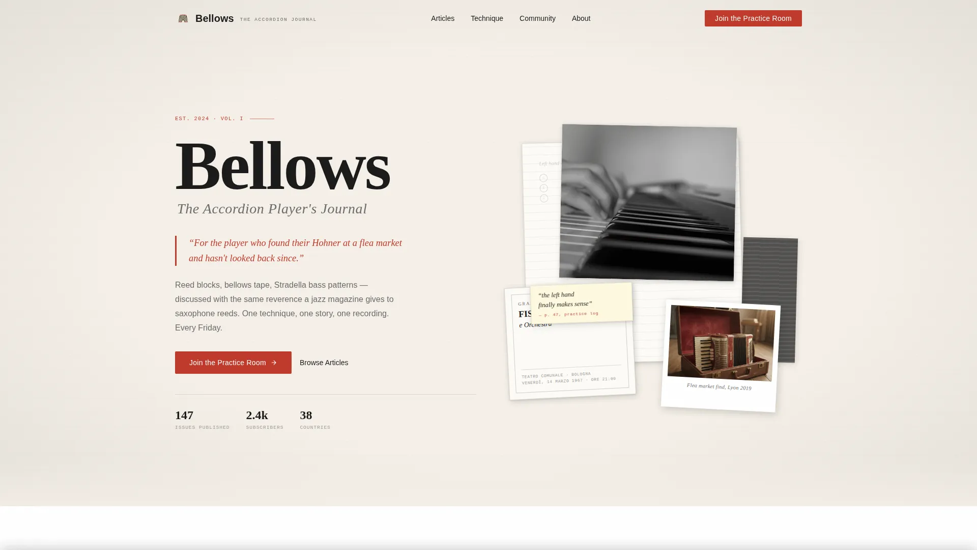
- A Collage and Scrapbook hero with overlapping layers, angled elements, and a parallax-shifting polaroid
- A masonry content grid with hover states and audio preview simulation for article cards
- Two strategically placed email capture placements: one inline torn-paper card and one sticky bottom bar
Feature list
The Bellows template ships with a focused set of built-in components drawn directly from its editorial and community brief.
Collage Hero with Parallax Element
The hero section layers torn manuscript pages, a vintage handbill, a strip of bellows tape, and a black-and-white photograph of accordion hands. One polaroid image subtly parallax-shifts on scroll, adding physical depth to the composition without heavy animation overhead.
Origin Story Column Layout
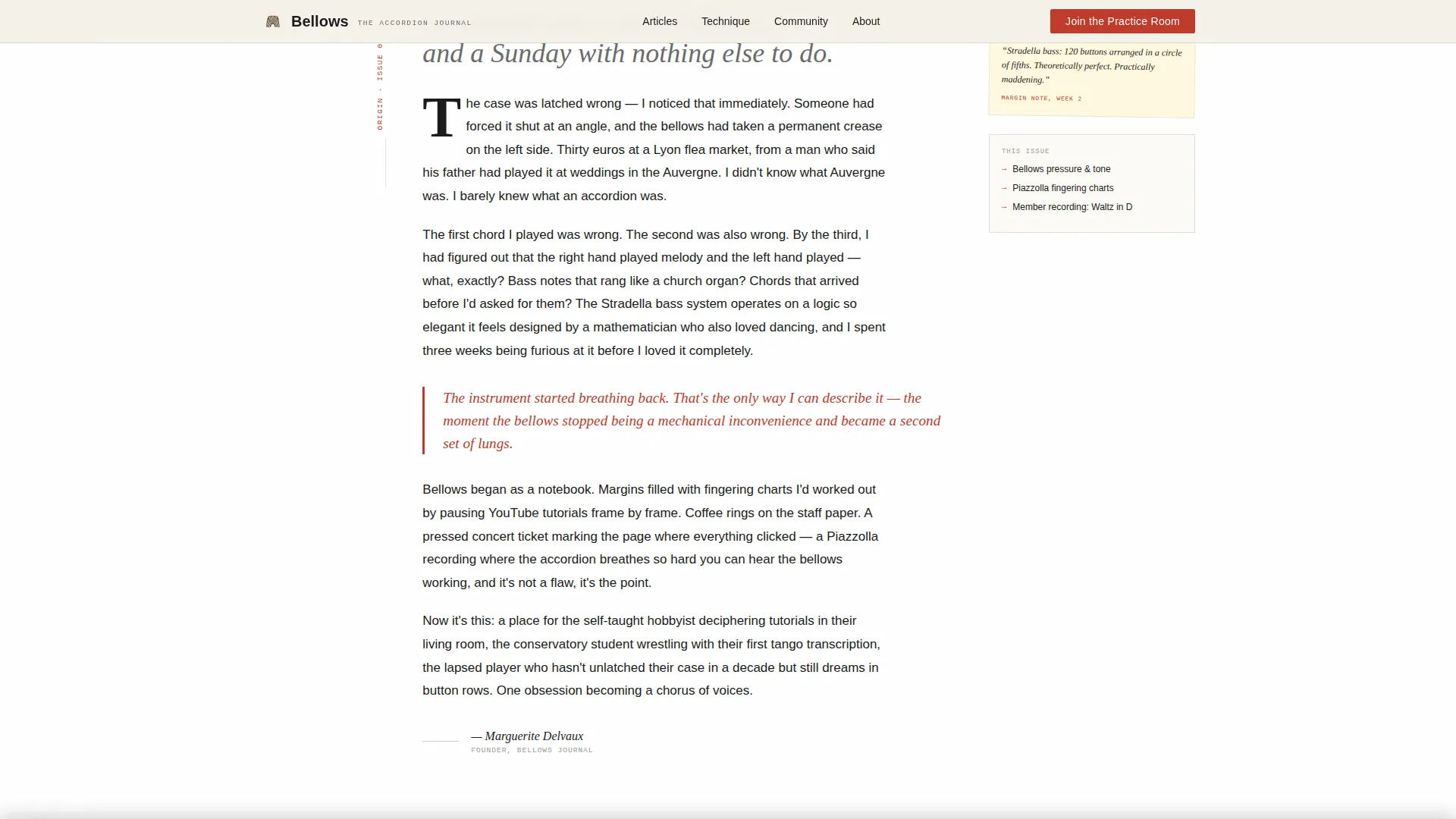
Below the hero, a single typeset column carries the founder's memoir voice. The layout is intentionally narrow and intimate, drawing the reader in before the page expands into the wider masonry grid. It establishes trust before asking for anything.
Masonry Content Grid with Hover Audio Simulation
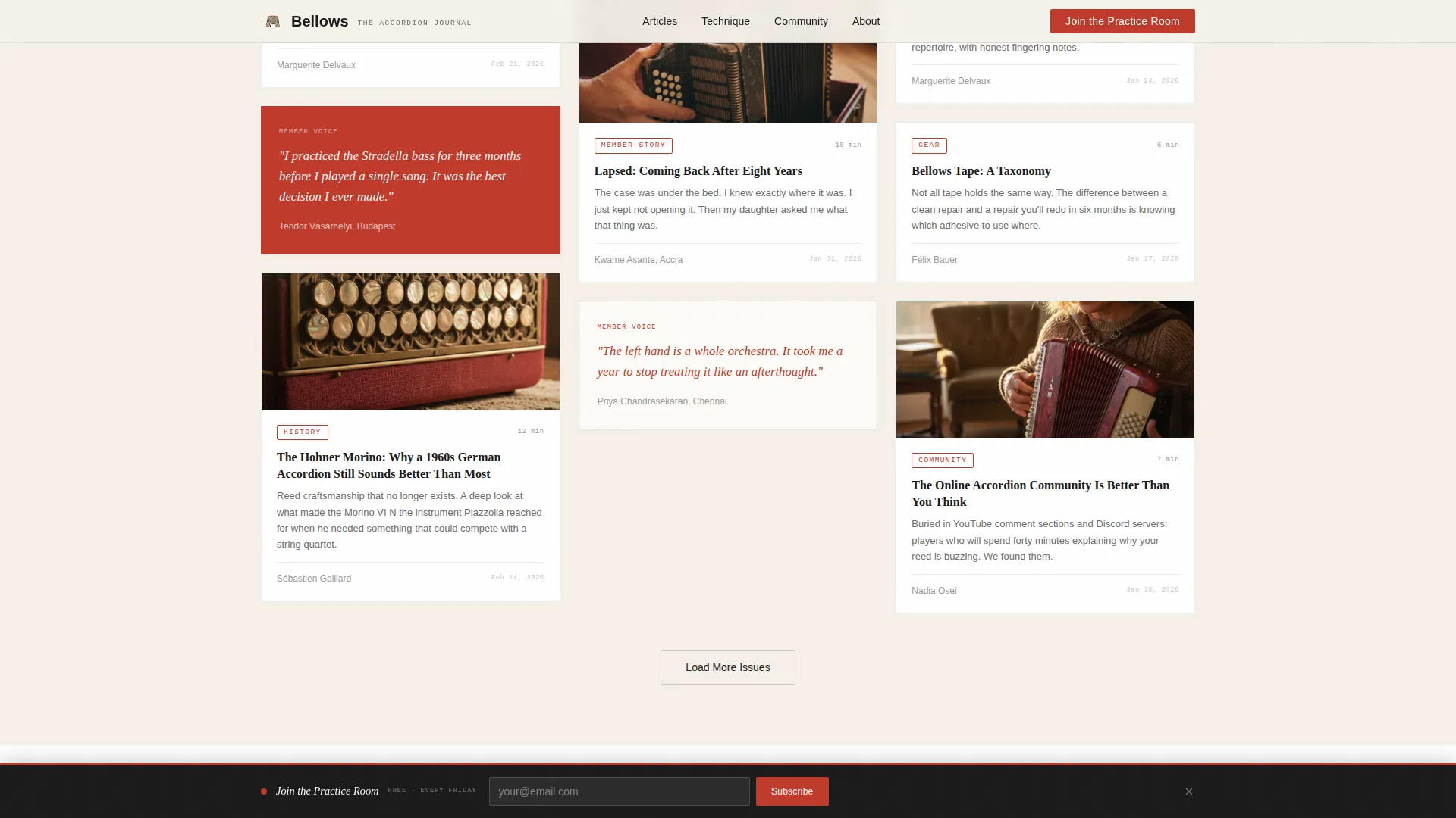
Article previews tile outward in a Pinterest-style masonry layout. Each card includes hover states and a simulated two-second audio preview interaction, giving the content grid a tactile, magazine-like feel that encourages browsing.
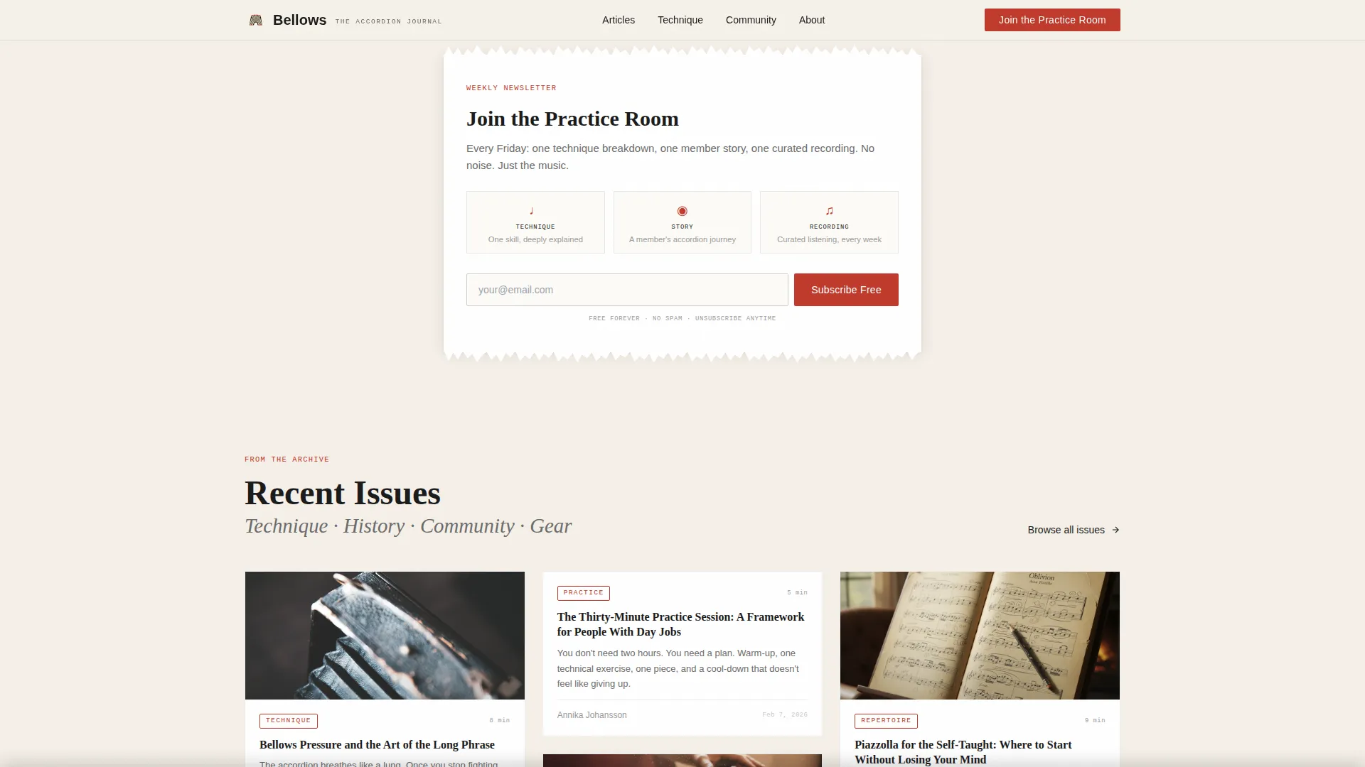
Inline Torn-Paper Email Capture
After the origin story, an email capture card styled as a torn-paper motif interrupts the scroll gently. It includes a single input field and a call-to-action button in annotation red. The prompt is "Join the Practice Room," framing the newsletter as a weekly ritual.
Sticky Bottom Bar for Return Visitors
Once a visitor has scrolled past three masonry content cards, a sticky bottom bar appears with a second newsletter prompt. The timing ensures the ask only surfaces after the reader has sampled enough content to decide the writing is worth their inbox.
Member Spotlight Cards
Community voices appear as masonry cards alongside article previews. These spotlight cards provide social proof through real member stories, deepening the sense of belonging and reinforcing the community dimension of the brand.
Page sections overview
| Section | Purpose |
|---|---|
| Hero Collage | Sets editorial tone with layered scrapbook composition and parallax depth |
| Origin Story Column | Founder memoir builds personal trust before widening to community |
| Inline Newsletter Capture | Torn-paper email card converts readers at peak engagement |
| Masonry Content Grid | Article previews tile outward with hover audio simulation |
| Member Spotlight Cards | Community voices add social proof and reinforce belonging |
| Sticky Bottom Bar | Second newsletter prompt surfaces after sufficient content exposure |
| Footer | Logo and tagline left, navigation links right |
Design & branding system
The visual identity is rooted in a 1960s European music journal aesthetic. Every color and type choice reinforces the feeling of a well-loved notebook rather than a digital product.
- Colors: aged parchment (#F5F0E8), fountain-pen black (#1A1A1A), faded annotation red (#C0392B) for interactive elements and pull quotes, and pencil-graphite gray (#6B6B6B) for secondary text and dividers
- Typography: Fraunces serif for headlines, DM Sans for body text, and IBM Plex Mono for annotations and category labels
- Backgrounds alternate between warm parchment and clean white; annotation red is reserved exclusively for buttons, category tags, and pull quotes that interrupt the scroll
Mobile & speed optimization
The template is designed desktop-first, reflecting the likely reading context of someone with an instrument nearby. A strong mobile fallback ensures the editorial experience holds on smaller screens.
- Minimal JavaScript is used for scroll effects, parallax behavior, and the hover audio simulation, keeping the page light
- Server Components handle static content sections, reducing unnecessary client-side rendering
- Staggered reveal animations and the scan line on the hero are scoped to avoid layout shift on mobile viewports
How this template helps you convert
Bellows builds conversion pressure gradually and honestly. By the time a visitor reaches the newsletter prompt, they have already read enough to want more.
- The Origin Story column establishes a human voice early, creating the kind of personal connection that makes a newsletter signup feel like following a writer, not joining a mailing list.
- The inline torn-paper email card appears at the moment of peak engagement, right after the founder memoir, when curiosity is highest and the visitor is already leaning in.
- The sticky bottom bar provides a low-friction second chance for readers who scrolled past the inline prompt, triggered only after they have browsed multiple content cards.
Other information about this template
Bellows is built for a specific intersection of editorial depth and community warmth. A few additional details are worth noting for anyone evaluating the template.
- The "Share Your Story" secondary call to action links to a short-form submission page, seeding user-generated content and reinforcing community ownership
- Pull quotes styled in annotation red are built into the masonry grid to stop the scroll and highlight standout lines from articles
- The footer follows an Arc Browser Split pattern: logo and tagline on the left, navigation links on the right
- The template is scoped to a single landing page structure, making it straightforward to deploy as a standalone community entry point
- The Ink and Paper color system and scrapbook composition make it well-suited to other hobby and passion editorial projects beyond accordion playing
Theme
Editorial Magazine
Creative direction
Origin Story
Color system
Ink & Paper
Style
Masonry/Pinterest
Direction
Lead Generation
Page Sections
Collage Hero with Parallax Depth
Origin Story Typeset Column
Masonry Grid with Hover Audio Simulation
Torn-paper Inline Email Capture
Sticky Bottom Bar Newsletter Prompt
Member Spotlight Card System
Related questions
Who is this template designed for?
Can I use this template for a newsletter-first project?
How does the hover audio preview work?
Is the masonry grid flexible enough for different content types?
What typography does this template use?



