Beta - Highvelocity Launch Landing Page Template
A bento grid landing page built for beta program launches. The template uses a dark Dashboard Pro aesthetic with live-feel metrics, a decrementing spot counter, and a single-click call to action. It is designed to prove product momentum, create genuine scarcity, and push early adopters toward signup before the beta closes.
by Rocket studio
Quick summary
This is a single-page bento grid landing page built specifically for beta program launches. It opens with a full-viewport stats wall that replaces the traditional hero section with live-feel numbers. Every design decision drives toward one action: claiming a beta spot before the counter runs out.
Who this template is for
This template is built for founders, product teams, and launch-focused builders who need to capture early adopters fast. It suits people who want to signal product momentum before a public launch.
- Startup CTOs evaluating new developer tools and wanting early feedback loops
- Product managers running structured beta programs with limited seat counts
- Indie hackers who need a credible launch page ready before the community thread goes live
What problem this template solves
Most pre-launch pages feel static and unconvincing. They show a polished illustration and a vague waitlist form, which gives visitors no reason to act now. This template replaces passive presentation with active proof.
- Visitors see no real evidence the product exists or is moving
- Generic waitlist pages fail to communicate scarcity or momentum
- Teams lose early adopters because the page does not create urgency
What you get with this template
You get a fully structured bento grid landing page designed around the launch energy of a real beta program. The layout is ready to drop your numbers, copy, and branding into.
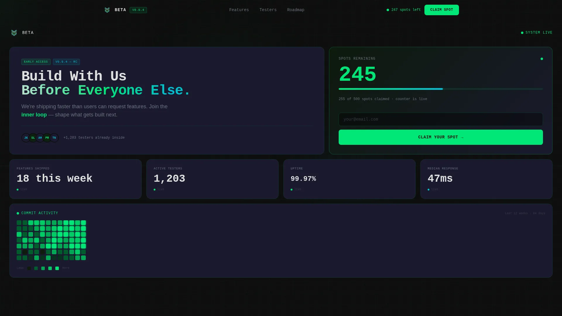
- A full-viewport stats wall header with metric cards for beta spots, features shipped, active testers, uptime, response time, and commit activity
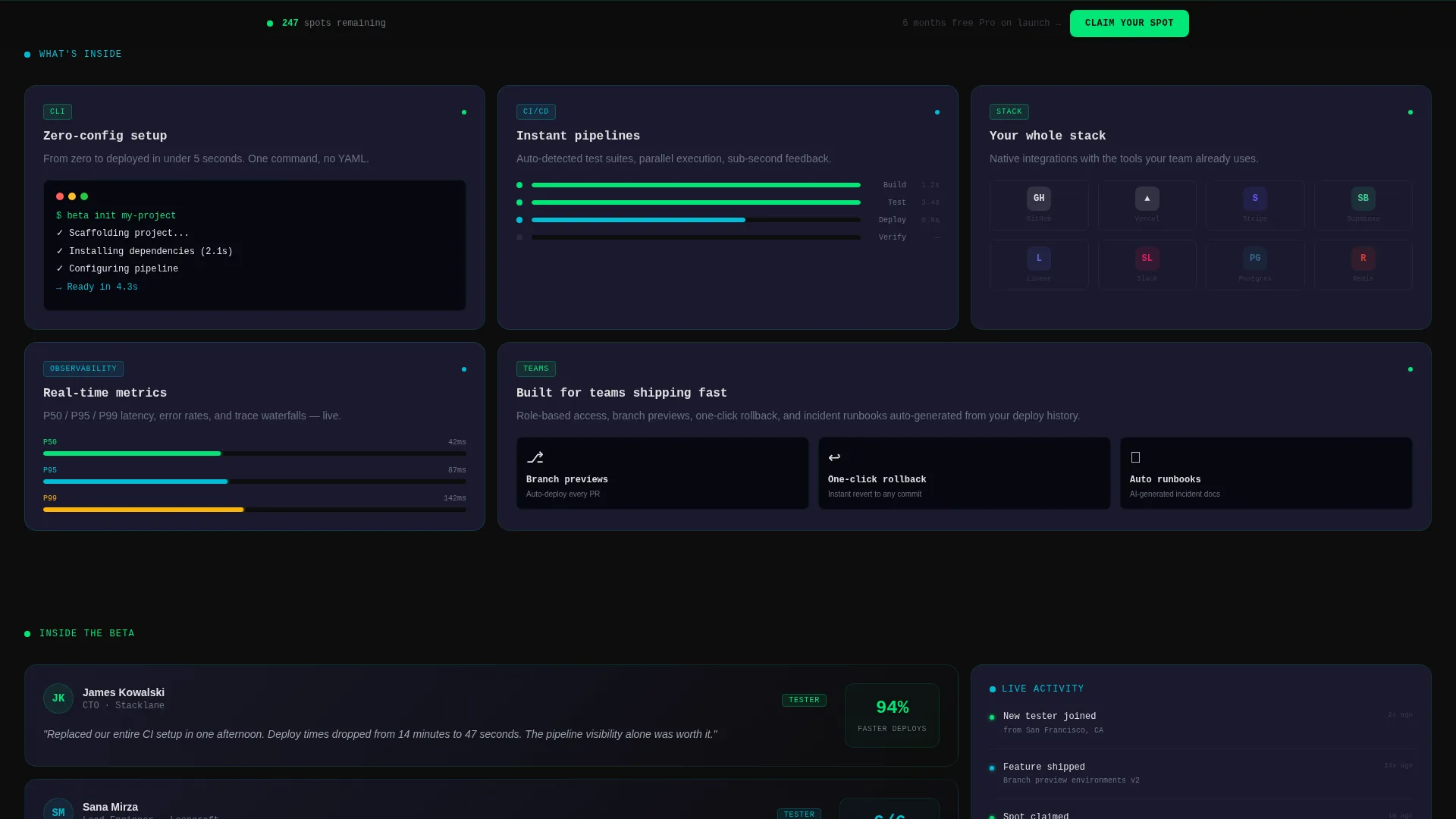
- Scrolling bento sections with feature preview cards, a roadmap timeline, tester testimonial cards, and an integrations stack card
- Three placement points for the primary call-to-action button, including a sticky bottom bar and a closing full-width card with an email field
Feature list
This section walks through the core built-in components that make the template work.
Full-Viewport Stats Wall Header
The header is a bento grid of oversized monospace numbers. It displays beta spots remaining, features shipped this week, active tester count, uptime percentage, median response time, and a commit activity heatmap. No hero image is used. The data itself serves as the visual anchor.
Decrementing Spot Counter with call to action Card
A dedicated bento card shows the remaining beta spots counting down. The primary call-to-action button sits directly below that number, making scarcity and action inseparable. This card appears first in the header grid so it is always above the fold.
Roadmap Timeline with Status States
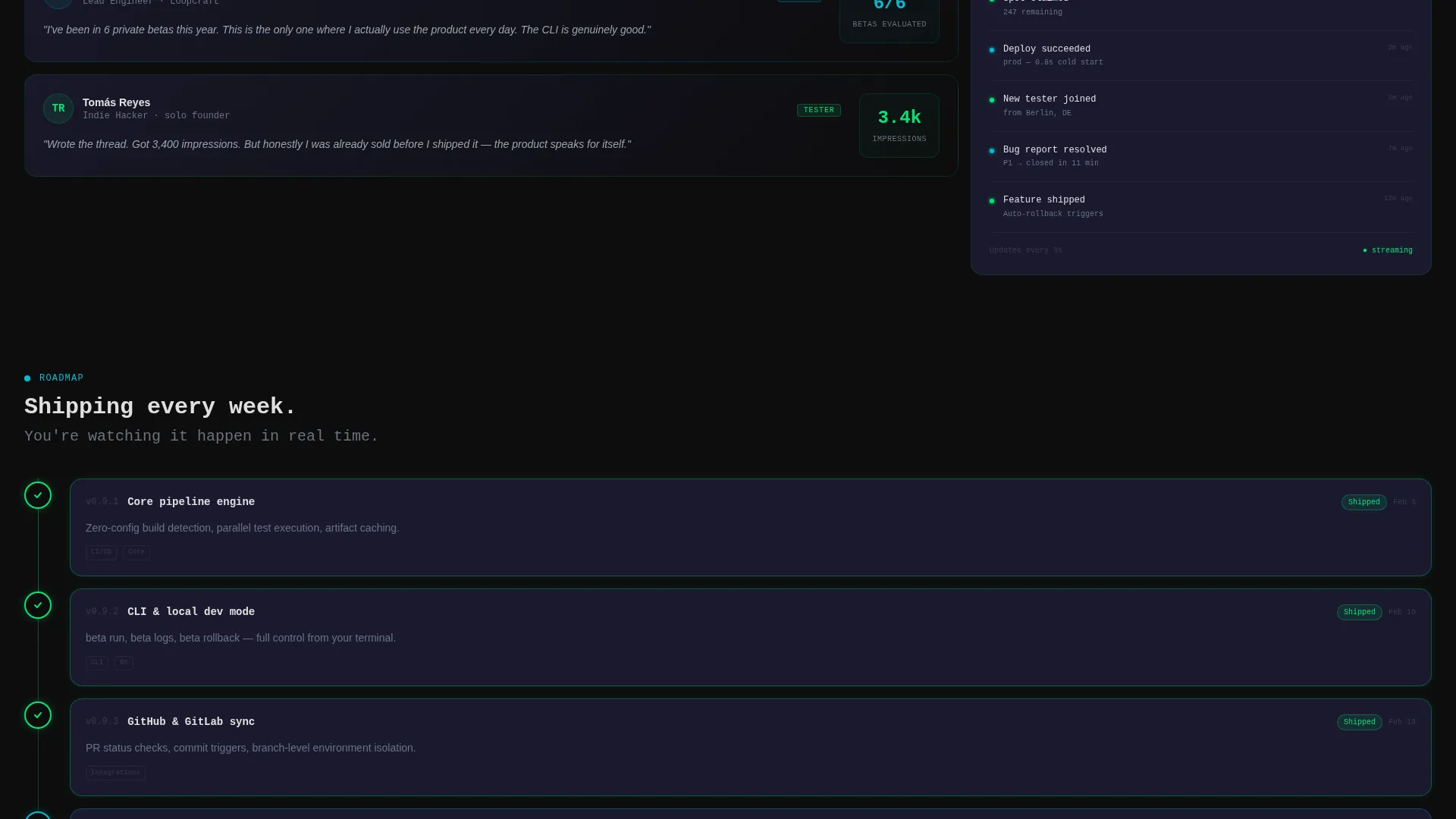
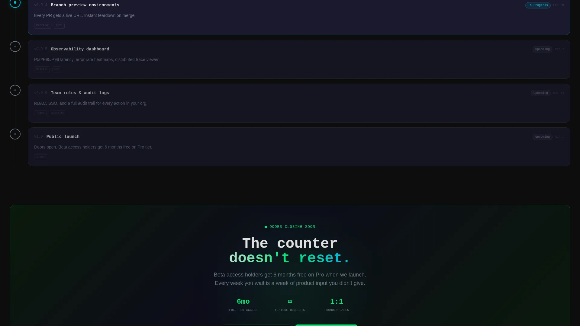
A bento card displays a product roadmap timeline. Shipped items are styled in telemetry green. Upcoming items pulse in electric cyan. Visitors can see real progress at a glance without reading a paragraph.
Tester Testimonial Cards
Testimonial cards from current beta testers are built into the bento layout. Each card is styled to feel like a real dashboard slice, reinforcing that actual users exist and are already inside the product.
Sticky Bottom Bar call to action
After the first scroll, a sticky bottom bar carries the primary call-to-action forward across the rest of the page. Visitors never lose sight of the next step, regardless of where they are in the scroll flow.
Closing Full-Width call to action Card
The page ends with a full-width card that adds a single email input field for visitors ready to commit. The form has one field maximum, keeping friction at its lowest possible point before the signup flow begins.
Page sections overview
| Section | Purpose |
|---|---|
| Stats wall header | Opens with live-feel metrics and the primary call to action card above the fold |
| Spot counter card | Shows remaining beta seats and anchors the first call to action button |
| Feature preview cards | Displays small interactive-style demos of product capabilities |
| Roadmap timeline card | Shows shipped and upcoming items with color-coded status states |
| Tester testimonial cards | Provides social proof from current beta participants |
| Integrations stack card | Shows logos of tools the visitor likely already uses |
| Sticky bottom bar | Keeps the call to action visible after the first scroll throughout the page |
| Closing call to action card | Full-width section with a single email field for direct commitment |
Design & branding system
The template uses a Dashboard Pro theme built on a Carbon Fiber color system. The palette is tuned to feel like the inside of a matte-black developer workstation late at night, purposeful and alive.
- Core colors: deep cockpit black (#0D0D0D) as the dominant background at roughly 80 percent of the canvas, woven carbon gray (#1A1A2E) for card surfaces, telemetry green (#00E676) for live and active states, signal white (#E0E0E0) for primary text, and electric cyan (#00BCD4) for interactive and counter states
- Typography: oversized monospace numerals for metric values, with headline copy placed inside grid cells as if it belongs to the data layout
- Card behavior: individual bento cards subtly pulse when their displayed value changes, and section cards load with slight upward momentum that accelerates as the visitor scrolls deeper
Mobile & speed optimization
The bento grid layout is structured to reflow cleanly on smaller screens. Cards that span two columns on desktop can stack vertically on mobile without losing the visual hierarchy of the metrics wall.
- Monospace number cards retain their oversized scale on mobile for immediate impact
- The sticky bottom bar remains fixed on mobile viewports, keeping the call-to-action reachable at all times
- Section load animations are designed with upward momentum that feels intentional rather than heavy, keeping the scroll experience smooth across devices
How this template helps you convert
The entire page is a click-through landing page engineered to earn one action: the tap or click that takes a visitor to the signup flow.
- Live-feel metrics in the header prove the product is real and actively moving, removing the skepticism that kills beta signups on generic waitlist pages
- The decrementing spot counter creates genuine, visible scarcity that motivates action without resorting to countdown timers that reset on refresh
- Three call to action placements across the page ensure the call to action is always within reach, whether the visitor decides in the first five seconds or after reading the full roadmap
Other information about this template
This template is part of the Startup and Launch category, under the Product Launch and Pre-Launch subcategory, with a niche focus on beta program landing pages. It is built for teams that want to move fast and launch with credibility.
- The template style is a bento grid, a layout pattern that organizes mixed-size cards into a dashboard-like composition
- It is classified as a click-through landing page, meaning its sole job is to earn the click to the next step rather than collect form data on the page itself
- The single email field in the closing call to action card is the maximum form complexity on this page, keeping the experience fast and low-friction
- This template fits naturally into a broader product launch flow where the landing page hands off to a dedicated signup or onboarding page
Theme
Dashboard Pro
Creative direction
Launch Energy
Color system
Carbon Fiber
Style
Bento Grid
Direction
Click-Through
Page Sections
Full-viewport Stats Wall Header
Decrementing Spot Counter with Call to Action
Roadmap Timeline with Status States
Tester Testimonial Cards
Sticky Bottom Bar Call to Action
Low-friction Closing Call to Action Card
Related questions
Does this template include a real-time database for the live metrics?
Can I change the color system to match my own brand?
Is this a multi-page template or a single landing page?
How many call-to-action placements does the template include?
Who is this template best suited for?



