Construction Blog & Media Reviews Website Template
Blueprint is a single-column editorial landing page built for a prestige construction review journal. It pairs a typographic hero with an inline five-step quiz that tests build literacy, then converts curious readers into subscribers at the results screen. The Luxe Minimal design uses cloud white, brushed graphite, and architectural gold to feel authoritative without being cold.
by Rocket studio
Quick summary
Blueprint is a single-column flow landing page designed for a construction review journal. It opens with a commanding typographic headline, moves through a dense editorial manifesto, and leads readers into a five-step inline quiz that reveals their construction literacy tier. The page earns trust through editorial rigour before asking for anything in return.
Who this template is for
This template suits publishers, educators, and content creators who want to build an audience around construction craft and critical industry knowledge. It is built for people who want authority, not just traffic.
- Project managers and owner-builders looking for a platform that matches their depth of interest
- Architecture students and general contractors who want peer-level critique and field knowledge
- Editorial teams launching a construction review blog or digital journal aimed at a craft-literate readership
What problem this template solves
Most construction content online is shallow, product-led, or written for a general audience. Professionals who want to read critically about craft, methodology, and technique have very few trusted publications to turn to. This template gives that publication a home.
- It replaces generic blog layouts with an editorial monograph aesthetic that signals authority immediately
- It removes the friction of asking for an email before delivering value, using a quiz to earn the conversion
- It gives readers a reason to self-identify and engage before they are ever asked to subscribe
What you get with this template
You get a fully structured single-column landing page with five distinct content sections, a persistent call-to-action bar, and an inline interactive quiz. Every element serves the editorial identity and the conversion goal at the same time.
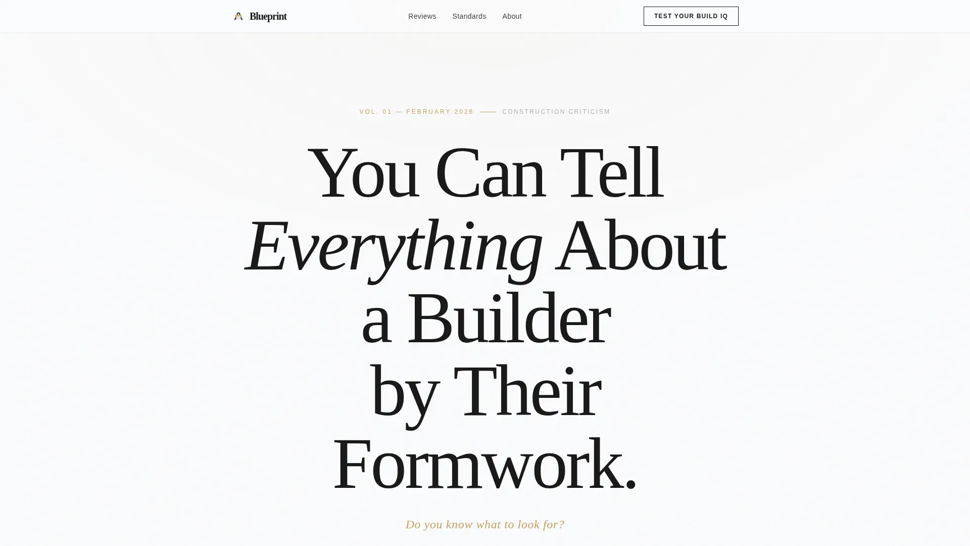
- A typographic hero with a giant serif headline and a gold-accented subhead, no imagery required
- A five-step inline quiz with image-based questions, role identification, a score reveal, and a single-field email gate at results
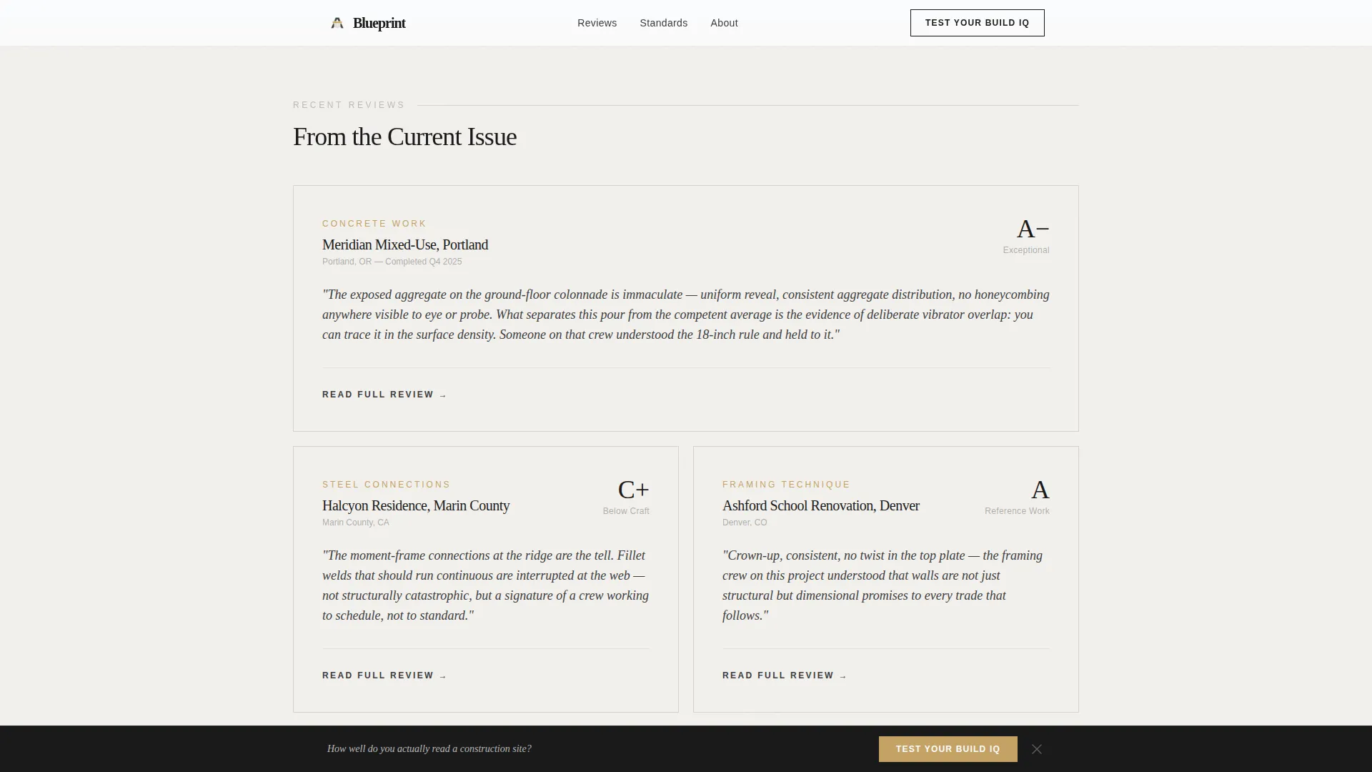
- A pale cement review excerpt grid, a full-width editorial philosophy statement, and marginalia-styled testimonials
Feature list
This section describes the key functional and design features built into the Blueprint template.
Giant Typographic Hero
The hero section uses no images. A single editorial statement is set in a large-scale refined serif typeface against cloud white. The only accent is a gold-toned subhead beneath it. The negative space is intentional and creates an immediate sense of authority.
Five-Step Inline Quiz
The quiz opens inline after the manifesto section without redirecting the visitor. It begins with a role identifier question, then moves into image-based questions where readers assess construction defects, material grades, and technique quality from close-up site photography. The quiz expands progressively within the page.
Score Reveal and Email Gate
After completing all five questions, the visitor sees their construction literacy tier. Only at this results screen are they asked for an email address to receive their full assessment and access to the top ten reviews. The email field is minimal, with a single input and a gold-accented submit button.
Review Excerpts Grid
Curated pull-quotes from construction reviews are displayed on pale cement cards in an asymmetric bento-style layout. The grid gives readers a taste of the editorial voice before they commit to subscribing.
Persistent Bottom Call-to-Action Bar
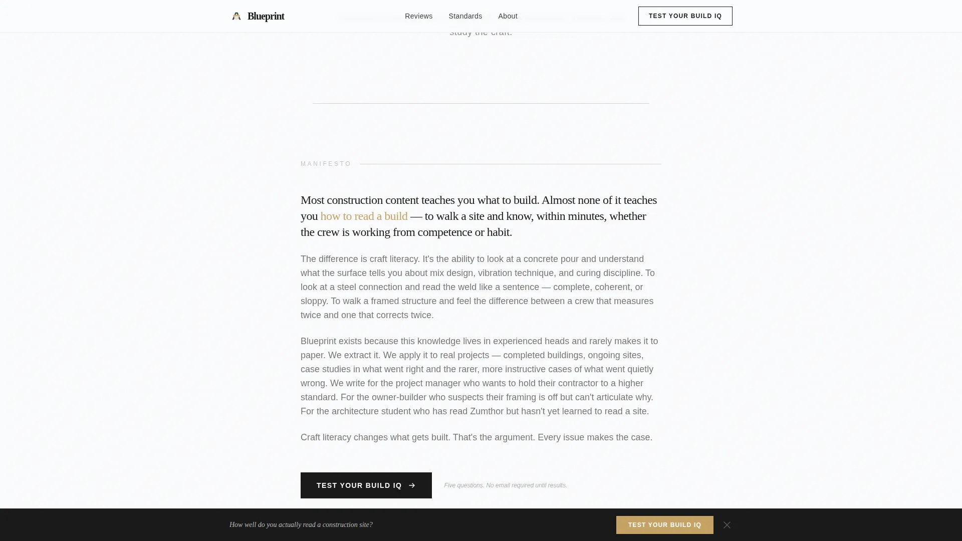
A fixed bottom bar appears as the reader scrolls past the manifesto. It repeats the primary call to action, keeping the quiz entry point visible throughout the reading experience without interrupting the page flow.
Marginalia-Styled Testimonials
Reader testimonials are formatted to look like handwritten margin notes rather than standard review cards. This design choice reinforces the editorial identity and adds social proof in a way that feels native to the journal aesthetic.
Page sections overview
| Section | Purpose |
|---|---|
| Typographic Hero | Arrests attention with editorial headline and gold subhead |
| Manifesto Paragraph | Builds intellectual argument for construction craft literacy |
| Quiz Call to Action | Invites readers to test their build knowledge inline |
| Review Excerpts Grid | Shows editorial voice through curated pale cement pull-quote cards |
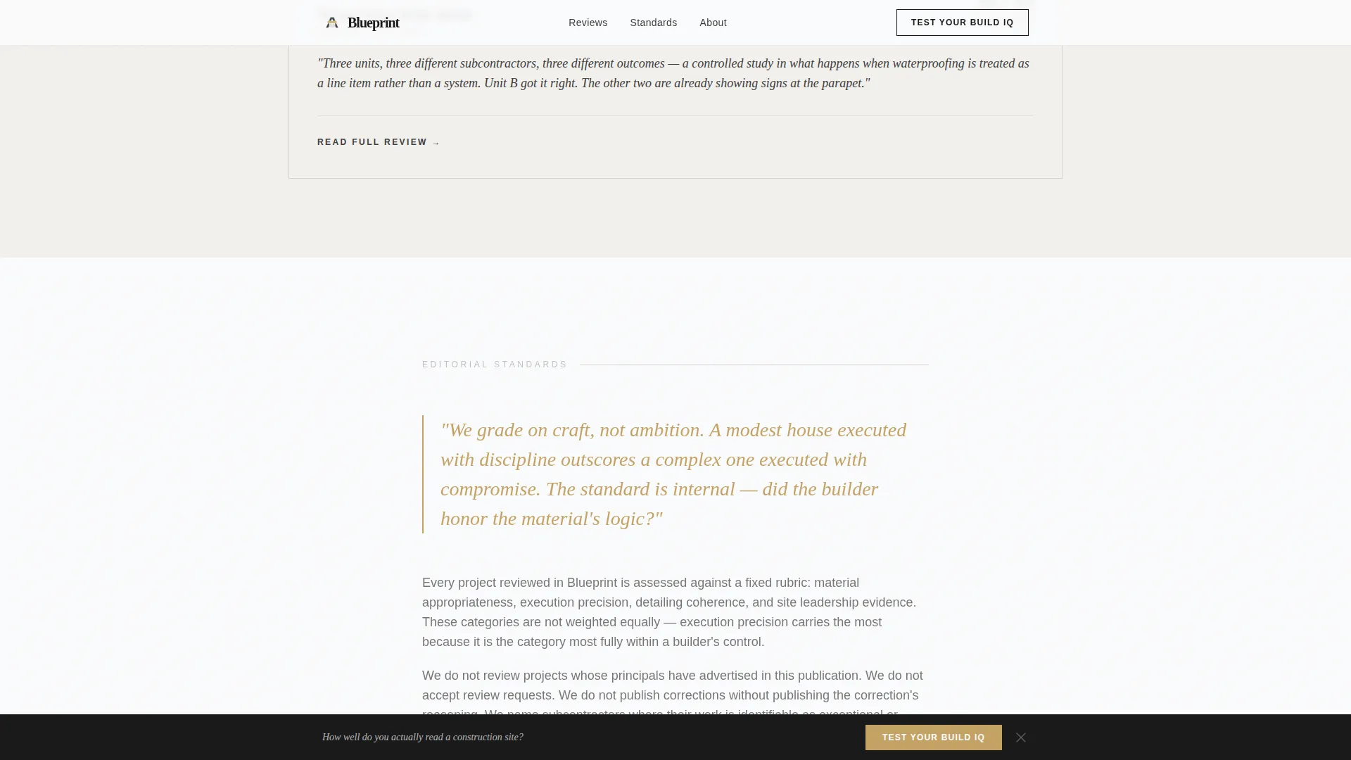
| Editorial Philosophy | Full-width statement with gold accent pull-quote on standards |
| Reader Testimonials | Marginalia-styled social proof with reader tier badges |
| Persistent Bottom Bar | Repeats quiz entry point as a fixed scroll-triggered bar |
| Minimal Footer | Single-row linear footer with essential links |
Design & branding system
The visual identity is Luxe Minimal, drawing from a Cloud Canvas color palette that feels like a freshly plastered wall in a high-end residential build. Every color choice is deliberate, and restraint is the defining quality of the design.
- Colors: cloud white (#FAFBFC) as the base, brushed graphite (#3D3D3D) for all body text, pale cement (#D6D2CC) for card backgrounds, and architectural gold (#C4A265) reserved for interactive moments and pull-quotes only
- Typography: Fraunces serif for all headlines and editorial statements, DM Sans for body text and user interface elements
- Animation: low-to-medium intensity, with scroll-reveal transitions on content sections and gold accent transitions on interactive elements
Mobile & speed optimization
The template is designed desktop-first to match the reading context of its primary audience, but it is fully responsive across screen sizes. The quiz and all interactive components adapt cleanly to smaller viewports.
- Static-first architecture with interactive components isolated to the quiz module only
- Scroll-reveal animations and inline quiz expansion are handled with lightweight client-side components to avoid heavy page loads
- The single-column flow structure makes the reading experience natural on any screen width without layout restructuring
How this template helps you convert
The page is built around a conversion model that earns trust before asking for anything. The quiz is the engine. Every section before and after it is designed to make the reader more curious and more willing to share their email at the results screen.
- The editorial headline and manifesto establish credibility immediately, so the reader trusts the quiz is worth their time before they click it
- The five-step quiz, especially the image-based questions, creates genuine curiosity about the reader's own score, making the email gate feel like a reward rather than a barrier
- The persistent bottom bar and the post-manifesto call to action work together to keep the quiz accessible at every point in the scroll journey without being aggressive
Other information about this template
Blueprint is built for a specific kind of publisher: one who wants the page itself to feel like a statement of editorial values. The template is suited to launching a construction review blog, a niche industry journal, or a craft-focused content platform where the brand voice is as important as the content strategy.
- Template style is Single Column Flow, making it straightforward to customize section by section
- The localization defaults are set for English, United States dollar pricing, and MM/DD/YYYY date format
- The footer follows a Pattern 1 Linear Single-Row layout, keeping the bottom of the page clean and minimal
Theme
Luxe Minimal
Creative direction
Vision & Mission
Color system
Cloud Canvas
Style
Single Column Flow
Direction
Quiz/Assessment
Page Sections
Giant Typographic Hero Section
Five-step Inline Quiz
Score Reveal with Email Gate
Review Excerpts Bento Grid
Persistent Scroll-triggered Call to Action Bar
Marginalia-styled Testimonials
Related questions
Can I change the quiz questions to match my specific topic?
Does the email gate appear before or after the quiz?
Is this template suitable for a desktop-first audience?
Can I use this template without activating the quiz?
How many sections does this landing page include?



