Urbex Editorial Blog Waitlist Landing Page Template
Breach is a waitlist landing page for an urban exploration and urbex blog. It blends editorial storytelling with a warm, field-notebook aesthetic to build an email list before launch. Three photo-essay dispatches pull readers deeper into forgotten spaces, and a segmented signup form converts curiosity into committed subscribers.
by Rocket studio
Quick summary
Breach is a single-page editorial landing page built for an urban exploration journal that hasn't launched yet. It documents forgotten buildings through photo essays and field notes, then converts reader curiosity into waitlist signups. The design feels like a sun-bleached field notebook, warm, worn, and impossible to put down.
Who this template is for
This template is built for creators who want to build an audience before they go live. It suits anyone with a story to tell about forgotten architecture and the patience to let imagery do the talking.
- Night-shift photographers and architecture students who document abandoned or adaptive-reuse buildings
- Urban explorers and armchair adventurers drawn to the idea of undocumented, forgotten spaces
- Editorial bloggers and journal makers who need a coming-soon page that feels as considered as the content itself
What problem this template solves
Most coming-soon pages feel like placeholders. They give no reason to sign up and no sense of what waits on the other side. Breach solves this by making the waitlist feel like exclusive access to something rare.
- Readers arrive with no context, so the page has to build trust and intrigue from the very first frame
- Without segmentation, an email list for a niche journal treats photographers and casual readers the same, wasting every future send
- Generic countdown timers create urgency but no desire; this template uses location teasing and field-note storytelling to create genuine want
What you get with this template
You get a fully designed, single-page editorial landing page that works as a coming-soon and waitlist capture tool. Every section is built to deepen atmosphere before asking for a signup.
- A full-bleed hero section with a delayed serif headline animation that materializes after two seconds of pure image
- Three structured photo-essay dispatches with datelines, italic field notes, and image grids that shift rhythm from spacious to mosaic
- A waitlist call-to-action block with an email field, a Photographer or Explorer toggle, and a footer coordinates teaser built on FOMO
Feature list
This section covers the core built-in features of the Breach landing page template.
Delayed Hero Headline Animation
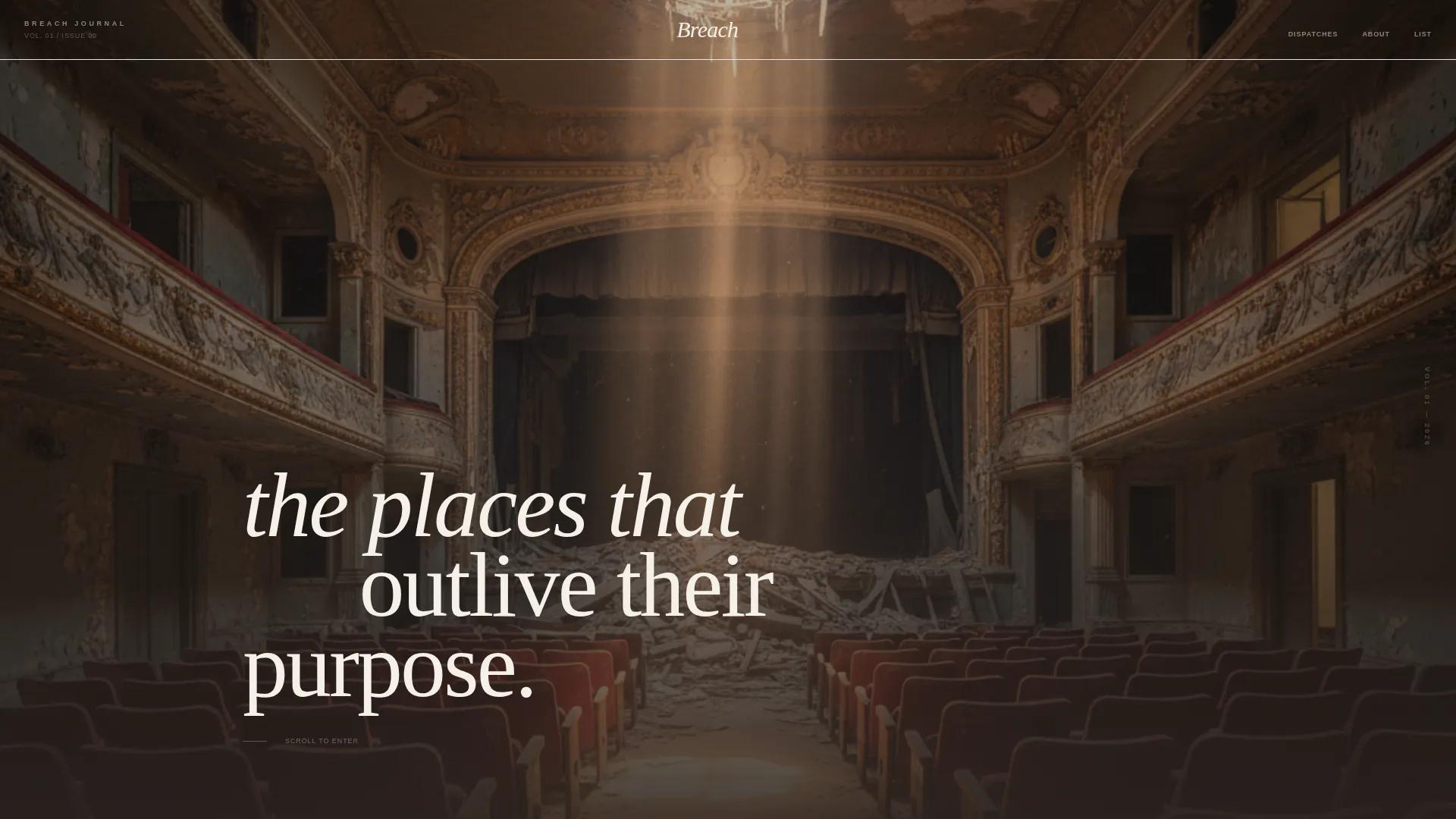
The hero opens on a full-bleed abandoned theater photograph. No text appears for the first two seconds. Then a single lowercase serif headline materializes slowly, creating the feeling of words forming in dust. This animation is built using GSAP ScrollTrigger for smooth, GPU-accelerated timing.
Three-Rhythm Dispatch Layout
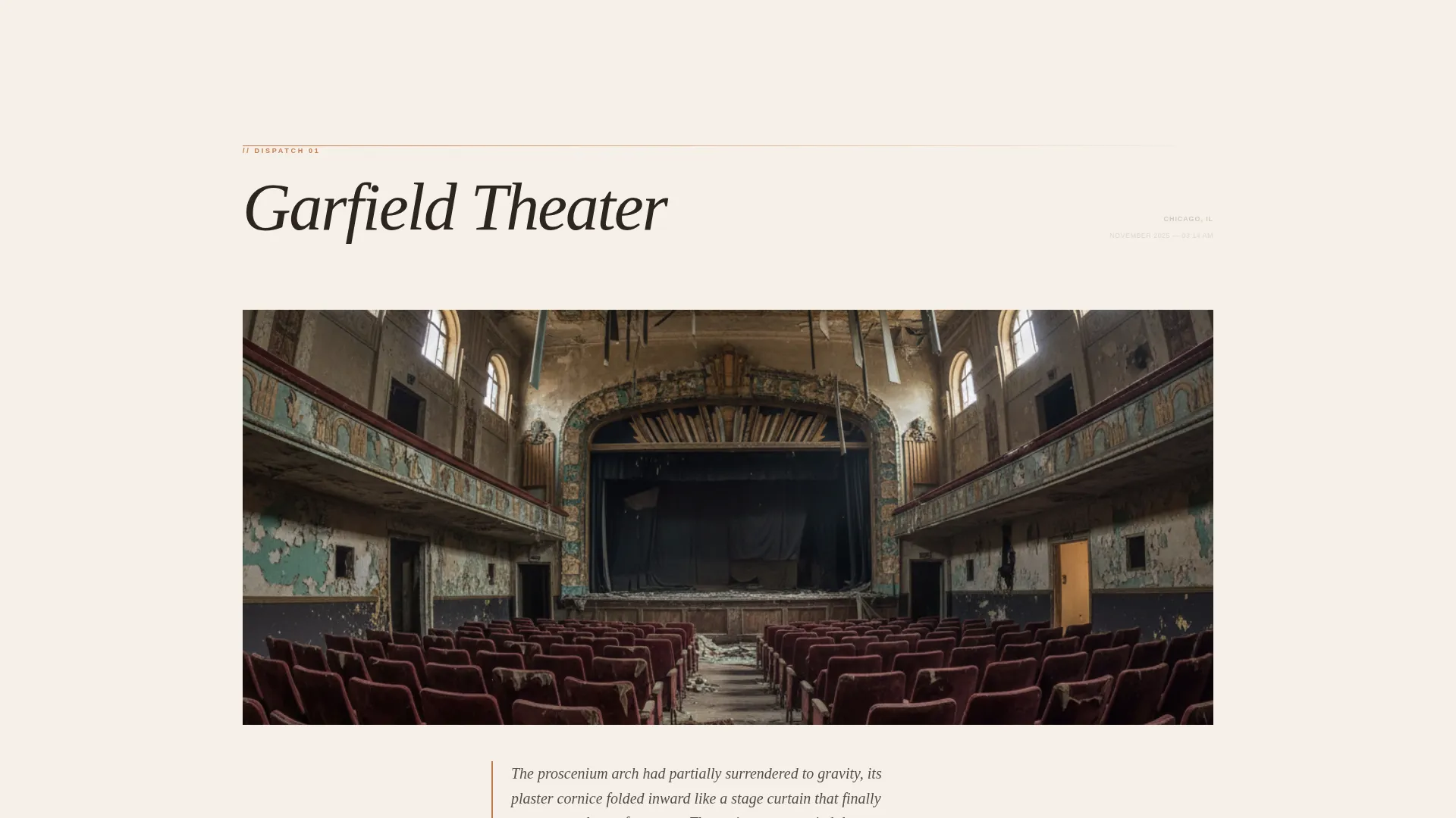
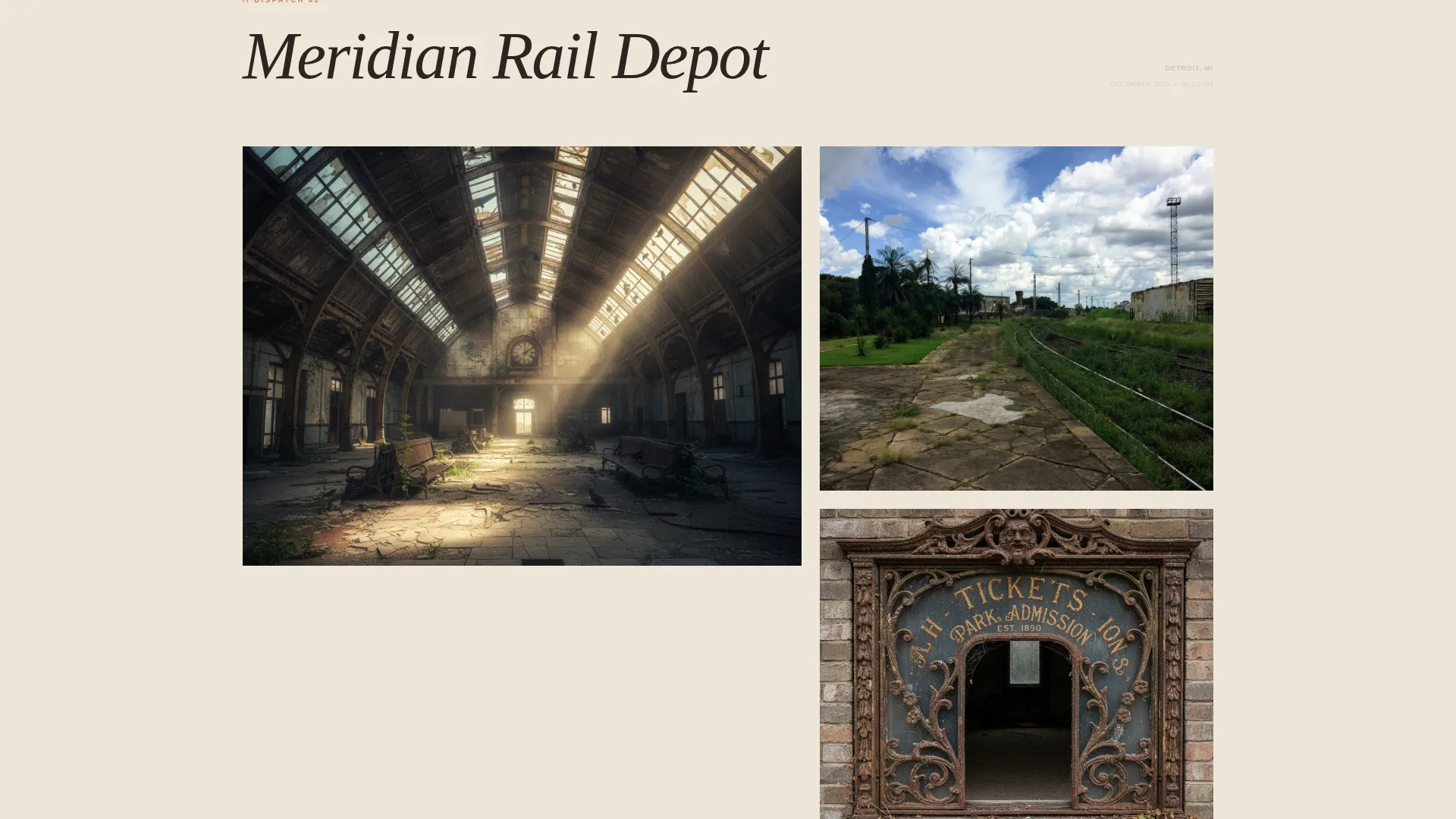
The page flows through three photo-essay dispatches, each with a distinct visual density. The first is slow and spacious. The second is a denser image grid. The third is a rapid mosaic. This accelerating rhythm builds the impression of a deep archive waiting behind a locked door.
Segmented Waitlist Form
The email capture block includes a single input field with the ghost text "your inbox becomes a skeleton key" and a toggle asking visitors to identify as a Photographer or Explorer. This simple segmentation step makes future list sends far more relevant without adding friction to the signup.
Coordinates Teaser in Footer
The footer carries a blurred location photograph with partially redacted GPS coordinates and the line "Full location drops to the list first." This secondary conversion point turns the natural curiosity of urbex readers into a concrete reason to sign up.
Staggered Scroll Reveals
Image grids and dispatch sections use staggered reveal animations triggered on scroll. Each element enters the viewport with a subtle, sequential delay that gives the page a handcrafted, editorial pace rather than a snappy app feel.
Image Hover Zoom
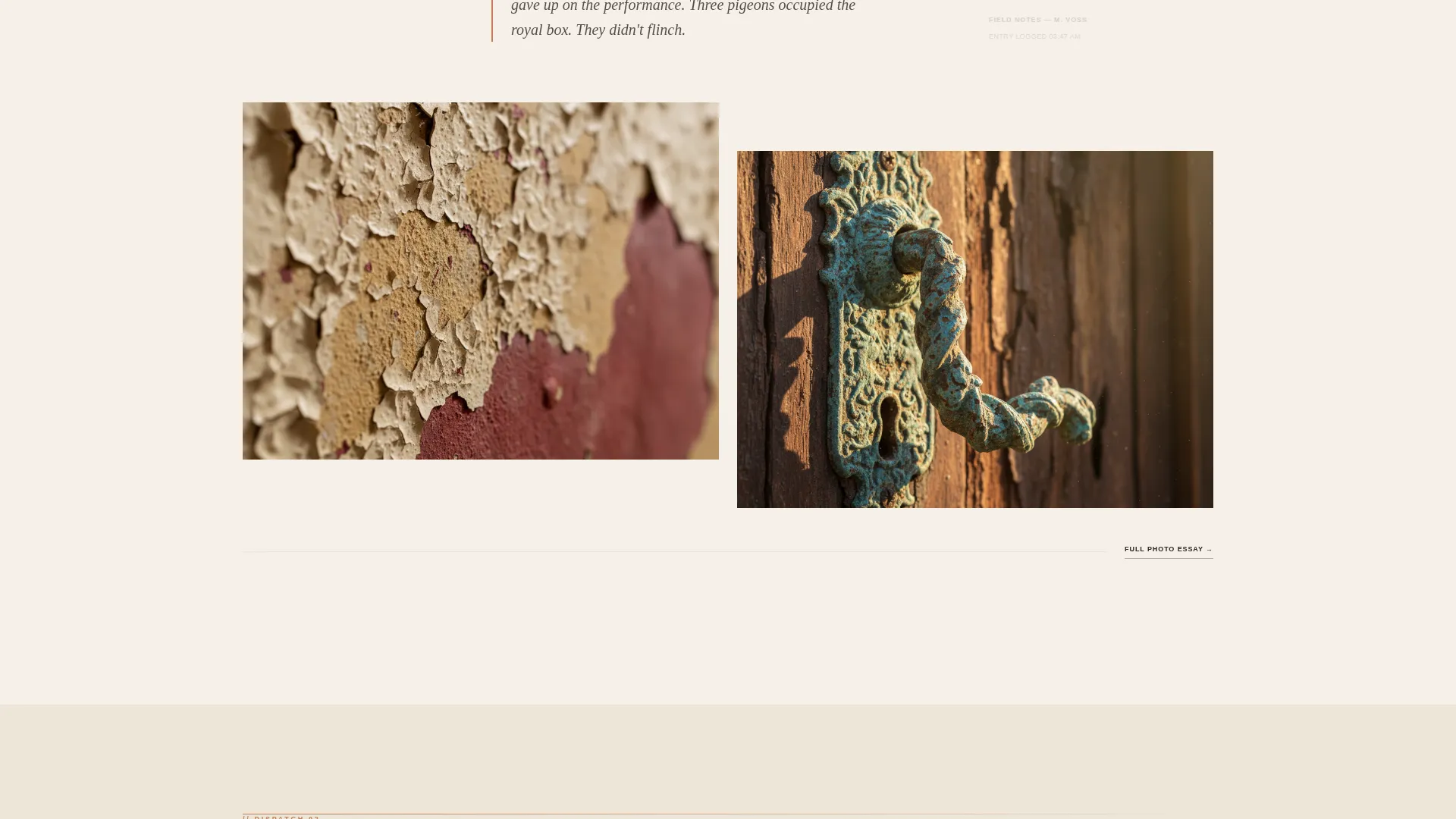
Individual dispatch images respond to hover with a gentle zoom effect. This adds tactile interactivity to the photo essays and encourages readers to linger on detail crops of peeling paint and oxidized hardware.
Page sections overview
| Section | Purpose |
|---|---|
| Full-Bleed Hero | Opens on abandoned theater photo; delayed headline materializes after two seconds |
| Dispatch 01 | Slow, spacious photo essay with dateline and italic field note |
| Dispatch 02 | Denser image grid dispatch with tighter editorial rhythm |
| Dispatch 03 | Rapid mosaic dispatch creating a sense of a deep, growing archive |
| Waitlist Call to Action | Email capture with Photographer/Explorer toggle and FOMO copy |
| Footer Coordinates Teaser | Blurred location photo with redacted GPS digits and list-first copy |
Design & branding system
The visual identity follows a Warm Artisan editorial theme. Every color and type choice is grounded in the metaphor of a field notebook left on a windowsill for years, sun-bleached, coffee-stained, and quietly beautiful.
- Color palette: soft parchment (#F5F0E8) as the dominant background, exposed-plaster warm gray (#B8AFA6) for supporting surfaces, oxidized copper (#C47A4E) on hover states and pull-quote borders, and deep charred timber (#2C2420) for body text and navigation
- Typography: DM Serif Display for headlines and pull quotes, Plus Jakarta Sans for body text and interface elements
- The copper accent appears only on interaction states and key borders, mimicking the slow rust of real copper and giving every hover moment a tactile, material quality
Mobile & speed optimization
The template is designed desktop-first, reflecting how its core audience scouts locations on larger screens using satellite imagery tools. It scales responsively to mobile for readers who discover it through social sharing.
- Images are lazy-loaded to defer offscreen assets and keep initial load light
- All scroll animations use GPU-accelerated transforms to maintain smooth motion without taxing the main thread
- The dispatch image grids reflow cleanly at smaller breakpoints, preserving the editorial rhythm on portrait-oriented screens
How this template helps you convert
Breach is not a generic signup form dressed in moody photography. Every design and copy decision is structured to move a curious visitor toward joining the list.
- The delayed headline and full-bleed hero create an atmosphere of discovery before any ask is made, so the visitor arrives at the waitlist form already emotionally invested in the journal
- The three dispatches accelerate in visual density, building a sense of a vast, undiscovered archive and making the "Get On the List" call to action feel like the only logical next step
- The footer coordinates teaser adds a second, low-pressure conversion point that uses the innate FOMO of the urbex community to capture visitors who scrolled past the primary form
Other information about this template
This template is a strong fit for urbex content creators, abandoned-building photographers, and editorial blog projects that are building an audience ahead of a formal launch. It is also well-suited to architecture and preservation writers who want to establish a sense of exclusivity around their documentation work.
- The Cloud Canvas color system and Warm Artisan theme are specifically matched to give the page a physical, printed-media feel rather than a digital-product look
- The Curated Collection creative direction means the page reads like flipping through a perfect-bound magazine, not scrolling a feed
- Template style is Editorial/Magazine, making it distinct from standard blog index pages or portfolio grids
- The Full-Bleed Photo header concept requires a wide-angle, high-resolution interior photograph to achieve the intended visual impact at launch
Theme
Warm Artisan
Creative direction
Curated Collection
Color system
Cloud Canvas
Style
Editorial/Magazine
Direction
Waitlist/Coming Soon
Page Sections
Delayed Hero Headline Animation
Three-rhythm Dispatch Layout
Segmented Waitlist Form
Footer Coordinates Teaser
Staggered Scroll Reveals
Image Hover Zoom Interaction
Related questions
Can I replace the dispatch locations and field notes with my own content?
Does the Photographer or Explorer toggle segment my email list automatically?
Is the delayed headline animation adjustable?
How many photos do I need to launch with this template?
Is this template suited to editorial topics outside urban exploration?



