Minimalism Podcast Landing Page Template
Breathe is a minimalism and decluttering podcast landing page built around an editorial Ink and Paper identity. It uses a newspaper front-page header, a masonry confession grid, a bold manifesto section, and a feature-article episode grid to guide visitors from curiosity to action. The primary call to action drives listeners straight to episode one.
by Rocket studio
Quick summary
Breathe is a single-page editorial landing page for a weekly minimalism and decluttering podcast. It opens with a full-width newspaper masthead, moves through a masonry grid of listener confessions, a broadsheet manifesto, and a feature-article episode grid, then closes with a typewritten email subscribe form. Every section earns its space through radical typographic specificity.
Who this template is for
This template is built for podcast creators who want their landing page to feel as considered as their content. It suits hosts who treat minimalism as an emotional practice, not a storage hack, and who need to earn listener trust before asking for a click.
- Podcast hosts in the minimalism, lifestyle, or self-development space who value editorial design
- Independent creators launching or relaunching a show and building an early email audience
- Designers or developers building a podcast landing page for a client with a print-inspired visual identity
What problem this template solves
Most podcast landing pages lean on player embeds and show art. They do not give a potential listener a reason to care. This template solves the problem of low conviction by using the editorial structure of a broadsheet newspaper to build trust and context before the call to action ever appears.
- Visitors leave without listening because the page never explains why this show matters to them specifically
- Generic layouts bury the thesis, making the show feel interchangeable with every other mindfulness podcast
- No emotional hook means no reason to subscribe, share, or return
What you get with this template
You get a fully structured, single-page landing page that leads with editorial confidence and converts through specificity. Every section has a defined conversion role, from the masthead that states the thesis to the episode grid that proves it is worth hearing.
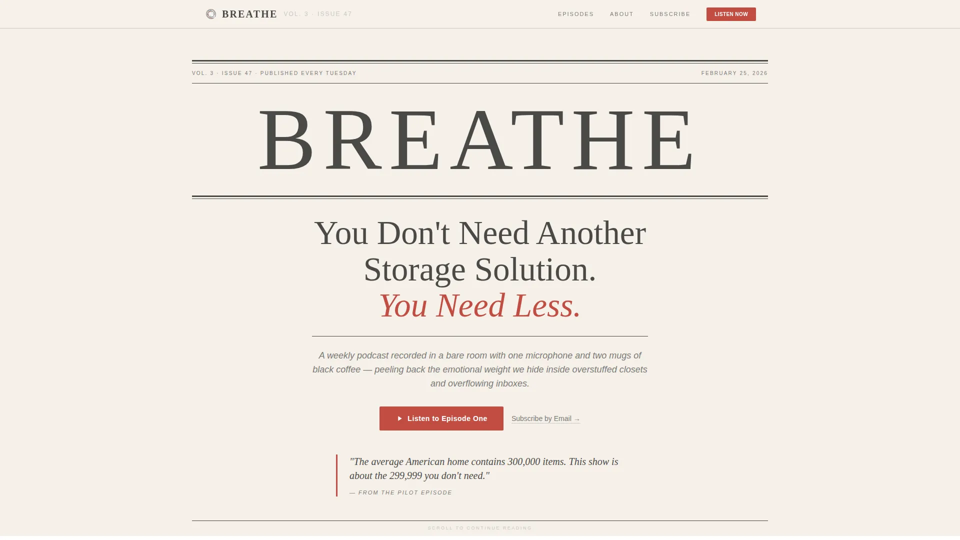
- A newspaper-style hero section with a full-width masthead, dateline, lead headline, and deck subhead
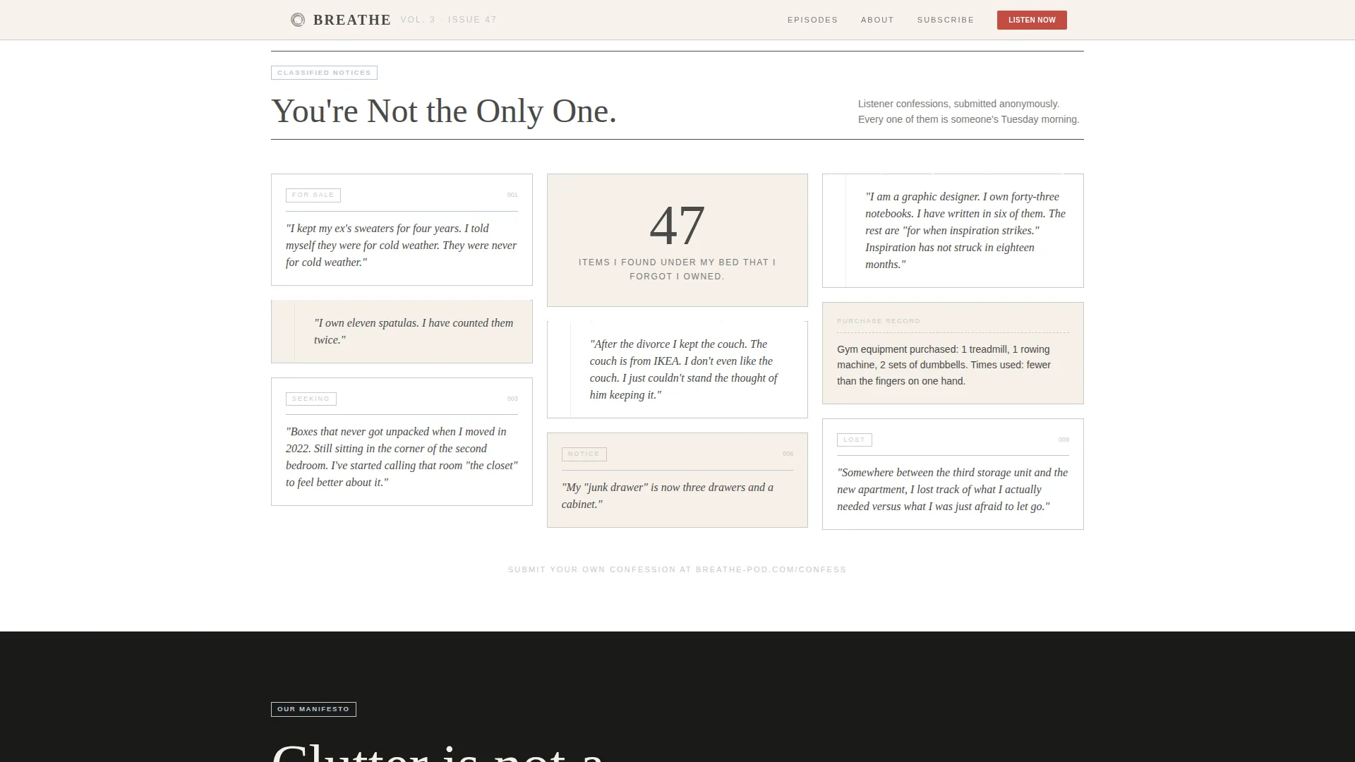
- A masonry confession grid, a broadsheet manifesto block, a mixed-tile episode grid with an embedded audio clip, and a typewritten email form
- A persistent call to action bar that reappears after the third scroll so the primary path stays visible throughout
Feature list
Newspaper Front-Page Masthead
The hero section is composed entirely of typography. A serif masthead reads "BREATHE" in tight editorial type. A dateline sets the publication cadence. An enormous lead headline carries the show's thesis, and a deck subhead sits below the fold line. No images, no illustrations, only ink on paper.
Masonry Confession Grid
The first content section uses a Pinterest-style masonry layout to display listener confessions styled as classified ads and torn notebook fragments. Tile sizes vary deliberately to create reading rhythm. The section answers the visitor's first question: is this show actually about me?
Broadsheet Manifesto Block
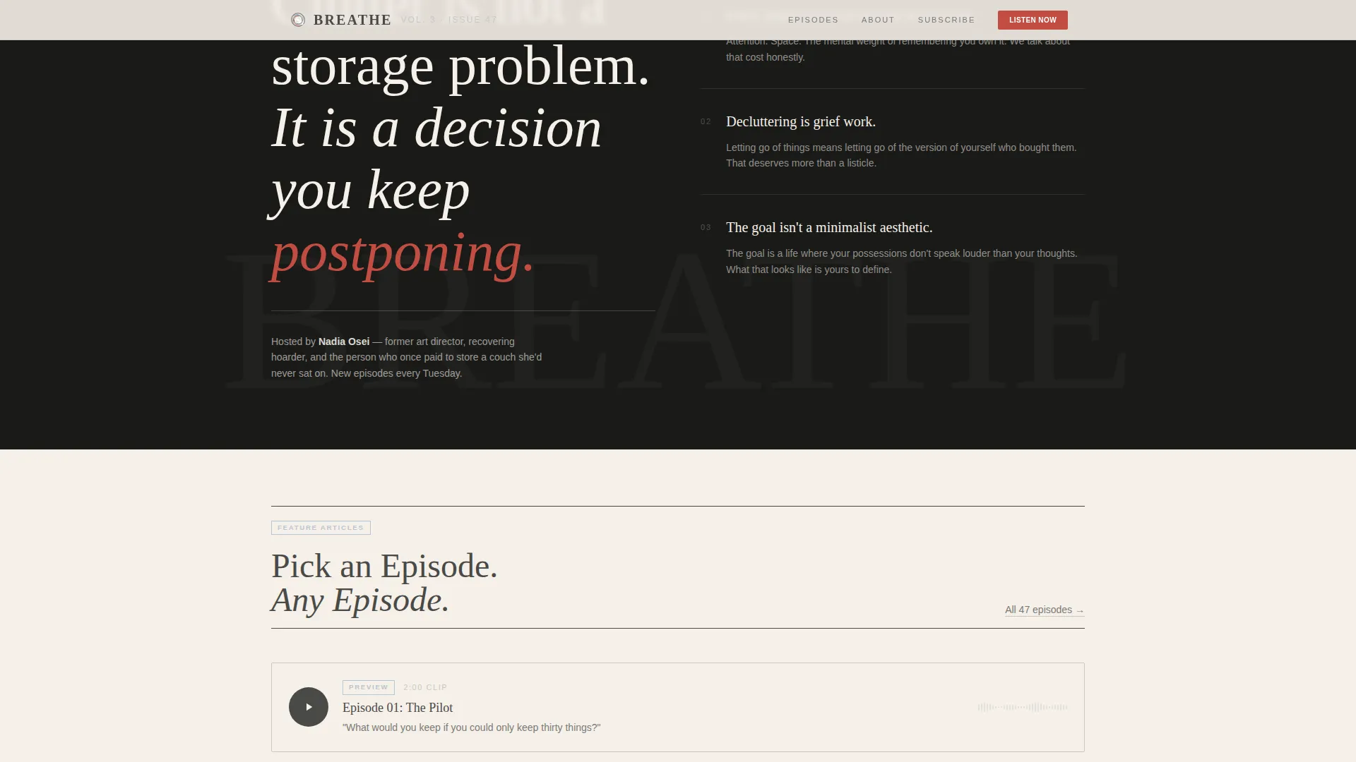
A full-width editorial section states the podcast's mission in bold broadsheet type. It functions as an editor's letter that deepens with every sentence. This section converts skeptical readers by proving the show has a clear, committed point of view.
Mixed-Tile Episode Grid
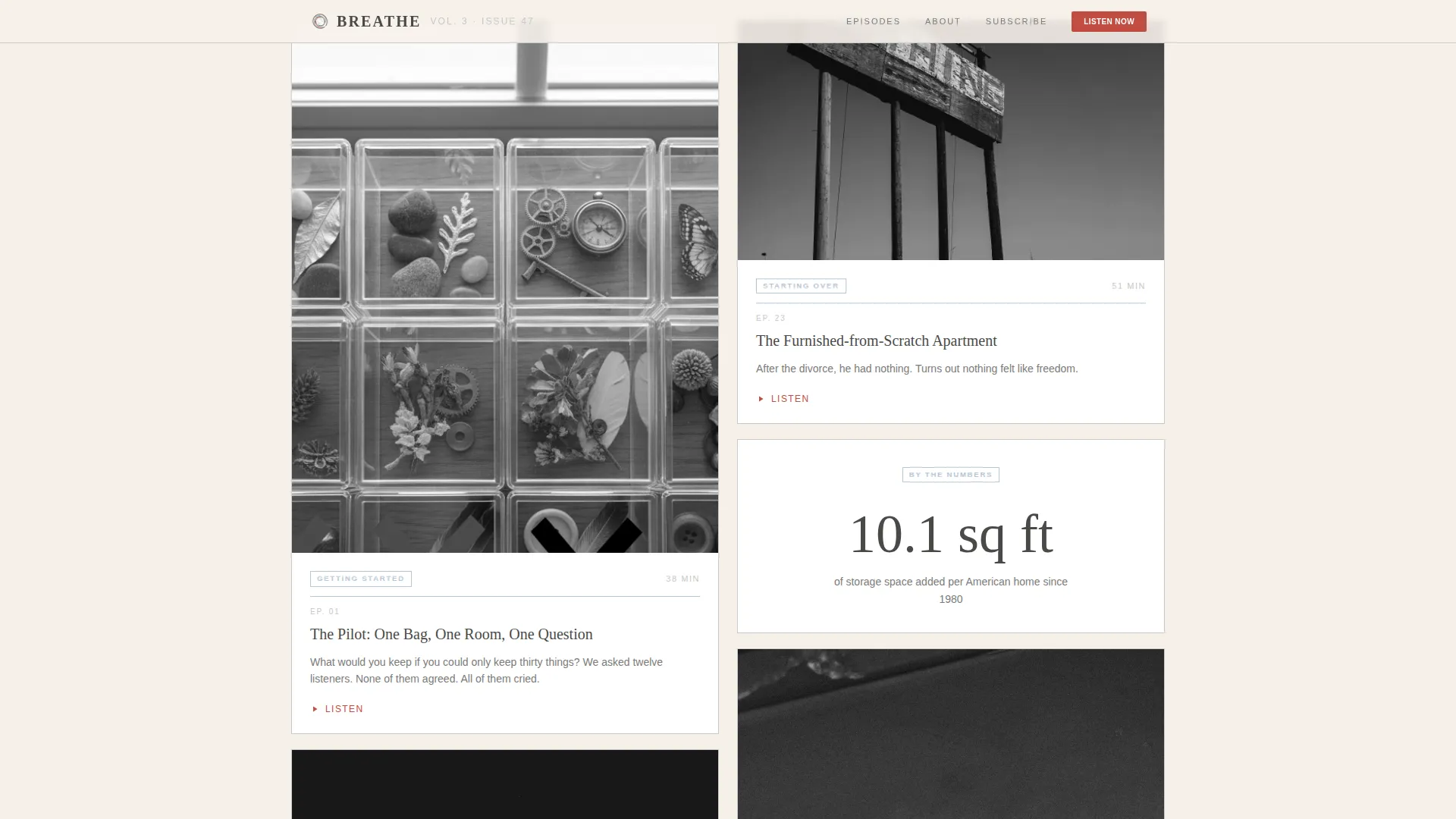
Episode cards are arranged like feature articles in a magazine. Some tiles are image-heavy, some are quote-only, and some show only a number and a title. An embedded two-minute audio clip from the pilot episode sits within the grid. Hyper-specific episode headlines carry the conversion work.
Typewritten Email Subscribe Form
A single-field email form is styled as a typewritten entry on unbleached newsprint. It provides a low-friction secondary conversion path for visitors who are not ready to open a listening platform but want to stay connected to the show.
Persistent Call to Action Bar
After the third scroll, a bottom bar appears and stays visible for the remainder of the page. It repeats the primary call to action in red-ink correction type. This ensures the path to episode one is always one tap or click away.
Page sections overview
| Section | Purpose |
|---|---|
| Hero Masthead | State thesis, deliver primary call to action |
| Confessions Masonry Grid | Build audience recognition and emotional resonance |
| Broadsheet Manifesto | Communicate the podcast's mission and point of view |
| Episode Feature Grid | Prove content quality through specific episode headlines and audio |
| Email Subscribe Form | Capture email with a low-friction secondary conversion path |
| Footer | Close the page with horizontal flow and dot separators |
Design & branding system
The visual identity follows an Ink and Paper editorial theme using the Soft Mist color palette. Every color choice is deliberate. The palette feels like a Sunday broadsheet left on a café table, warm where it has been touched, cool where it has not.
- Four-color system: unbleached newsprint (#F5F0E8) for backgrounds, pencil-graphite gray (#4A4A48) for body text, faded margin blue (#B8C6D4) for thin rules and episode category tags, and red-ink correction (#C24D42) reserved strictly for calls to action and pull quotes
- Typography pairs Fraunces serif for editorial headlines with DM Sans for interface labels, creating the contrast of a printed broadsheet with functional digital clarity
- Backgrounds alternate between newsprint and pure white as the page descends, while the layout grows quieter and more spacious toward the bottom, visually enacting the decluttering thesis
Mobile & speed optimization
The template is built desktop-first to honor the newspaper broadsheet metaphor, and it scales responsively to smaller screens. The masonry grid and mixed-tile episode layout adapt to maintain readable proportions across devices.
- GSAP-powered line reveals animate the hero text on load, and scroll-reveal stagger animations bring the masonry grid and episode tiles into view progressively
- React Server Components handle static sections, while Client Components manage animations and interactive elements such as the FAQ accordion and email form
- The persistent call to action bar is implemented as a client-side component that activates after the third scroll, keeping the primary path available without interrupting the editorial reading experience
How this template helps you convert
This template earns the click by giving the thesis away for free. It does not ask for a commitment before delivering real value. The conversion logic runs in sequence through the page.
- The masthead headline delivers the show's core argument in a single line, creating instant resonance with the right visitor and filtering out everyone else before the scroll even begins
- Listener confessions, pull quotes, and hyper-specific episode titles such as "Episode 12: I Threw Away My Wedding China and Called My Mother" create curiosity that only listening can satisfy
- The persistent bottom bar and the embedded two-minute audio clip give visitors two different moments to convert, one through reading and one through hearing, without ever repeating the same pitch twice
Other information about this template
This template is designed specifically for the minimalism and decluttering podcast niche within the broader Blog and Editorial category. It is built to serve a narrow, self-aware audience and uses that specificity as a conversion tool rather than a limitation.
- The footer uses a horizontal flow pattern with dot separators, consistent with the editorial print aesthetic throughout the page
- The FAQ accordion is an interactive component included in the template for use within the page
- The template targets an English-language United States audience and uses no currency or localization-dependent elements
- Social proof in this template takes the form of anonymous listener confessions and pull quotes rather than star ratings or follower counts, which aligns with the intimate editorial tone of the show
Theme
Ink & Paper
Creative direction
Vision & Mission
Color system
Soft Mist
Style
Masonry/Pinterest
Direction
Click-Through
Page Sections
Newspaper Front-page Masthead
Masonry Confession Grid
Broadsheet Manifesto Block
Mixed-tile Episode Grid
Typewritten Email Subscribe Form
Persistent Call to Action Bar
Related questions
What kind of podcast works best with this template?
Does the template include the audio player and email form?
Can I change the colors and fonts?
Is the masonry grid flexible for different amounts of content?
Do I need development experience to customize this template?



