LEGO Blog Landing Page Template with Builder Quiz
Brick is a hub and spoke landing page template built for serious building brick bloggers. It guides visitors through a day-in-the-life scroll journey, from morning unboxing to evening display shelf, and converts them with a five-question builder-type quiz. The design pairs Japanese Zen restraint with editorial confidence, making every section feel curated and intentional.
by Rocket studio
Quick summary
Brick is a single-page, anchor-navigated landing page template for adult fans of building bricks and the communities around them. A custom studio illustration opens the experience, a day-in-the-life scroll structure organizes the content, and a five-question illustrated quiz drives email capture. The result is a blog landing page that reads like a craft journal, not a content index.
Who this template is for
This template is made for creators who take their building brick hobby as seriously as a professional craft. It suits independent publishers, community builders, and enthusiast writers who want their blog to feel considered and curated rather than generic.
- Adult hobbyist bloggers covering set reviews, build guides, and collector content
- Parents or family-focused creators publishing weekend build content and gift guides
- Community leaders who want to grow an engaged audience through archetype-based personalization
What problem this template solves
Most blog landing pages present content as a flat index. There is no sense of journey, no personality, and no reason for a first-time visitor to stay. For a niche audience that cares deeply about craft, that mismatch drives people away.
- A generic blog layout gives no signal that this space is for serious hobbyists
- Standard calls to action like "subscribe to our newsletter" feel transactional and easy to ignore
- Without structure, contextual content like technique guides and photography tips gets buried
What you get with this template
You get a fully structured, single-page layout designed around a five-spoke anchor navigation system. Every scroll moment has a purpose, and every content section surfaces the right posts at the right moment in the visitor's journey.
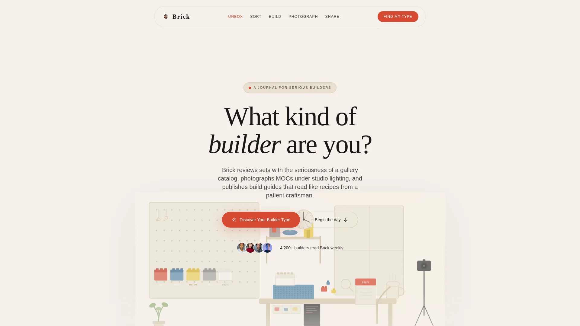
- A hero section with a custom SVG studio illustration and parallax scrolling
- Five themed content spokes, Unbox, Sort, Build, Photograph, and Share, each surfacing relevant blog content
- A five-question illustrated quiz with archetype results and an email capture field on the results page
Feature list
Custom SVG Studio Illustration Header
The header features a hand-crafted cross-section illustration of a builder's studio rendered in clean linework and flat color. It shows a desk with a half-finished model, a pegboard wall of sorted bricks, a mug of tea, and morning light through a window. The illustration scrolls at a slower parallax rate than the headline, creating depth without motion overload.
Five-Spoke Anchor Navigation
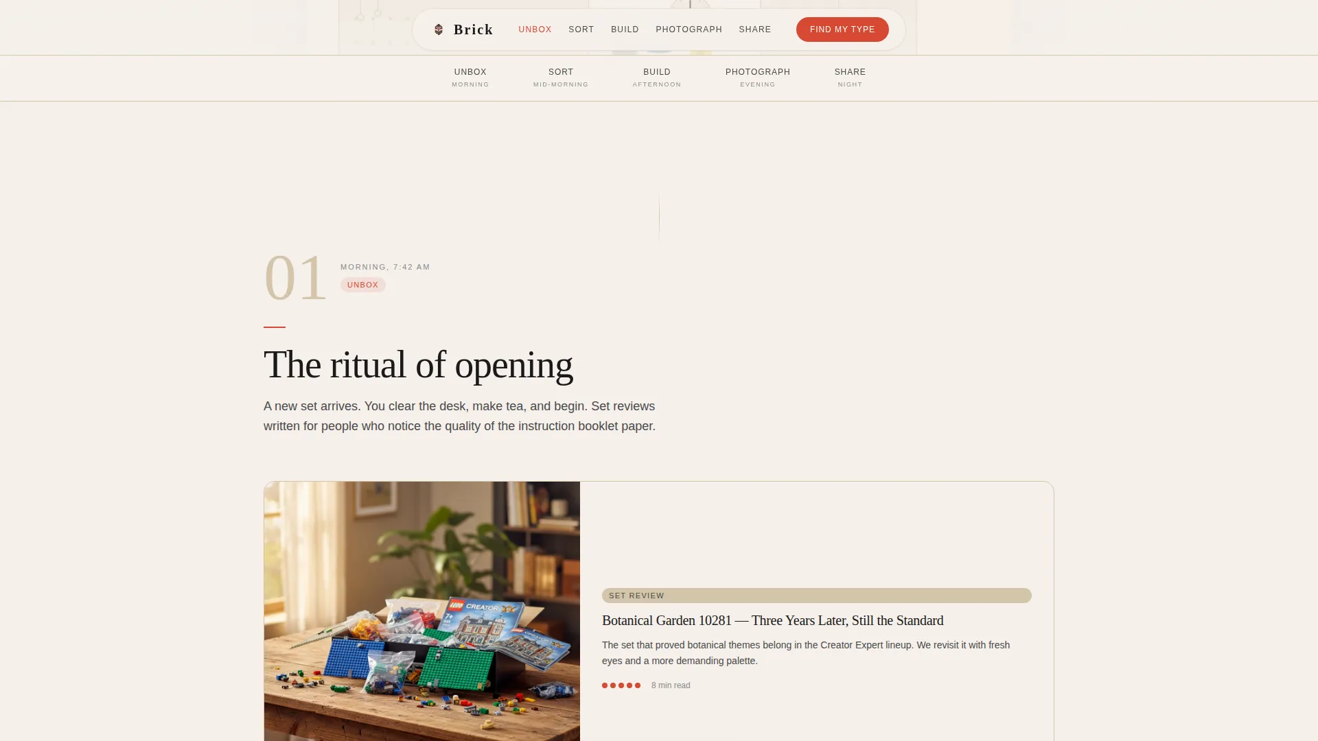
The anchor navigation links five named moments in a builder's day: Unbox, Sort, Build, Photograph, and Share. Each spoke scrolls the visitor to a dedicated section where contextually matched blog content appears. The structure makes the page feel like a guided tour rather than a browsing session.
Illustrated Builder-Type Quiz
The primary conversion tool is a five-question illustrated quiz covering preferred build scale, solo versus collaborative building, instruction-following versus freeform creation, display versus play, and favorite brick era. Results assign visitors one of four archetypes: The Architect, The Collector, The Freestyler, or The Curator. Each archetype receives a personalized reading list drawn from the blog.
Floating Quiz Call to Action Pill
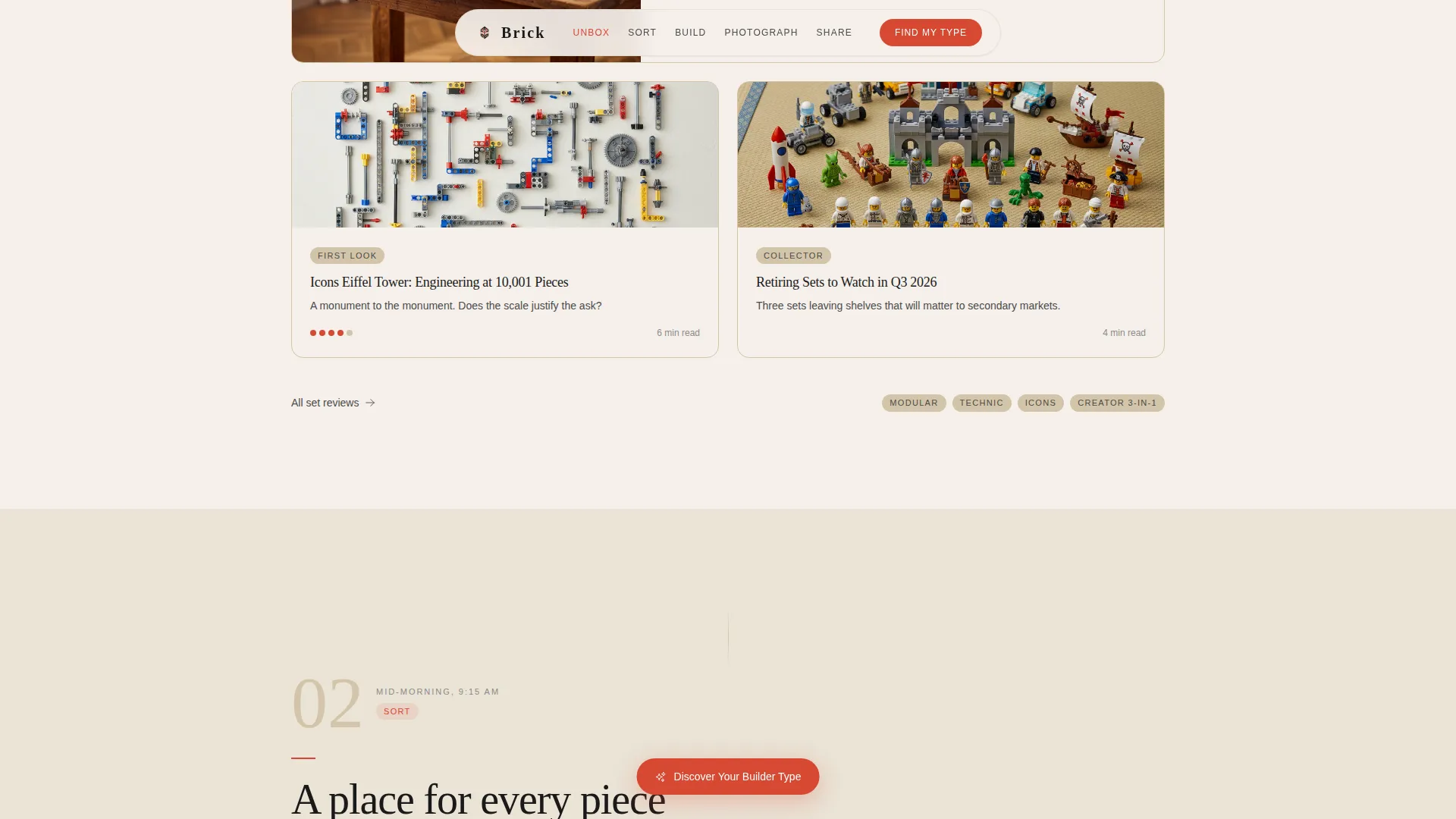
A floating pill button labeled "Discover Your Builder Type" appears after the second spoke and stays accessible as the visitor scrolls. This persistent prompt keeps the primary conversion action visible without interrupting the reading experience.
Archetype Email Capture on Results Page
The quiz results page includes a single-field email capture framed as "Send My Build Plan." The framing positions the email request as a gift to the visitor rather than a requirement, reducing friction and improving opt-in quality.
Day-in-the-Life Scroll Journey
The full page is structured as a morning-to-evening arc through a builder's day. Staggered scroll reveals and IntersectionObserver-triggered animations guide attention naturally from section to section. The experience feels like shadowing a craftsman through their routine.
Page sections overview
| Section | Purpose |
|---|---|
| Hero Studio Illustration | Opens the page with a custom parallax illustration and the quiz call to action |
| Unbox Set Reviews | Surfaces set review content within a morning unboxing moment |
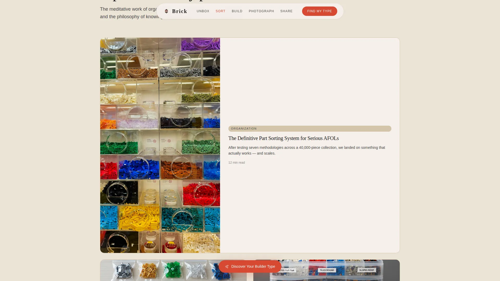
| Sort Organization Content | Presents technique and brick organization guides in a sorting context |
| Build Guides Section | Shows build guides, techniques, and model spotlight content |
| Photograph Studio Tips | Delivers studio lighting guides and model photography content |
| Share Community Gallery | Displays reader model galleries, community counts, and archetype results |
| Footer Horizontal Flow | Closes the page with a structured horizontal footer layout |
Design & branding system
The visual identity follows a Luxe Minimal approach rooted in a Japanese Zen palette. Every color has a role, and negative space is treated as a design element, not empty area. Typography is thin-weighted and generously tracked, giving the page an architectural editorial feel.
- Color palette: stone white (#F5F0EB) and tatami beige (#D4C5A9) for backgrounds, sumi ink (#1A1A1A) for text, and torii vermillion (#D64933) used only for navigation highlights, active states, and call to action buttons
- Typography pairing: Fraunces serif display for headings and DM Sans for body text, creating contrast between warmth and clarity
- Visual tone: restrained and intentional, with the vermillion accent appearing sparingly so that every instance commands attention
Mobile & speed optimization
The template is built desktop-first to match how most hobbyists engage with long-form content at a desk. Full mobile support is included so the experience holds up on any screen.
- Animations use native CSS scroll and GPU-accelerated transforms to keep motion smooth without heavy dependencies
- Section reveals are triggered by IntersectionObserver, so content loads into view progressively rather than all at once
- The quiz micro-interactions and floating pill call to action are designed to work cleanly on both large and small viewports
How this template helps you convert
The conversion strategy is layered and low-pressure. Visitors are drawn in by the illustration, kept engaged by the scroll journey, and guided toward the quiz before they have time to feel sold to.
- The "Discover Your Builder Type" call to action appears in the hero and again as a floating pill after the second spoke, giving visitors two natural moments to engage without interruption
- The five-question quiz uses illustrated choices to feel playful and personal, sorting visitors into archetypes that make the reading list feel curated specifically for them
- The email capture on the results page is framed as "Send My Build Plan," positioning subscription as a delivery of value rather than a barrier
Other information about this template
This template is part of the Brick collection, a curated set of templates built for editorial and lifestyle blogs that treat their subject matter with craft-level seriousness. It is a strong fit for anyone building a content destination in the building brick hobby space.
- The template includes social proof elements: a reader model gallery, archetype community counts, and set review scores displayed within relevant spokes
- Localization defaults are English (US), USD currency format, and MM/DD/YYYY date format
- The footer uses a horizontal flow layout suited to linking categories, archetype pages, and community resources
- Animation fidelity is high, with parallax scroll, staggered reveals, floating pill behavior, and quiz micro-interactions all included in the base template
Theme
Luxe Minimal
Creative direction
Day-in-the-Life
Color system
Japanese Zen
Style
Hub & Spoke (Anchor Nav)
Direction
Quiz/Assessment
Page Sections
Custom SVG Studio Illustration Header
Five-spoke Anchor Navigation
Illustrated Five-question Quiz
Floating Quiz Call to Action Pill
Archetype Results and Email Capture
Staggered Scroll Reveal Animations
Related questions
Can I use this template without running the quiz?
What builder archetypes does the quiz produce?
Is this template suitable for a parent-and-child building blog?
How does the email capture work on the results page?
Can the five spoke sections be renamed or reordered?



