Premium Hobby & Passion Content Portfolio & Case Study Website Template
Brick is a horizontal-scroll editorial landing page for LEGO building blogs and communities. It presents as a broadsheet newspaper come to life, a gothic masthead, cinematic dark palette, full-bleed MOC photography, curated gallery walls, two-column set reviews, and a persistent email subscription bar that travels with every swipe through the publication.
by Rocket studio
Quick summary
Brick is a desktop-first horizontal-scroll landing page built for LEGO editorial blogs and builder communities. It reads like a broadsheet newspaper, complete with a gothic masthead, photojournalistic hero image, and panel-by-panel content rhythm that alternates between dense editorial writing and pure photography. Every design decision earns the reader's trust before asking for their email.
Who this template is for
This template was built for a specific kind of creator: someone who takes the hobby seriously and wants a publication to match. It suits editors and community managers who want their content to feel as considered as the builds they cover.
- AFOL (Adult Fan of LEGO) bloggers and newsletter editors who publish MOC essays and set reviews
- Hobby community managers running curated builder galleries and submission-based content programs
- Digital designers and builders who want a visually serious editorial home for their writing and photography
What problem this template solves
Most hobby blogs look like hobby blogs, generic layouts that undersell the craft and photography behind serious builds. Brick solves the credibility gap between the quality of the content and the quality of the container holding it.
- Generic blog templates flatten photography instead of making it the centerpiece of the reading experience
- Standard vertical layouts create no sense of editorial pacing, turning every article into the same scroll
- Community-built content often lacks the visual structure that makes it feel curated and worth subscribing to
What you get with this template
You get a complete horizontal-scroll landing page organized as a multi-panel editorial publication. Every section is designed to deliver content before it asks for anything in return.
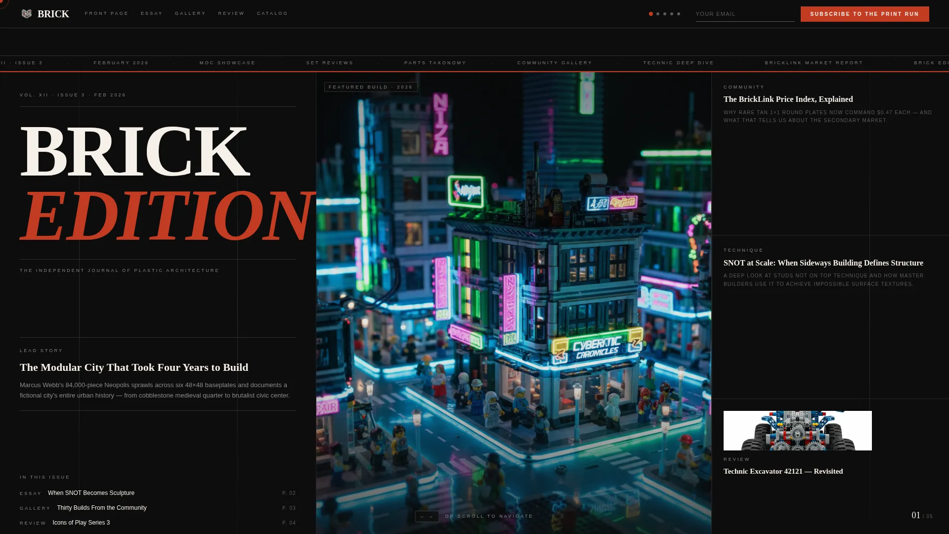
- A newspaper front-page hero with a gothic masthead, volume and issue number, publication date, and a captioned MOC photograph with builder attribution
- Four horizontal content panels covering a featured build essay, a community gallery wall, a two-column set review, and a parts taxonomy diagram
- A persistent "Subscribe to the Print Run" bar with a single email input field that travels the full width of the scroll
- A secondary "Submit Your Build" path with a photo upload and short description field for community participation
- A footer in a clean linear pattern carrying the logo, navigation links, social handles, and copyright year
Feature list
This template is built around a distinctive set of design and content features drawn directly from the editorial brief.
Horizontal Scroll Panel Navigation
Five distinct horizontal panels snap into place as the reader navigates. Each panel functions as a separate page of the publication, creating a rhythm that alternates between text-heavy editorial reading and full-image moments. Keyboard arrow navigation is also built in.
Newspaper Front-Page Hero
The opening panel presents as a full-viewport broadsheet front page. It includes a condensed gothic serif masthead reading "BRICK EDITION," a volume and issue number, a publication date, and a hero MOC photograph captioned with the builder's name, piece count, and build duration.
Community Gallery Wall
Panel two displays thirty community MOC builds as a curated gallery wall. Each image sits in a white-bordered frame set against deep editorial black, giving the grid the visual weight of a physical exhibition rather than a social feed.
Two-Column Set Review Layout
Panel three presents a set review in a two-column editorial layout with margin annotations. The format mirrors serious design criticism publications, giving reviews the structural authority they deserve.
Parts Taxonomy Diagram
Panel four presents an exploded diagram of a single build with every element cataloged. It reads like a museum artifact spread, giving the parts taxonomy the same visual reverence as the photography.
Scroll-Linked Animation System
The template uses horizontal scroll snap, scroll-linked word reveals, parallax photography layers, and staggered gallery reveals. GPU-accelerated transforms and IntersectionObserver-driven reveals handle all motion.
Page sections overview
| Section | Purpose |
|---|---|
| Newspaper Hero Panel | Full-viewport masthead, hero MOC photo with builder caption, column rules |
| Featured Essay Panel | Full-bleed photography paired with editorial long-form text |
| Community Gallery Wall | Thirty MOC builds in white-framed grid against black |
| Set Review Panel | Two-column editorial layout with margin annotations |
| Parts Taxonomy Panel | Exploded build diagram with every element cataloged |
| Footer Bar | Logo, navigation links, social handles, copyright year |
Design & branding system
The visual identity follows an Ink and Paper editorial theme through a Cinematic Dark color system. The palette reads like a limited-run art zine printed on heavy uncoated stock.
- Colors: deep editorial black (#0D0D0D) as the dominant canvas, warm newsprint cream (#F5F0E8) for all typography, red-oxide (#C23B22) for navigation hotspots and interactive elements, and pencil-graphite gray (#5C5C5C) for caption text and column divider rules
- Typography: Fraunces as the condensed display serif for masthead and editorial headings, DM Sans as the clean body and interface typeface
- Thin column rules frame compositions, cream type glows against the dark background, and every colored brick photograph reads like stained glass against the black canvas
Mobile & speed optimization
Brick is designed desktop-first to deliver the full horizontal scroll experience on wider screens. A vertical fallback layout is included for smaller devices so content remains readable on mobile.
- Desktop layout: horizontal panel navigation with scroll snap, keyboard arrow support, and parallax photography
- Mobile fallback: panels reflow into a vertical reading stack so the content hierarchy and photography remain clear on smaller screens
How this template helps you convert
The conversion strategy is built into the content sequencing. Readers receive substantial editorial value before the subscription ask becomes persistent.
- Three full articles and a thirty-build gallery are delivered across the first four panels, so visitors experience the publication's quality before the email prompt becomes a fixed presence.
- The "Subscribe to the Print Run" bar travels as a fixed element across the full horizontal scroll, collecting only a single email address in a cream input field against the black navigation bar, low friction, always visible, never intrusive.
- The "Submit Your Build" secondary path gives community builders a clear contribution route, deepening engagement and giving the editor a steady pipeline of community content.
Other information about this template
Brick is a single landing page, not a multi-page site. It functions as an editorial showcase and subscription acquisition page for a LEGO building blog.
- Template style: Horizontal Scroll with snap-point panel navigation
- Theme: Ink and Paper editorial
- Color system: Cinematic Dark
- Header concept: Newspaper front page with gothic masthead
- Content direction: Content and resource hub with email subscription as primary conversion
- Animation level: High, including scroll-linked reveals, parallax layers, and staggered gallery entrances
- Interactivity level: High, with fixed subscribe bar, horizontal panel navigation, and keyboard arrow support
- The date format used in the masthead follows the convention: Vol. X, Issue Y, Month Year
- Social proof is built into the template through builder attribution, community build count, and issue volume numbering



Theme
Ink & Paper
Creative direction
Gallery Walk
Color system
Cinematic Dark
Style
Horizontal Scroll
Direction
Content/Resource
Page Sections
Horizontal Scroll Panel Navigation
Newspaper Front-page Hero
Curated Community Gallery Wall
Two-column Set Review Layout
Parts Taxonomy Diagram Panel
Scroll-linked Animation System
Related questions
Is this template designed for vertical or horizontal scrolling?
Can I use this template for a community LEGO blog rather than a solo publication?
What does the Subscribe to the Print Run feature look like?
What typography and colors does the template use?
Does the template include space for builder attribution and build metadata?



