Complete DevTools Startup Professional Website Template
Deploy is a dark-themed, glassmorphic landing page template built for command-line-first developer tools. It features a live-rendered dashboard mockup with a tabbed Build/Test/Ship switcher, industry-report-style data cards, and a sticky CLI install bar. Designed for senior engineers at Series A startups, it earns the install by proving the problem before asking for the action.
by Rocket studio
Quick summary
Deploy is a single-page, dashboard-style landing page template for devtools startups. It opens with a Feature Tab Switcher hero showing a live dashboard mockup across three states: Build, Test, and Ship. Data cards escalate the cost of slow pipelines section by section. The primary call to action drives a one-step CLI install.
Who this template is for
This template is built for founders and engineers who are shipping a command-line-first developer tool and need a landing page that speaks directly to a technical audience. It skips marketing fluff and leads with product proof.
- Senior engineers and platform leads at Series A startups evaluating devtools
- Developer-tool founders who want a landing page that converts engineers, not marketers
- Technical teams launching a continuous integration and continuous delivery (CI/CD) tool, build system, or deployment platform
What problem this template solves
Most landing pages for developer tools look like SaaS marketing pages. They lead with feature lists and hero illustrations that mean nothing to an engineer at 2 AM staring at a broken pipeline. This template solves that mismatch head-on.
- Engineers distrust landing pages that assert value without showing proof
- Generic templates lack the visual and structural language that resonates with a technical audience
- The cost of slow pipelines is real, but most pages never quantify it before asking for a sign-up
What you get with this template
You get a fully structured, single-page landing page built around a dark glassmorphic design system. Every section is purpose-built to escalate urgency and earn the install through data before the call to action appears.
- A tabbed hero dashboard mockup with Build, Test, and Ship states and animated active-tab indicators
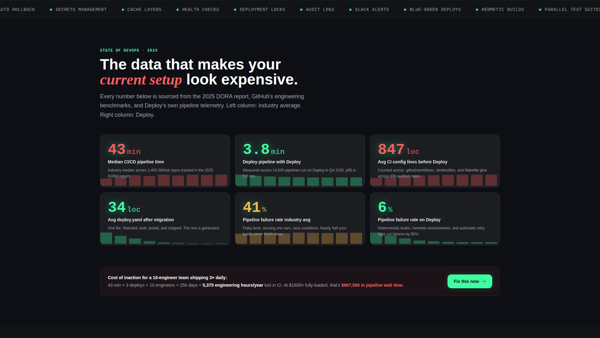
- A scrollable data grid of glassmorphic stat cards, each with a bold metric, a one-line insight, and a subtle chart
- A sticky CLI install bar with a copy-ready install snippet and toggle pills for Homebrew, npm, and Docker
Feature list
This template ships with a focused set of components designed for one job: turning a skeptical senior engineer into an active CLI installer.
Tabbed Dashboard Hero
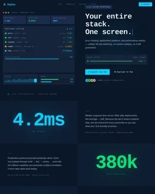
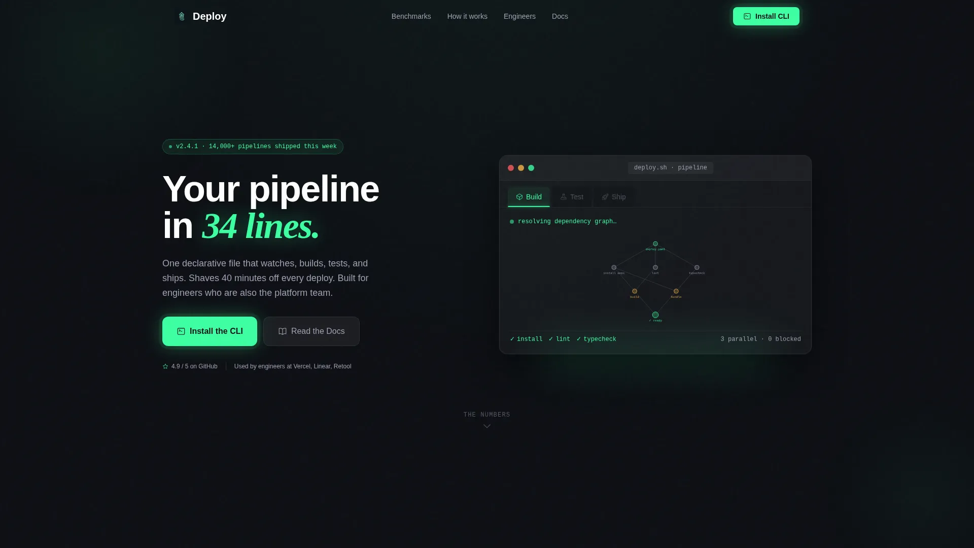
The header centers a glassmorphic toolbar with three clickable tabs labeled Build, Test, and Ship. Each tab swaps the rendered dashboard content below it. Build shows a dependency graph resolving in real time. Test shows parallel test suites with cascading green checkmarks. Ship shows a deployment timeline with commit SHAs, environment badges, and a pulsing Deploy button. The active tab carries a glowing mint underline; inactive tabs frost over.
Industry Report Data Cards
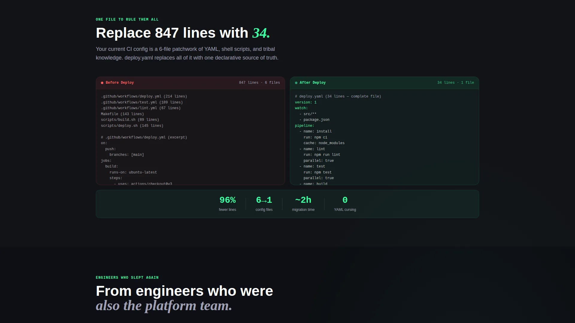
Below the hero, each section presents a hard data point pulled from engineering benchmarks. Metrics include median deploy times, mean time to recovery comparisons, pipeline failure rates, and config file line counts before and after. Every stat lives inside its own glassmorphic card with a bold mint number, a one-line insight, and an animated chart behind the frost.
Sticky CLI Install Bar
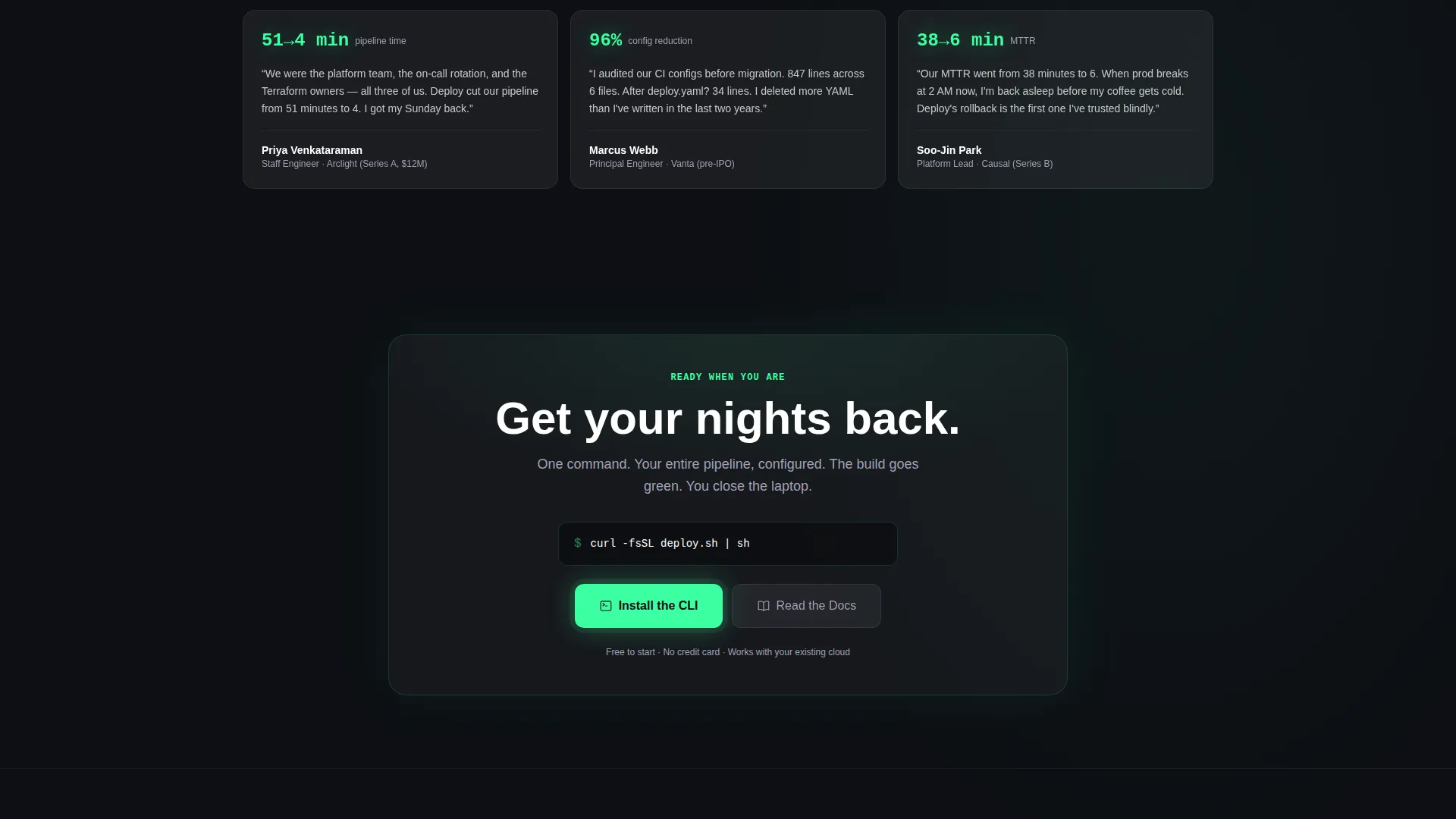
After the third data card, a sticky glassmorphic bar locks to the viewport. It contains the one-step install snippet (curl -fsSL deploy.sh | sh) with a copy button. Toggle pills let visitors switch between Homebrew, npm, and Docker install paths. This bar stays visible as the reader scrolls through the data section.
Dual Call-to-Action Architecture
The primary call to action, "Install the CLI," appears first inside the hero dashboard and again in the sticky bar. A secondary path, "Read the Docs," gives engineers a lower-commitment option to vet the tool before committing. Both actions coexist without competing.
Glassmorphic Component System
Every interactive and display element uses frosted glass panels at 6% opacity with a 12-pixel blur. The color system pairs deep terminal black (#0D0F14) with electric mint (#3DFFA2) for success states and primary accents. Soft lavender gray (#A1A1B5) handles secondary labels and metadata. The result is a translucent heads-up display (HUD) aesthetic where data glows beneath each panel.
Page sections overview
| Section | Purpose |
|---|---|
| Tabbed Hero Dashboard | Introduce the product through three interactive Build, Test, and Ship dashboard states |
| Deploy Time Card | Present median deployment time benchmarks to quantify pipeline inefficiency |
| MTTR Comparison Card | Show mean time to recovery data to frame reliability cost |
| Failure Rate Card | Surface pipeline failure rate statistics to escalate urgency |
| Config Line Count Card | Contrast config complexity before and after to prove simplicity |
| Sticky Install Bar | Deliver the CLI install snippet with copy button and install-method toggles |
| Secondary call to action Row | Offer the "Read the Docs" path for engineers who need to vet before installing |
Design & branding system
The visual identity follows a Startup Velocity theme expressed through a Glassmorphic color system. The aesthetic is intentionally nocturnal. It evokes the quiet relief of a green build at 2 AM, not a daytime marketing booth.
- Core palette: deep terminal black (#0D0F14) for backgrounds, electric mint (#3DFFA2) for accents and success states, soft lavender gray (#A1A1B5) for secondary text, and frosted glass panels at 6% white opacity with a 12-pixel blur
- Every card and toolbar element hovers on its own pane of frosted glass, with edges catching faint light and data glowing beneath like instrument readings in a dark cockpit
- No stock photography is used anywhere; the product dashboard mockup is the hero visual throughout
Mobile & speed optimization
The template is designed to remain readable and functional on smaller viewports without compromising the dashboard-first layout. The glassmorphic components and data grid adapt to narrower screens without losing hierarchy.
- The tabbed hero dashboard and sticky install bar are structured to reflow cleanly on mobile screen widths
- Data cards in the grid stack vertically on smaller screens so each metric remains legible and scannable
- The install snippet and copy button remain accessible without horizontal scrolling on standard mobile devices
How this template helps you convert
This template is engineered around a single conversion insight: engineers do not install tools they do not trust, and trust is built with proof, not promises. Every section earns the next click.
- The tabbed hero leads with the live dashboard, so visitors see the product working before they read a single headline. Proof comes before copy.
- The Industry Report data section escalates the cost of inaction card by card. Each benchmark makes the reader's current toolchain look more expensive, building urgency naturally without aggressive sales language.
- The sticky install bar appears at exactly the right moment, after the data has done its job. The one-step snippet and install-method toggles remove every remaining friction point between intent and action.
Other information about this template
This template is a strong fit for devtools teams preparing for a Series A launch or a Product Hunt debut. It is built for a technically literate audience that evaluates tools by reading source code and deployment docs, not testimonial carousels.
- The template structure supports a "data-first, call to action-second" narrative sequence, which aligns with how senior engineers make adoption decisions
- The sticky install bar pattern is reusable across devtools categories including command-line interface (CLI) tools, infrastructure-as-code platforms, and build toolchains
- Because no stock photography is used, the template stays fresh without requiring asset replacement before launch
- The dual call to action approach, Install the CLI plus Read the Docs, accommodates both the engineer ready to install now and the one who needs architectural confidence first
Theme
Startup Velocity
Creative direction
Industry Report
Color system
Glassmorphic
Style
Dashboard/Data Grid
Direction
App Download
Page Sections
Tabbed Build, Test, Ship Hero
Industry Report Data Grid
Sticky CLI Install Bar
Dual Call-to-action Layout
Glassmorphic Dark Design System
Related questions
What type of product is this template best suited for?
Can I replace the benchmark data in the stat cards?
Does the tabbed dashboard hero require a live data connection?
Can the install toggle pills be changed to different install methods?
Who is this landing page template designed for?