SEO & Content Newsletter Blog Website Template
The Digest Curated Morning SEO Newsletter Landing Page Template is a single-page, asymmetric 60/40 grid design built for SEO newsletter creators who want to convert website visitors into loyal subscribers. It combines an editorial Atelier Studio aesthetic with a five-question interactive quiz, warm stone typography, and a focused subscription form that earns sign ups through curation, craft, and quiet confidence.
by Rocket studio
Quick summary
This template gives you a visually rich, conversion-focused newsletter landing page designed around one editorial premise: curation is a craft. The 60/40 asymmetric grid, Warm Stone color system, and a built-in five-question quiz work together to communicate your clear value proposition before a visitor even considers leaving. Every section earns attention. Every call to action earns the click.
Who this template is for
This template is built for creators and professionals who run or plan to run a curated SEO or content marketing newsletter. It serves a specific target audience that values editorial precision over volume.
- In-house content leads who manage editorial calendars alone and need a high-quality newsletter landing page that matches their professional brand
- Freelance SEO consultants toggling between multiple client accounts who want a compelling landing page that communicates expertise at a glance
- Agency strategists who need to grow newsletter sign ups quickly and want a structured layout that converts website visitors without requiring weeks of design work
What problem this template solves
Most newsletter creators publish strong content but lose potential subscribers at the landing page. A generic, unfocused page with competing navigation links, a vague headline, and a buried sign up form fails to communicate value. This template fixes that problem at every level.
- It removes all the confusion caused by cluttered pages by using a distraction-free layout with no competing navigation links pulling attention away from the subscription goal
- It replaces a generic pitch with a clear value proposition that tells visitors exactly what they will receive: five curated links, one original insight, and one actionable takeaway, every morning
- It turns passive interest into active sign ups through a five-question quiz that diagnoses the visitor's content intelligence gap and presents the newsletter subscription as the precise solution
What you get with this template
You get a fully designed single-page newsletter landing page that combines editorial visual storytelling with a structured, conversion-oriented layout. Every section is pre-built and ready for your content.
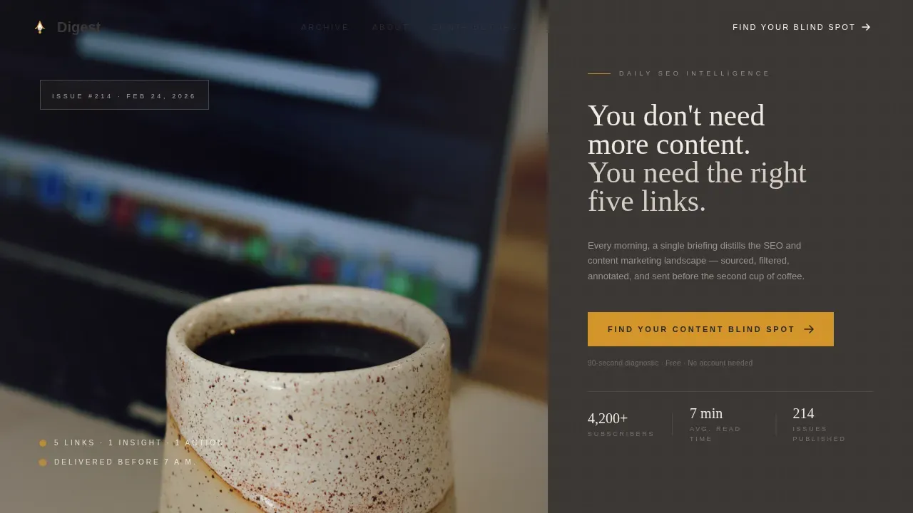
- A hero section with a 60/40 split composition, a bold headline in warm serif Fraunces type, a saffron-ink call to action button, and a moody overhead desk photograph
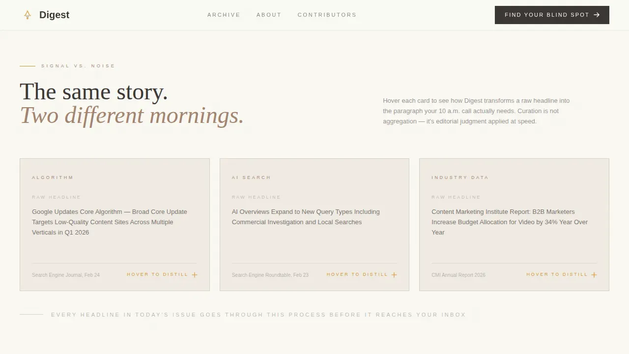
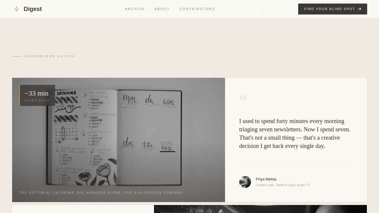
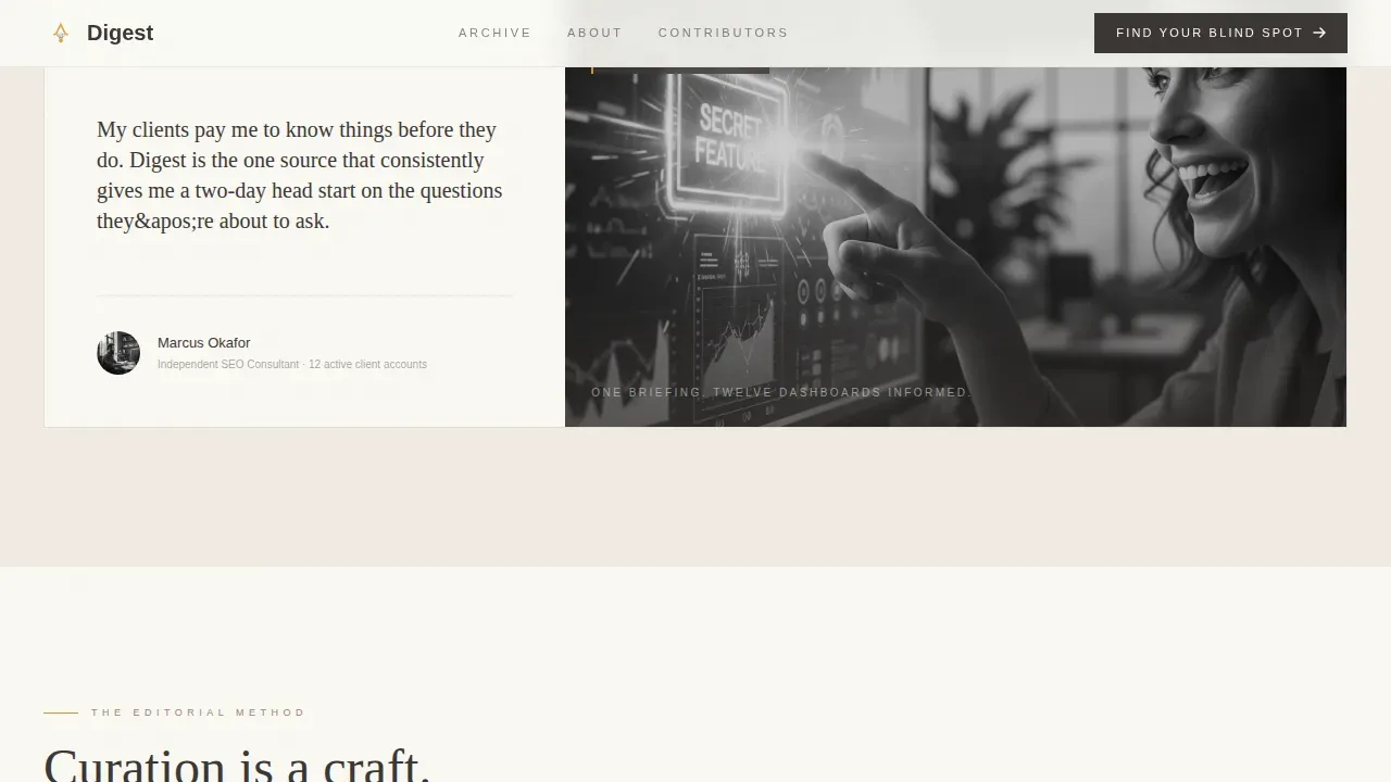
- A Signal versus Noise section with hover-reveal micro-interactions that show raw news headlines transforming into distilled digest versions, plus alternating 60/40 pull quote blocks with subscriber testimonials as social proof
- A five-question "Find Your Content Blind Spot" quiz with a saffron-accented progress track, personalized scoring, and a final screen featuring a simple signup form with a single email field
Feature list
This template packs a focused set of built-in capabilities. Each one serves the core goal: to convert visitors into newsletter subscribers through editorial quality and interactive design.
Asymmetric 60/40 Grid Layout
The page uses a structured asymmetric grid that alternates column dominance throughout the scroll. The wider 60-column holds warm white backgrounds with generous white space. The narrower 40-column anchors in charcoal graphite with reversed cream type. This rhythm keeps the eye curious and guides attention naturally from section to section, improving reader engagement without distraction.
Five-Question Interactive Quiz
The "Find Your Content Blind Spot" diagnostic is the primary call to action on this newsletter landing page. Each question appears one at a time on a saffron-accented progress track. Questions cover how visitors currently discover curated SEO news, how many minutes they spend on it daily, whether they act on what they read, which content format they publish most, and their biggest ranking frustration. Results deliver a personalized content-intelligence score with a named gap, then present the subscription as the remedy.
Signal versus Noise Hover Interactions
Every third section introduces a hover-reveal micro-interaction. Visitors hover over a raw news headline and watch it transform into the digest's distilled version. This interaction makes an argument without saying a word: the template demonstrates the editorial value of curated SEO news rather than simply claiming it. It is a practical, visually appealing demonstration of the newsletter's core promise.
Curated Collection Scroll Narrative
The creative direction treats each section as a hand-selected exhibit rather than a feed item. Sections present one editorial principle each: sourcing methodology, signal-versus-noise filtering, the original analysis layer, and the actionable brief format. The scroll builds a quiet argument for curation as craft. This approach supports reader engagement and increases perceived value before the visitor reaches the final sign up form.
Warm Stone Atelier Design System
The color system uses honed limestone (#D6CFC4), kiln-fired clay (#A3836D), charcoal graphite (#3B3735), and a single saffron ink accent (#D4952A). Fraunces serves as the warm serif headline typeface. DM Sans handles all body text. Saffron ink appears only on hover states, active buttons, and the quiz progress bar, making every interaction feel deliberate and visually appealing without visual clutter.
Subscription-Focused Final Screen
After the quiz delivers a personalized result, the final screen presents a single email field and a benefit-driven call to action button reading "Send Me Tomorrow's Briefing." This simple signup form follows best practices for effective newsletter landing pages: one field, one action, and a clear value proposition. No extra friction. No second choices. Just a clean, honest invitation to subscribe.
Page sections overview
| Section | Purpose |
|---|---|
| Hero split composition | Introduces the newsletter with a bold headline, desk photograph, and saffron call to action |
| Signal versus Noise | Demonstrates editorial curation through hover-reveal headline transformation interactions |
| Subscriber Voices | Builds social proof through alternating 60/40 pull quote and paragraph blocks |
| Curation Craft bento | Shows sourcing methodology through an asymmetric bento layout |
| Quiz call to action | Launches the five-question diagnostic with personalized scoring and subscription offer |
| Footer flow | Closes the page with a horizontal footer pattern |
Design & branding system
The visual identity follows the Atelier Studio theme. Every design choice references the feel of a designer's worktable: a slab of travertine holding a leather-bound notebook, a brass paperweight, and a sharpened pencil. The result is a visually appealing, editorially serious newsletter landing page that feels earned rather than assembled.
- Colors: honed limestone (#D6CFC4), kiln-fired clay (#A3836D), charcoal graphite (#3B3735), and saffron ink (#D4952A) reserved for interactive and highlighted elements only, ensuring visual consistency across every section
- Typography: Fraunces for all serif headline treatments, DM Sans for body copy, creating visual clarity through a deliberate contrast between editorial warmth and functional readability
- White space and visual rhythm: generous white space in the 60-column, reversed cream type in the 40-column, and alternating grid dominance maintain visual clarity and distraction-free design throughout the scroll
Mobile & speed optimization
The template is built desktop-first because its target audience works primarily at desks. That said, the layout includes a solid mobile fallback so the newsletter landing page displays correctly on all screen sizes. The mobile version preserves the editorial feel of the desktop experience.
- The asymmetric grid collapses gracefully into a stacked single-column layout on smaller screens, maintaining visual consistency and keeping the subscription form prominent
- Server Components handle static sections for faster initial renders, while Client Components manage the interactive quiz, keeping the mobile version lightweight and responsive
- The distraction-free design principle carries fully into mobile: no navigation links, no competing calls to action, and a simple signup form that keeps the focus on one action
How this template helps you convert
A newsletter landing page only works if it earns trust and removes friction simultaneously. This template is engineered to do both through every scroll section, not just the final form.
- The hero section opens with a concise headline that uses identity-based language, speaking directly to content professionals who are overwhelmed by information volume, and pairs it with a saffron-ink call to action button that stands out through color restraint rather than noise
- The quiz section earns the conversion by proving in roughly ninety seconds that the visitor's current information diet has a measurable gap, making the subscription feel like a logical and personal solution rather than a generic email marketing pitch
- Social proof blocks throughout the page, including subscriber testimonials in the alternating pull-quote sections, reinforce credibility and provide the clear expectations that help undecided visitors commit to sign ups
Other information about this template
This template fits naturally into a broader email marketing strategy for any SEO-focused newsletter creator looking to grow newsletter subscribers and drive traffic from organic and referral sources. It supports growth strategies that rely on a high-quality landing page as the central conversion point rather than scattered blog post links or social media profiles.
- The drag and drop editor support in the underlying platform means you can customize colors, copy, and layout without writing code, making this accessible to solo creators and small teams alike
- The quiz functions as an effective lead magnet, gathering audience segment signals while delivering a personal connection through a scored, named result rather than a generic thank-you message
- The template is well-suited as a landing page example for teams studying best newsletter landing pages in the editorial and content niche, comparable in structural clarity to successful landing pages built around concise headlines and strong social proof
- Landing page examples like Morning Brew and Arnold's Pump Club have demonstrated that morning newsletter formats with a clear value proposition and direct call to action consistently outperform broader content hubs for newsletter sign ups; this template applies those same structural principles to the SEO niche
- For creators who want to reference best newsletter landing pages as benchmarks, the Digest template draws comparable inspiration from how Morning Brew and Arnold's Pump Club use social proof, bold headline placement, and simple signup forms to convert visitors at scale
- The sneak peek format in the Signal versus Noise section gives potential subscribers a practical preview of what curated insights look like before they commit, setting clear expectations and increasing perceived value
- Teams building a content strategy around a daily digest can use this template as a standalone page or connect it to existing blog content to drive traffic and support newsletter sign ups through featured content and upcoming events announcements
- The absence of navigation links is intentional: removing competing elements from the page keeps attention on the subscription form and supports the distraction-free layout principle that underpins all high converting landing pages
- The positive corner of the page experience is the quiz result screen, where a visitor receives a named, specific diagnosis and a direct path to a solution, turning a passive website visitor into a motivated new subscriber
Theme
Atelier Studio
Creative direction
Curated Collection
Color system
Warm Stone
Style
Asymmetric Grid (60/40)
Direction
Quiz/Assessment
Page Sections
Asymmetric 60/40 Editorial Grid
Five-question Content Blind Spot Quiz
Signal Versus Noise Hover Interactions
Subscriber Testimonial Pull-quote Blocks
Warm Stone Atelier Branding System
Distraction-free Subscription Screen
Related questions
Do I need to write code to customize this template?
How does the quiz help grow newsletter sign ups?
What social proof elements are built into this template?
Is this template suited for different audience segments?
Can this template support a broader content strategy?



