Daily News Newsletter Landing Page Template
Dispatch is an editorial morning briefing newsletter landing page built for solo founders and indie developers. It uses a single-column flow, zine-style typography, and a parchment-and-signal-orange palette to present curated founder stories, revenue milestones, and build logs. The page earns subscriptions by giving visitors a generous preview of real issue content before asking for an email address.
by Rocket studio
Quick summary
Dispatch is a newsletter landing page template designed for indie hackers and solo founders who publish a daily morning briefing. It delivers a focused page built around editorial typography, a chapter-style hero, inline archive accordions, and a sticky subscription bar. Every layout decision serves one primary goal: turning curious visitors into committed email subscribers.
Who this template is for
This template speaks directly to independent creators who send a daily or weekly newsletter to an audience of builders. It is not a generic blog theme. It is a conversion-first, content-led page that fits the specific voice and rhythm of the indie founder publishing world.
This template is a strong match if you are:
- A solo developer or indie hacker shipping a SaaS product and documenting the journey publicly
- A designer or maker who recently launched a Gumroad product and wants to grow an audience through a newsletter landing page
- A burned-out engineer who left a large tech company to build independently and wants a publication-quality page to attract email subscribers
What problem this template solves
Most newsletter landing pages feel generic. They use the same stock layout, the same placeholder copy, and the same forgettable form. For a newsletter that covers founder pain points, revenue milestones, and hard-won lessons, that kind of page is a mismatch. It fails to communicate the voice, the depth, or the value proposition of what you actually write.
Dispatch solves that mismatch by giving your newsletter landing page a publication identity from the first scroll. It addresses several real pain points for indie newsletter creators:
- Visitors arrive and leave without subscribing because the page gives them no reason to trust the content
- The sign up form is buried or competing with navigation, reducing newsletter sign ups significantly
- There is no preview of newsletter content, so potential subscribers cannot tell what they are signing up for
What you get with this template
Dispatch is a single-column flow landing page that delivers everything needed to convert visitors into email subscribers. It is built with an editorial zine aesthetic that feels intentional and earned. The entire newsletter experience is previewed on the page itself, so you are not asking for blind trust.
Here is what is included in the template:
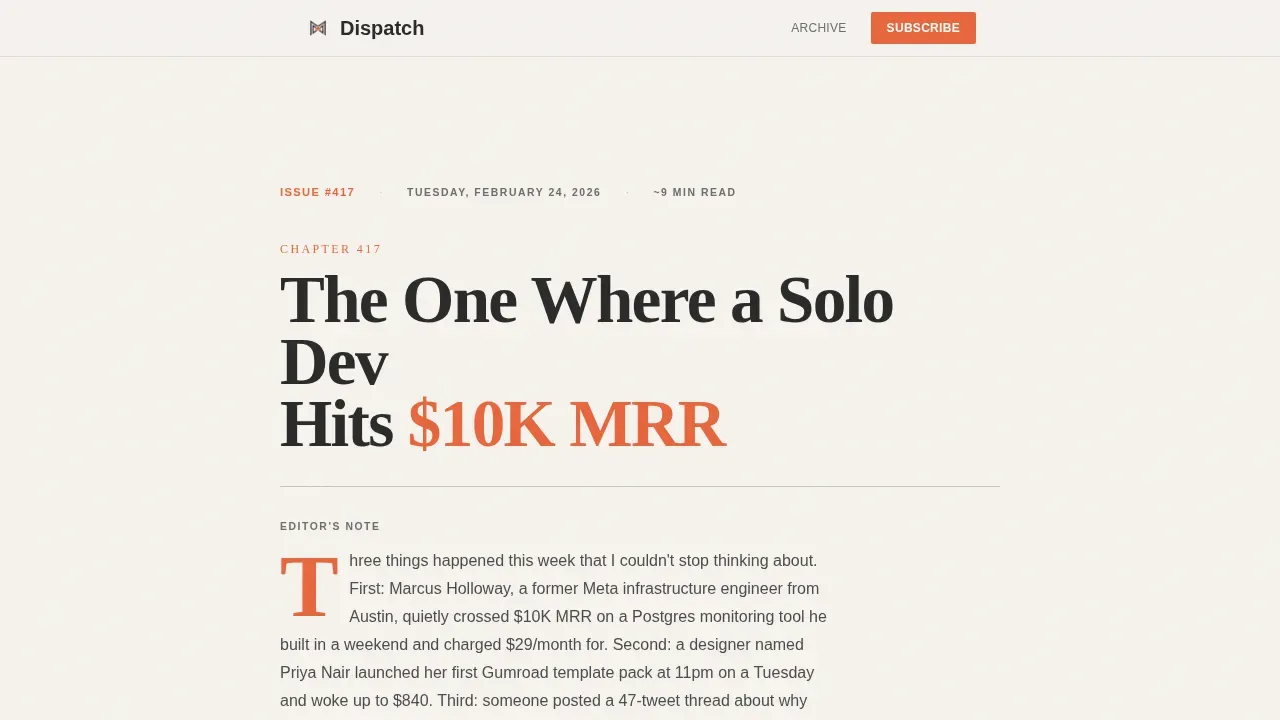
- A chapter-style hero section with large serif display type, a dateline, an estimated read time, and an editor's note teasing three stories from the current issue
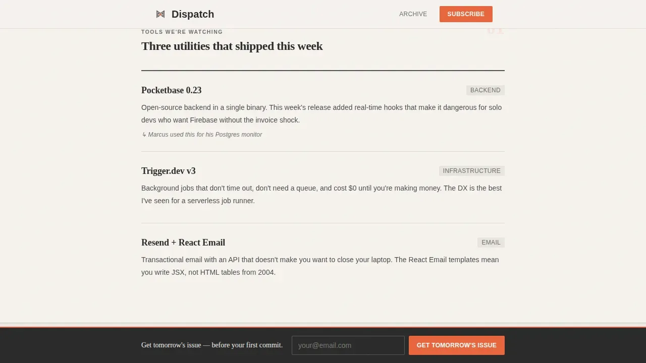
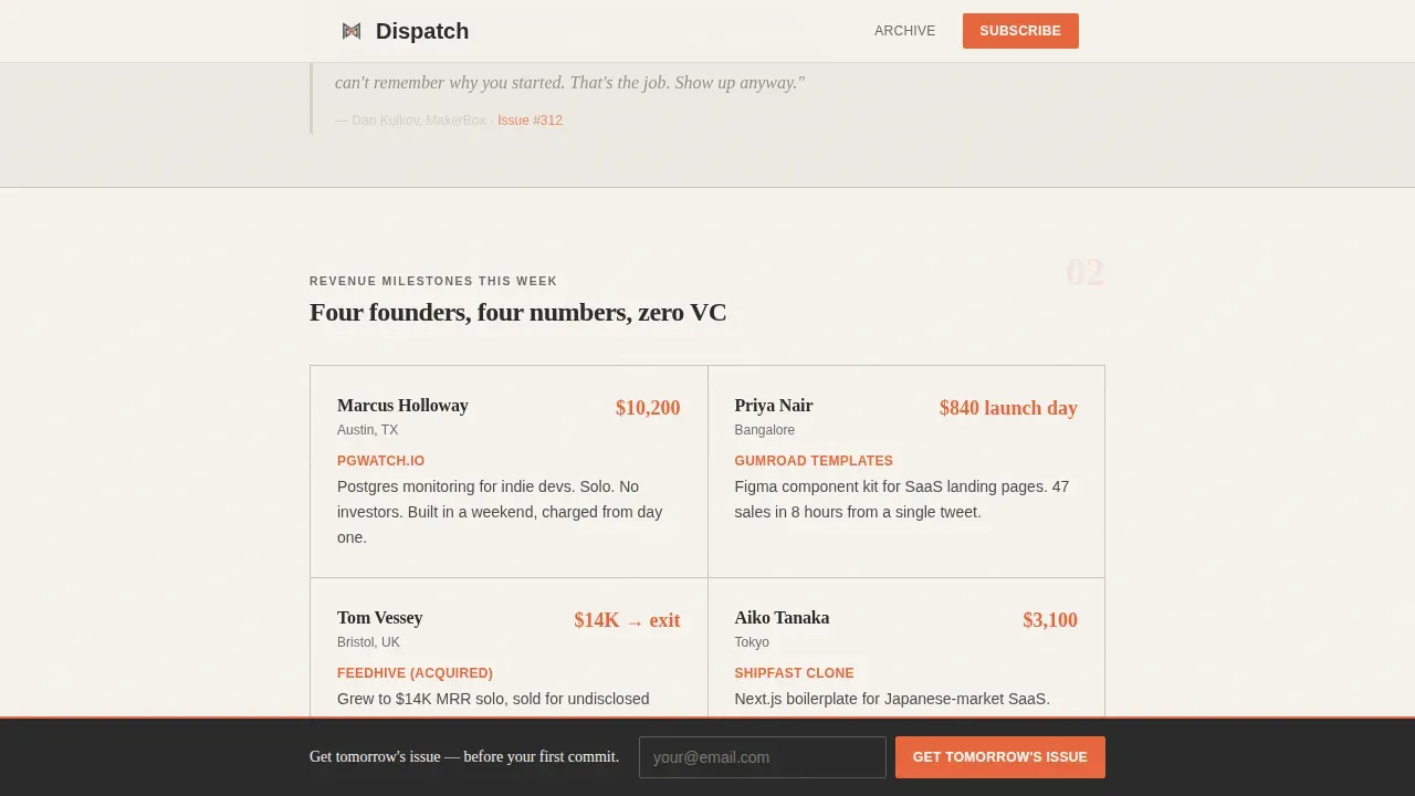
- Four themed editorial card sections covering tools, revenue milestones, a featured thread, and a build log, each with pull quotes, founder names, and highlighted figures
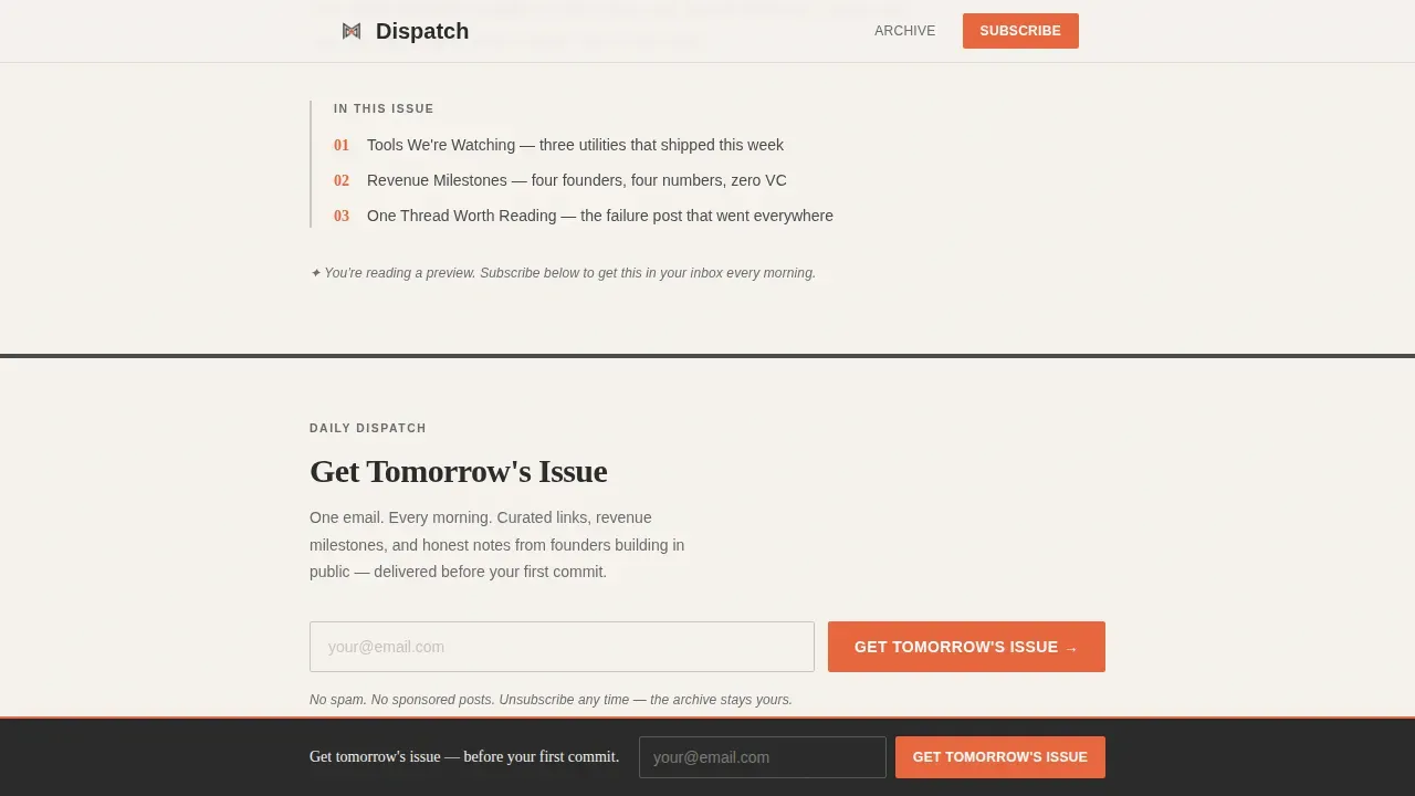
- Two subscribe call-to-action placements, one beneath the hero and one as a sticky bottom bar that fades in after scrolling past two curated sections, each with a single email field and a signal orange submit button
- Three past-issue archive accordions rendered inline, giving visitors a generous sneak peek at real newsletter content before committing
Feature list
This template ships with several carefully designed features. Each one supports the newsletter landing page's primary goal of earning subscriber trust and driving sign ups.
Chapter-Style Hero With Editorial Typography
The page opens like the title page of a hardcover book. Large Fraunces serif type carries a chapter title, a dateline, and an estimated read time. A single illustrated drop cap and a short editor's note pull the reader in immediately. This bold headline approach captures reader's attention without relying on images or gradients.
Themed Editorial Card Sections
Four thematic content clusters scroll in sequence: "Tools We're Watching," "Revenue Milestones This Week," "One Thread Worth Reading," and "The Build Log." Each card includes pull quotes and founder names displayed with signal orange accents. The rhythm alternates between dense link roundups and single-story deep dives, maintaining visual interest and demonstrating the newsletter content value clearly.
Dual Subscribe Placements With Sticky Bar
The subscription form appears twice. First, directly beneath the hero as an inline sign up form with a single email text box and a signal orange submit button. Second, as a sticky bottom bar that fades in after the visitor scrolls past two editorial sections. This double placement keeps the subscription process visible without interrupting reading flow.
Inline Archive Accordions
Three full past issues are embedded as expandable accordions. Visitors can read real newsletter content directly on the page. This gives potential subscribers clear expectations about what they will receive. Providing this level of preview is one of the most effective ways to increase conversion rates on newsletter landing pages, because it removes uncertainty before the ask.
Cloud Canvas Color System With Signal Orange Accents
The palette is strict and intentional. Parchment white backgrounds, pencil-lead gray body text, cloud shadow section dividers, and signal orange reserved for links, issue numbers, and the subscribe button. Signal orange appears sparingly, which means every instance carries weight. This visual consistency across the entire page reinforces the brand identity of the publication.
Scroll Reveal Animations and Accordion Transitions
The page uses medium-intensity scroll reveal animations to unfold sections as the visitor reads. Archive accordions open with smooth transitions. The sticky subscribe bar fades in gracefully. These interactions add editorial personality without requiring heavy JavaScript, keeping the experience clean across all devices.
Page sections overview
| Section | Purpose |
|---|---|
| Chapter Hero | Opens with serif title page, dateline, drop cap, editor's note |
| Editorial Cards | Four themed content clusters with pull quotes and founder figures |
| Subscribe Block One | First inline sign up form with signal orange submit button |
| Archive Accordions | Three expandable past issues for inline content preview |
| Sticky Subscribe Bar | Persistent bottom bar with email field that fades in on scroll |
| Footer | Horizontal flow footer with essential links |
Design & branding system
The visual identity of Dispatch is built around the Cloud Canvas color system. Every design decision reflects a freshly printed independent zine: generous white space, considered serif typography, and an almost tactile sense of ink on paper. The result is a brand identity that feels earned, not assembled from a template library.
Key design characteristics:
- Typography uses Fraunces for display headings and DM Sans for body text, creating a sharp contrast between editorial authority and readable clarity
- The four-color palette, parchment white at #F6F3EE, pencil-lead gray at #4A4A4A, cloud shadow at #C9C5BE, and signal orange at #E8663C, maintains consistent branding across every section with signal orange used sparingly for maximum impact
- Section dividers use cloud shadow as thin horizontal rules, and white space is treated as a design element rather than empty filler, keeping the layout open and the eye moving
Mobile & speed optimization
Dispatch is designed desktop-first with a layout that translates cleanly to mobile devices. The single-column flow requires minimal restructuring at smaller screens, so the reading experience stays intact across all screen sizes. Thumb-friendly tap targets are built into the sticky subscribe bar and the accordion controls.
Specific mobile considerations in this template:
- The sticky bottom bar is sized and spaced for comfortable use on mobile devices, with clear tap areas that work well on smaller screens
- Accordion transitions are lightweight, keeping interactions smooth without adding render-blocking scripts
- The template uses server components for static content and minimal JavaScript, which supports fast load behavior on mobile friendly connections
How this template helps you convert
A newsletter landing page only works if it earns trust before it asks for an email address. Dispatch is structured specifically to build that trust through content, not just promises. The conversion strategy is layered and deliberate.
- The page gives away roughly 60 percent of a real issue inline, including editorial cards, pull quotes, and archive accordion previews. Giving visitors this much real newsletter content removes hesitation and sets clear expectations about what they will receive after subscribing. This "try before you subscribe" approach is one of the most reliable ways to improve conversion rates on content-led pages.
- Two strategically placed subscribe prompts keep the call to action visible without interrupting reading. The first sign up form sits immediately below the hero, capturing visitors who decide quickly. The sticky bottom bar captures visitors who need more context, appearing after they have already read through two curated sections and are more likely to convert. Using a single primary call-to-action button in each placement, styled in signal orange, focuses attention and avoids decision fatigue.
- Social proof is embedded throughout the page in the form of real founder names, actual revenue figures displayed in signal orange, and direct quotes from past issues rendered as pull quotes. Displaying subscriber numbers and real outcomes provides measurable social proof that signals the newsletter is worth reading. Testimonials from current subscribers and highlighting the subscriber count both serve as credibility signals that encourage new sign ups.
Other information about this template
Dispatch is positioned as a focused page for a very specific publishing niche, but the layout and conversion principles it uses apply broadly to any newsletter landing page project. Whether you are building your own newsletter for the first time or redesigning an existing publication's subscribe page, the template gives you a strong structural foundation.
A few additional details worth knowing before you start customizing:
- The template is built as a single-column flow, which means you can start customizing content without worrying about complex grid logic or column alignment across different screen sizes
- Every section header, editorial card, and accordion is editable. You can replace the placeholder newsletter content with your own subject line examples, recent newsletter topics, and real subscriber testimonials
- The sticky subscribe bar and archive accordions are interactive components built with minimal JavaScript. They work reliably across email clients that render web previews and across all major browsers
- The template supports integration with your preferred email marketing tool by connecting the sign up form to your subscriber list. The subscription form is built to accept an email address and route it to whichever email campaigns platform you use
- For creators who want to use a drag and drop editor or drag and drop builder to extend the layout, the clean component structure makes it straightforward to add or rearrange sections without breaking the visual system
- If you want to offer early access to a new issue series or a paid tier, the subscribe block is easy to adapt with additional copy above the subscription form
- Alt text fields are available for any decorative elements you add, ensuring that images you insert remain descriptive for assistive tools and search engines
- The page template does not include pop ups by default, but the layout supports adding pop ups as an additional conversion layer if your email marketing tool provides that feature. Many creators use pop ups alongside a newsletter landing page to capture visitors who attempt to exit
- The template works well alongside free newsletter templates for scaffolding early issues, helping you move quickly from landing page launch to first send
- Effective newsletter landing pages like those used by publications that prioritize concise copy and minimal copy tend to outperform cluttered alternatives. Dispatch follows that principle throughout. It is designed to convert visitors through editorial quality and actionable insights, not volume of text or flashy design elements
- The entire thing is production-ready and requires no coding knowledge to deploy. You can easily create your live newsletter landing page, connect a subscription form to your email marketing tool, and hit send on your first issue without writing a line of code
- The template is built to support lead generation for newsletter creators who want to grow their email subscribers list before launch, during early access periods, or as part of ongoing email campaigns
- The intuitive drag and drop approach to layout editing means you can kick things off quickly. Start creating your newsletter landing page by swapping in your own newsletter content, adjusting the Cloud Canvas palette to reflect your own brand identity, and previewing the result across screen sizes before publishing
Theme
Editorial Magazine
Creative direction
Curated Collection
Color system
Cloud Canvas
Style
Single Column Flow
Direction
Content/Resource
Page Sections
Chapter-style Editorial Hero Section
Themed Editorial Card Sections
Dual Subscribe Placements with Sticky Bar
Inline Archive Accordions
Cloud Canvas Color System
Scroll Reveal Animations and Accordion Transitions
Related questions
Can I customize the colors and typography in this template?
How does the inline archive accordion work for visitors?
Does the sticky subscribe bar work on mobile devices?
Do I need coding skills to launch this newsletter landing page?
How does this template help grow my subscriber count?



