Clinical Medical Intelligence Landing Page Template
Rounds is a premium healthcare newsletter landing page built for editorial teams that want to convert senior clinicians and health-tech leaders into loyal subscribers. The asymmetric 60/40 grid, Ink and Paper visual identity, and curated-collection scroll structure make it easy to showcase real edition content, build credibility fast, and capture signups with minimal friction.
by Rocket studio
Quick summary
Rounds is a single-page template designed for professional healthcare newsletter publishers. It pairs a cinematic full-bleed header with an asymmetric 60/40 editorial grid, letting you place real issue content beside social proof as visitors scroll. The Japanese Zen color palette and serif typography signal authority from the first glance, while a low-friction email form with a specialty dropdown handles lead capture cleanly.
Who this template is for
This template is built for publishers, editorial teams, and healthcare organizations that need a high-converting subscription page. It suits anyone communicating with a professional clinical audience who values depth over volume.
- Hospital communications leads and residency program directors launching a weekly briefing
- Health-tech founders and health policy teams growing a subscriber base among clinicians
- Healthcare provider networks wanting to deliver curated insights to hospitals and clinics
What problem this template solves
Generic newsletter pages fail to convey editorial authority to a demanding professional audience. Senior clinicians and healthcare leaders do not subscribe based on vague promises. They subscribe when they can see the quality of the work for themselves.
- Most templates cannot accommodate real edition previews alongside institutional social proof
- Busy readers at hospitals and clinics need to find value signals quickly or they leave
- Low-signal pages produce low conversion rates, while editorial-first layouts earn the click
What you get with this template
You get a complete, ready-to-customize landing page that demonstrates quality before asking for a commitment. Every section is structured to ease the decision for a skeptical, time-pressed professional audience.
- A full-bleed hero section with serif headline overlay and a subscription form placed above the fold
- A 60/40 asymmetric edition-preview grid paired with a social proof column
- A bottom conversion section with email input, specialty dropdown, and subscriber count display
Feature list
This template includes a focused set of design and layout features. Each one is grounded in the source brief and built to serve healthcare newsletter lead generation.
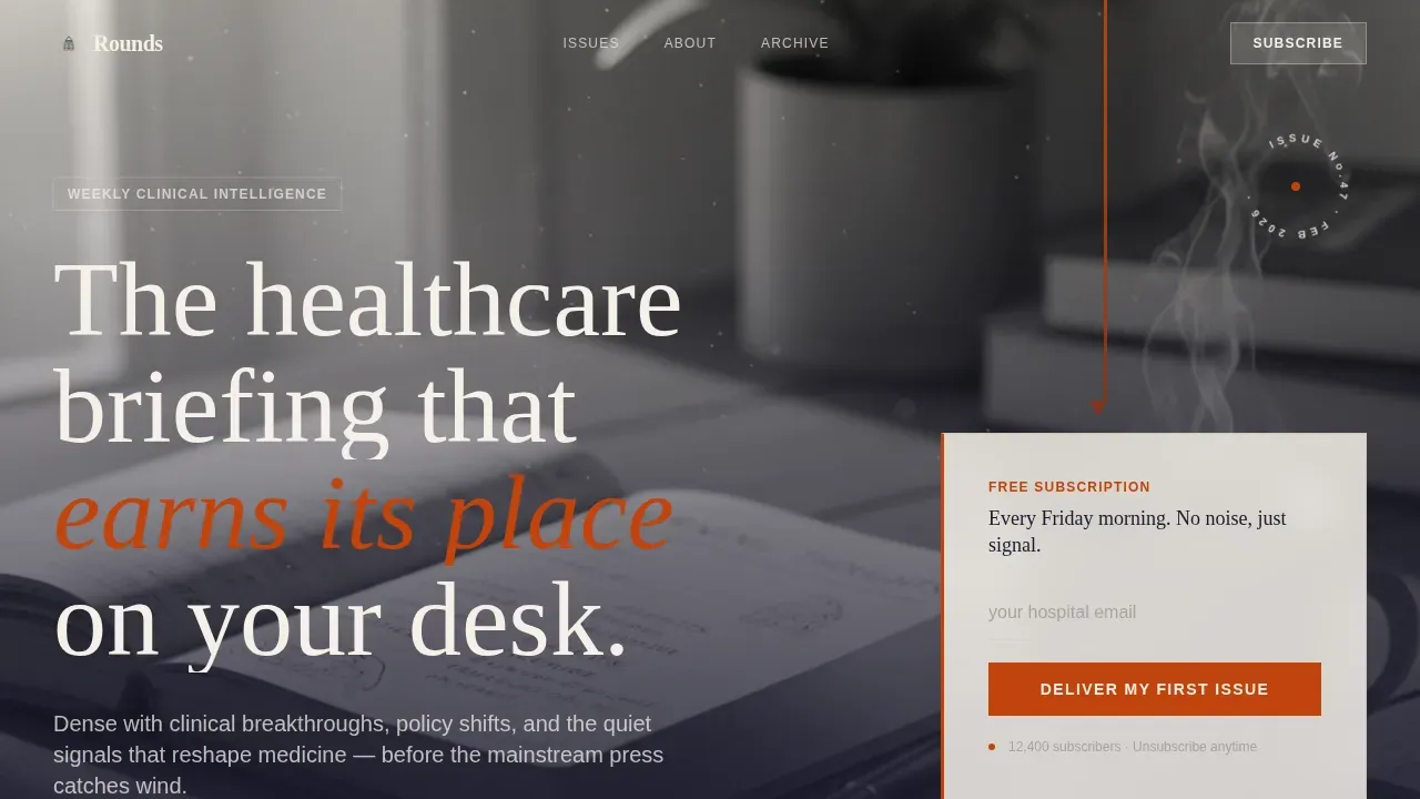
Full-Bleed Hero with Overlay Form
The header opens with a cinematic overhead desk photograph desaturated to near-monochrome, with a single persimmon-red accent threading through the image. A serif headline sits directly over the photo, and a floating subscription card with a single email input is placed above the fold. This keeps the primary call to action visible without scrolling, which is essential for improving conversion rate on professional pages.
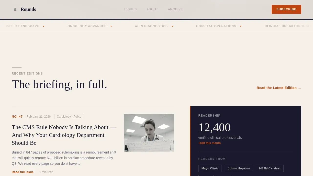
Asymmetric 60/40 Editorial Grid
The wider left column showcases three recent edition cards, each with a real headline, a real lede, and an issue date. The narrower right column runs a parallel track of subscriber counts, reader testimonials, and institutional citation logos. The pairing builds the case through content rather than claims, making it easy to convey credibility to a discerning audience.
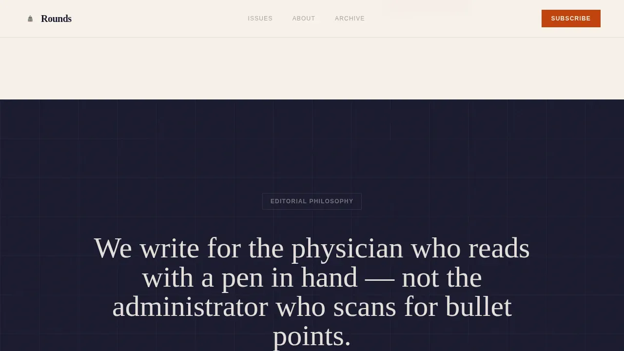
Scroll-Reveal Editorial Philosophy Section
A centered typographic pull quote section with persimmon-red accent text appears mid-page. It uses scroll-triggered reveals to deliver the editorial message at the right moment. This gives publishers a way to place their voice and values clearly in front of readers who are still deciding.
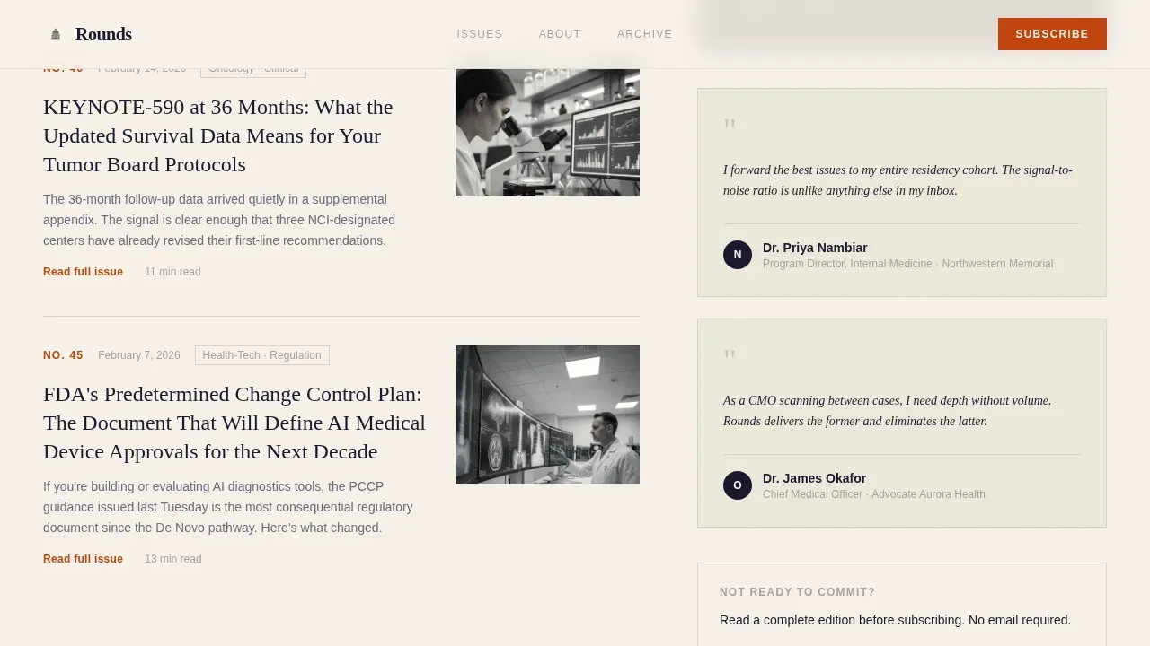
Spotlight Testimonial Cards
A named testimonial grid features titled professionals from hospitals, clinics, and health policy organizations. Each card uses a spotlight hover effect. Patient testimonials and named reader endorsements address the trust signals that healthcare landing pages need to build credibility with a professional audience.
Segmented Bottom Conversion Form
The email capture form reappears at the bottom with an added specialty dropdown covering cardiology, oncology, primary care, health policy, and other. This segments subscribers on entry without adding friction. A simple form that asks only for necessary information is one of the most effective ways to improve signup rates on healthcare pages.
Minimal Footer with Contact Information
The footer follows a clean horizontal flow design with minimal visual weight. It provides contact information so visitors know how to reach the publisher, and it keeps the page focused on the conversion goal without unnecessary distractions.
Page sections overview
| Section | Purpose |
|---|---|
| Hero with Form | Grab attention and capture email above the fold |
| Recent Editions Grid | Show real content as proof of editorial quality |
| Editorial Philosophy | Convey the publisher's voice and values |
| Reader Testimonials | Build trust with named professional endorsements |
| Bottom Conversion Form | Capture segmented signups with specialty dropdown |
| Minimal Footer | Provide contact information and close the page cleanly |
Design & branding system
The visual identity follows a Japanese Zen restraint philosophy. Every color, typeface, and spacing decision is deliberate, making it easy to customize without breaking the system.
- Colors: washi cream (#F5F0E8) as the dominant background, sumi ink black (#1A1A2E) for all body text, stone garden gray (#A8A29E) for section dividers, and persimmon red (#C1440E) reserved for calls to action and pull quotes only
- Typography: Fraunces serif for display headlines and DM Sans for body text and labels, creating a clear hierarchy between editorial and functional text
- Imagery: the template uses a desaturated near-monochrome hero photograph with a single accent color, enhancing the editorial tone while keeping layouts clean and professional
Mobile & speed optimization
The template is designed desktop-first for CMOs and senior clinicians scanning between cases on larger screens, with full mobile support so no reader is excluded regardless of device.
- The asymmetric grid adapts to single-column layouts on smaller screens, ensuring key information stays easy to read
- Scroll-reveal animations and spotlight hover effects are handled by client-side components, keeping static sections fast and easy to load
- The form elements, including the specialty dropdown, remain easy to interact with on touch screens
How this template helps you convert
A well-structured healthcare landing page earns subscriptions by removing doubt and reducing effort. This template is engineered around that principle.
- The primary call to action is placed above the fold in the hero, making it the first thing people see, which directly supports improving conversion rate on professional pages
- The 60/40 grid lets real edition content do the persuasion work, so visitors already feel like readers before they subscribe
- The segmented bottom form captures specialty data on entry, making the list more valuable from the first signup without adding extra steps
Other information about this template
This template is a practical starting point for any editorial healthcare team working without a large development budget. No-code tools enable healthcare professionals to create professional marketing materials without extensive coding knowledge, and this template is built with that reality in mind. No-code platforms often include user-friendly interfaces that simplify the design process for non-technical users, and this template is structured to take full advantage of that ease.
- You can customize colors, text, images, and layouts directly without touching code, so updating branding or swapping edition content takes minutes rather than days
- Healthcare organizations can tailor each section to reflect their specific branding, whether that means adjusting the color system, adding videos to the editorial philosophy section, or uploading a fresh set of edition cards
- Templates like this one are structured to accommodate a variety of content types, including health tips roundups, policy insights, medical practices updates, and clinical research highlights, which means the same design works across different editorial angles
- The average conversion rate for healthcare landing pages sits around 3.2%, but top-performing pages can reach as high as 21.1%, and using a template optimized for credibility and ease is one practical way to work toward the higher end of that range
- If you are working across a platform that supports A/B testing, this template's modular sections make it straightforward to test headline variations, form placement, or testimonial arrangements without rebuilding the page
Theme
Ink & Paper
Creative direction
Curated Collection
Color system
Japanese Zen
Style
Asymmetric Grid (60/40)
Direction
Lead Generation
Page Sections
Full-bleed Hero with Subscription Form
Asymmetric 60/40 Edition Preview Grid
Scroll-triggered Editorial Philosophy Block
Spotlight Hover Testimonial Cards
Segmented Bottom Conversion Form
Clean Minimal Footer
Related questions
Can I customize the colors and typography in this template?
Does this template include a specialty dropdown in the signup form?
Is this template suitable for clinics and smaller organizations, or only large hospitals?
Can I use this template without any coding experience?
How do I add my own edition content to the editorial grid?


