Insider Workplace Trends Landing Page Template
Dispatch is an editorial newsletter landing page template built for curated remote work content. It uses an asymmetric 60/40 grid, a tactile Ink and Paper color system, and a Collage/Scrapbook hero to show off past issues as artifacts. The primary goal is waitlist sign ups, earned by giving visitors a full Issue #0 preview before asking for an email.
by Rocket studio
Quick summary
Dispatch is a single-page newsletter landing page template designed for a curated remote work links publication. It pairs an asymmetric 60/40 grid with a hand-crafted Editorial Magazine aesthetic to create a landing page that feels like a well-annotated zine rather than another polished SaaS form. The page earns newsletter sign ups by letting readers experience the curation quality before they subscribe.
Who this template is for
This template speaks directly to creators and curators who want a newsletter landing page that reflects genuine editorial taste. It is built for people who distrust generic templates and want a focused page with a distinct visual identity.
- Freelance developers and digital nomads who curate remote work resources for a niche community
- Ops managers and async-first team leads who want to grow an email list around practical, tactical content
- Independent newsletter writers who need a waitlist landing page that proves quality before asking readers to sign up
What problem this template solves
Most newsletter landing page examples fall into one of two failure modes: they either look too corporate or say too little. Potential subscribers leave without converting because the page gives them no reason to trust the content. The effectiveness of a newsletter landing page depends on how clearly it communicates value, and this template is built around that principle.
- Generic newsletter page designs fail to show the actual content, leaving readers with no clear expectations about what lands in their inbox
- A standard sign up form on a bland page cannot convert visitors who are already skeptical of low-quality "future of work" content
- Without social proof and a sample issue, a curated newsletter landing page cannot demonstrate the taste and judgment that justify the subscription
What you get with this template
This template gives you a complete, well structured newsletter landing page built around one primary goal: converting curious visitors into waitlist subscribers. Every section serves the subscription process without distraction.
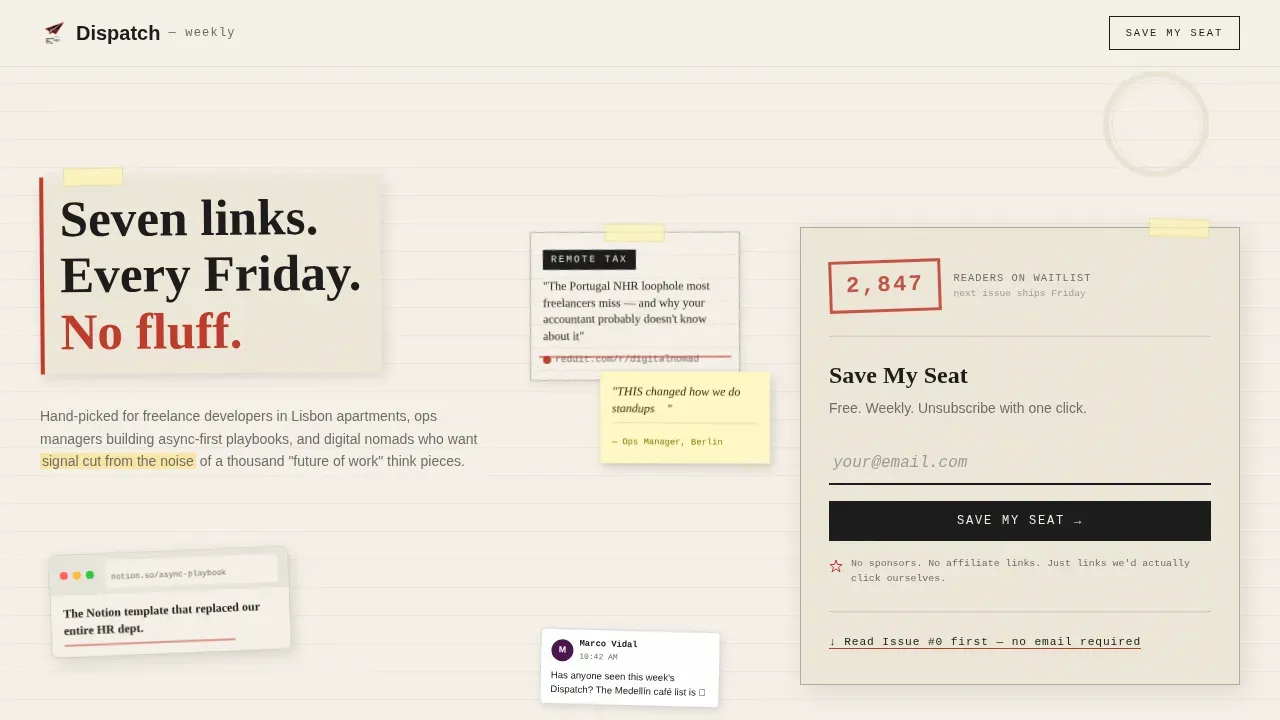
- A Collage/Scrapbook hero section with a typewriter-styled email sign up form, a live waitlist counter styled as a library checkout stamp, and a bold headline on a torn paper strip
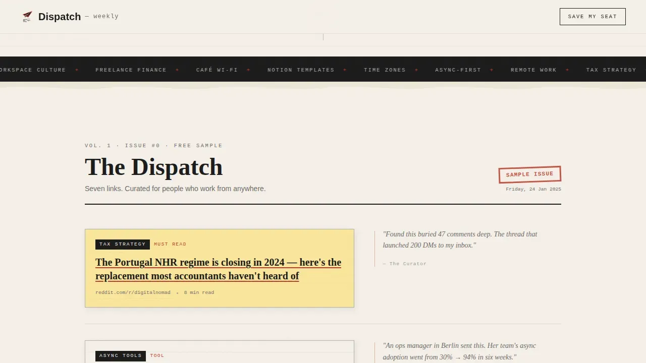
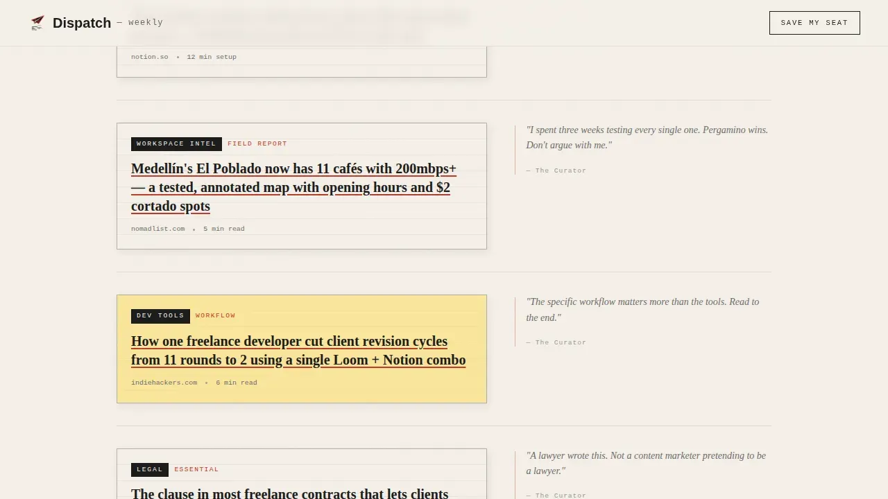
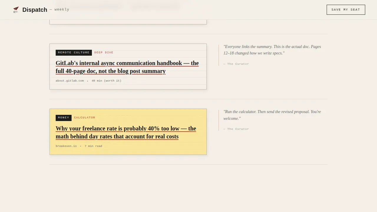
- A full Issue #0 preview rendered as a newspaper clipping artifact, organized into editorial departments with torn-paper dividers between themes
- Post-it note testimonial blocks, a secondary "Join the Friday List" call to action at the bottom, and an ultra-minimal footer
Feature list
This template is built around a few key elements that work together to turn readers into subscribers. Each component is grounded in best practices for effective newsletter landing pages.
Asymmetric 60/40 Collage Hero
The hero section opens as a layered scrapbook wall. Torn browser tabs, highlighted article snippets, sticky notes with handwritten annotations, pinned screenshots, and a coffee ring stain are arranged at slight angles. A parallax cursor effect shifts elements as the pointer moves, making the landing page feel alive. A bold headline sits on a torn strip: "Seven links. Every Friday. No fluff." The typewriter-styled sign up form sits below it with a blinking cursor on cream paper, inviting the first sign up without friction.
Issue #0 Sample Preview
Below the hero, the landing page displays a full preview of Issue #0 as a curated artifact rather than a text list. Each featured link appears as a newspaper clipping in the 60% column, with a handwritten curator annotation in the 40% margin beside it. This section is the core trust mechanism of the page, giving visitors a complete experience of the product before the subscription process begins. Showcasing real, clickable content proves editorial quality in a way no headline alone can.
Themed Editorial Departments
The page scrolls through three distinct content departments: async tools, tax strategy, and workspace culture. Each department is visually separated by torn-paper edge dividers, mimicking magazine sections. The rhythm alternates between dense link previews and open white space, so readers never feel overwhelmed. Section headers give each area a clear identity and help readers navigate the page without feeling lost.
Post-it Testimonial Blocks
Social proof appears as scribbled testimonials on Post-it note graphics pinned between departments. These direct quotes from readers highlight specific benefits, reinforcing the value proposition in a format that fits the overall editorial aesthetic. Curated testimonials presented this way help potential subscribers identify themselves within a community of like-minded remote workers, which increases the likelihood of conversion. Adding a privacy note near the call-to-action area further strengthens trust.
Live Waitlist Counter
The final call-to-action section displays a live subscriber count stamped like a library checkout card number. This subscriber count creates a sense of momentum. A visible count signals that others already find the newsletter valuable, which reduces uncertainty for potential subscribers sitting on the fence. The "Join the Friday List" sign up form below it is minimalist, asking only for an email address to keep friction low and conversion rates high.
Ultra-Minimal Footer
The footer follows a horizontal ultra-minimal pattern. It saves space without sacrificing structure, keeping the single page focused on the primary goal: the email list. Navigation links are deliberately absent from the main page flow, so readers stay focused on subscribing rather than wandering to other parts of a site.
Page sections overview
| Section | Purpose |
|---|---|
| Collage Hero Wall | Opens the page with a scrapbook parallax composition and typewriter sign up form |
| Issue #0 Preview | Displays a full sample issue as a newspaper clipping artifact to prove curation quality |
| Async Tools Dept. | Showcases curated links around async work tools with torn-paper editorial dividers |
| Tax Strategy Dept. | Highlights tax-focused remote work links within a visually distinct magazine department |
| Workspace Culture Dept. | Covers workspace and nomad culture links in a third editorial department |
| Post-it Testimonials | Places handwritten social proof notes between sections to reinforce trust |
| Waitlist Counter call to action | Shows a stamped subscriber count and secondary sign up form to close conversions |
| Ultra-Minimal Footer | Provides minimal page close with no distracting navigation |
Design & branding system
The visual identity uses an Ink and Paper color system that feels like a Risograph-printed independent zine. The palette is deliberately lo-fi and tactile, creating consistent branding that stands apart from gradient-heavy SaaS landing page examples. A clean layout, bold typography, and a muted color palette reinforce credibility and keep readers focused on the content.
- Colors: deep editorial black (#1A1A1A) for body text, warm newsprint cream (#F5F0E8) for backgrounds, marginalia red (#C0392B) for links and hover states, and pencil graphite (#6B6B6B) for secondary text and divider rules
- Typography: Fraunces serif for display headlines, DM Sans for body copy, and IBM Plex Mono for typewriter and code-style elements, creating visual consistency across every section of the landing page
- Decorative elements: torn paper edges, coffee ring stains, sticky note graphics, rotated collage layers, and hand-annotation styles give the page strong visuals that feel curated rather than generated
Mobile & speed optimization
The desktop version of this template is the primary experience, built for freelance developers and remote workers at laptops. However, the layout is fully responsive, ensuring the newsletter landing page reads clearly on smaller screens too. The mobile version preserves the editorial feel with stacked columns and readable typography. Animations use CSS transforms only, and section reveals rely on Intersection Observer, keeping the page performant across screen sizes.
- Parallax and floating element animations are handled through CSS transforms to minimize layout recalculations and maintain smooth performance on the desktop version
- The mobile version stacks the asymmetric 60/40 columns into a single readable flow, ensuring the sign up form and call-to-action remain prominent on smaller screens
- Intersection Observer triggers staggered section reveals as readers scroll, creating engaging content reveals without heavy JavaScript overhead
How this template helps you convert
An effective newsletter landing page combines a clear value proposition with social proof and a distraction-free layout. This template is built around those principles, giving visitors the right nudge at every scroll point. The conversion rate of a newsletter landing page improves when readers experience the product before they are asked to subscribe.
- The hero sign up form captures early intent from readers who already trust the headline, while the live waitlist counter creates urgency by showing active subscriber numbers before anyone scrolls further
- The Issue #0 preview acts as a full product demonstration, giving visitors actionable insights and real link examples so they understand exactly what lands in their inbox each Friday, which sets clear expectations and removes signup hesitation
- The Post-it testimonial blocks and the secondary "Join the Friday List" sign up form at the page bottom catch readers who needed more convincing, covering the full subscriber journey from first impression to final conversion
Other information about this template
This template belongs to the Blog and Editorial category with a Remote Work Newsletter subcategory. It is designed as a focused page for a single newsletter publication, though the layout ideas and section structure can inspire multiple newsletters in the same niche. Below are a few additional details worth knowing before you customize and launch your own landing page.
- This is a waitlist and coming-soon landing page direction, not a post-launch subscription page, making it ideal for creators building an email list before their first public issue
- The template style is an asymmetric grid (60/40), which is less common among newsletter landing page examples and immediately signals that this is not a generic newsletter page
- You can customize colors, annotations, and clipping content to match your own brand identity without altering the underlying grid structure
- The page is built desktop-first, so the desktop version carries the most visual detail; the mobile version simplifies gracefully without losing the editorial character
- Previously created issues can be added to the artifact scroll section to build an archive of past curated content as the newsletter grows
- The subscription form asks only for an email address, keeping the subscription process simple and reducing friction for potential subscribers who are on the fence
- The template supports engaging content types across the editorial departments: tools roundups, tax and finance links, workspace culture stories, and nomad city guides
- Effective newsletter landing pages across many categories share the same key elements this template delivers: a bold headline, a concise value proposition, a visible sign up form, and social proof
- Best newsletter landing pages earn the click by demonstrating quality, not just promising it, and this template is built around that philosophy
- Landing page examples in the editorial and media space show that readers respond well to curated artifact layouts, which is exactly the creative direction this template uses
- Tools like Landingi allow users to build newsletter landing pages with drag-and-drop editors and templates without coding, while ConvertFlow enables users to create, personalize, and run different versions of landing pages to improve conversion rates and track conversions over time; this template is compatible with those workflows as a starting design
- Search engines reward focused, well-structured pages with clear topical signals; a newsletter landing page that covers a specific niche like remote work curated links sends clearer signals to search engines than a broad general-interest page
- Displaying subscriber numbers, privacy reassurance near the call to action, and direct quotes from readers are all practices that the best newsletter landing pages use to build trust, and all three are built into this template's structure
Theme
Editorial Magazine
Creative direction
Curated Collection
Color system
Ink & Paper
Style
Asymmetric Grid (60/40)
Direction
Waitlist/Coming Soon
Page Sections
Collage Scrapbook Hero with Parallax
Full Issue Preview as Editorial Artifact
Themed Department Sections with Torn-paper Dividers
Post-it Social Proof Testimonials
Stamped Live Waitlist Counter and Final Call to Action
Related questions
Can I use this template if my newsletter is not about remote work?
Does the live waitlist counter require a third-party tool to work?
How does the Issue #0 preview improve newsletter sign ups?
Is this template built for desktop or mobile readers?
Can I add more past issues to the page as the newsletter grows?



