Fitness Blog & Media Reviews Website Template
Broadcast is a bold fitness landing page template built for strength podcasts and media brands. It uses an asymmetric 60/40 grid, an Ink and Paper editorial aesthetic, and a Parchment and Rust color system to draw serious lifters and coaches into the audio player. The template drives clicks through audio previews, sticky calls to action, and magazine-style storytelling.
by Rocket studio
Quick summary
Broadcast is a single-page fitness podcast template designed to win the trust of serious training audiences before asking for a click. It pairs a cinematic barbell hero with scroll-driven editorial storytelling, a live episode feed, and hover audio previews. Every section earns the next one, guiding visitors toward "Listen to the Latest Episode" without a form or email gate in the way.
Who this template is for
This template fits creators and brands that take long-form strength content seriously. If your podcast features real coaches, dietitians, or athletes and your audience shows up to train before sunrise, this page speaks their language.
- Strength and conditioning podcasters who want an editorial-quality landing page without hiring a designer
- Fitness media brands building credibility with coaches, collegiate interns, and serious home-gym lifters
- Retired athletes and sports dietitians launching audio content for a training-focused audience
What problem this template solves
Most podcast landing pages look like generic app store cards. They list episode titles and drop a play button into a white box. Broadcast fixes that by making the page itself feel like proof of the content's quality.
- Clickbait-heavy fitness media has conditioned audiences to distrust new shows, so this template leads with editorial depth and manifesto-style copy before asking for a listen
- A plain episode list gives no emotional reason to care, so Broadcast uses hover audio previews and pull-quote testimonials to let the content do the persuading
- Without a clear scroll path, visitors bounce before they reach the call to action, so the 60/40 asymmetric layout channels attention from philosophy down to featured episodes and then to the player
What you get with this template
You get a fully designed, section-rich landing page built around the aesthetics and conversion logic of a serious media brand. Every component is documented in the brief and ready to customize.
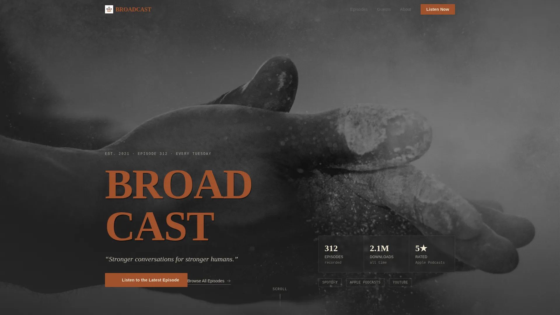
- A Type Over Image hero with a grainy black-and-white barbell photograph, oversized rust serif headline, and italic graphite manifesto line
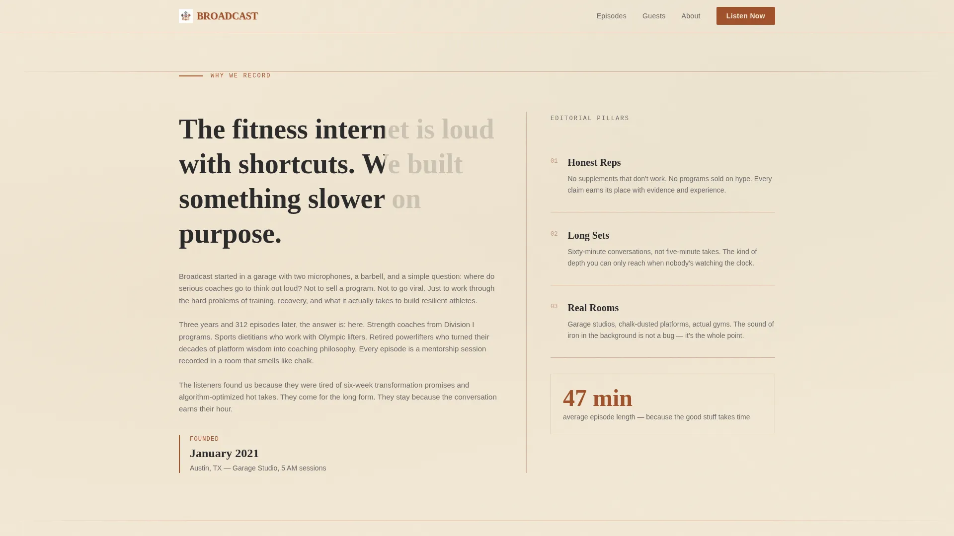
- An asymmetric 60/40 grid manifesto section where the wide column carries editorial WHY copy and the narrow column runs a live episode card feed
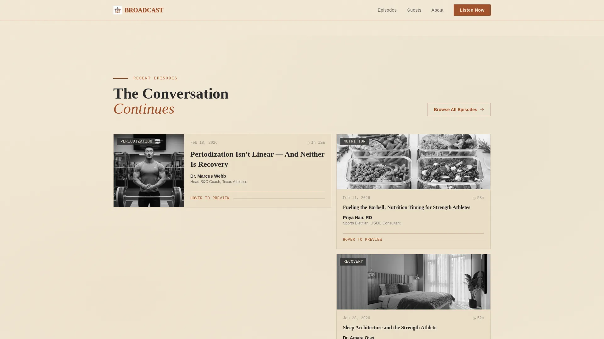
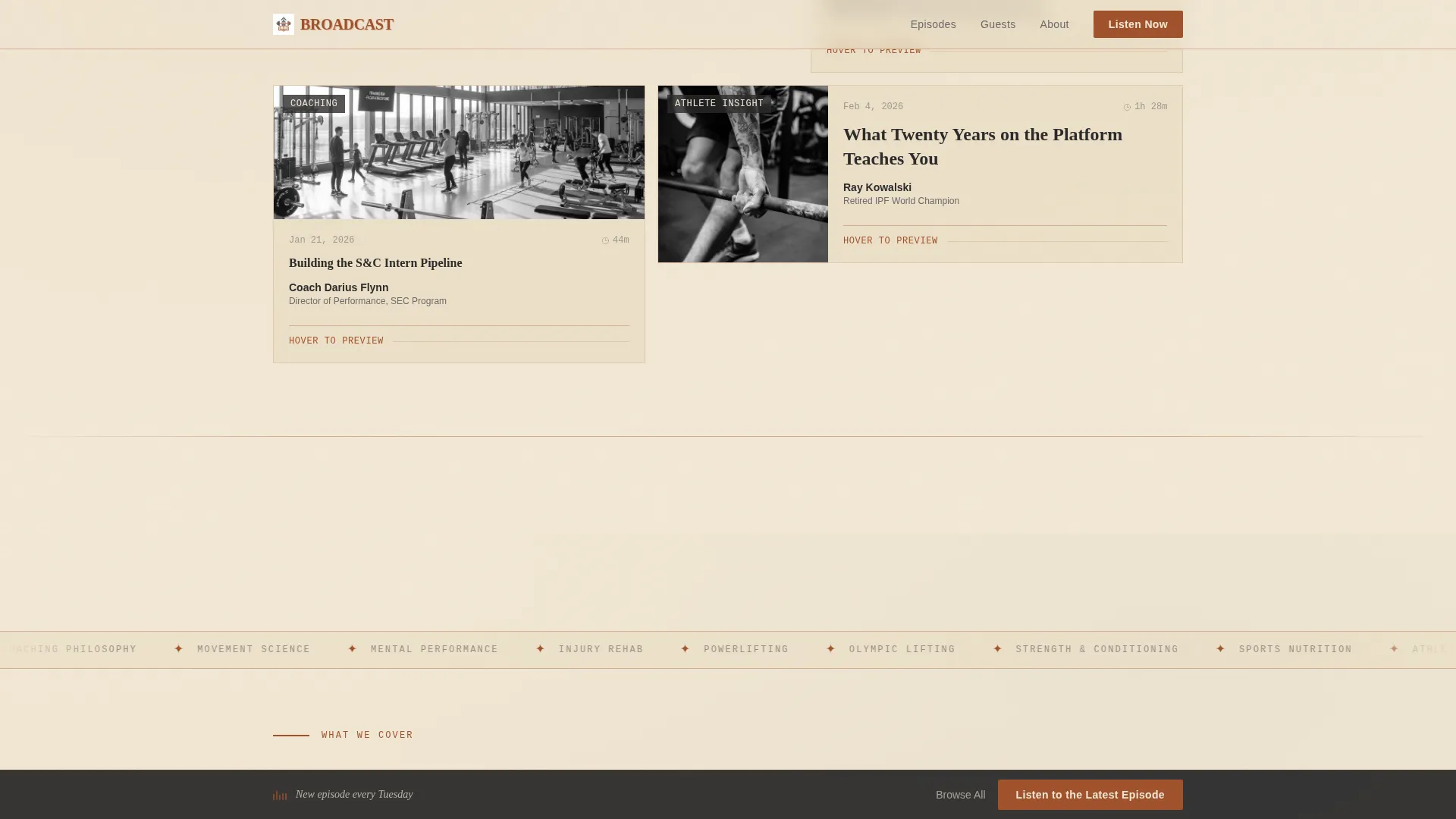
- An episode bento grid with hover audio previews, guest name cards, and grayscale-to-color transitions on interaction
- Four editorial pillar cards inside a marquee ticker section, plus three magazine-style pull-quote testimonial cards with full attribution
- A sticky "Listen to the Latest Episode" call-to-action bar that activates after the midpoint scroll and a secondary "Browse All Episodes" path to the full archive
- A split footer with logo and tagline on the left and navigation links on the right
Feature list
A paragraph introducing the feature list: every feature below is drawn directly from the template brief, giving you a clear picture of what ships with Broadcast and how each piece works together to convert curious visitors into committed listeners.
Asymmetric 60/40 Editorial Grid
The layout splits the viewport into a 60-percent column for long-form WHY copy and a 40-percent column for the live episode feed. This structure keeps philosophy and proof side by side as the visitor scrolls, reinforcing the brand's credibility at every breakpoint.
Hover Audio Preview on Episode Cards
Three embedded audio clips auto-preview on hover, playing roughly fifteen seconds of a guest mid-sentence. The curiosity gap this creates is the primary conversion mechanism, letting the content sell itself without a hard pitch.
Scroll-Scrub Manifesto Section
The manifesto text animates in sync with the visitor's scroll position, revealing editorial copy in stages. The effect mirrors the experience of turning pages in a training journal, keeping readers engaged through the full philosophy section.
Sticky Call-to-Action Bar
After the visitor passes the page midpoint, a persistent rust-on-parchment bar appears with the primary call to action. It stays visible without interrupting reading, giving returning attention a clear next step at any moment.
Magazine Pull-Quote Testimonials
Three spotlight testimonial cards display coach and athlete quotes in large display type with full attribution. The format mirrors editorial pull quotes from a print magazine, reinforcing the brand's journalistic tone and social proof simultaneously.
Marquee Ticker with Pillar Cards
Four editorial pillar cards sit behind a continuously scrolling marquee ticker. A spotlight hover effect highlights each card individually, making the brand's content pillars feel dynamic rather than static.
Page sections overview
| Section | Purpose |
|---|---|
| Hero with Stats | Sets tone, stamps brand name over cinematic barbell image |
| Manifesto Copy | Communicates the podcast's WHY through editorial typography |
| Episode Card Feed | Provides scrolling proof of content depth beside manifesto |
| Episode Bento Grid | Delivers hover audio previews and guest card interactions |
| Editorial Pillars | Defines four core content pillars with marquee and spotlight |
| Testimonial Cards | Builds trust with magazine-style pull quotes from real listeners |
| Sticky call to action Bar | Re-captures attention at scroll midpoint with primary action |
| Split Footer | Closes page with logo, tagline, and navigation links |
Design & branding system
The visual identity follows an Ink and Paper editorial theme. The palette and type choices reference letterpress broadsheet printing, making the page feel as substantial as a well-worn training journal rather than a generic media site.
- Color system: aged parchment cream (#F2E8D5) for backgrounds, deep editorial charcoal (#2B2B2B) for body text, oxidized rust (#A0522D) for headlines and call-to-action elements, and faded graphite (#6B6B6B) for timestamps and metadata
- Typography pairing: Fraunces handles all display headlines and episode titles, while DM Sans carries body copy and interface labels, keeping the editorial hierarchy clear at every scroll depth
- Thin rust-colored horizontal rules mark each section transition, replicating the page-divider detail of a printed journal and reinforcing visual rhythm throughout the scroll
Mobile & speed optimization
The template is built desktop-first around the 60/40 asymmetric grid, and the layout stacks cleanly into a single column for smaller screens. Animations are handled through CSS-first techniques and GPU-accelerated transforms to keep motion smooth without heavy script overhead.
- Scroll-scrub text reveals, Ken Burns hero motion, and IntersectionObserver-triggered section reveals all use lightweight CSS animation paths rather than JavaScript-heavy libraries
- The episode bento grid and sticky call-to-action bar reflow into touch-friendly stacked layouts on mobile, preserving the conversion path on any screen size
- Spotlight card effects and marquee ticker animations rely on GPU-accelerated transforms only, keeping frame rates consistent across devices
How this template helps you convert
The conversion strategy is built around earning the click through content credibility rather than forcing a decision through friction. Every section is sequenced to deepen trust before the call to action appears.
- The hero section establishes brand weight immediately with the oversized serif stamp and cinematic barbell image, so visitors know within seconds whether this show is made for people who train seriously.
- Hover audio previews on the episode bento grid let three clips play automatically on interaction, giving visitors a fifteen-second sample of a real guest mid-insight so the curiosity gap closes the conversion without a hard sell.
- The sticky call-to-action bar activates after the scroll midpoint, catching visitors who have already read through the manifesto and testimonials and are ready to act, reducing the effort required to reach the player.
Other information about this template
Broadcast is a landing page template within the Blog and Editorial category, specifically matched to the Fitness Podcast and Media niche inside the Fitness Blog and Media subcategory. It is designed to work as a standalone click-through page with no email gate or form on first visit.
- The primary call to action reads "Listen to the Latest Episode" and the secondary path reads "Browse All Episodes," giving two audience entry points without competing for attention
- Social proof is built into the page structure through listener count stats, episode count displays, and three attributed pull-quote testimonials from coaches and athletes
- The template uses imperial measurement conventions and United States English throughout, matching the localization of the target audience
- The footer follows a split layout pattern with the brand logo and tagline on the left and navigation links on the right, keeping the page closure clean and brand-consistent
Theme
Ink & Paper
Creative direction
Vision & Mission
Color system
Parchment & Rust
Style
Asymmetric Grid (60/40)
Direction
Click-Through
Page Sections
Asymmetric 60/40 Editorial Grid
Hover Audio Preview on Episode Cards
Scroll-scrub Manifesto Section
Sticky Listen Call-to-action Bar
Magazine Pull-quote Testimonials
Marquee Ticker with Editorial Pillar Cards
Related questions
Does this template include actual audio files or podcast episodes?
Can I customize the color system and typography?
Is this template suitable for a new podcast with only a few episodes?
Does the sticky call-to-action bar appear on mobile as well?
Do I need a developer to set up this template?



