Heritage Podcast Community Landing Page Template
Airwave is a heritage-styled, hub-and-spoke podcast landing page built for a podcast about podcasting. It uses a Japanese Zen color palette, editorial serif typography, and a gallery walk layout to guide visitors through the show's origin, episodes, and hosts. A waitlist form with a two-option toggle turns potential listeners into subscribers before the first episode drops.
by Rocket studio
Quick summary
Airwave is a coming-soon podcast landing page template built for creators who make podcasts about podcasting. It pairs an editorial Heritage and Story visual identity with a hub-and-spoke anchor navigation structure, guiding visitors through three gallery-style exhibit spokes before landing them at a focused waitlist form. The page earns every signup by showing voice, taste, and craft first.
Who this template is for
This podcast landing page is designed for independent audio creators who want a striking, craft-first presence before they hit publish. It suits podcasters who treat the medium seriously and want their page to reflect that seriousness.
- First-time podcast hosts building anticipation before launch, editing early episodes in tools like Audacity and looking for a community to join
- Mid-tier creators whose downloads have plateaued and who want a compelling podcast landing page that rebuilds momentum and signals renewed focus
- Audio enthusiasts and other podcasters who appreciate technical depth, mic craft, and the quieter world behind the microphone
What problem this template solves
Most podcast landing page designs feel generic. They list episodes, drop a subscribe button, and call it done. For a podcast that focuses on the art and process of podcasting itself, that approach undermines credibility before a single word is spoken.
- Potential listeners arrive without context and leave without a reason to return, because the page offers no sense of the show's character or community
- Creators struggle to build credibility and capture podcast subscribers before launch, because standard templates give no room for voice, story, or craft
- A poorly structured podcast page fails to turn casual listeners into loyal audience members, because it lacks the personal connection that makes people feel they have found their people
What you get with this template
This template delivers a complete, ready-to-customize podcast landing page that immediately establishes editorial identity and drives waitlist signups. Every section is intentional, every interaction deliberate.
- A full hub-and-spoke anchor navigation layout with six distinct page sections, from the hero section through three gallery exhibit spokes to a dedicated waitlist call to action and a minimal footer
- A waitlist form with a two-option toggle asking visitors whether they already host a podcast or are still dreaming about it, paired with a progress ring that fills as the waitlist grows and creates communal momentum
- Staggered animation throughout: word-by-word blur-in on the hero headline, scroll reveal on each spoke, a pulsing waveform graphic, and a persistent floating call-to-action button that appears after the second spoke
Feature list
This podcast landing page packs deliberate, craft-driven features into every scroll interaction. Each element below is grounded in the source brief and built to serve both the creator and the visitor.
Stacked Editorial Hero Section
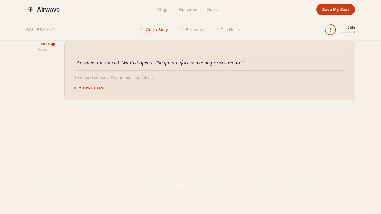
The hero section opens with three words stacked vertically in a tall editorial serif at roughly 15vw: "STORIES / BEHIND / SOUND." Each word fades in one breath apart against a washi cream field. No image interrupts the moment. A single thin ink line descends beneath the final word like a scroll invitation, and a kanji-inspired glyph marks the anchor nav hub below. The hero section immediately establishes the show's tone with pure typographic confidence.
Hub-and-Spoke Anchor Navigation
A central gallery map sits beneath the hero, anchoring three navigable spokes. Visitors can move directly to the origin story, the episodes section, or the hosts section without linear scrolling. The anchor nav acts as a gallery map they return to between exhibits, keeping the page neatly organized and the audience engaged across every section.
Gallery Walk Exhibit Spokes
Each spoke is framed as a curated exhibit room. Spoke one presents the podcast's founding story through a notebook-scan timeline with a handwritten aesthetic. Spoke two displays episode highlights as square cards in a card-based grid, mimicking an Instagram grid with waveform overlays. Spoke three introduces hosts through portrait diptychs paired with context about their earliest recordings. Scrolling feels like moving through a quieter, more intimate gallery room with each step.
Waitlist Form with Listener Toggle
The primary call-to-action reads "Save My Seat" in vermillion against ink. The form collects a single email address and presents one toggle: "I already host a podcast" or "I'm still dreaming about it." This low-friction form keeps the ask small while segmenting the audience from the first interaction. A progress ring around the glyph fills as the waitlist grows, giving new visitors a sense of live momentum.
Persistent Floating Call-to-Action Button
After the second spoke, a floating "Save My Seat" button appears and stays visible as visitors continue scrolling. This keeps the primary conversion goal in view without interrupting the gallery experience. The button uses vermillion sparingly, consistent with the overall design rule that every instance of the accent color feels intentional.
Japanese Zen Color and Typography System
The page uses a four-color Japanese Zen palette: washi paper cream dominates the canvas, sumi ink black handles all typography, dry stone gray separates sections like raked gravel paths, and torii vermillion appears only on active navigation states and call-to-action elements. Fraunces serves as the editorial serif for headlines, and DM Sans handles body text and interface copy. The result is a podcast landing page design that feels unhurried, deliberate, and warm.
Page sections overview
| Section | Purpose |
|---|---|
| Hero Headline | Stacked editorial serif opens with three words fading in one breath apart, setting tone |
| Anchor Nav Hub | Gallery map glyph with progress ring lets visitors jump between exhibit spokes |
| Spoke One: Origin | Notebook-scan timeline tells the founding story with a handwritten aesthetic |
| Spoke Two: Episodes | Card-based grid of episode highlights with waveform overlays, Instagram-grid style |
| Spoke Three: Hosts | Portrait diptychs paired with earliest recording context establish host authority |
| Waitlist Call to Action | Email form, listener toggle, and "Save My Seat" button capture signups |
| Persistent Float Button | Floating call to action appears after spoke two and stays visible for remainder of scroll |
| Minimal Footer | Horizontal minimal footer closes the page cleanly |
Design & branding system
This podcast landing page design draws from a Heritage and Story theme executed through Japanese Zen minimalism. Every visual decision is deliberate. Brand consistency across the palette and typography creates a page that feels cohesive from the first scroll to the last.
- Four-color Japanese Zen palette: washi cream (#F5F0E8) as the dominant canvas color, sumi ink black (#1A1A2E) for all type, dry stone gray (#A3A89E) as a section divider, and torii vermillion (#C73E1D) used sparingly on active states and call-to-action pulses only
- Fraunces editorial serif for all headline copy, DM Sans for body and interface text, with high-quality images reserved for notebook scans and host portrait diptychs rather than decorative stock photography
- White space is used generously throughout, with a clean layout and dark background elements appearing only where the design calls for intentional contrast, reinforcing the quiet listening-room atmosphere
Mobile & speed optimization
This podcast landing page is designed desktop-first for its editorial gallery layout, but it is fully responsive across mobile devices. Every section reflows cleanly so the experience remains readable and engaging on smaller screens.
- The hub-and-spoke anchor navigation adapts for touch devices, keeping the gallery map accessible and each spoke easy to reach without losing orientation
- Animations including the hero blur-in, scroll reveal transitions, waveform pulse, and floating call-to-action button are handled with client-side components, while static content uses server components to keep the page loading efficiently on mobile devices
- The waitlist form is mobile-friendly by design: a single email field and a binary toggle are fast to complete on any screen size, reducing friction for new visitors arriving from social media links
How this template helps you convert
A compelling podcast landing page earns its signups. This template is built around a single conversion goal: grow the waitlist. Every design and structural decision supports that goal without cluttering the page with competing asks.
- The gallery walk structure keeps the audience engaged through three distinct exhibit spokes before presenting the call to action, so visitors arrive at the form having already experienced the show's voice, taste, and editorial craft. An effective landing page earns the click rather than demanding it, and this template is built on that principle.
- The waitlist form uses a low-friction two-field design with a listener toggle that segments the audience from the first interaction, helping creators understand whether signups come from active podcast hosts or aspiring creators. The progress ring adds social proof in real time, turning casual listeners into invested early community members.
Other information about this template
The Airwave heritage podcast about podcasting landing page template is a strong fit for independent creators, small audio production teams, and boutique media companies building a pre-launch presence for podcast content that focuses on the craft of the medium itself. Below are additional details that may be useful for creators evaluating this template.
- This template is built as a single podcast page and is not designed for multiple shows or multi-show networks. Its hub-and-spoke focus is intentional: one podcast, one landing page, one clear call to action.
- Airwave history, as captured in the origin spoke, is structured as a notebook-scan timeline. Creators can use this section to tell their founding story with text and handwritten-style visual assets without needing to supply guest headshots or third-party media.
- Airwave media assets such as episode waveform graphics and host portrait diptychs are placeholders within the template. Creators replace them with their own audio visuals and host photography to personalize the page.
- The page supports social media icons in the footer area, helping creators build a stronger online presence and direct traffic to their listening platforms. Including direct links to listening platforms such as Apple Podcasts helps potential listeners subscribe at their preferred listening platform or their favorite listening platform with a single tap.
- The embedded media player slot in the episodes spoke is designed to surface a short description and waveform overlay for each episode highlight card. Creators can feature their latest episode or a high-quality show trailer using an embedded audio player in this section to give new listeners a sample before they sign up.
- Show notes and episode descriptions can be surfaced within episode cards, supporting search discoverability and giving potential listeners context about podcast episodes before committing to the full episode.
- The template fits niche podcast content beyond podcasting as a subject. The gallery walk structure and Heritage and Story visual identity also suit editorial podcasts covering subjects like true crime, pop culture, or history, provided the founder adapts the copy and assets to match.
- Chili piper or other scheduling tools, gong gong's or other CRM integrations, and money movement or payment processing are not part of this template's scope. The page is intentionally lean: one form, one goal.
- Airwave media and airwave history assets are illustrative placeholders. Creators customize both to reflect their real podcast story and episode lineup.
- The template is well suited for use alongside platforms like Wix, Squarespace, or Leadpages when creators want a standalone waitlist page that sits outside their main hosting provider's built-in tools.
- The hollywood sign of good podcast landing page design is a clean layout that does the talking before the host ever speaks. This template does exactly that: an excellent job of letting editorial craft carry the first impression while the form captures the lead.
- Content strategy for this page is intentionally narrow. One podcast, one waitlist, one primary action. That focus is what makes an effective landing page work in a crowded streaming services landscape where new listeners have infinite choices and short patience.


Theme
Heritage & Story
Creative direction
Gallery Walk
Color system
Japanese Zen
Style
Hub & Spoke (Anchor Nav)
Direction
Waitlist/Coming Soon
Page Sections
Staggered Hero Blur-in Animation
Hub-and-spoke Anchor Navigation
Gallery Walk Episode and Host Spokes
Waitlist Form with Listener Toggle
Persistent Floating Call to Action Button
Japanese Zen Color and Type System
Related questions
Does this template work for a podcast that has not launched yet?
Can I adapt the episode spoke before I have published episodes?
How does the listener toggle on the waitlist form work?
Is this template suitable for a podcast that covers topics other than podcasting?
Does the page support links to listening platforms like Apple Podcasts?


