Smart Podcast Curation Landing Page Template
Airwave is an editorial podcast landing page built for curators who believe taste beats volume. The landing page design follows a vintage letterpress aesthetic, with a masonry grid of past digest issues, a parallax crosshatch hero illustration, and a pinned waitlist bar. It gives potential listeners a compelling reason to sign up before the first edition ships.
by Rocket studio
Quick summary
Airwave is a Waitlist/Coming Soon podcast landing page for a daily editorial digest. It hand-picks five essential podcast episodes per issue and presents them like a broadsheet editor's morning column. The landing page design uses pressroom black, newsprint cream, and editorial red to create an ink-and-paper atmosphere that immediately sets this apart from generic podcast platforms.
Who this template is for
This landing page is built for editorial podcast curators who want their audience to feel the weight of a considered recommendation. It suits anyone creating a daily digest format rather than a single ongoing podcast feed.
- Podcast hosts and editors building a pre-launch waitlist for a curated daily briefing
- Independent media creators who want a dedicated landing page with strong visual identity
- Newsletters and digest publishers expanding into podcast curation and building an email list before launch
What problem this template solves
Most podcast landing page designs feel algorithmic and interchangeable. Visitors arrive, see a generic player embed, and leave without subscribing. This template solves that trust problem at the visual level before a single word is read.
- New listeners have no clear reason to subscribe when a landing page looks like every other podcast page
- Potential listeners need editorial credibility signals, not just episode lists, to commit their inbox
- Podcast curators lose new subscribers because their landing page fails to communicate a distinct point of view
What you get with this template
This template delivers a complete, production-ready podcast landing page with every section pre-built and styled. You get a cohesive landing page design that feels intentional from the first scroll to the bottom folio bar.
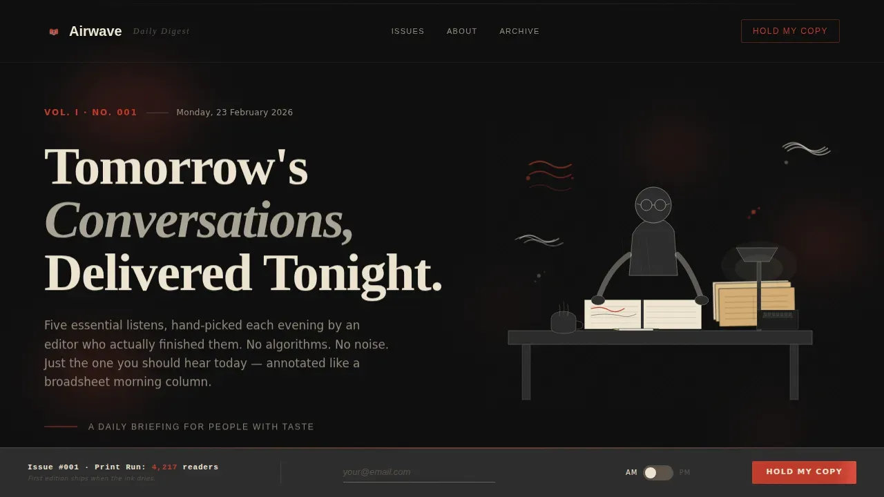
- A parallax hero section with a hand-drawn crosshatch illustration and animated ink-drop effects
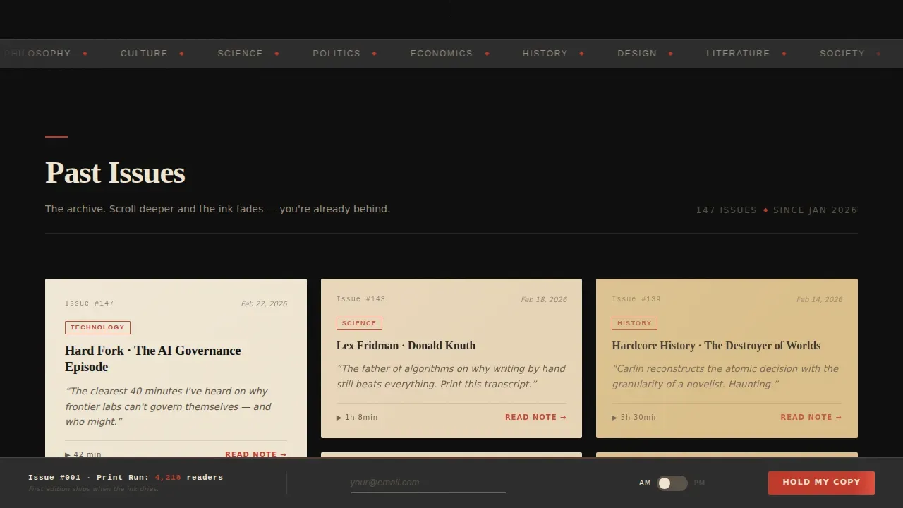
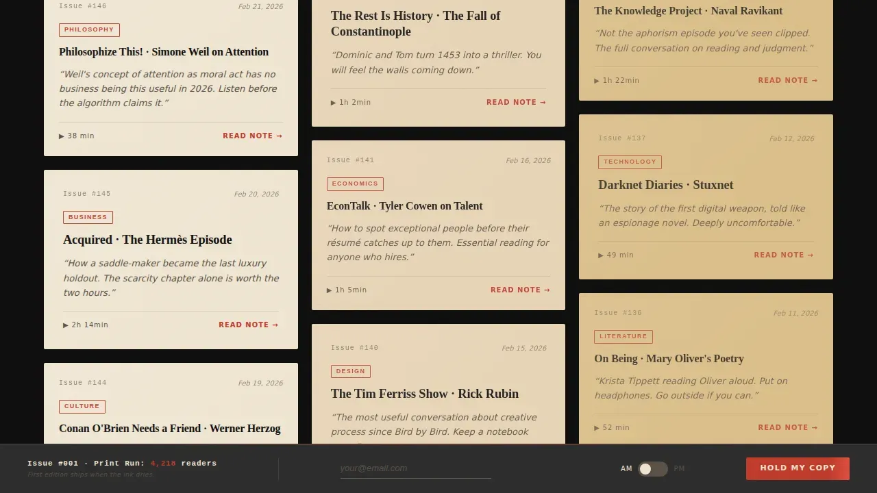
- A staggered masonry grid of past digest issues styled as torn newspaper clippings with genre tags in editorial red
- A pinned waitlist call to action bar with an email field, a Morning or Evening edition toggle, and a live print-run counter as social proof
Feature list
This podcast landing page ships with six purposefully designed features. Each one supports the editorial identity and moves visitors toward signing up.
Parallax Crosshatch Hero Illustration
The hero opens with a custom SVG illustration of a figure at a cluttered desk, surrounded by floating sound waves rendered as ink splatters and stacked broadsheets. Subtle parallax animation makes ink drops drift and page corners curl as users scroll, giving the landing page an immersive, editorial atmosphere no stock photo could replicate.
Staggered Masonry Issue Grid
Past digest issues load as torn newspaper clipping tiles in staggered clusters of three, then two, then four. Each tile carries a podcast episode title, an italicised editor's note, and a genre tag stamped in editorial red. As visitors scroll deeper, paper textures grow yellower and ink appears more faded, building a sense of archive depth that encourages people to explore every issue.
Pinned Waitlist Folio Bar
A slim bottom bar styled as a newspaper folio line stays pinned while users scroll. It holds the primary call to action, a single email opt-in field, and a Morning or Evening edition toggle. The clear call to action keeps the conversion point visible without interrupting the browsing experience, which helps lift conversion rates on single-page podcast landing layouts.
Live Print-Run Social Proof Counter
The waitlist bar features a live counter styled as an editorial print-run number, for example "Issue #001 · Print Run: 4,217 readers." This social proof element converts raw subscriber numbers into a narrative of scarcity and demand. New visitors read it as editorial legitimacy rather than a basic count, which builds trust faster than testimonials alone.
Editorial Process Panel
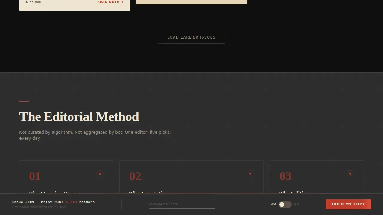
An asymmetric three-panel section explains the curation philosophy behind each daily episode selection. This section gives the host a space to write about their process, share key takeaways from their editorial method, and connect directly with the audience on a human level. It is one of the most important sections for turning curious visitors into loyal listeners.
Cinematic Dark Color System
The entire landing page design is built on a four-color palette: pressroom black (#0D0D0D), newsprint cream (#F0E6D3), typewriter-ribbon charcoal (#2B2B2B), and editorial red (#C0392B). Brand colors are applied with precision: red appears only on accent marks, issue numbers, genre tag stamps, and hover states. Typography pairs Fraunces heavy serif display headings with DM Sans for body and interface copy.
Page sections overview
| Section | Purpose |
|---|---|
| Hero illustration | Parallax crosshatch scene sets editorial tone and fades in the dateline headline |
| Masonry issue grid | Displays past digest issues as newspaper clippings with staggered, aging reveal |
| Editorial process panels | Three-panel asymmetric layout explains the podcast curation philosophy |
| Pinned waitlist bar | Persistent folio-style bar collects email sign-ups with edition toggle |
| Minimal footer | Extreme minimal footer anchors the page without distracting from the call to action |
Design & branding system
The landing page design draws directly from vintage letterpress and broadsheet editorial traditions. Every visual decision reinforces the idea that a human editor, not an algorithm, chose these podcast episodes.
- Four-color Cinematic Dark palette with brand colors applied strictly: editorial red (#C0392B) reserved for accents, issue numbers, and hover states only
- Fraunces heavy serif for display headlines and DM Sans for interface and body copy, creating a clear typographic hierarchy across every page section
- Torn newspaper clipping tile styling, scan-line shimmer effects, and yellowing paper textures that deepen as the archive scroll progresses
Mobile & speed optimization
The landing page is built desktop-first but fully responsive for mobile users, which matters because commuters are a core part of the target audience. Commute-bound listeners are most likely to access this page on a phone during transit.
- Static sections use server components to keep the page lightweight while Client components handle animations, staggered tile reveals, and the interactive toggle
- The masonry grid reflows cleanly for smaller screens so podcast episode clipping tiles remain readable and tappable on mobile
- The pinned folio waitlist bar remains accessible and fully functional on mobile so users can subscribe without pinching or zooming
How this template helps you convert
A high-converting podcast landing page needs a compelling headline, a clear value proposition, and a prominent call to action. This template delivers all three within a single, focused page flow.
- The parallax hero and editorial dateline headline capture attention immediately, giving new listeners a strong reason to keep scrolling before they reach the email opt-in field
- The aging masonry archive creates a sense of an established, trusted body of work, which builds the social proof and editorial credibility that encourages people to join the waitlist
- The pinned folio bar keeps the call to action in view at all times, so visitors never have to hunt for the sign-up form regardless of how deep into the archive they scroll
Other information about this template
This template is one of several podcast landing page templates available on Unicorn Platform, tailored to different podcasting needs and styles. It sits within the Blog and Editorial category under the Podcasting Newsletter subcategory.
- A podcast landing page is a dedicated webpage designed to engage listeners and encourage actions like subscribing or sharing episodes; this template is purpose-built for exactly that goal
- The lead magnet here is editorial scarcity: the print-run counter and the "first edition ships when the ink dries" line function as a lead magnet by turning delay into anticipation, which helps grow an email list before a single episode goes live
- The template can support social media links in the footer or editorial process section so creators can promote the digest across other channels and drive word of mouth marketing
- Embedding podcast episodes or audio previews as exclusive content is possible within the masonry tile structure, giving potential listeners a sample before they subscribe
- The landing page description, episode list format, and genre tag system give new subscribers valuable information about what each issue contains, helping them decide whether to listen and share
- The template is free to customize with your own brand colors, episode descriptions, and waitlist copy; no technical skills are required to get started
- Podcasters who want to promote a daily digest, build an email list, and reach new listeners across podcast platforms will find this landing page design ready to use from day one
- The host bio and curation philosophy panels give podcasters a place to establish authority, share their stories, and attract more listeners through genuine editorial voice
- Reviews and testimonials from early readers can be added to strengthen social proof as the waitlist grows; displaying real feedback builds trust with every new visitor who lands on the page
- This template works equally well as a standalone page or embedded within a larger website, depending on your resources
- Tips for getting the most from this template: write a sharp episode description for each clipping tile, keep the edition toggle visible, and update the print-run counter regularly to signal active growth to new visitors
- For inspiration on how to write editor's notes for each podcast episode, look at morning newsletter formats that post brief, opinionated episode annotations rather than full review write-ups
Theme
Ink & Paper
Creative direction
Curated Collection
Color system
Cinematic Dark
Direction
Waitlist/Coming Soon
Page Sections
Parallax Crosshatch Hero with Animated Ink Drops
Staggered Masonry Archive Grid
Pinned Folio Waitlist Bar with Edition Toggle
Live Print-run Social Proof Counter
Asymmetric Editorial Process Panels
Cinematic Dark Ink and Paper Design System
Related questions
Can I embed actual podcast episodes on this landing page?
Does the template include the live waitlist counter out of the box?
Is this landing page suitable for mobile users?
Can I customize the brand colors and typography?
Do I need technical skills to use this template?



