Real Estate Investing Newsletter Blog Website Template
Ledger is a single-column landing page template built for a real estate investing weekly newsletter. It uses an Ink and Paper editorial aesthetic, aged parchment tones, and a Day-in-the-Life scroll structure to earn subscriber trust through real deal content, annotated numbers, and a friction-free click-through to email signup.
by Rocket studio
Quick summary
Ledger is a click-through landing page template for a weekly real estate investing newsletter. The design draws on an aged broadsheet aesthetic to build credibility with analytically minded investors. Scroll sections reveal real subject lines, deal breakdowns with visible numbers, and a subscriber testimonial before guiding visitors toward a single, low-friction call to action.
Who this template is for
This template is built for newsletter operators and independent publishers targeting serious, numbers-driven real estate investors. It suits creators who lead with content quality rather than hype and need a landing page that earns the click before asking for it.
- Mid-career professionals in accounting, technology, or property management who publish deal intelligence
- Newsletter writers building an audience of second-generation landlords and capital-ready investors
- Independent real estate educators who want a credibility-first signup flow
What problem this template solves
Most newsletter landing pages describe their content instead of showing it. That approach loses analytically minded readers who need proof before they commit. This template solves the trust gap by letting the content itself do the persuading.
- Skeptical investors scroll past vague value claims and never reach a signup button
- A single long form above the fold creates friction before value is established
- Generic design signals low-effort publishing, undermining credibility with sophisticated readers
What you get with this template
You get a fully structured single-column landing page with six distinct content sections, a defined visual identity, and a mobile-first layout with a fixed bottom call to action bar. Every section is built around showing real content rather than describing it.
- A cinematic hero section with a type-over-image header and a primary call to action button
- A Day-in-the-Life scroll flow: email preview card, deal breakdown excerpt, subscriber testimonial, and a last-issue teaser
- A click-through architecture that routes visitors to a separate single-field email capture page with zero form friction on the landing page itself
Feature list
This template is built around a set of deliberate, content-led features that work together to build investor trust section by section.
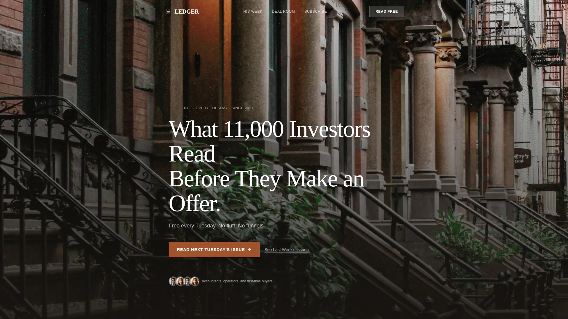
Cinematic Type-Over-Image Hero
A desaturated brownstone photograph forms the full-width header background. Large serifed display type sits low and left-aligned over the image, with a lighter-weight subheadline below it. The composition is still and editorial, never animated.
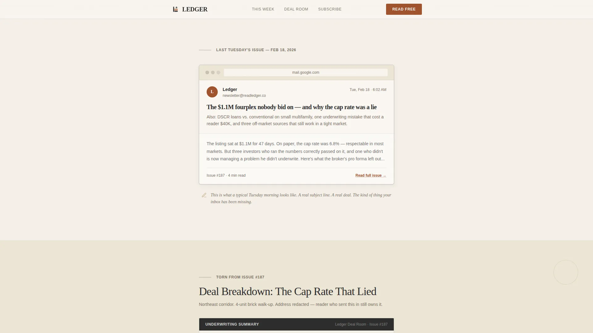
Email Preview Card Section
A rendered inbox-style preview displays a real newsletter subject line. This section gives visitors an immediate, tangible sense of what lands in their inbox each Tuesday before they commit to subscribing.
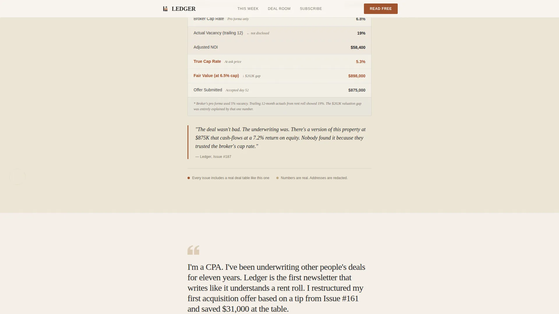
Annotated Deal Breakdown Excerpt
A torn-paper styled content block shows an actual deal breakdown with visible numbers and redacted addresses. Margin annotations are part of the visual treatment, reinforcing the insider, hand-edited feel of the publication.
Subscriber Testimonial Block
A single, full-width pull quote from a real subscriber describes a specific moment when the newsletter changed how they structured a deal. The terracotta accent color frames this block to draw the eye without competing with surrounding content.
Fixed Mobile Call to Action Bar
On mobile viewports, a persistent bottom bar keeps the primary call to action visible throughout the scroll. This ensures the signup path is always one tap away without interrupting the reading experience.
Last-Issue Teaser and FOMO Close
A final scroll section surfaces the previous issue as a preview, paired with copy that creates a sense of forward momentum. Visitors feel the cost of not having read last Tuesday's edition before the call to action appears one final time.
Page sections overview
| Section | Purpose |
|---|---|
| Hero with headline | Establish editorial authority and introduce the primary call to action |
| Email preview card | Show a real subject line to make the newsletter tangible |
| Deal breakdown excerpt | Prove content depth with annotated numbers and redacted deal data |
| Subscriber testimonial | Build trust through a specific, outcome-focused reader quote |
| Last-issue teaser | Create urgency by showing what skeptical visitors already missed |
| Minimal footer | Close the page cleanly without distraction |
Design & branding system
The visual identity follows an Ink and Paper theme built on a Warm Stone color palette. Every design decision reinforces the feeling of a hand-annotated broadsheet rather than a digital marketing page.
- Colors: aged parchment (#F5F0E8) for backgrounds, charcoal ink (#2C2C2C) for body text, sandstone tan (#C4A882) for structural accents, and muted terracotta (#A0522D) reserved for links, buttons, and pull quotes
- Typography: Fraunces serifed display face for headlines, DM Sans for body copy and interface elements, with generous leading throughout
- Backgrounds alternate between parchment and soft cream across sections, and terracotta appears sparingly so every instance reads as deliberate emphasis
Mobile & speed optimization
The template is built with a mobile-first layout priority, reflecting a newsletter audience that reads primarily on a phone. Interactions are kept intentionally minimal to maintain a fast, editorial feel.
- Subtle scroll-triggered fade-ins and paper texture effects replace flashy transitions
- A fixed bottom call to action bar on mobile keeps the signup path accessible without adding visual noise
- The static-first, low JavaScript build approach keeps the page light and responsive across devices
How this template helps you convert
The page earns the click by building genuine credibility across every scroll section, so the call to action feels like a natural next step rather than a demand.
- The Day-in-the-Life structure mirrors how a real reader experiences the newsletter, letting visitors self-qualify as they scroll through the email preview, deal numbers, and subscriber story.
- The click-through architecture removes the signup form from the landing page entirely, lowering commitment friction so visitors reach the email capture step already convinced.
Other information about this template
This template is well-suited to single-column editorial landing pages where content quality is the primary conversion driver. It fits neatly within the broader Blog and Editorial category and reflects the specific needs of the real estate investing newsletter niche.
- The footer follows a Superhuman-style extreme minimal pattern, keeping the page close without adding distracting links or navigation
- The secondary text link "See Last Week's Issue" sits mid-scroll as a low-pressure proof point for visitors who need more evidence before clicking through
- Social proof is embedded structurally: the 11,000-subscriber count, the testimonial block, and the real deal numbers all appear before the final call to action
- This template is designed as a standalone landing page and does not include a multi-page site structure

Theme
Ink & Paper
Creative direction
Day-in-the-Life
Color system
Warm Stone
Style
Single Column Flow
Direction
Click-Through
Page Sections
Type-over-image Hero Section
Inbox-style Email Preview Card
Annotated Deal Breakdown Block
Subscriber Testimonial Pull Quote
Fixed Bottom Call to Action Bar
Last-issue Teaser and FOMO Close
Related questions
Does this template include an email signup form on the landing page?
What sections are included in this landing page template?
Is this template designed for mobile readers?
Can I adapt this template for a newsletter on a different topic?
What visual style does this template use?



