Agency & Freelance Newsletter Specialist Blog Website Template
Byline is a warm artisan editorial landing page template built for independent creatives who want to share the real story behind their work. It pairs a printed-journal aesthetic with a focused email signup flow, making it ideal for a monthly freelance deep dive that earns trust through honest numbers, contributor spotlights, and a browsable archive.
by Rocket studio
Quick summary
Byline is a single-page editorial template designed for a monthly digital journal covering independent creative work. It opens with a large typographic chapter spread, guides visitors through intimate contributor spotlights with margin notes, and closes with a clean email signup. The aesthetic feels like a handmade ledger, unhurried and warm.
Who this template is for
This template is built for independent creatives who want to publish a monthly journal or newsletter with real editorial depth. It suits founders who care about writing as much as conversion, and who want their page to feel like a curated reading experience rather than a marketing funnel.
- Solo designers, two-person development shops, and freelance brand strategists billing in the five-figure monthly range
- Agency escapees in their first one to two years of independence who want to document and share what they are learning
- Editorial creators who want a content destination that earns signups through demonstrated depth, not promises
What problem this template solves
Most newsletter landing pages look like every other landing page. They list benefits, stack social proof, and push a button. That approach works for software, but it undercuts an editorial publication whose value lives inside the writing itself.
- Generic templates cannot convey the tone or intimacy of a monthly freelance deep dive, leaving potential readers unconvinced before they ever sign up
- Without a structured archive presentation, past issues sit invisible, and new visitors have no way to assess the quality already in the vault
- A disconnected design forces the creator to fight the layout instead of letting the writing and real contributor data do the persuading
What you get with this template
You get a complete, single-page editorial layout built around five carefully sequenced sections. Every section is designed to deepen trust as the visitor scrolls, from the opening chapter spread to the floating archive bar that surfaces past issues at the right moment.
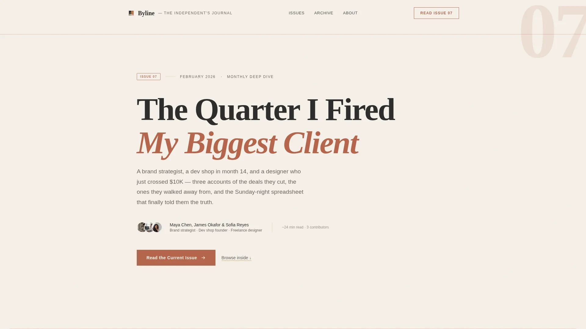
- A hero section styled as a large-format typographic chapter spread with paper grain texture, oversized chapter number, hand-set serif title, and a two-line author byline with circular portrait
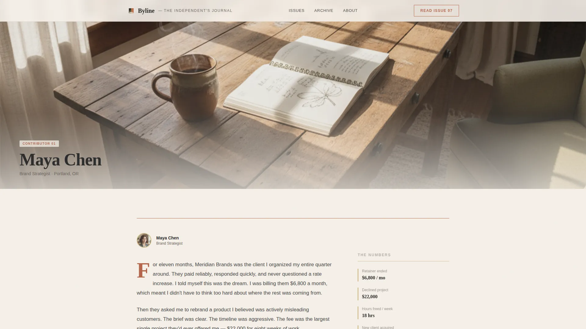
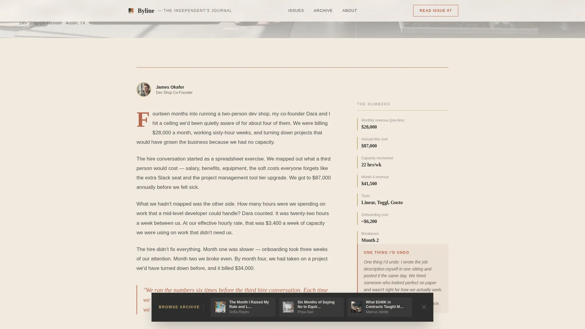
- Creator spotlight sections featuring full-width workspace photography, a two-column editorial layout, and right-column margin notes showing invoice totals, hours tracked, tools used, and a single honest confession
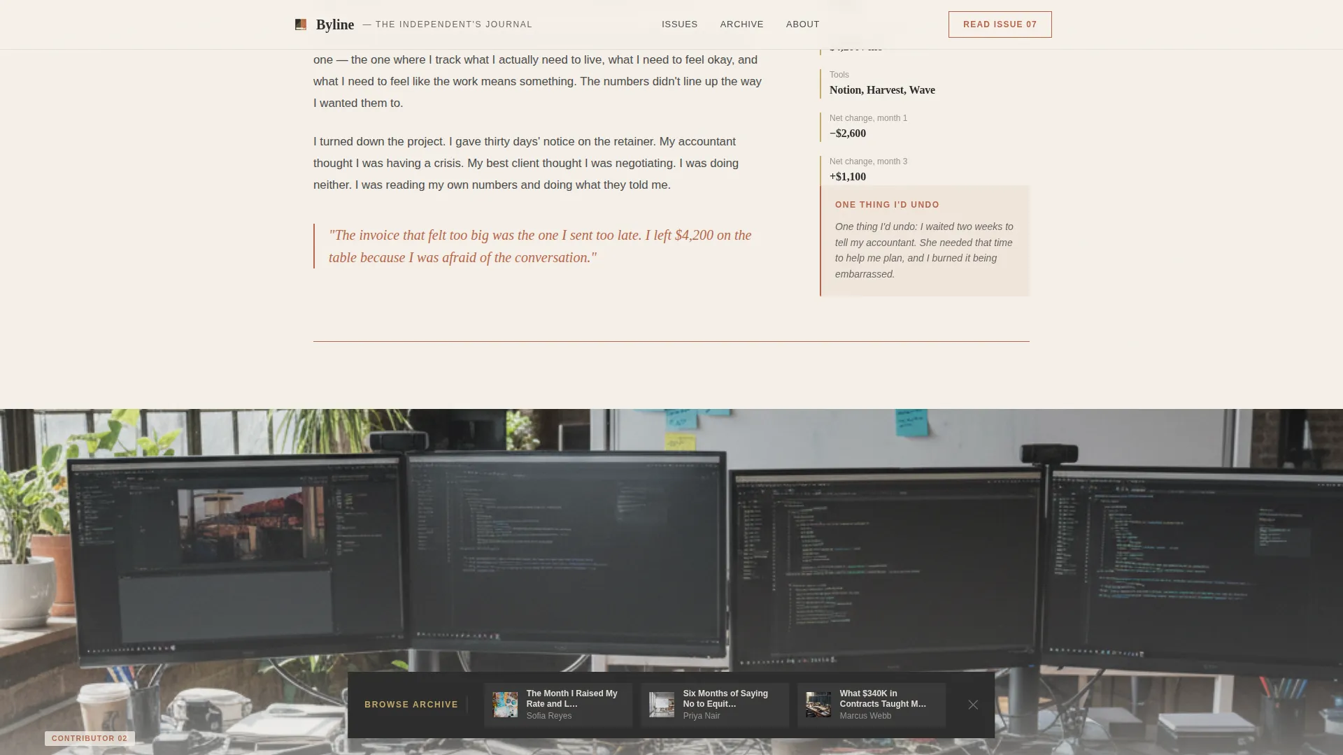
- A floating bottom archive bar triggered after the second spotlight, surfacing three past issue cover cards with chapter title and contributor name, plus a single-field email signup with transparent frequency copy
Feature list
This template delivers a focused set of editorial and conversion features drawn directly from its printed-journal design philosophy.
Chapter Hero Spread
The hero section mimics the opening page of a printed volume. It includes an oversized terracotta chapter number, a hand-set serif issue title, a two-line author byline, a small circular contributor portrait, and a subtle paper grain texture over a ceramic off-white background. Generous margins keep the layout breathing.
Two-Column Creator Spotlight
Each contributor spotlight opens with a full-width atmospheric workspace photograph. Below it, a two-column editorial layout places the narrative on the left and margin notes on the right. Margin notes carry real data: invoice totals, hours logged, tools used, and one honest "thing I'd undo" confession per issue.
Scroll-Triggered Floating Archive Bar
After the visitor scrolls past the second contributor spotlight, a floating bottom bar appears. It presents three past issue cover cards, each showing the chapter title and contributor name. This gives new visitors tangible proof of depth before they are asked to sign up.
Email Signup with Transparent Frequency
The primary call to action gates the full issue behind a single email field. A secondary line reads "One email per month. No sequences. Just the issue." This copy removes the common objection that signing up means entering a long nurture sequence.
Scroll-Triggered Section Reveals
Sections animate into view as the visitor scrolls, reinforcing the page-turning sensation of reading a printed journal. The pacing is deliberate: each reveal feels like turning to a new chapter rather than watching elements load.
Hover States on Archive Cards
Each of the three archive cards responds to hover with a visual state change that encourages exploration. Visitors can preview past issue titles and contributor names before deciding whether the archive earns their email address.
Page sections overview
| Section | Purpose |
|---|---|
| Chapter hero spread | Opens the journal, establishes tone, and introduces the current issue with typographic weight |
| Creator spotlight one | Profiles the first contributor with workspace photo, editorial narrative, and data-rich margin notes |
| Creator spotlight two | Deepens the reading experience with a second contributor portrait and vulnerable operational detail |
| Email signup block | Converts engaged readers into subscribers with a single field and transparent send frequency |
| Floating archive bar | Surfaces three past issues at scroll depth to prove existing value before the signup ask |
| Footer layout | Closes the page with the horizontal footer pattern and essential navigation |
Design & branding system
The visual language draws from a Japanese Zen color palette applied to a warm artisan editorial context. Every color choice has a functional role, not just a decorative one. The result is a page that feels considered and quiet, like a well-made physical object.
- Four-color palette: ceramic off-white (#F5F0E8) for backgrounds, sumi ink charcoal (#2C2C2C) for body text, tatami gold (#C4A96A) for section accents and faint background washes at five percent opacity, and kiln-fired terracotta (#B5654A) reserved for pull quotes, drop caps, and hover states
- Typography pairing: Fraunces serif for display headlines and chapter numbers, DM Sans for body copy and interface elements, creating a clear contrast between editorial presence and functional legibility
- Single-pixel terracotta section dividers act as chapter breaks, and a paper grain texture on the hero background gives the screen a tactile, printed-stock quality
Mobile & speed optimization
The template is designed desktop-first to honor the editorial reading experience, with a two-column layout and generous margin notes that work best on wider screens. Responsive breakpoints adapt the layout for smaller devices without losing the journal's character.
- Images are lazy loaded, so the page does not wait for heavy workspace photography before becoming interactive
- The static-first build approach means the page loads quickly without relying on server-side rendering or dynamic data fetching
- The floating archive bar and scroll-triggered reveals are built with medium animation weight, providing motion that feels intentional rather than heavy
How this template helps you convert
This template converts by earning trust before asking for anything. The editorial structure guides visitors through a rising sequence of vulnerability and proof, so the email field at the end feels like a natural next step rather than an interruption.
- The chapter hero spread establishes the journal's voice immediately. A visitor knows within seconds whether this publication speaks to their situation, reducing bounce from the wrong audience.
- The contributor spotlights build credibility with real data. Invoice totals and margin notes in the right column make the value of the content concrete, not abstract.
- The floating archive bar appears at the moment of highest engagement, after two spotlights have done the persuading. Presenting three past issues at that scroll depth answers the unspoken question: is this worth my email address?
Other information about this template
This template is part of a broader editorial and magazine template category designed for content-led businesses. It fits naturally within agency and freelance newsletter publishing, where the writing itself is the product.
- The template style is classified as Editorial and Magazine, and it sits within the Blog and Editorial category with a focus on the agency and freelance monthly deep dive niche
- The creative direction follows a Creator Spotlight approach, which is a section structure built around profiling individual contributors rather than promoting a single brand voice
- The header concept is Chapter and Book, a typographic convention borrowed from print publishing to signal that each issue is a complete, curated reading experience
- The landing page direction is Content and Resource, meaning the page functions as a destination that delivers value on arrival, not just a gateway to value elsewhere
Theme
Warm Artisan
Creative direction
Creator Spotlight
Color system
Japanese Zen
Style
Editorial/Magazine
Direction
Content/Resource
Page Sections
Chapter Hero Spread
Two-column Creator Spotlight
Floating Scroll-triggered Archive Bar
Single-field Email Signup
Scroll-triggered Section Reveals
Archive Card Hover States
Related questions
Who is this template designed for?
Can I use the contributor spotlight layout for a single-author publication?
How does the email signup section work?
What makes this different from a standard newsletter landing page?
Does this template support a paid subscription flow?



