Tech & Gadget Blog Reviews Website Template
Byline is an editorial landing page template built for consumer tech review publications. It combines a full-bleed overhead desk photo, a day-in-the-life narrative scroll, and inline data cards to deliver authority before asking anything of the reader. A focused email gate then converts that trust into subscribers and full-review downloads.
by Rocket studio
Quick summary
Byline is a single-page editorial template for consumer tech review publications. It opens with a cinematic overhead desk photo, guides readers through a morning-to-midnight reviewer narrative, surfaces inline data cards as evidence, and closes with a focused email gate. Every design decision reinforces depth, honesty, and earned authority.
Who this template is for
This template is built for publishers and creators who take consumer tech seriously. It fits anyone who wants their review content to feel as credible as it actually is.
- Independent tech reviewers and gadget journalists launching or refreshing a digital publication
- Small editorial teams running a consumer tech blog who want a polished, magazine-grade presence
- Solo writers and content creators who need a trust-first landing page to grow a review-focused email list
What problem this template solves
Most tech content online looks like every other tech content online. Readers are skeptical, and a generic blog layout does nothing to prove that your analysis is worth their time. Byline solves the credibility gap before the conversion ask.
- Readers bounce before reaching a gate because there is no evidence of depth early in the page
- Generic layouts undercut serious editorial work by making rigorous reviews look like quick takes
- Email capture forms that appear too soon damage trust rather than build it
What you get with this template
You get a fully structured editorial landing page that leads with narrative and evidence, then converts. Every section is purposeful and sequenced to mirror how a thorough review actually unfolds.
- A full-bleed hero section with a fade-up serif headline and no premature call to action
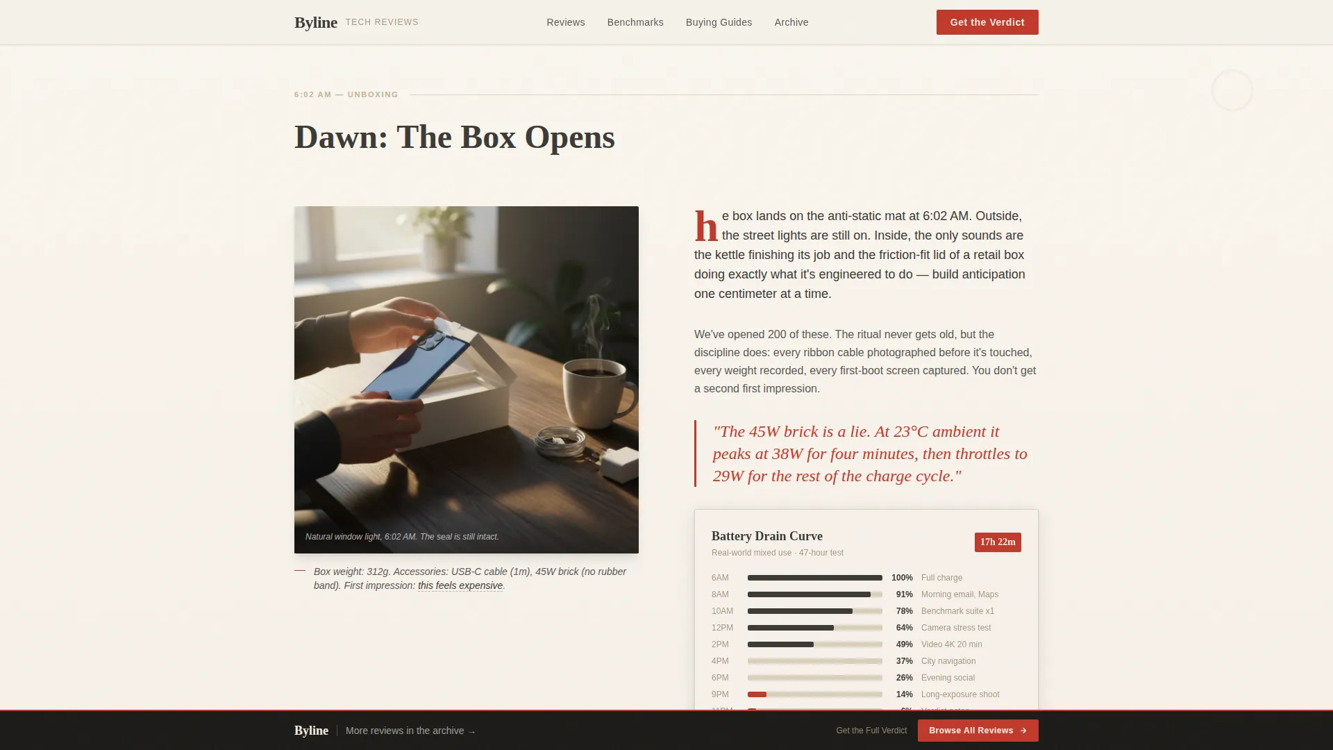
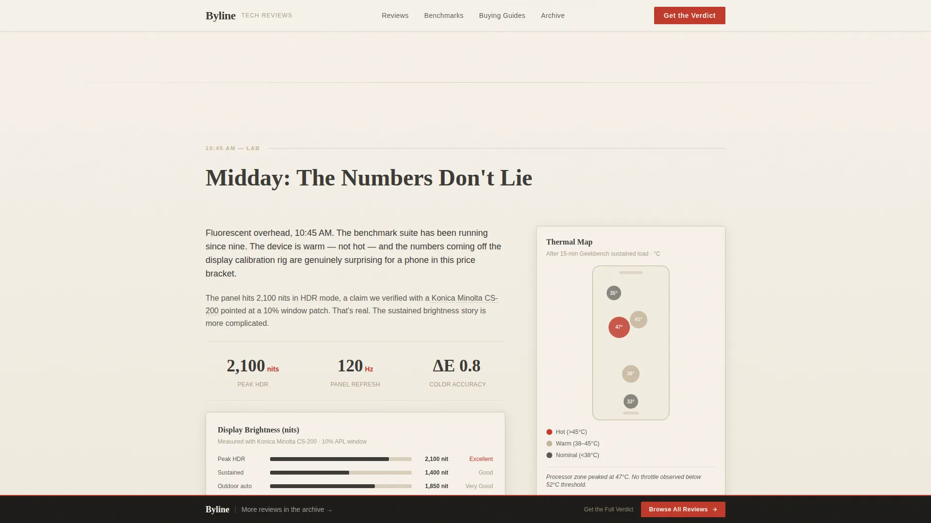
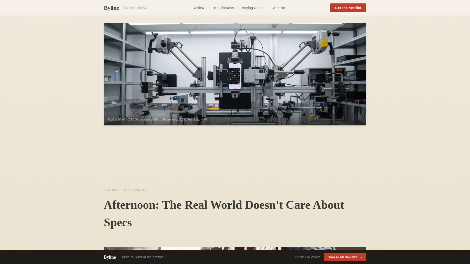
- Four narrative content sections covering dawn unboxing, benchmark grind, real-world carry, and an email gate, each with distinct lighting direction and inline data card components
- A persistent bottom rail linking to the review archive as a secondary conversion path
Feature list
This template ships with the following built-in capabilities, all grounded in the source brief.
Full-Bleed Overhead Hero
The hero opens with a top-down photograph of a cluttered reviewer's desk. Natural window light rakes across the frame, and a serif headline fades up in newsprint white after the image settles. No call to action interrupts the first beat.
Day-in-the-Life Narrative Scroll
The page is structured as a single reviewer's arc from dawn to late night. Each section shifts its photography temperature and lighting mood to mark the passage of time, pulling the reader forward the way chapters move through a long-form feature.
Inline Data Cards
Battery curves, display-nit charts, and thermal maps appear inside the narrative flow as animated data card components. They provide measurable evidence without breaking the editorial rhythm, functioning like infographics inside a magazine spread.
Trust-Sequenced Email Gate
Three full content sections scroll past before the email gate appears. By the time readers reach the "Get the Full Verdict" form, they have already experienced the depth of the review. The gate collects an email address and offers an optional weekly roundup opt-in checkbox.
Persistent Bottom Rail
A fixed bottom rail sits across the page throughout the scroll. It carries a secondary call to action inviting readers to browse the full review archive, keeping a low-friction path available without competing with the primary gate.
Scroll-Reveal Animation System
The template includes medium-intensity scroll-reveal and fade-up sequences throughout the page. The hero section uses parallax. Data card animations trigger on scroll entry, keeping the reading experience dynamic without feeling distracting.
Page sections overview
| Section | Purpose |
|---|---|
| Hero Desk Photo | Opens with full-bleed overhead image and fade-up serif headline |
| Dawn Unboxing | Morning narrative with inline battery curve data card |
| Benchmark Grind | Midday section with display-nit chart and thermal map card |
| Real-World Carry | Afternoon street narrative covering durability and real use |
| Email Gate | Primary conversion: full review PDF and benchmark data download |
| Persistent Bottom Rail | Secondary conversion linking to the full review archive |
Design & branding system
The visual identity follows an Ink and Paper editorial theme built around a Warm Stone color system. The palette is deliberately analog in feel, referencing newsprint, pencil graphite, and worn limestone rather than the glowing gradients common in tech design.
- Colors include unbleached newsprint (#F5F0E8) for body backgrounds, pencil-graphite charcoal (#3B3A36) for headlines, sandstone (#C4B49A) for section dividers, and editorial red (#C0392B) reserved for pull quotes, ratings badges, and hover states
- Typography pairs Fraunces serif for all display headlines with DM Sans for body text and interface elements, creating a clear editorial hierarchy
- Thin sandstone rules act as section dividers, and editorial red appears sparingly so each instance reads like an editor's urgent margin note
Mobile & speed optimization
The template is designed desktop-first to honor the broadsheet metaphor, but it is built to remain fully readable and functional on smaller screens. Layout reflow and component stacking ensure the editorial hierarchy holds across device sizes.
- Server Components handle all static content sections, keeping initial load lean and predictable
- Client-side rendering is scoped to scroll animations and data card interactions only, avoiding unnecessary JavaScript weight on static copy
- The narrative scroll and data cards reflow gracefully on mobile so readers on phones can follow the full day-in-the-life arc without losing context
How this template helps you convert
Conversion here is treated as a consequence of trust, not a demand made on arrival. The page is sequenced so readers feel the value before they are asked to give anything.
- Three substantive content sections with photography, data cards, and long-form narrative run before the email gate appears, so readers arrive at the form already convinced the full verdict is worth having.
- The "Get the Full Verdict" gate is simple: one email field and one optional checkbox for the weekly roundup, reducing friction to the minimum possible.
- The persistent bottom rail keeps a secondary path to the archive always visible, so readers who are not ready to subscribe can still move deeper into the publication.
Other information about this template
This template is part of a Blog and Editorial category set, specifically aligned with the Tech and Gadget Blog subcategory and the Consumer Tech Review niche. A few additional details worth knowing before you build:
- The footer follows a Linear Single-Row pattern, keeping the page close clean and uncluttered
- Localization is set for English (United States), with US date formatting and USD currency references where applicable
- The headline typeface, Fraunces, is a variable serif designed for editorial use at display sizes, pairing naturally with the broadsheet visual metaphor
- The animation intensity is set to medium, meaning scroll-reveal and parallax effects are present but never aggressive enough to distract from reading
- This template works well as the entry point for a larger review publication, with the archive rail providing a natural bridge to additional content pages

Theme
Ink & Paper
Creative direction
Day-in-the-Life
Color system
Warm Stone
Style
Editorial/Magazine
Direction
Content/Resource
Page Sections
Full-bleed Overhead Hero Section
Day-in-the-life Narrative Structure
Inline Animated Data Cards
Trust-sequenced Email Gate
Persistent Bottom Rail
Scroll-reveal and Parallax Animations
Related questions
Who is this template designed to attract as a reader?
Does the email gate appear immediately when the page loads?
What does the email gate offer to readers?
Can this template support an ongoing publication rather than a single review?
What typography comes with this template?



