Bold Entertainment Thought Leadership Landing Page
Byline is a bold entertainment thought leadership landing page built for cultural critics and industry insiders. The horizontal scroll layout moves through manifesto-style panels, each pairing a sharp declaration with an essay excerpt. A collage header, typewriter headline, and "Get the Monday Brief" email form work together to turn curious visitors into loyal subscribers.
by Rocket studio
Quick summary
Byline is a horizontal scroll landing page for an entertainment thought leadership blog. It combines a collage hero, manifesto panels, and a minimal email subscription form to convert showrunners, journalists, and studio executives into weekly newsletter readers. The design feels like a curated editorial magazine, tactile, opinionated, and impossible to skim past without reading something.
Who this template is for
This template was designed for writers and publishers who operate at the intersection of cultural criticism and entertainment industry analysis. If your work deserves a platform that looks as sharp as the ideas it carries, Byline was built for you.
- Entertainment journalists and cultural critics launching an independent publication
- Showrunners, studio development executives, and industry professionals building a thought leadership presence
- Editors and writers who want to grow an email readership without relying on social media platforms
What problem this template solves
Most blog templates treat editorial content like a feed. Posts are stacked, dated, and forgotten. That format works fine for recipes and travel guides. It does not work for writing that demands to be read in full, argued with, and forwarded before Monday morning.
- Readers bounce before they feel the weight of the writing, because the page never earns their attention first
- Generic newsletter forms ask for trust before delivering any value, killing conversion before it starts
- A flat vertical layout cannot communicate the editorial ambition that separates a publication from a personal blog
What you get with this template
You get a fully structured single-page layout that doubles as a reading experience and a lead generation tool. Every design decision reflects the brief: give the best sentences away freely, then ask for an email address.
- A collage hero with cursor-reactive parallax and a typewriter-effect headline that sets the publication's tone immediately
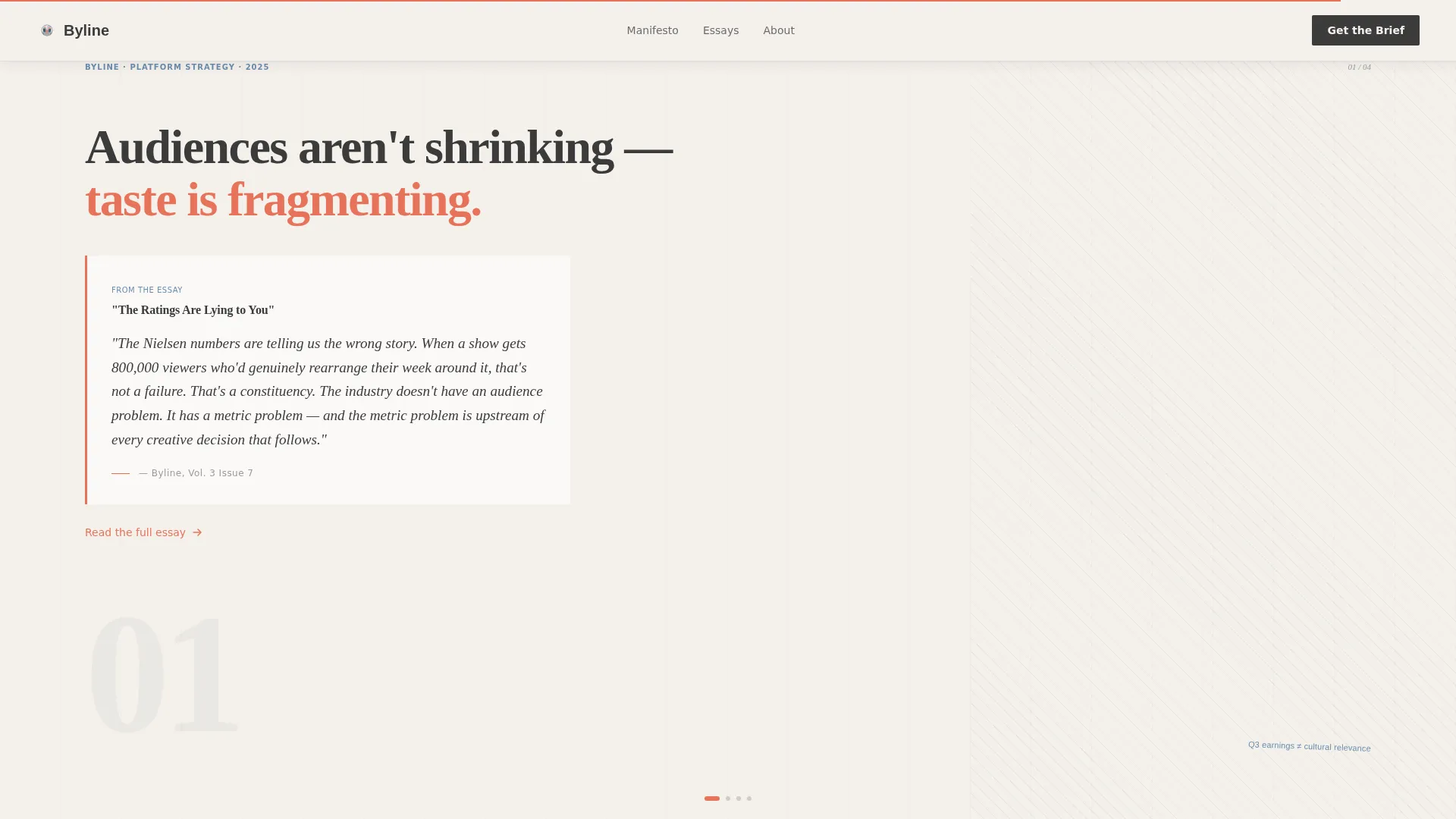
- Four horizontal scroll panels that each carry a manifesto declaration, an essay excerpt, and shifting collage textures
- A sticky "Get the Monday Brief" email form that appears after the third panel and anchors the final subscription section
Feature list
A brief overview covers what makes this template function as both a showcase and a conversion tool for editorial content.
Collage Hero with Cursor Parallax
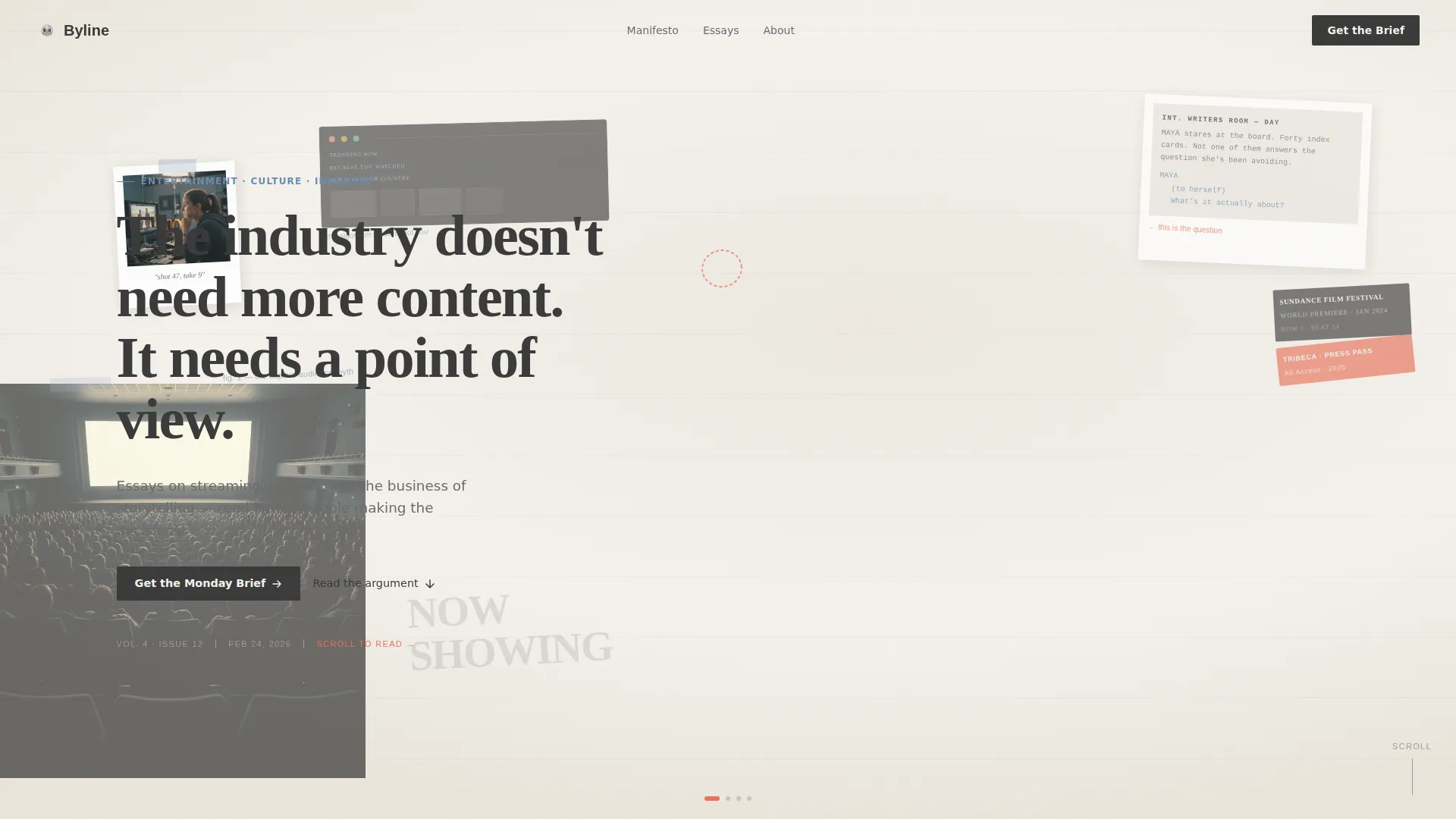
The full-viewport header layers magazine tear-outs, annotated film stills, a Polaroid at an angle, screenplay pages, and ticket stubs into a corkboard-style composition. Collage elements drift with cursor movement, creating a live but unhurried sense of depth that signals editorial ambition from the first second.
Horizontal Scroll with Snap Panels
The page moves left to right through four distinct panels, each locked into place with CSS scroll-snap behavior. The scroll mimics the physical act of turning magazine spreads, with panel textures shifting between streaming interface screenshots, handwritten margin notes, and vintage cinema typography to keep the eye engaged.
Manifesto Panel Structure
Each horizontal panel opens with a single bold declaration about entertainment culture, followed by an essay excerpt that earns it. The escalation from observation to provocation to invitation gives the page a narrative arc that builds subscriber intent naturally.
Typewriter Headline Effect
The hero headline "The industry doesn't need more content. It needs a point of view." renders with a typewriter animation that punches through the collage composition. The effect reinforces the publication's editorial voice before any body copy is read.
Sticky Email Subscription Form
After the third panel, a minimal "Get the Monday Brief" form appears as a sticky element. It requests only an email address and is framed with copy that sets clear expectations. The same form anchors the final panel, giving subscribers a clean, low-friction path to sign up.
Archive Link Path
A secondary call to action, "Read the Archive," links to three landmark essays. It gives visitors who are not yet ready to subscribe a way to go deeper, building trust through demonstrated writing quality before asking for any commitment.
Page sections overview
| Section | Purpose |
|---|---|
| Hero Collage Header | Establishes editorial voice and draws visitors in with cursor-reactive parallax |
| Panel 1: Observation | Delivers the first manifesto statement and an essay excerpt about audience fragmentation |
| Panel 2: Provocation | Escalates with the algorithm-as-studio-head declaration and a supporting excerpt |
| Panel 3: Invitation | Presents a third manifesto beat, introduces the sticky subscription form |
| Panel 4: Subscription | Full email sign-up section with archive essay links as secondary path |
| Minimal Footer | Closes the page cleanly with a horizontal, low-profile footer pattern |
Design & branding system
The visual identity follows an Editorial Magazine theme built on a Cloud Canvas color system. Every color choice reinforces the idea that words carry the weight here, not visual noise.
- Soft newsprint white (#F4F1EC) covers backgrounds, giving the page a matte, printed-page quality
- Pencil-sketch graphite (#3B3B3B) carries all body text for clean, effortless legibility; marginalia blue (#6B8CAE) marks section transitions and byline metadata
- Highlight coral (#E8735A) appears only on pull quotes and hover states, reserved for moments when the page wants the reader to stop and feel something
Typography pairs Fraunces, a variable serif, for display headlines and pull quotes, with DM Sans for body copy and interface elements. The combination reads like a well-designed print magazine that happens to live on a screen.
Mobile & speed optimization
Byline is designed desktop-first, reflecting the reality that its primary audience reads between meetings on a laptop. The template is structured to remain functional and readable on smaller screens.
- Horizontal scroll panels use CSS scroll-snap to deliver fluid, precise navigation without JavaScript overhead
- IntersectionObserver drives staggered reveal animations, so elements enter the viewport only when needed
- The collage composition and parallax effects are contained within standard CSS and JavaScript patterns for manageable load behavior
How this template helps you convert
The page earns the email signup rather than demanding it. Conversion is built into the structure, not bolted on at the end.
- The collage hero and typewriter headline establish a strong editorial identity immediately, giving the visitor a reason to keep scrolling before reading a single word of the essays
- Each horizontal panel delivers a complete, well-written excerpt freely, so by the time the subscription form appears, the visitor has already experienced the publication's value at full strength
- The "Read the Archive" secondary path captures visitors who need more convincing, reducing the binary pressure of subscribe-or-leave and keeping more people in the conversion funnel
Other information about this template
This template sits at the intersection of editorial publishing and lead generation, a combination that few standard blog templates are designed to handle. A few additional details worth knowing before you build:
- The template is suited for a B2C and B2B hybrid audience, meaning it works for individual cultural critics and for industry-facing publications targeting professional readers
- The lp_direction is Lead Generation, so the primary success metric the layout is built around is email subscriber acquisition, not pageviews or social shares
- The footer follows a Vercel Horizontal minimal pattern, keeping the close of the page clean and uncluttered
- Typography and color are fully customizable within the Cloud Canvas system; the palette is designed to be swapped without breaking the editorial feel
- The collage header approach is intentionally imperfect in its composition, reflecting a curated-but-human aesthetic rather than a polished commercial look

Theme
Editorial Magazine
Creative direction
Manifesto
Color system
Cloud Canvas
Style
Horizontal Scroll
Direction
Lead Generation
Page Sections
Collage Hero with Cursor Parallax
Horizontal Scroll with Snap Panels
Manifesto Panel Structure
Typewriter Headline Animation
Sticky Email Subscription Form
Archive Link Secondary Path
Related questions
What kind of publication is this template designed for?
Does this template support email platform integrations?
Can I customize the manifesto panel copy and collage visuals?
Is this template practical for mobile readers?
How many horizontal scroll panels does the layout include?



