Byline Designer Interview Newsletter Landing Page Template
Byline is a hub-and-spoke newsletter landing page built for a weekly design interview publication. It pairs a half-page black-and-white editorial portrait with oversized serif typography, a spoke navigation system linking to designer spotlight cards, a live waitlist counter, and a single-field "Reserve My Seat" subscription form. The result is a professional, magazine-grade landing page that converts curious visitors into founding subscribers.
by Rocket studio
Quick summary
The Byline template is an editorial newsletter landing page designed for a weekly publication that profiles the designers shaping digital product. It combines a print-magazine aesthetic with a focused waitlist flow. Visitors arrive at a striking half-page portrait header, navigate a spoke-anchor system to read designer spotlights, and sign up via a concise single-field form. Every section is built to set clear expectations and earn the subscriber's trust before Issue 001 ships.
Who this template is for
This template is purpose-built for editorial newsletter creators who want a landing page that feels as considered as the content inside it. It suits anyone launching a design-focused publication and needing to build an email list before the first issue goes out.
- Newsletter editors and independent publishers in the design and user-experience space who want to grow subscribers through a dedicated landing page
- Mid-career product designers, design students, and hiring managers who are building audience-first media projects and need a professional web presence
- Small business founders or solo creators in a specific niche who want to promote a design interview publication and capture a waitlist before launch
What problem this template solves
Most newsletter creators try to grow an email list by posting a link in their bio or relying on their social media accounts. That rarely works at scale. A standalone newsletter landing page gives visitors enough information to decide and one clear place to sign up. Designing a newsletter landing page from an editorial perspective requires balancing aesthetics with conversion-focused design, and most generic templates fail at both.
- Generic newsletter templates do not communicate the depth or voice of a long-form interview publication, leaving visitors without a clear value proposition
- Without social proof such as a live waitlist counter or testimonials, first-time visitors have no signal that others are already interested
- A scattered page with multiple calls to action dilutes focus and lowers conversion rates, whereas a single purposeful call to action guides visitors toward one clear decision
What you get with this template
This template delivers a complete, single-page waitlist landing page structured around six editorial sections. Each section is designed to communicate authority, highlight the newsletter's format, and move visitors toward signing up. The layout mirrors the rhythm of a printed magazine, alternating dense typographic sections with generous whitespace.
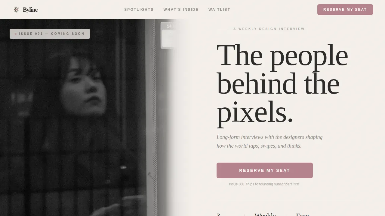
- A half-page photo-and-text hero section featuring a black-and-white designer portrait alongside an oversized serif headline and the primary "Reserve My Seat" call to action button
- A hub-and-spoke anchor navigation system where each spoke links to a named designer spotlight card containing a pull quote, three signature-work thumbnails, and an editorial teaser
- A live waitlist counter, a single-field subscription form with urgency micro-copy, and a secondary "Nominate a Designer" path that turns sign-ups into a community act
Feature list
This template ships with six focused feature areas, each built to serve the editorial mission and the waitlist goal.
Half-Page Editorial Hero
The header splits the viewport into two equal halves. The left side holds a black-and-white portrait photograph of a designer, shot tight with shallow depth of field and natural window light. The right side is pure typography on warm off-white: a bold headline in heavy serif, a concise italic subhead, and the dried-rose "Reserve My Seat" button. No gradients, no illustrations. Just the face and the words, like a magazine cover stripped to its essentials.
Hub-and-Spoke Anchor Navigation
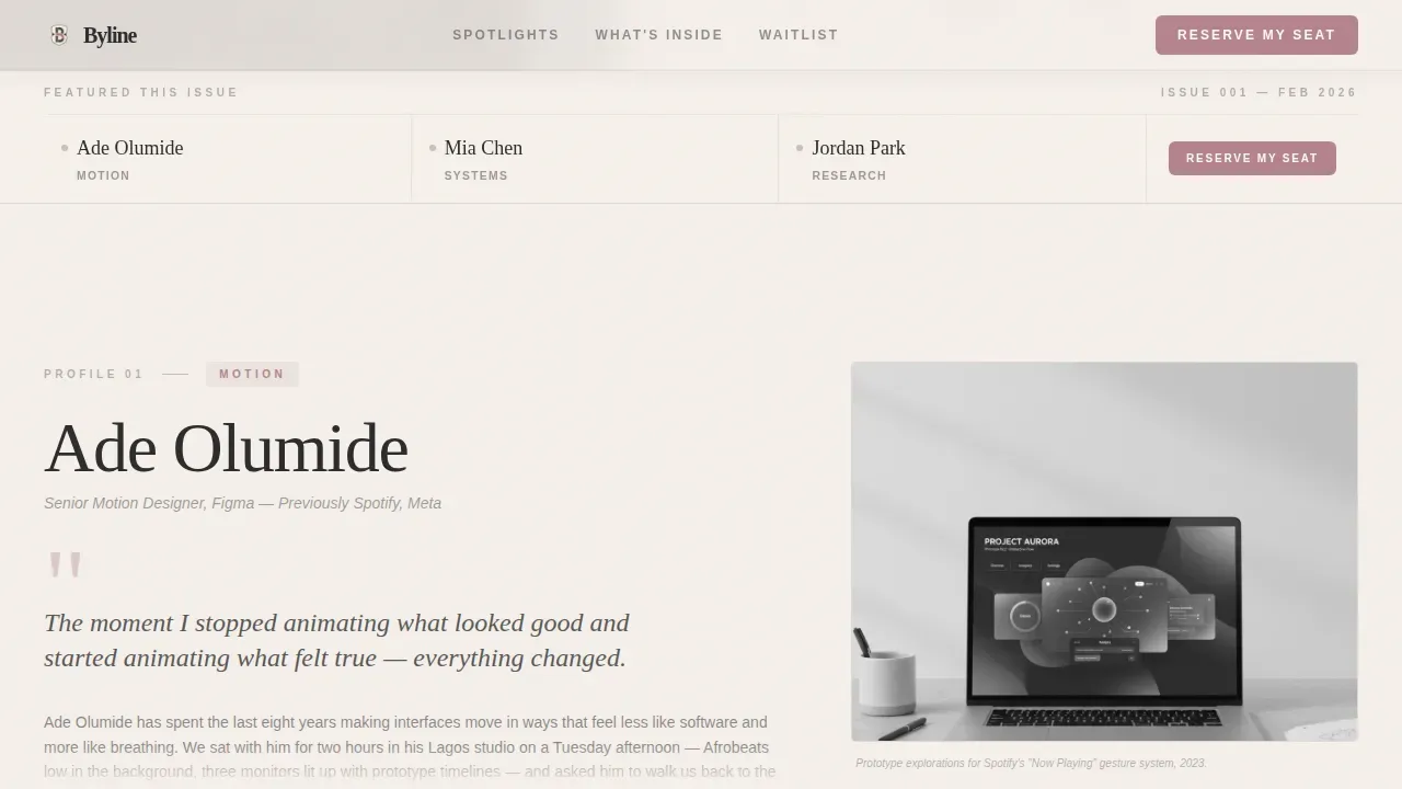
The spoke navigation sits directly below the hero and lists each featured designer by name and discipline. Clicking any name smooth-scrolls the page to that designer's spotlight card. The navigation also exists as a sticky bar so visitors always have a quick way to jump between profiles without losing their place on the page.
Designer Spotlight Cards
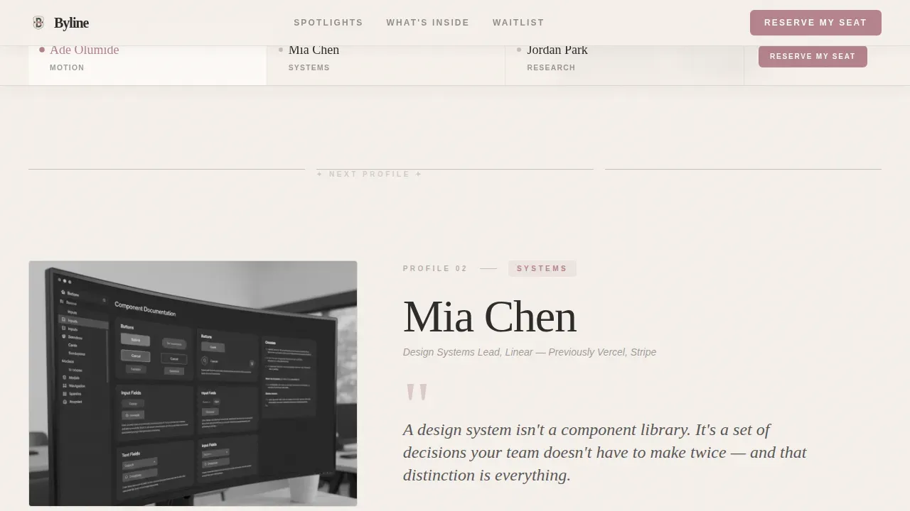
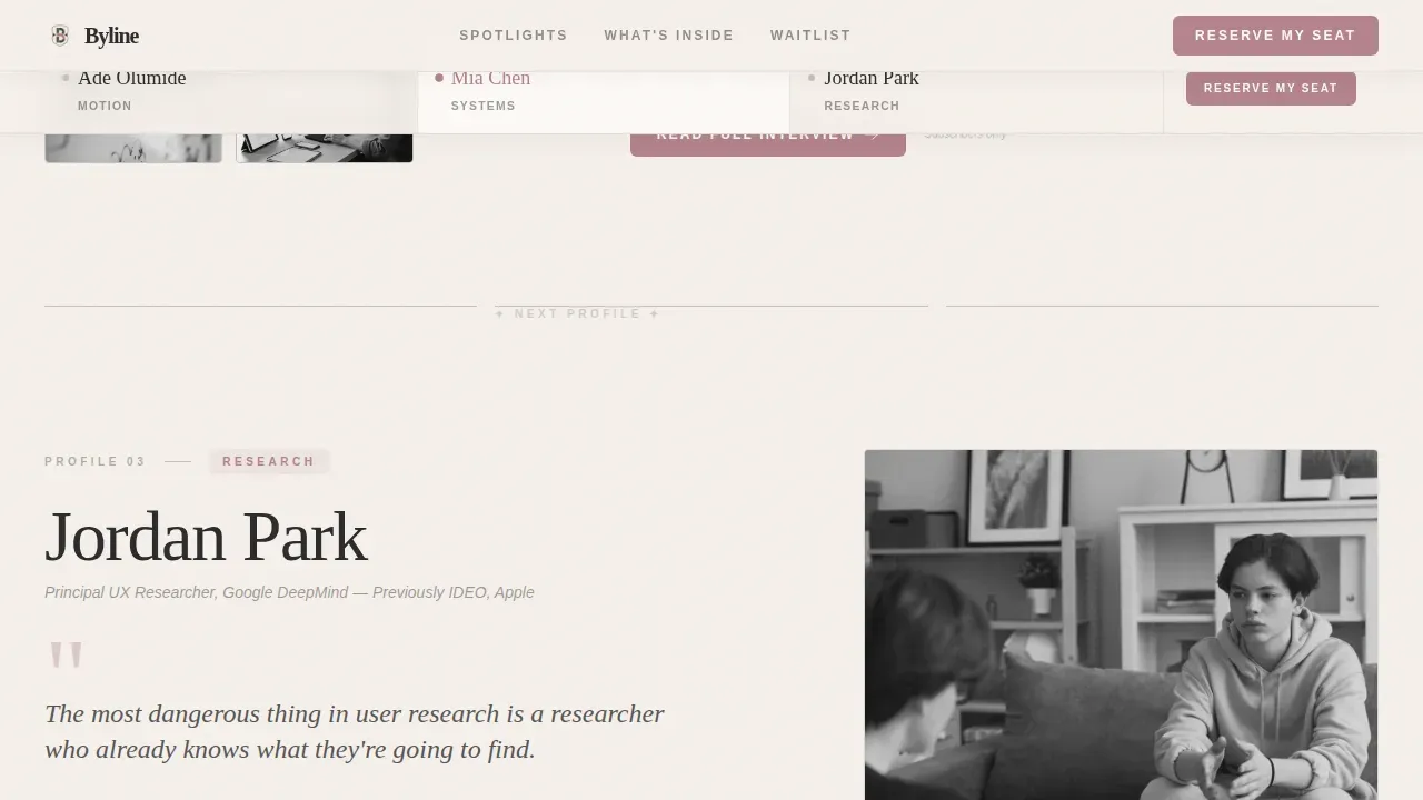
Each spotlight card is a self-contained editorial unit. It opens with an oversized pull-quote set in serif type, followed by a thumbnail gallery of three signature works and a two-sentence editorial teaser that ends mid-revelation. The teaser is deliberately unresolved to compel the click to subscribe. Three cards alternate between tight typographic layouts and generous whitespace, mimicking the pacing of turning magazine pages.
What's Inside Bento Section
A structured bento-style section breaks down the editorial formats subscribers can expect: long-form interviews, annotated portfolio breakdowns, and honest career retrospectives. This section sets clear expectations about what lands in the inbox each week, communicating the newsletter's value proposition in a scannable format that visitors can absorb in seconds.
Live Waitlist Counter and Subscription Form
The subscription form is intentionally concise: one email text box, one "Reserve My Seat" button, and one micro-copy line reading "Issue 001 ships to founding subscribers first." A live counter displays the current waitlist size directly above the form, providing real-time social proof that manufacture urgency without making any false claims. This is the primary conversion engine of the page.
Nominate a Designer Secondary Path
Below the main subscription form, a secondary form invites visitors to nominate a designer by submitting a name and a link. This feature serves a dual purpose. It gives engaged visitors something meaningful to do beyond signing up, and it generates organic sharing because nominators are naturally inclined to tell the person they nominated.
Page sections overview
| Section | Purpose |
|---|---|
| Hero portrait header | Establish editorial voice and capture immediate attention with the primary call to action |
| Spoke navigation hub | Let visitors jump directly to featured designer profiles via anchor links |
| Designer spotlight cards | Showcase three alternating profile cards with pull quotes, photos, and editorial teasers |
| What's Inside bento | Communicate the newsletter's content formats and set clear expectations |
| Waitlist call to action | Convert visitors with a live counter, single-field form, and founding-subscriber urgency copy |
| Nominate a Designer form | Invite community participation and encourage organic sharing before launch |
| Minimal footer | Close the page cleanly with a horizontal, low-distraction footer layout |
Design & branding system
The visual identity uses an Ink and Paper theme with a Soft Mist color system. Every color choice references analog print production, from the warm off-white background that reads like uncoated cotton stock to the deep editorial charcoal used for body text. The palette is deliberately understated: the content is the ornament, not the decoration around it. A consistent color scheme across all sections reinforces the brand identity and creates the kind of familiarity that makes readers trust a publication before they have even read a word.
- Colors: warm off-white (#F5F0EB) as the dominant background, deep editorial charcoal (#2B2B2B) for body text and masthead elements, muted fog gray (#C8C2BC) for dividers and secondary surfaces, and dried-rose ink (#B5838D) reserved for anchor navigation highlights, pull-quote marks, and the subscribe button
- Typography: DM Serif Display for all headlines and pull quotes, Manrope for body copy and interface elements, creating a clear typographic hierarchy that communicates professional editorial authority at a glance
- Aesthetic: minimalist design philosophy drawn from letterpress print tradition, with no gradients, no illustrations, and generous margins that give the content room to breathe
Mobile & speed optimization
The template is designed desktop-first to honor the editorial magazine feel, with a responsive layout that adapts to smaller screens without sacrificing the typographic hierarchy. The scroll-linked animations, staggered fade-ups, and smooth anchor scroll behavior are built to feel natural across device sizes.
- Static sections use server-rendered components for fast initial load, while interactive elements such as the live waitlist counter and subscription form are handled as client components
- The spoke navigation collapses gracefully on narrow viewports so mobile visitors can still reach each designer spotlight without friction
- Photos and portrait images are sized and structured to display crisply on both large desktop monitors and mobile screens, keeping the visual quality consistent wherever the page is viewed
How this template helps you convert
Newsletter landing pages have the highest conversion rate of all signup forms, reaching around 23 percent when the page is focused and purposeful. This template is engineered around that principle. Every design decision, from the single call to action in the hero to the live waitlist counter at the bottom, exists to move visitors toward one action: reserving their seat.
- The page uses one call to action repeated in three strategic positions: the hero header, the sticky anchor navigation bar, and the final waitlist section. Repeating one call to action this way removes decision fatigue and keeps visitors focused on a single goal without overwhelming them with competing options.
- Social proof appears in the form of a live waitlist counter that shows real subscriber numbers, setting clear expectations about demand and creating genuine urgency. A compelling landing page is crucial for growing newsletter subscribers over time, and visible social proof is one of the most reliable ways to build that credibility with first-time visitors.
- The "Nominate a Designer" secondary path turns passive visitors into active participants, driving traffic back to the page organically as nominators share their submission and bring attention from their own networks.
Other information about this template
This template is a strong fit for anyone building an email newsletter in the design, product, or creative industry. It works equally well for independent publishers, small business owners running thought-leadership content, and companies launching editorial arms to showcase their expertise. Below are practical details that help clarify scope and usage.
- The template is built as a single landing page with anchor-linked sections, so all navigation stays on one page rather than routing to separate site pages
- You can easily customize the designer names, disciplines, pull quotes, and thumbnail photos to reflect your actual editorial lineup before launch
- The welcome email flow is not built into the landing page itself, but the subscription form is structured to connect with your email list provider so you can set up a welcome email sequence independently
- The byline editorial designer interview newsletter landing page template is listed in the Blog and Editorial category, under the user experience and design newsletter subcategory, making it straightforward to find among other professional newsletter templates in the marketplace
- Bylines are critical for establishing editorial authority and humanizing the publication. In creating an engaging newsletter landing page, the byline serves as a powerful trust signal and branding tool. Placing a byline directly under the article title for immediate recognition is a practice this template supports naturally through its spotlight card structure
- Online bylines can be hyperlinked, allowing readers to click through to the author's LinkedIn or website to verify their expertise. The spotlight card teaser section is a natural place to add such links when you customize the template
- Newsletter landing pages used in a specific niche like design interviews tend to attract a highly qualified audience. Most newsletters that serve tech people and design professionals benefit from the kind of editorial credibility this template communicates visually before a single word is read
- This template provides enough information in its default sections to launch a waitlist campaign without needing additional pages. Additional information about format, frequency, and past examples can be added inside the spotlight cards or the What's Inside bento as you build out your editorial voice
- Newsletters are great tools for building brand awareness and reinforcing brand identity, and a dedicated landing page is the most direct way to communicate that brand identity to new visitors arriving from social media accounts, blog posts, or referral links
- Using newsletter templates like this one can significantly reduce the time needed to create engaging content for your launch campaign. The consistent branding built into the color scheme, typography, and layout means your page looks professional from day one
- The page can support testimonials from early readers or design industry figures in the spotlight card section, adding another layer of social proof as your waitlist grows
Theme
Ink & Paper
Creative direction
Creator Spotlight
Color system
Soft Mist
Style
Hub & Spoke (Anchor Nav)
Direction
Waitlist/Coming Soon
Page Sections
Half-page Editorial Hero with Bold Headline
Hub-and-spoke Anchor Navigation
Designer Spotlight Cards with Pull Quotes
Live Waitlist Counter and Subscription Form
Nominate a Designer Community Path
What's Inside Editorial Bento
Related questions
Can I change the featured designer names and photos in this template?
Does this template include a welcome email or email sequence?
Is this template suitable for a small business or solo creator, not just a large publication?
How does the live waitlist counter work?
Can I use this template if my newsletter covers a different design niche?



